As was foretold, we've added advertisements to the forums! If you have questions, or if you encounter any bugs, please visit this thread: https://forums.penny-arcade.com/discussion/240191/forum-advertisement-faq-and-reports-thread/
Options
Portraits (Photo Assignment)
JazzBlack Registered User regular
I have to take 6 photos into a class. Its my first photo assignment and the brief is to "Take self portrait imagery or of another. Portrait may be abstract, body parts can be hidden. Experiement with lighting shadows and enviroment.
Iv taken a few just want to get some feedback on them, likes and dislikes and constructive critisicm is welcome.
1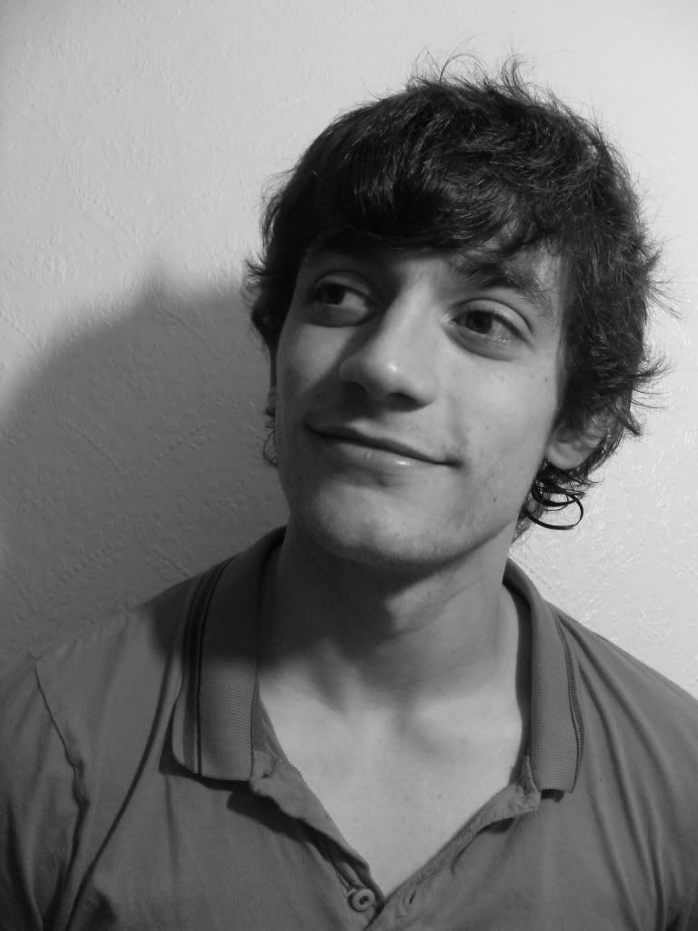
2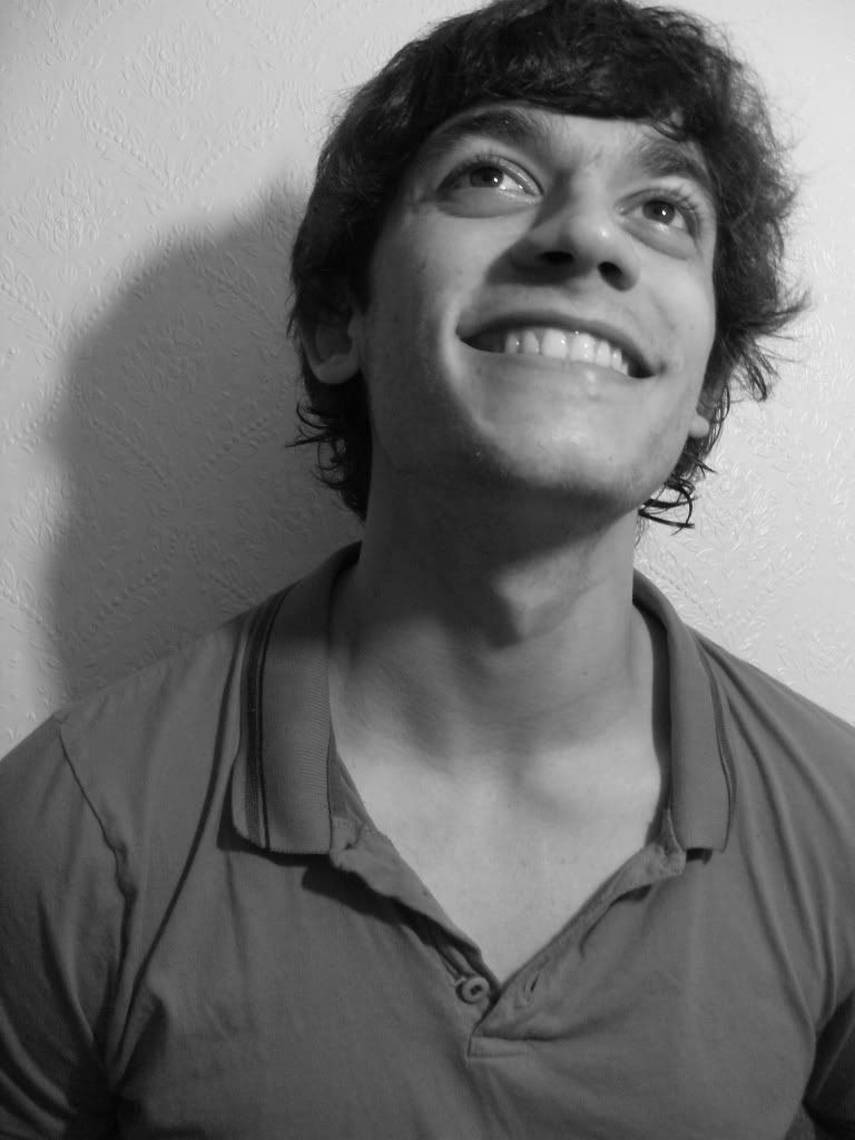 3
3
 4
4
 5
5
 6
6
 7
7
 8
8
 9
9
 10
10
 11
11
Iv taken a few just want to get some feedback on them, likes and dislikes and constructive critisicm is welcome.
1
2

JazzBlack on
0
Posts
12
Sorry ther is alot. but as i said any constructive critisicm is welcome.
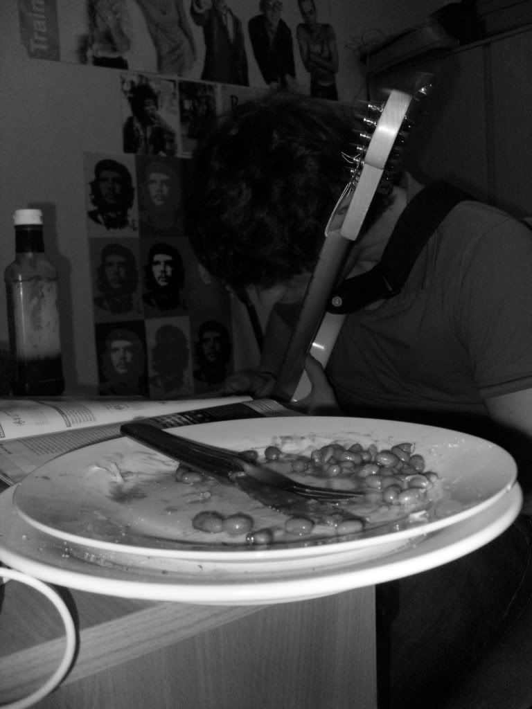
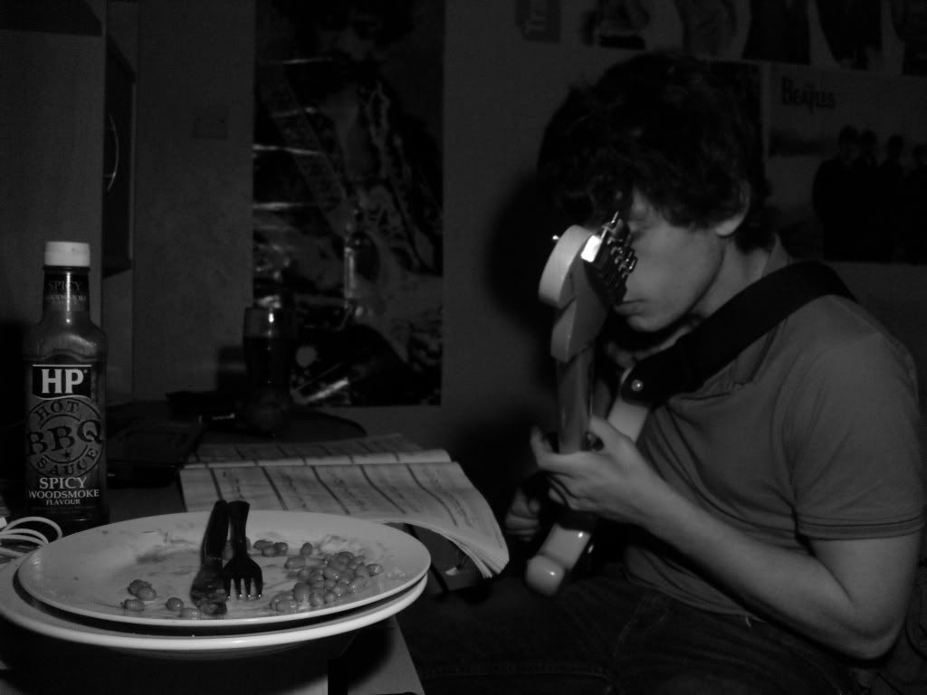
I like number 7, I would like others but a half eaten plate of beans doesn't do much for me artistically.
hes pretty good with it too.
haha ye i supose i could crop it out on some of them.
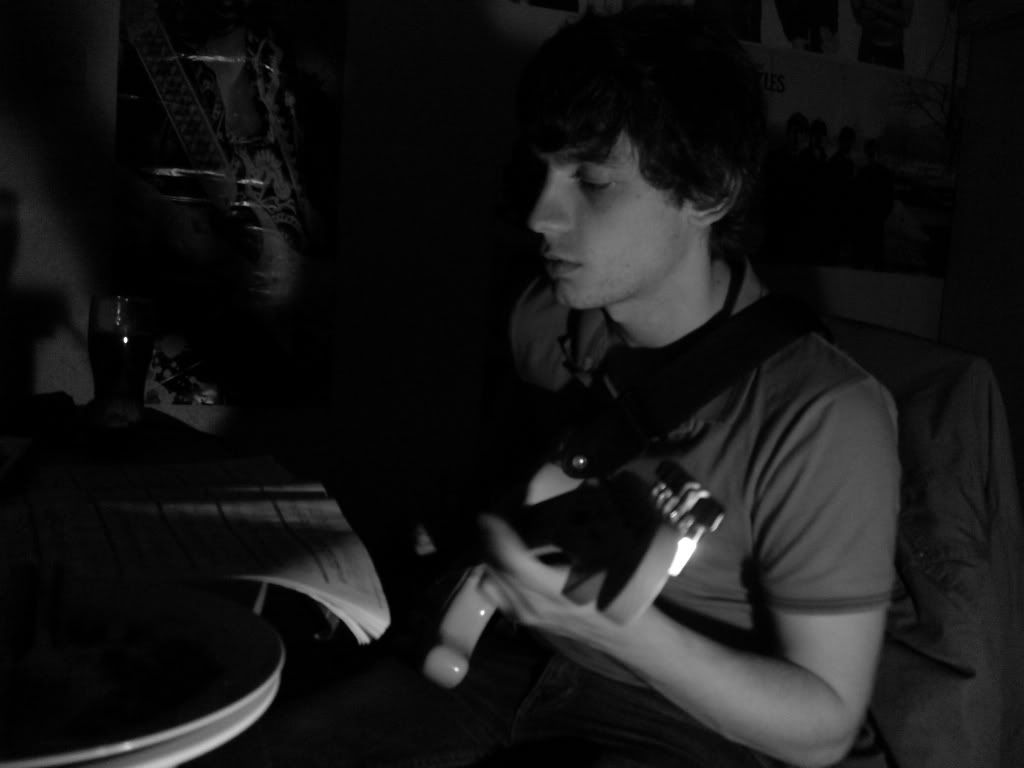
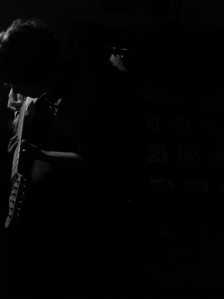
His face being obscured serves no purpose in the image so you'd want to change that but the other elements are beginning to come together to tell us about his character.
The way you have the scene lit puts too much emphasis on the plate of beans which has the effect of making it the sole focal point (it can be a focal point but right now it's stealing viewing time from more important elements which is making the image difficult to read). The beans are a great element in the image because imediately it gives us a clue about his personality (portrait photography is all about explaining a person visually). I read the image as him being able to play an instrument and read sheet music (classical music and higher class connotations), yet he seems indy/ common/ grounded by his love of a common working man's food.
I love the intimacy of the underexposure and the documentary feel this gives the image. The surrounding darkness suggests isolation (perhaps another important factor of his personality when playing music) and lets us focus on the character.
This can be the first test shoot. Go take some more using any tips you pick up from this thread (things that work/ don't work) come back and show us!
On to the pictures - I'm gonna offer opinion on each image, but portraiture is not my thing so feel free to disagree with whatever I have to say...
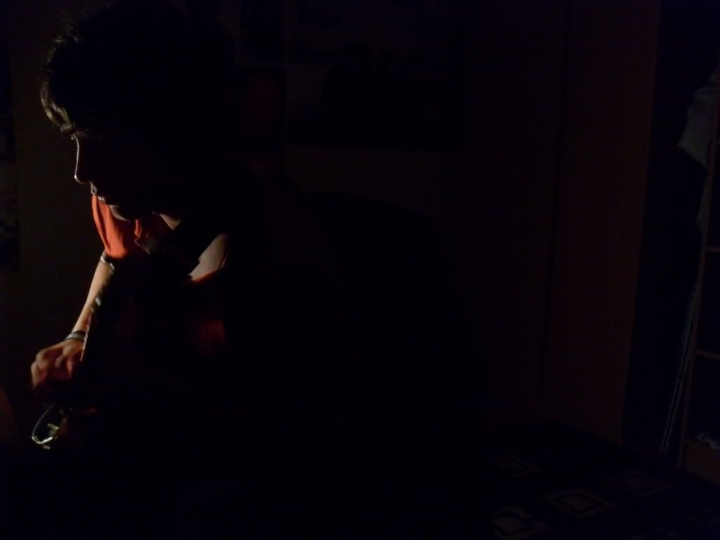
1. Feels very slightly underexposed. Also the focus is soft around the eyes, and that is the most interesting part of a person for the viewer (9 times out of 10, and excluding "OMG BOOBIES") - so it helps make an image strong when the eyes are the most in-focus part of the image. The expression is pleasant and the looking-to-the-side is good. But this feels a little snapshot-ish. Your assignment seems angled towards "play around" as if it were to develop a baseline, and in that vein I think this is a fine place to start.
2. The eyes are brighter and that's an improvement over #1, but the wallpaper is in more focus than the eyes. This is a good thing to work on. I like the expression, the direction he's looking. In both of these images I would prefer more contrast. If you're shooting digital that's easy to do, but if it's film I have no idea how to increase the contrast. I prefer my B&W shots with true blacks and true whites, and these feel like they stay in the greys for the most part.
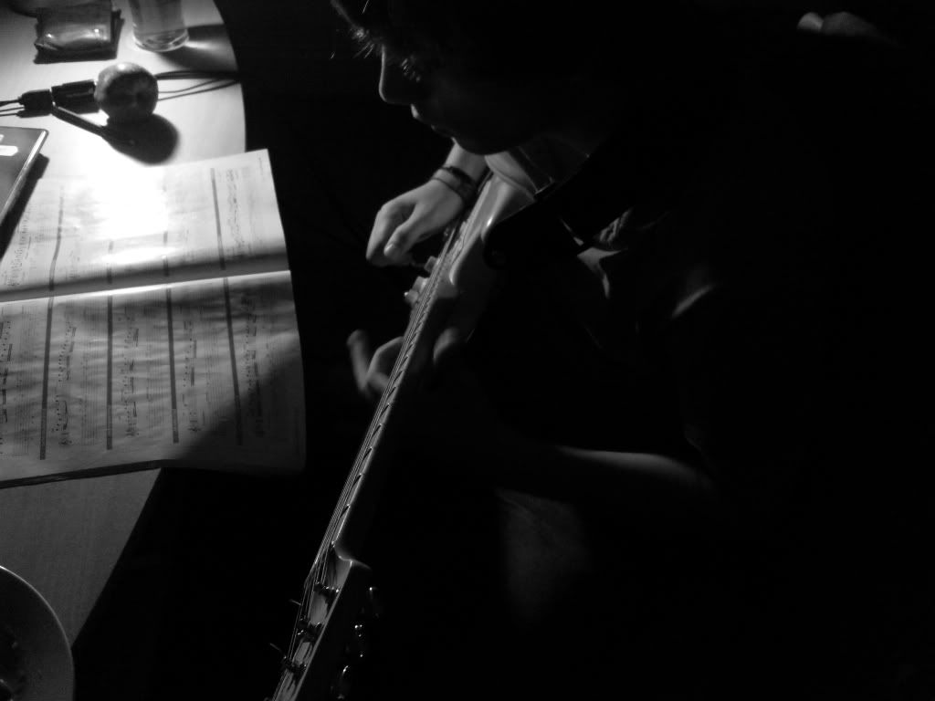
3. This is a picture of a plate of beans that has a background consisting of a room and oh, there's a guy with a guitar. If this was your intent, then you got it nailed. If this isn't the intent, then reshooting this shot a few times and play with angles and whatnots and see if you can improve on the composition so that it does a better job of painting the picture you wanted to describe.
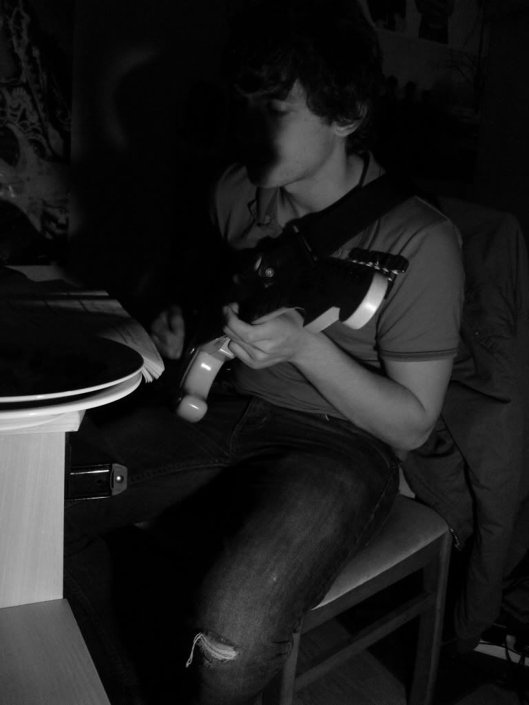
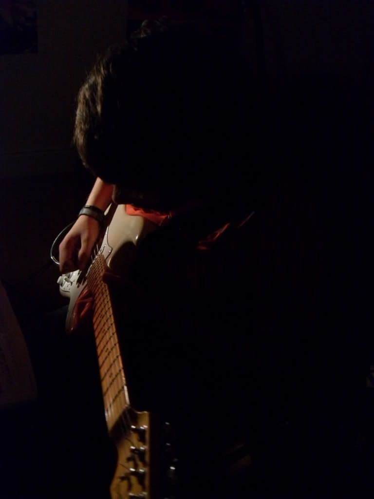
4. I like this the best of the bunch so far. It's not as snap-shot feeling, and the darker shadows are more interesting to me. The obscured face and obscured plate make me curious about the scene. This also shows that you followed the "play with lighting" advice.
5. I don't like this as much as #4. I think it's because I can see more and the mystery is gone.
6. Again, I think 4 is better for these shots. I especially don't like the tip of the guitar obscuring his face. I don't feel the beans/BBQ sauce add interest to the image. But you might try adding a couple lights (flashlights might even work) to subtly light up the sauce and the plate of beans, maybe highlighting them will enhance the image; ie - make them the focus using light.
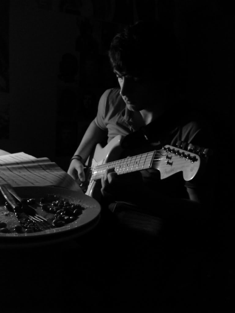
7. I like this the best of all the shots so far. There's a blown-out highlight on the sheet music, and maybe diffusing the light (like with a paper towel) or something might alleviate that in future shots, but that's my only complaint. You might also try a bit more light on the subject's face (from the exact same angle as the current light - I like that we only get these slivers of highlights to show his eyes, etc, but it would be cool if they were brighter). Good composition, I like the mystery of not quite seeing the subject, I like the story it tells.
8. Pretty good shot, except the beans distract me again. Again maybe a bit more light on them to make them feel more important. Also the focus seems soft again. Are you shooting handheld or using a tripod? Maybe the issue isn't that you're focussing in the wrong place, but maybe it's that you're hand-holding at shutter speeds that are too slow.
9. I don't like this one at all. The subject is crammed into the left side of the picture and the right side is nearly empty and whatever is there is not recognizable and is distracting rather than interesting.
10. Same as #9, but in color.
11. This is better than 9 or 10, but still I think there's too much unused space on the right.
12. This is the best of these last 4 pictures, but I still don't feel it. Again it's too far to the left. The high-angle doesn't bring me into the scene, it's very removed (like watching surgery from an overhead viewing room).
I hope these thoughts help!
My Website | My "photo-a-day" 2010
But the one thing I noticed mostly is that all these photos were a bit too blurry for my likin'.
My favorite is #2, because it feels more like a portrait to me. The other pictures don't seem to be as much about the person as they are about guitars, since the guitar obscures your face. I'm not looking at the subject but the guitar because the guitar seems to be the focal point. This makes me care less about the person in the portrait.
One thing I notice about a lot of your portraits are that the face is obscured, cut off, the eyes are hidden by shadows, ect. Ask yourself; what do I want my viewer to look at? If these are portraits where you want me to look at the face, make sure everything in the photograph points to the face. Akso try making eye contact with the camera. It draws the viewer in.
I really like the black and white ones. Any chance you could do some more film noir style portraits? That would be sweet.
Keep on working on your compositions, you'll get better
I like drawing, cartoons, cookies, and shiny pointy objects.
this image that i took after the first lot went down quite well, i think its definatly better than the others. dunno what you guys think.
(although when the image was printed it came out a bit darker, and i think it added somthing more to it.)