As was foretold, we've added advertisements to the forums! If you have questions, or if you encounter any bugs, please visit this thread: https://forums.penny-arcade.com/discussion/240191/forum-advertisement-faq-and-reports-thread/
Web Comic Tips and Tricks?
sgt scruffian Registered User regular
Registered User regular
Hey gang, I've joined the masses and started work on a web comic. The premise is basically the random things my friend and I come up with, so it will mostly range from obscure things brought about by delusion to vastly exaggerated events from our lives. This means that it really has no set "genre" or "topic" and I intend to use the comic as a sort of blog for my day and random thoughts. So with that in mind, I'll post two strips I have done as well as a brief idea of what the blog would read that will accompany them.
The Bathroom
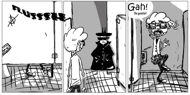
"Hey, thanks. I suppose my mouth is kinda pretty."
The bathroom, in most part, is a sacred place. Office bathrooms less so, but there are generally assumed rules that apply to anywhere someone might have to be peeing in the direct vicinity of another human being. Apparently some people are unaware of these rules. Rules that include not standing outside of stalls, staring at the door, until someone finishes their business. At nine at night. When there is no one else in the office. And you have managed to creep into the bathroom without so much as a peep to alert the innocent toileter to you presence until they finally open the door and the only thing they can think as they see your eyes lock with their's is "huh, so tonight is the night i finally get raped in a bathroom."
Lumberjacks
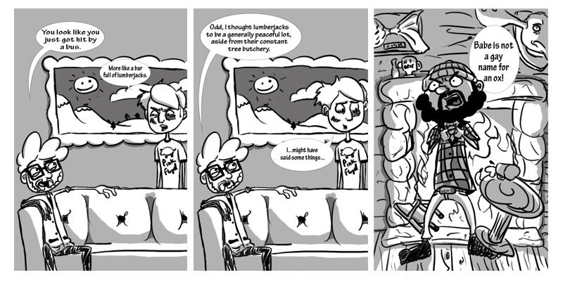
"Cedar smells like shit! Maple syrup is too sugary!"
Lying is a curious thing. When done well it can lead one to ruin. When done poorly, it is often the height of entertainment for anyone smart enough to see through your ruse. The other day Elliott regaled me with a tale his uncle told him. It involved lumberjacks and the fighting of said people. To be precise, it was a story about his uncle apparently fighting every lumberjack, in every bar, in every state. Which begged the questions: Where do you find a lumberjack? And when you find one, how would you pick a fight with them?
So tell me what you think. I'm curious to get some opinions on the work and hopefully do some finer tuning on future strips before I put the site up. Violent criticism bordering on insults is expected, as well as the ten or so "you should add color" comments.
Other than critiques though, I would love to hear any general tips you all might have for getting a web comic running and keeping it that way. Thanks.
The Bathroom
"Hey, thanks. I suppose my mouth is kinda pretty."
The bathroom, in most part, is a sacred place. Office bathrooms less so, but there are generally assumed rules that apply to anywhere someone might have to be peeing in the direct vicinity of another human being. Apparently some people are unaware of these rules. Rules that include not standing outside of stalls, staring at the door, until someone finishes their business. At nine at night. When there is no one else in the office. And you have managed to creep into the bathroom without so much as a peep to alert the innocent toileter to you presence until they finally open the door and the only thing they can think as they see your eyes lock with their's is "huh, so tonight is the night i finally get raped in a bathroom."
Lumberjacks
"Cedar smells like shit! Maple syrup is too sugary!"
Lying is a curious thing. When done well it can lead one to ruin. When done poorly, it is often the height of entertainment for anyone smart enough to see through your ruse. The other day Elliott regaled me with a tale his uncle told him. It involved lumberjacks and the fighting of said people. To be precise, it was a story about his uncle apparently fighting every lumberjack, in every bar, in every state. Which begged the questions: Where do you find a lumberjack? And when you find one, how would you pick a fight with them?
So tell me what you think. I'm curious to get some opinions on the work and hopefully do some finer tuning on future strips before I put the site up. Violent criticism bordering on insults is expected, as well as the ten or so "you should add color" comments.
Other than critiques though, I would love to hear any general tips you all might have for getting a web comic running and keeping it that way. Thanks.

sgt scruffian on
0
Posts
Art isn't bad at all, and I like the style. But the panels feel confusing. You've really got a low contrast strip going on, with plenty of soft grays, sketchy lines, and text bubbles without borders. I can't say that it doesn't work, but it doesn't feel quite right to me.
Is there anything you might suggest to remedy this? Should I just break down and put in the extra effort to color it? What might make it better?
It's hard to say, because a lot of things are involved. Short answer, I'd probably like color better.
But let's look at it for a second:
Your use of grays is inconsistent. In the lumberjack strip, first two panels, the darkest (and easiest to focus on) thing is the picture on the wall. Your text is lost in it, and so is the guy speaking the words. I'd like to see more emphasis on the characters and speech bubbles - maybe thicker lines for those things, thinner ones for the backgrounds. Make the backgrounds paler than the foregrounds, to give the panels a sense of depth, and draw our eyes to your actors. Right now, everything is a mess of similar grays - Paul Bunyan's face is the same shade as the wall behind him, for example.
Honestly, a lot of your problems would be more easily dealt with if you even used flat colors, I think.
And about the tiny text, it's actually so small because I put the text bubbles in the individual panels before I shrunk them down to fit on the strip. The folly of working on stuff at two in the morning. I'll definitely fix that.
To Grenn: I don't know man, my hand writing is atrocious. Even more so with a wacom. Is it the font that bothers you, or do you just think hand written text would better suit the style?
And I personally wouldn't worry about hand-lettering. If you can do it, go for it, but a nice font is better than shitty handwriting. I have that same problem myself, with my stuff.
if those blocks of text are literally meant to be read along with the comic, you're doing comics wrong. that looks like -- no, it is -- an artist's statement that would be attached to a work of art. this are quickly-drawn comics, not pop art meant to be intellectually stimulating.
sorry, can't edit my posts: be incredibly funny, incredibly accessible, incredibly clever and interesting, post your comics a bunch on comic-oriented forums (like this one) that have audiences that would also like your work, and make sure they're so funny that we don't care that you're basically just plugging your comic. and also be good at the internet.
oh, and so, basically be talented from the get-go. that is how comics succeed now. it is not 10 years ago when webcomics were a brand-new thing.
As for the body of text accompanying the comics, I actually took the idea directly from Penny Arcade and Tycho's accompanying rants. What I write is not intended to be a statement of why the comic is funny, but rather an explanation of the comic's origin and where the ideas came from. The bodies of text above are quickly written samples that could use elaboration and when put on the site I intend for them to be significantly longer and about more than just the comic that day. For the purposes of this forum, however, I rushed them in order to try and get some comments and suggestions as quick as possible so that I might start work on fine tuning my stuff as quickly as possible. I can see how that might make for a poor sampling of the overall idea.
And unfortunately I am not the end all be all webcomic messiah, so I will not be able to accomplish your suggested solutions just yet. Is there anything else you might suggest? Why is the comic not funny? Do you just think it's stupid, do you not understand where its coming from, could the art better depict the idea behind it? Any bit helps and is appreciated.
As far as comics go, though, there aren't "workshop classes" for that. You can only show it to us, and all we can say is "This joke isn't funny." You can show us more jokes, but if it keeps happening where you say "My humor is random..." (which is the most common "excuse" with webcomics), then your humor probably doesn't belong in comic format. Well, belong meaning: you aren't going to be that successful and have an audience.
How to "become funny:"
Participating in random conversations in online forums and reading a lot of comics will help you achieve this. Some of the up-and-coming comics I read are people who have a strong "online presence" on some forum, they make a lot of friends there, and start making comics just to be funny to that audience, and then they grow from there.
Also, the only successful "from life" comics that I read either rely on a strong sense of writing interesting ideas, or extremely powerful humor. I'm not saying you have to be a "messiah," but that you have to be good. I don't think any of the people whose comics I read started out with no quality to their humor. Their humor evolves, but they started out with a powerful draw. They are genuinely funny people, they know how to make people laugh, and that comes across.
Other examples of successful and accessible comics: Cyanide and Happiness, XKCD, A Softer World, Saturday Morning Breakfast Cereal.
Family Guy would probably get away with the "Babe is not a gay name for an ox" in a...more effective way? I don't know. There's probably books about how to make humor effective. I'll make some shit up anyways.
The Success of A Comic
1. 50% is the Punchline. Is the punchline obvious? Is it accessible (meaning, do I need prior knowledge which isn't common to get it)? Example of success: John Stewart doesn't just make a joke about Sarah Palin without first showing us a clip of Sarah Palin being stupid. Punchlines should almost always catch the reader off-guard.
2. 30% is Expressiveness of Characters. This requires being a good artist and having a good grasp of expression. 50% practice, 50% talent. Only Penny Arcade and Ctrl-Alt-Del got away with starting out with piss-poor expressive characters.
3. 20% is the Lead. How do your characters speak? Is their very syntax funny? Does the style lend towards humor? Do you lead up to the punchline successfully? Even the parts of the joke which aren't punchlines need to feel funny.
Conclusion: This is an inverted pyramid (like a news article is). You have to draw your reader in with a lead, you have to keep them in with the style and expressiveness, and then you have to reward them for their effort with the punchline. If you let them down on the punchline too many times, they won't come back. If you can't lead to the punchline well, they won't even "finish" the comic -- sure, they'll read it, but they will no longer care. Very few comics succeed without expressiveness, some of these would be:
You don't *need* the whole balloon to fit untouched in the panel - take a look at penny arcade or PvP; the text often takes up a large amount of panel, sometimes bumping against the border or covering unimportant parts of the characters.
It is funny though, I laughed C:
One thing I think they all have in common, however, is that they are writing something they really enjoy. They are certainly doing a better job of conveying it to a larger audience, but I can say that I share that as well. This is something I am doing for myself because I like doing it and I would love it if others did too, so I will try to apply your advice to future comics.
Pittens, I'm glad to hear you laughed. It's a nice contrast, haha. And I totally agree with the bubbles going out of bounds, I think that will probably help a lot. The font is called Teknofont, and I think it will serve the comic well, but I will look around. The inconsistent size will not return, it was a fluke in the creative process for that particular comic.
EDIT: I checked out blambot, and despite having tons of great fonts I would love to use, they all cost money, which will be going to hosting the comic at the moment. Perhaps when I get the chance I will snatch up a few.
Also, don't take those percentages as some kind of rule. It seems to make sense to me, but I made it up just because it makes sense to me. Not arbitrary, but not some sort of "Standard."
Didn't think the blog post on the bathroom one added to it at all but the comic definitely got a chuckle out of me.
Keep it up I'd like to see more.
I like it.
Also, people who tell you what's funny are leaving out the 'to me' part most times. Certain types of humor are universal. Slapstick is universal. So are fart and dick jokes. If you're thinking of winning an Eisner award for a webcomic about funny things, get used to disappointment. People now have in their heads what's funny. I happen to vehemently dislike that Dinosaur comic. It's a wall of text with the same strange dinosaur clip art pics, and the jokes are smirk-worthy, but only as a 'get it?' kind of exercise. Meanwhile, consistently, the 'Garfield Without Garfield' strip hits me in a way that is just incredible, which is just re-appropriating the images that have already been created.
Cerebral humor seems to be in fashion these days. I can really get a good laugh out of some of the xkcd stuff, but it's not the Three Stooges. I know, it's blasphemy that humor be considered lowbrow or 'fun'.
If it doesn't make you laugh, but is constructed like jokes people say are funny, then, it's probably not funny. I've also decided that being on this forum, ain't the place to get the best advice on what's funny and what's not. No offense to those who genuinely think that they're helping out around here, but, it seems like every constructive comment is doused with poison...that elitist scenester poison that comes through when people want to seem interesting or in an in crowd.
Also, get yourself (once you have a site and some viewers) over to isitfunnytoday.com and register your site. There you will get a good barometer of what people think is funny, by people who read your comic.
If you'd like some actual Photoshop tips, I'd check out Polykarbon.com's tutorial on halftones. Doing this will give your grays an awesome analog feel, even if you do all your stuff digitally.
I like it, keep up the good work.
Certain comics require you to be a certain kind of person. XKCD is written for scientific thinkers; the guy is an engineer. The Three Stooges is not universally funny either; it's not blasphemous, it's just not clever or creative; it's on part with "Scary Movie." It doesn't take much thought to hit someone in the face, whereas things like John Stewart and Family Guy have swaths of writers that sweat their brains out in order to come up with quality writing. There's a reason slapstick isn't on television anymore.
I might be wrong, but I'm pretty sure the "is enough of a nerd to read online comics every week" demographic expects somewhat clever humor. The huge group of people who are satisfied by not much thought in humor are not putting RSS feeds for comics on iGoogle pages, visiting the sites every time a new comic is updated, and providing ad revenue.
Sorry if I'm being snarky, but the "elitist" argument always stands out to me as the weakest argument someone can give. I don't read good comics because they're "in." I read them because they make me laugh. This is a purely consumerist argument.
Peace, man. I don't want to have a slugfest about this because largely we agree. And, if you've traveled around this great big 'net, you know that people can't be judged by a single post, and I want you to know I definitely respect your opinion. It's just that xkcd has become the 'fashion specs' of the internet comic community. People wear their love of that comic as if it makes their tastes more refined. I like the comic, and when I have to look up the joke, I find that more humorous on an Andy Kaufman level...But I'm a serious Johnny Come Lately to the comic, and only found out about it because someone suggested I give it a read.
You're not being snarky, man. And, I read your post, and agreed to some degree with your dissection of the online community. But for every xkcd, Penny Arcade, and Cyanide and Happiness, there are people who collect pictures of LOLCATS and think they're the height of humor in the world, and when they're not sending you viruses, might just be your manager at work.
A pie to the face, a ladder to the back of the head, or a thwack to the fall guy, these things are going to get a laugh more often than jokes about Micronesian finance.
But, I know what you mean, quality humor is still quality. You did mention Family Guy once or twice. The fight between Peter and the Chicken...that's slapstick. Stewie farting and having a red-out? That's gross-out slapstick. So, how long did the writers slave over Peter, Brian, Stewie, and Chris playing ipecac chicken and end up with brown vomit everywhere? If I ask someone if they think Family Guy is clever...I don't know what people would say.
I have to say that the quality of these jokes is based on their devotion to making the music, dialogue and situations funny, but there's a LOT of broad humor in there.
As to the critical eye that's tossed out out there, one of the stickies on this board for folks doing webcomics is a piece of advice that says 'don't'. Pretty much says 'Don't try. If it's not worth being in print, then don't do it.' Well, the web makes something that's hard to break into without serious outlay of money something that you can try your hand at. If I had to use Prismacolors or ink and paint for my comics, rather than Illustrator and Photoshop, I'd be keeping PRANG and other folks in business for a long time. As it stands now, my freelance pieces get sold, and my comic (which has its moments, honestly) gets to be a free hobby that happens to entertain some folks.
A proposition that wouldn't be possible in a purely analog world.
I'm of a mind there's room for both.
I believe that the PA guys have a font that's very similar to Blambot Casual.
They also use some of the sound effect fonts.
AM
Anyways, sorry for derailing the thread. I just don't think people honestly read things like XKCD to be "in." When I don't understand the joke, that sucks, and I say "Uh...what?" But a lot of the time the jokes are right on. I don't think he caught on because he's trendy. The webcomic world is economyless consumerism. A Softer World, for instance, is definitely hipster...but I think they're also often pretty friggin smart.
"He is also prone to sitting on stoops in the rain, looking moody."
Let me know what you think of the colored image over the black and white. As per pittens suggestion, the text is a different font at a legible size and the word bubble is no longer constrained to the panel. I personally think it's a great improvement.
Opinions? Suggestions?
But I'm nitpicking. This is definitely an improvement, scruff.