As was foretold, we've added advertisements to the forums! If you have questions, or if you encounter any bugs, please visit this thread: https://forums.penny-arcade.com/discussion/240191/forum-advertisement-faq-and-reports-thread/
Options
Faded Sneakers Art Thread ~ NSFW
Faded_Sneakers City of AngelsRegistered User regular
City of AngelsRegistered User regular
Hello AC people ~
I was looking for something to draw the other day outside my own projects and stumbled across your "bi-weekly" er "semi-monthly" ~_O challenge thread.
Looking at some of the past ones you guys had done I was inspired to draw up what I would have entered had I been there at the time. Im going to toss up the first few I did and will post more as I finish them.
Crits etc are welsome.
In any case hope you like them and thanks for the cool ideas.
EDITED TO ADD UPDATED PICS:
SOOOOOOOOOOOOOOOO, here is a quick update on the ones I posted originally ... I changed a few things and think it fleshed them out a bit even if the additions are minimal which in a few cases they are.
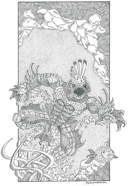
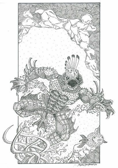
Redesign of Creature from the Black Lagoon
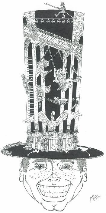
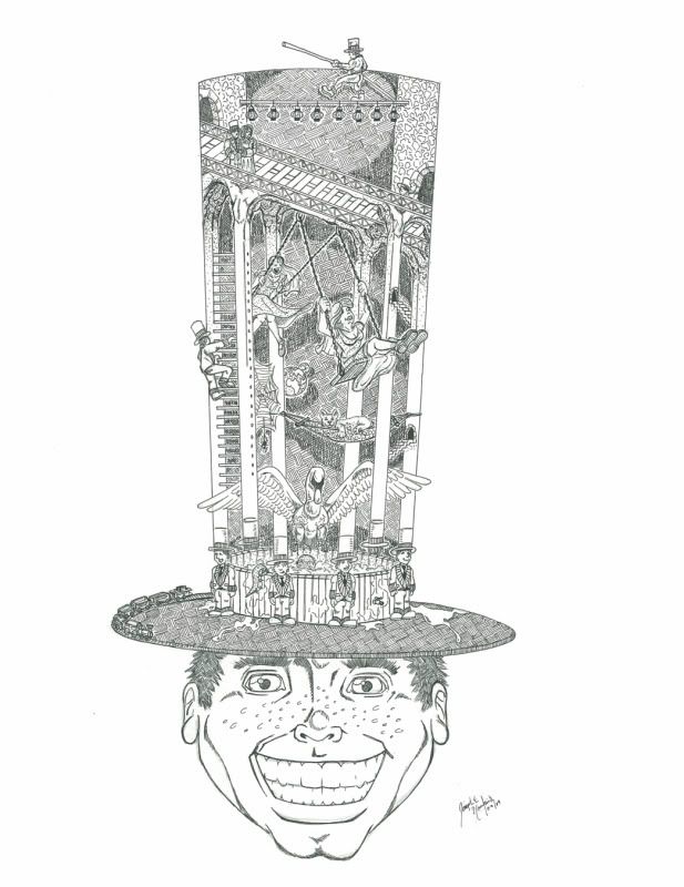
Fancy Hat
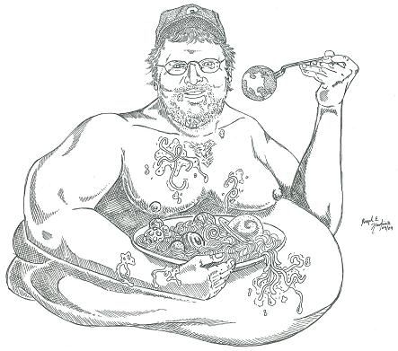
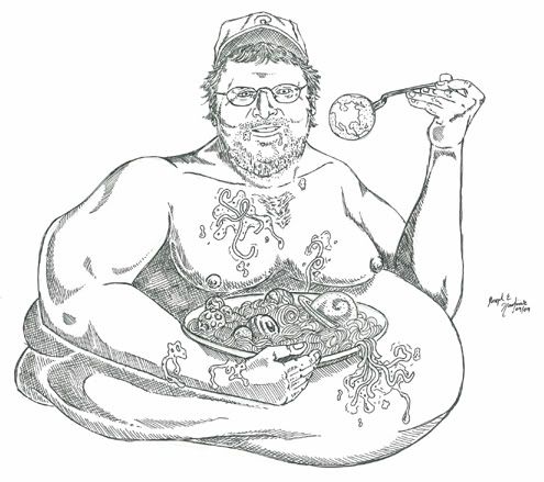
World Destroyer ... Michael Moore
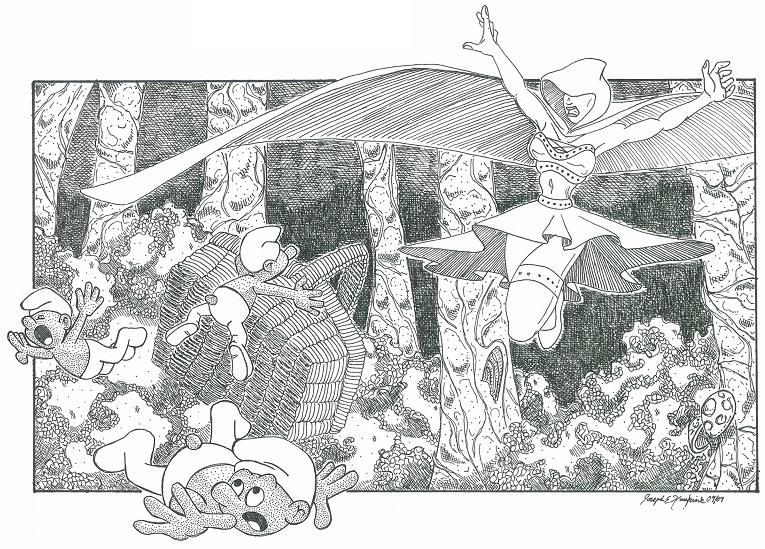
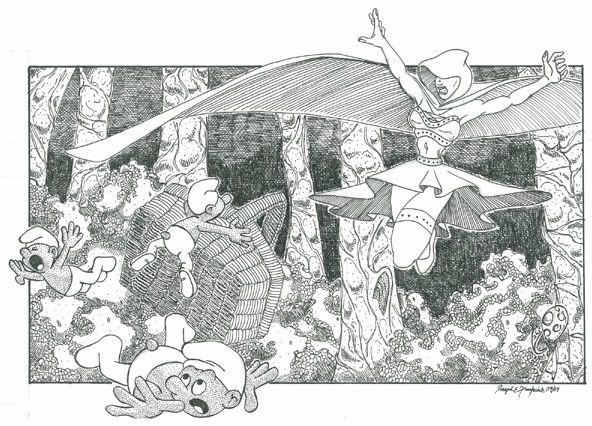
Red vs Blue ... Not-so-little Red Riding Hood vs Smurfs
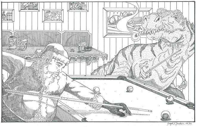
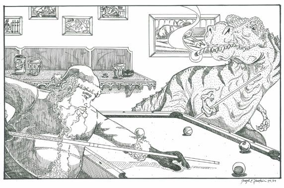
Santa Vs Dinos
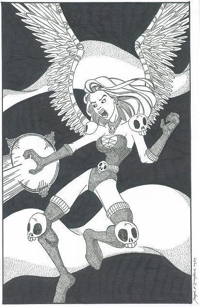
Random exagerated anatomy woman
I was looking for something to draw the other day outside my own projects and stumbled across your "bi-weekly" er "semi-monthly" ~_O challenge thread.
Looking at some of the past ones you guys had done I was inspired to draw up what I would have entered had I been there at the time. Im going to toss up the first few I did and will post more as I finish them.
Crits etc are welsome.
In any case hope you like them and thanks for the cool ideas.
This is from the Red Vs Blue one. A Not-so-little Red Riding Hood vs Smurfs.
Santa vs. Dinos
Choose your World Destroyer. This portrait is kinda fail, so I better mention it is supposed to be Michael Moore.
Redesign of a Classic Monster. I chose Creature from the Black Lagoon.
Fancy Hats. Thought this idea was awsome. Took a long while to think up a concept but I enjoyed the challenge.
This started out as one thing but ended up nothing particular. Just a random drawing messing with exagerated anatomy.
BAH!
Thats all for now. But Ill be back with more probably next week.
EDITED TO ADD UPDATED PICS:
SOOOOOOOOOOOOOOOO, here is a quick update on the ones I posted originally ... I changed a few things and think it fleshed them out a bit even if the additions are minimal which in a few cases they are.
Redesign of Creature from the Black Lagoon
Fancy Hat
World Destroyer ... Michael Moore
Red vs Blue ... Not-so-little Red Riding Hood vs Smurfs
Santa Vs Dinos
Random exagerated anatomy woman
Instagram: fadedsneakers
Faded_Sneakers on
0
Posts
In general I think it would help if you made your lines thicker when an object or character is closer to the viewer, and thinner when it is farther away. It would help your scans read better. Try playing around with different line weights rather than one uniform line weight.
I know John K has a lot of stuff about line weight on his blog. Maybe it will help you. http://johnkstuff.blogspot.com/search?q=line+weight
Nice stuff keep on posting!
I like drawing, cartoons, cookies, and shiny pointy objects.
NightDragon you are right of course. Ive always had trouble with women. Even when doing anatomy studies, unless Im doing a portrait, I feel the need to enhance their body to make it more curvy while sacrificing believability. I really need to find a happy medium between authenticity and fantasy.
Details tend to stun the average viewer into "ooooooh nicccceee deetaaaails" mode. But as most practicing artists know, it's considerably harder to pull things like this off when you pare them down to their basics. all of the flaws become much more readily apparent, as is the case in the last one.
Basically, you've got a neat technique, you seem to have some experience under your belt, go back and practice some of the basics again. Do some still life studies and observational drawings. They will help you tons.
I'm a professional working artist who is currently doing first year art courses in school. I had an established style and way of drawing through years of self teaching. I can't even begin to tell you how useful I find the first year drawing course. It's never too late to go back and do that stuff that you missed, or didn't quite grasp.
aside from anatomy, you need to work on your visual flow. Like the last one, the anatomy is exaggerated, but the image doesn't flow well. her body makes sort of a really awkward "s" shape. She looks "flyswatted" As though she's been smushed into the background like a fly on paper.
Read this for more information on avoiding stuff like this to make your character work more dynamic:
http://itchstudios.com/psg/art_tut.htm#perspective_and_construction
like I said before, you have a very interesting style, and I think with a bit of work, it'll really be spectacular.
I'm also not saying you shouldn't go for heavy details. I think when done well, it really is something great to look at, but it is still important to get your basic underlying drawing down before cutting in these details.
It should go in layers.
Keep it up and keep posting, I'm interested in seeing where you take all of this
NOW, on to some new things!
In keeping with my original reasons for posting the first few are from your "Competition Thread" ideas.
Heroes in a Half Shell
Gams and Garters: Everyone else did sexy lay-day-s so i thought id freak some people out with something different. O_O rawr
Halloween Costume: Dr. Drew is the host of a radio show called Loveline. A caller called in about Furry Fetishes and at the end of the call someone said if Drew were a furry hed be bugs bunny. Couldnt get that out of my head so here it is.
These next two are random extras.
Fist a page of faces you may or may not be able to recognize
Last but not least a portrait of Lyrium and her father (check out the second page of the snap shot thread if this seems strange, i swear its not strange <_< >_> @_@ much. sad face)
BY THE WAY! As to the comments about my female anatomy, give me a few days please because I'm wiping together a page of warrior ladies that I think are more accurately depicted. =P
See you on the flip side!
I'm digging this up from the grave because it's really good:
Edit: also, do you use a ruler?
Bombardier ~ oo, cool tutorial. Thanks for that. The note on there about parallel lines struck me immediately as something that I need to change.
Pretty much the only time I use a ruler is when an item seems to demand it, such as furniture, buildings and certain tools like the pool ques or sword blades. For cross hatching I never use a ruler.
facebook.com/LauraCatherwoodArt
i took gams n garters and outlined just the important parts of the figure
paring it down to the very basic image of a man
the waist has liefeld written all over it. it is entirely too thin. because you've rendered him in a moderately realistic style, it just doesn't work, if you pushed him a bit more cartoony, maybe it would, but in this instance it just looks really jarring
his hands are too big
his arms are both very awkward, his left seems to be growing out of his upper torso and his right has double jointed elbows
this stage of development is crucial to your drawing, you must make sure that all of the pieces fit and are believable at this stage, or the drawing falls to pieces no matter how many nice details you put in.
yeah i agree with this, but i think people on this forum tend not to see flaws through copious amounts of details
they just stop at the details and go "ooooh stippling" and end it there which is why i pared it down to a basic image.
Have I told you you're good people?
d'awww
I completely agree that an understanding of anatomy is immensely important for any successful artist. I certainly see the specific points you outlined and I appreciate the critique.
I like the idea of areas of rest and will try incorporating that in a few illustrations.
And here is the first image of a WIP I am working on:
Ultimately there will be a somewhat gothic cityscape behind the car, shading, and some mix of demonic or human elements interacting with the car as well as a title.
it's a lot cleaner and bolder than your other work and already i can see some improvement
of course... clean and bold is my preference so i'm being biased
The head, torso and appendages don't feel like this whole form, but more like a bunch of body parts stuck together like a toy company manufactures its action figures.
Look up Extended Gestures. It's a concept covered in Nicholaides' The Natural Way to Draw. This concept would be invaluable to you as an artist.
Ill look up the Natural Way to Draw.
Ive been looking into buying a couple new technical pens to help with the line weight issue. The only old school Faber-Castell one I found was used and was broken so needless to say that was crap $25 in the trash. Soon as I can get my hands on a couple different sizes Ill start using them and see if I cant vary up my linework.
Literal Literature: Lord of the Flies. Originally when I thought of LotF this pretty much leapt to mind but as a rotting corpse on a deserted beach with the only other life a swarm of flies buzzing about the body but as I started drawing that felt too comical and not kind of subtley sad enough so I ended up going this route. I may do another to see if I can make a more skeletal "worn" looking character work.
God Splicing: Egyptian Anubis and Hindu Vishnu
And some portraits as posted in the Sketch a Forumer Thread (to see colors check out that thread):
Last a kind of progression thing. This was a Christmas commission that frustrated me, and not just because I waited to almost the last minute to do it and then aged the girl from 20 to 50 between the first and last drafts.
*sigh*
BAH!
Retro Future:
Now an old challenge thread topic, Satan Teapot:
Is it just me or does the "Mother Demon Thing" kind of look like a monkey slurping a spaghetti noodle?
Sigh.
This second one belongs in a PAAC Card Thread but I dont know where it went and dont remember who the OP was so here is what I would have posted there.
Added a PAAC Logo from Iruka because I thought it made the template more complete.
Self portrait. GAR!
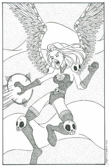
And some naked ladies doing stuff.
I feel the "Dragon Snake" should continue to bob in and out of the water a couple times to make the foreground look more complete but I couldnt agree with myself on how to do it without it looking silly.
Kinda think I should add a Clown hiding behind a Barrel in the background. Not sure if it would be worth the effort at this point though.
Working on some new stuff so hopefully Ill be around again.
Heres a logo I worked on recently. WAY too fucking detailed but I like the idea, now I just want to simplify it.
Heres just an update on some pieces youve already seen.
Catch you on the flip side!
Working on some designs. If you like anyone in particular let me know. Leaning towards 9 I think myself.
Not really sure where this is going but I liked the first panel so I had to ink at least that.
If you can think of anything I should add to this let me know.
Yes I started this like five months ago. But I still think it needs to be finished. Almost there.
One of the many examples of my desire to add detail and crosshatch totally effing me up. Sigh.
Cleaned up a bit. Think Im gonna stipple the background before I lay it away.
And stippled. Cant decide whether to leave the foreground clean or go in and add blacks and details. I think I may end up ruining it.
Doodles reposted from the uh doodle thread.
Kind of drew it and then lost the punch line.
I think originally it was "Urine shock?" or "Urine trouble?"
God I suck at writing crap.
Always thought this was a rather peaceful panel.
And now just some updated stuff. Having to put warning things up in DeviantArt makes me feel like Im doing something bad so I added some decency.
And finished this for no particular reason.