As was foretold, we've added advertisements to the forums! If you have questions, or if you encounter any bugs, please visit this thread: https://forums.penny-arcade.com/discussion/240191/forum-advertisement-faq-and-reports-thread/
Options

Portfolio Day NSFW and Image heav

MuseMuse Registered User regular
edited December 2009 in Artist's Corner
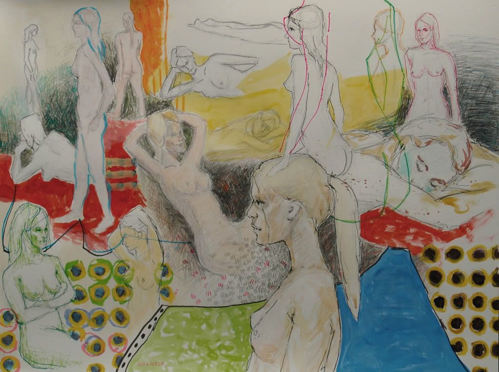
Hello again! For those that don't really remember me (which is probably the case) I'm a long time lurker to this forum and extremely infrequent poster, last year I made a thread here http://forums.penny-arcade.com/showthread.php?t=75609. Currently I'm a senior in high school, and like last year I'm setting up a portfolio to be viewed by colleges at portfolio day at MICA. I would greatly appreciate your thoughts on my portfolio, I'm bringing a binder with copies of my work in addition to the hard copies also, so help with order would be great. Crits are always welcome too:

MixedMediaPiece.jpg

SubwayScene.jpg

Portfolio09099.jpg

Portfolio09108.jpg

livedrawing2.jpg

msw013.jpg

selfportrait.jpg

stwr067.jpg

stilllife.jpg

lifedrawing.jpg

lifedrawing3.jpg

landscape.jpg

IllustrationSubject1.jpg

Flag.jpg


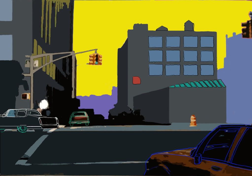
also I've recently bought a tablet and after a few practice sketches am trying to do my first digital piece:

chaseprofile.jpg

Are there any good tutorials for doing finished pieces and any good brushes you would recommend? The brushes I've found have only been stamp brushes, which I don't really like as much

Muse on

Posts

  • Options
    rtsrts Registered User regular
    edited November 2009
    I don't have much to comment on as far as portfolios for colleges are concerned. I don't know what they look for. I will say that I think removing white from your palette for at least a few paintings could go a long ways for you.
    stwr067.jpg

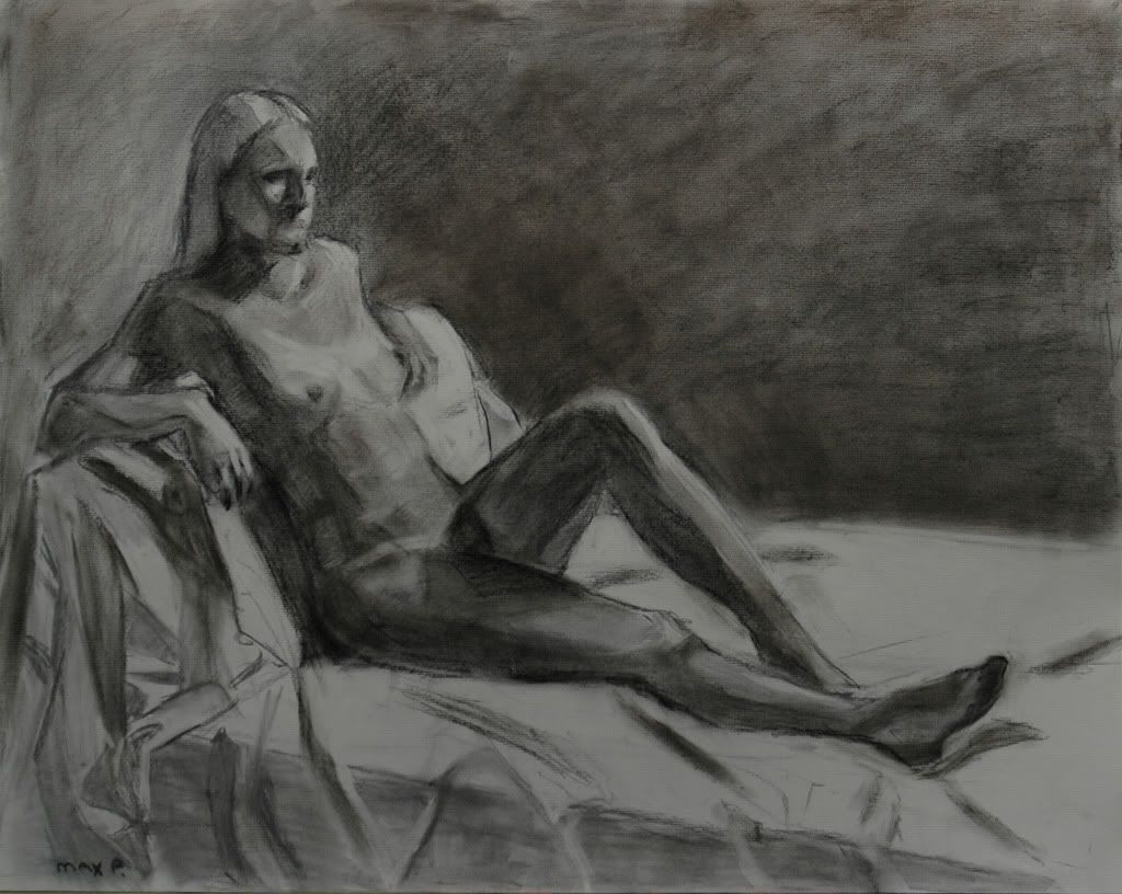
    This is your best piece by far..it should probably be at the front of your portfolio.

    rts on
    skype: rtschutter
  • Options
    CharisCharis Registered User regular
    edited November 2009
    You have some strong work to put a portfolio together with. If it's 'National Portfolio Day' you're talking about, then I will tell you that you've got some strong work going on here, and some things to bulk. A lot of schools at those days like to see some sketch work as well as finished pieces, so make sure to bring some model sketches. When I went to a Portfolio day a few years ago I brought a lot of finished paintings, but one of the pieces that got the most attention was a series of contour drawing I'd done of my dog.

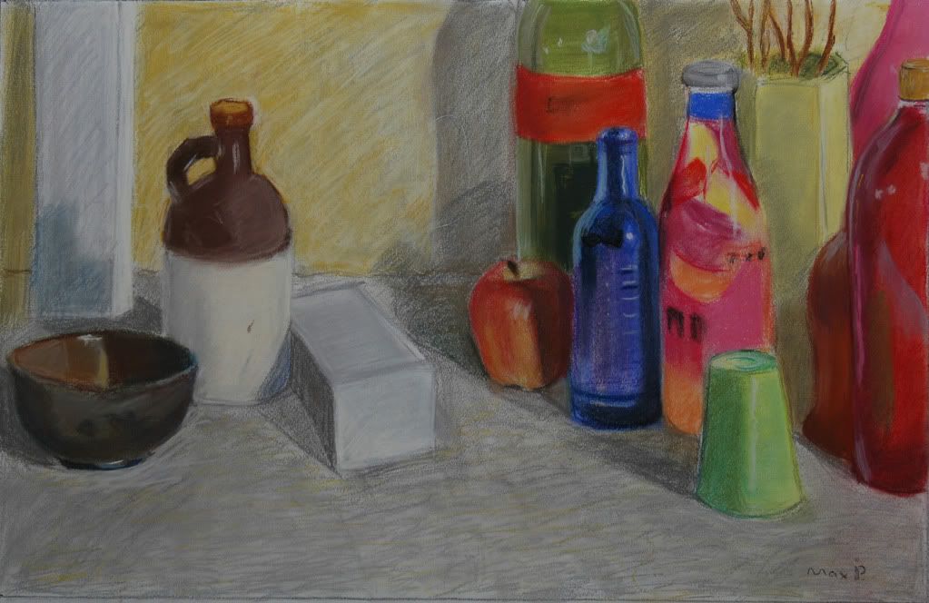
    Other than that, I'm also guessing that these were mostly from photo sources. A lot of schools love to see things they can tell are from direct observation. In fact, a lot of schools will tell you that you need at least 2 still lives or landscapes that are from direct observation. I know it's boring, but bringing those still lives with you will really help. It doesn't have to be fruit, mine was a pencil drawing of my box of paints. Either way, work on that observation stuff.

    As I said, very nice work. Some schools accept you on the spot, so good luck!

    Charis on
  • Options
    beavotronbeavotron Registered User regular
    edited November 2009
    i can't imagine you'll have any trouble getting into schools with this work
    it's very good for a high school student

    charis made some good suggestions about doing some sketchwork for it and i second that motion! all of the reviewers at my school were all up in bones over sketch work
    it shows you really understand the basic, underlying structures of things.

    and that you're well rounded
    well rounded portfolios are great.

    beavotron on
  • Options
    MuseMuse Registered User regular
    edited November 2009
    ha, thanks for replying so fast, I didn't really expect that:
    What would removing white out of my palette do for me? Not to sound rude if that comes off as rude, I'm just curious what would make you say that and how it would help me.
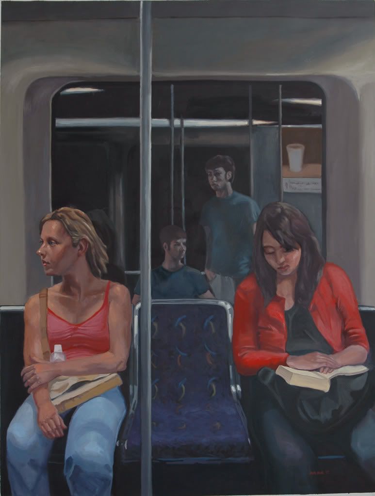
    Also I probably should have explained some of my pieces a bit beforehand, I was going to do that in the OP but I was a little pressed for time, as far as life work goes:
    lifedrawing.jpg

    lifedrawing3.jpg
    were finished sketches from a model drawing thing at the local university and this:
    livedrawing2.jpg
    was quick 15-30 minute poses from the same class that I went back and applied paint and marker to
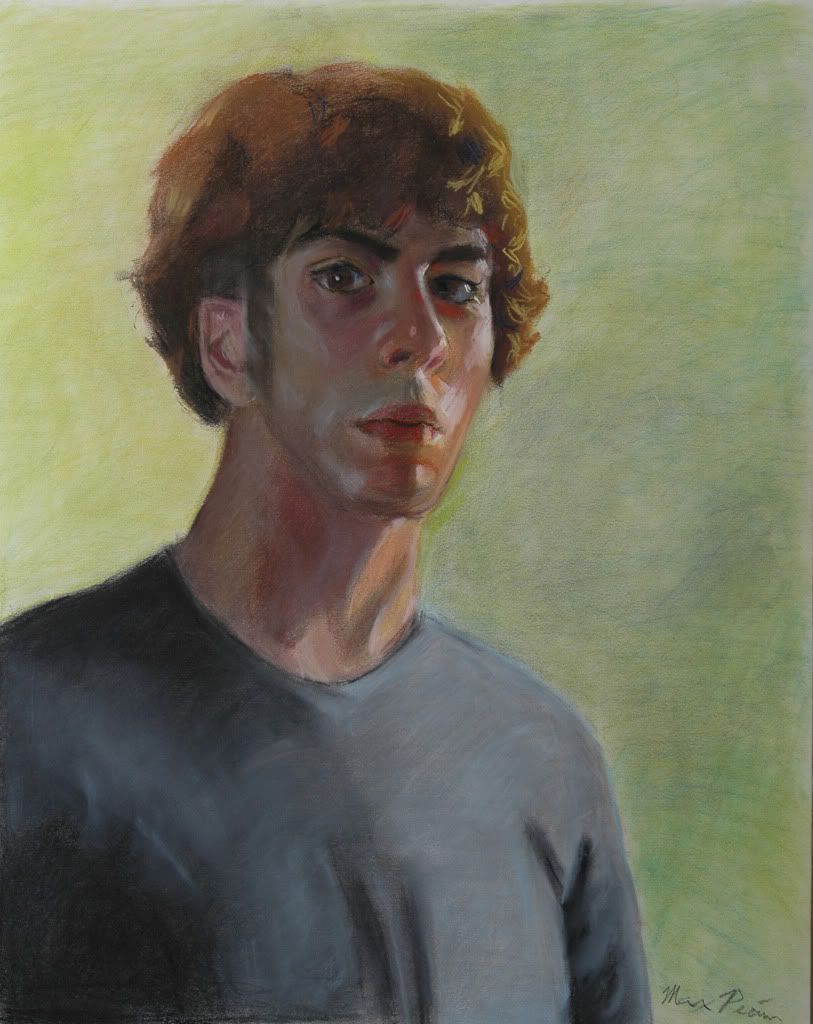
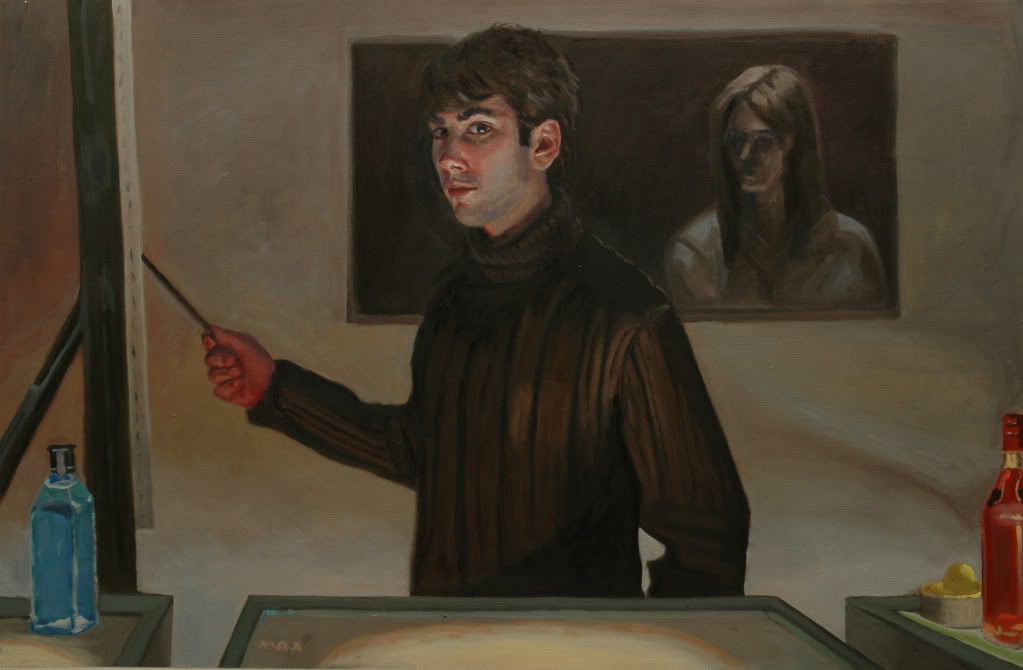
    and these were self portraits that I did in front of a mirror
    selfportrait.jpg
    stwr067.jpg
    and the one still life was also from observation.
    As for sketch work, would a sketchbook I used in ninth and tenth grade work? most of the sketches I've done recently are sheets from large newsprint pads that I've drawn all over front and back that I've ripped out so I wasn't sure if they would want to see that...I've also done some pre-sketches for some of my paintings on my tablet, would those work?
    Also I forgot to add this to OP
    Philosopher.jpg

    Muse on
  • Options
    KendeathwalkerKendeathwalker Registered User regular
    edited November 2009
    removing white from your pallete is a way to force you to use richer color and also learn how your different pigments mix with each other. Your color is pretty chalky and dead because you seem to be raising the value of your colors and mixtures by adding only white to them. Dont think replacing white with naples yellow will solve your problem either as that color has a lot of white in it and has a lot of the same effects when mixing. Really a good exercise to teach you to mix colors better is to do a master copy, particularly some one like sargent who used alot of vibrant color.

    Kendeathwalker on
  • Options
    valerycevaleryce Registered User regular
    edited November 2009
    Are you intending on majoring in illustration, fine art, or something else? Your traditional skills are pretty strong. I doubt you'd have trouble getting into a program with your current portfolio.

    valeryce on
    Art Blog!
    I like drawing, cartoons, cookies, and shiny pointy objects.
  • Options
    rtsrts Registered User regular
    edited November 2009
    removing white from your pallete is a way to force you to use richer color and also learn how your different pigments mix with each other. Your color is pretty chalky and dead because you seem to be raising the value of your colors and mixtures by adding only white to them. Dont think replacing white with naples yellow will solve your problem either as that color has a lot of white in it and has a lot of the same effects when mixing. Really a good exercise to teach you to mix colors better is to do a master copy, particularly some one like sargent who used alot of vibrant color.

    Exactly. People tend to just mix white into their colors when they want to get a lighter value but while there are occassions where this is perfectly acceptable, in most instances you need to think of a better solution to get a good looking color feel to your paintings. White and black destroy color, it's what they do. Removing them from your palette (and having them on your palette is fine once you understand their limitations and uses) helps you to mix better, richer colors.

    Overuse of white is probably the most common problem I see painters making. Instead of using white paint, consider your options. There are a lot of ways to get the color you want. Planning ahead is an important part of painting. You can even use the surface to lighten your colors if you work them transparently.

    rts on
    skype: rtschutter
  • Options
    winter_combat_knightwinter_combat_knight Registered User regular
    edited November 2009
    Damn! Nice work. I reckon something like this order
    ordere.jpg

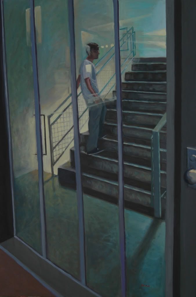
    Your life drawing stuff should act as a was to break up your work a little. Give them something fresh to look at half way through, and then excite them again towards the end. Personally, i think you should drop THIS one. It feels out of place.

    winter_combat_knight on
  • Options
    beavotronbeavotron Registered User regular
    edited November 2009
    i like wck's order, but i'd end it on number 10
    it's like a walking away pose, a nice end to a series.
    and try to fit 12 and 4 together somehow, they look like they should go together
    to show planning in the layout of your portfolio shows a lot of promise
    reviewers love little things like that.

    beavotron on
  • Options
    FlayFlay Registered User regular
    edited November 2009
    I'm also I've also been told that the general rule for any group of images is that the best should be first, and the second best last. Mind you, there are always exceptions to the rules.

    Everything in this thread is great, you have an amazing amount of talent for a high-school student. :)

    Flay on
  • Options
    robotsintheskiesrobotsintheskies Registered User regular
    edited November 2009
    I agree with..um..whoever said it before me, it doesn't look like you're going to have any trouble getting in, your stuff is really excellent!

    I'm not super sure about this piece though...
    IllustrationSubject1.jpg
    It looks a bit conflicting, and it might not supplement your portfolio as a whole.

    Your work just reaffirms my fears that I will not be getting into college. Where do you find the time to paint all this awesome stuff? D:

    robotsintheskies on
  • Options
    MuseMuse Registered User regular
    edited November 2009
    Thanks for the input:
    @Kendeathwalker and Cakemikz- Ah gothcha I'll definitely keep the amount of white I use in mind then...though I'll probably have to buy lighter paint...what colors are good for lighting up tones? Most of the color I have is either mid tone or pretty dark
    @valeryce-um...I was thinking more toward Fine Arts since I've never really done many illustration things, but I've always enjoyed illustration alot so I'm considering majoring in illustration, I probably won't figure out until I absolutely have to declare a major though knowing me
    @WCK- haha thanks for that makes my life a little easier.
    @beavotron- yeah I've heard layout is extremely important, it's just hard for me because I'm a horrible judge of my own work haha
    *ugh how do you quote multiple people?
    as far as this:
    IllustrationSubject1.jpg
    goes I kinda wanted to include a digital piece in my portfolio...maybe this would work better?
    Absence.jpg
    I just finished this mixed media self portrait today, and I was thinking about adding this in as well, thoughts?
    mx039.jpg
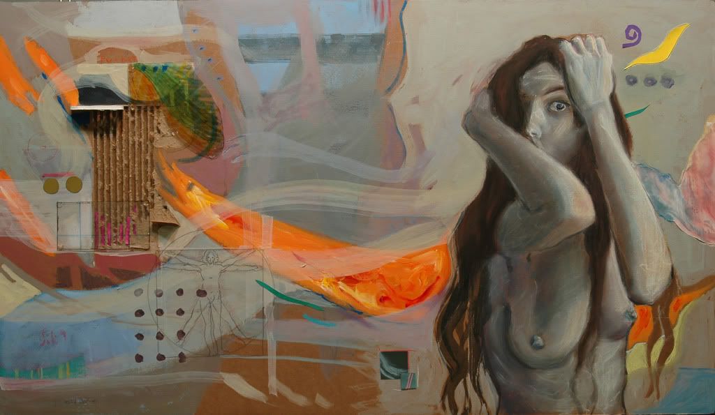
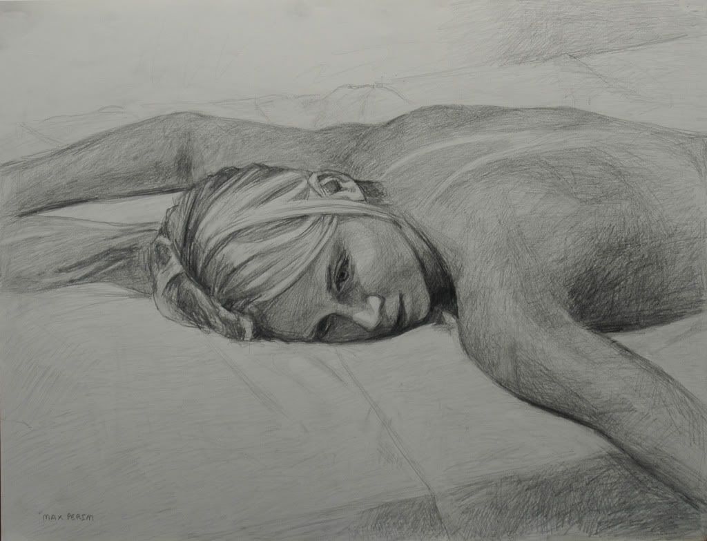
    I was looking at Audrey Kawasaki's work and it really made me want to do something on plywood, plus I needed an anatomy piece so I killed two birds with one stone

    Muse on
  • Options
    beavotronbeavotron Registered User regular
    edited November 2009
    yes add that in too!

    i like the face
    and again, mixed media is something reviewers are really going to like to see

    you have so much potential
    really really great work for someone your age
    i hate saying that "someone your age" it sounds patronizing, but most people of high school age don't seem to have the dedication to make it this far on their own

    you'd better keep posting.

    beavotron on
  • Options
    robotsintheskiesrobotsintheskies Registered User regular
    edited November 2009
    Muse, I don't think it's that necessary to include a digital piece, your paintings speak strongly enough as it is, I think adding a digital piece to your portfolio would just make it seem like 'Hey here's something else I can do, that's a bit pale in comparison to this other awesome shit I did'

    I read that apparently it's better to show your strong skills rather than go for a variety of mediums, but I'm not sure if that's what MICA wants.

    If you really feel strongly about including a digital piece, your original one is probably the better choice IMO. The alternative you just posted seems weaker.

    robotsintheskies on
  • Options
    MuseMuse Registered User regular
    edited November 2009
    beavotron wrote: »
    yes add that in too!

    i like the face
    and again, mixed media is something reviewers are really going to like to see

    you have so much potential
    really really great work for someone your age
    i hate saying that "someone your age" it sounds patronizing, but most people of high school age don't seem to have the dedication to make it this far on their own

    you'd better keep posting.
    ha thanks don't worry, it didn't really sound patronizing... and to be honest I've tried posting like...once or twice here before, like I've been lurking for like maybe four years haha, but then like I post work and don't really get posts or I don't feel knowledgeable enough to offer critiques and then I just kinda fade again into the woodwork, it's intimidating haha but I dunno, I'll try and get over it

    and Robotsintheskies I guess it's not that I feel that I have to include a digital piece, I guess I just feel inclined
    to put in something digital now that I got a tablet and discovered how fun it is trying to figure it out, the last photoshop thing I posted was pretty old though (like before I got my tablet) so I can see how it could be weaker.
    Speaking of which I was just working on this today:
    Chasesdrawing.jpg
    here's what it looked like before, photobucket seemed to have done something to the OP:
    Huuurgh
    chaseprofile-1.jpg
    In the beginning I figured that in order to blend I would have to mess with opacity, so I set up a shitload of layers with different opacities....which was long didn't really work and unnecessarily hard. But then I discovered messing with flow, which is sooooooo much easier to blend haha Critiques are greatly appreciated since I'd like to finish this for my friend who I'm drawing. Is there anything I should know about painting with photoshop since I'm just really starting out?...Oh! and are their any brushes that are good to have on this sort of thing, and where would I find them?

    Muse on
  • Options
    MuseMuse Registered User regular
    edited December 2009
    so.... I've been working on figuring out how to paint digitally
    chaseprofileint.jpg
    opinions?
    I'm trying to figure out brushes and everything but it seems like a lot to take in haha any tips in general?

    Muse on
  • Options
    MustangMustang Arbiter of Unpopular Opinions Registered User regular
    edited December 2009
    Y'know, I usually poo poo the use of soft brushes but I really like the effect you've achieved here by shoring it up with the small hard rounded brush. It's pretty fucking cool actually, especially around the cheek bone.

    Mustang on
  • Options
    MuseMuse Registered User regular
    edited December 2009
    hm... well the smooth brushes were me just using what came with my copy of photoshop, so I guess I must have gotten lucky haha what brushes are good to use without looking like a cheap effect

    Muse on
  • Options
    SublimusSublimus Artist. nowhereRegistered User regular
    edited December 2009
    Most people stick with the standard hard round that comes standard with ps. But the way to make it good instead of total shit is simply to go into the brush setting and under the 'other dynamics' tab, turn on opacity to pen pressure.

    I also work with the flow around %60, I find it feels a little more natural.

    Sublimus on
Sign In or Register to comment.