As was foretold, we've added advertisements to the forums! If you have questions, or if you encounter any bugs, please visit this thread: https://forums.penny-arcade.com/discussion/240191/forum-advertisement-faq-and-reports-thread/
Options

Trying to start a web comic!

m.brooks42m.brooks42 Registered User regular
edited February 2010 in Artist's Corner
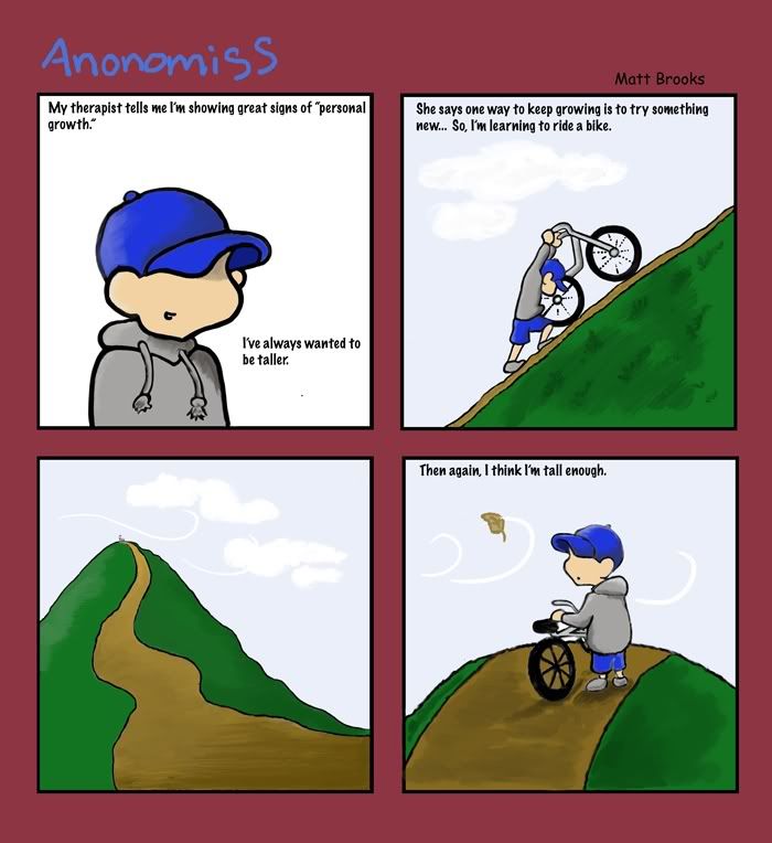
3Hello again! If I took everyone's suggestions into consideration and tried to put it into practice with #4 "Heights"... I'm wondering how i could change the art to make the creating process faster, much faster, but lose as little quality or appeal or whateva as i can... thanks :)
O PS: I also don't know anything about what colors compliment etc.. what color could I use to fill the gutters because i was told the mauve clashes with the title?? O and also I'm having trouble with the line art looking sloppy using photoshop elements (because I smudge tool every paint brushed line to smooth em out)..

Here's what I've made so far, and I'm learning how to use photoshop elements as I go:
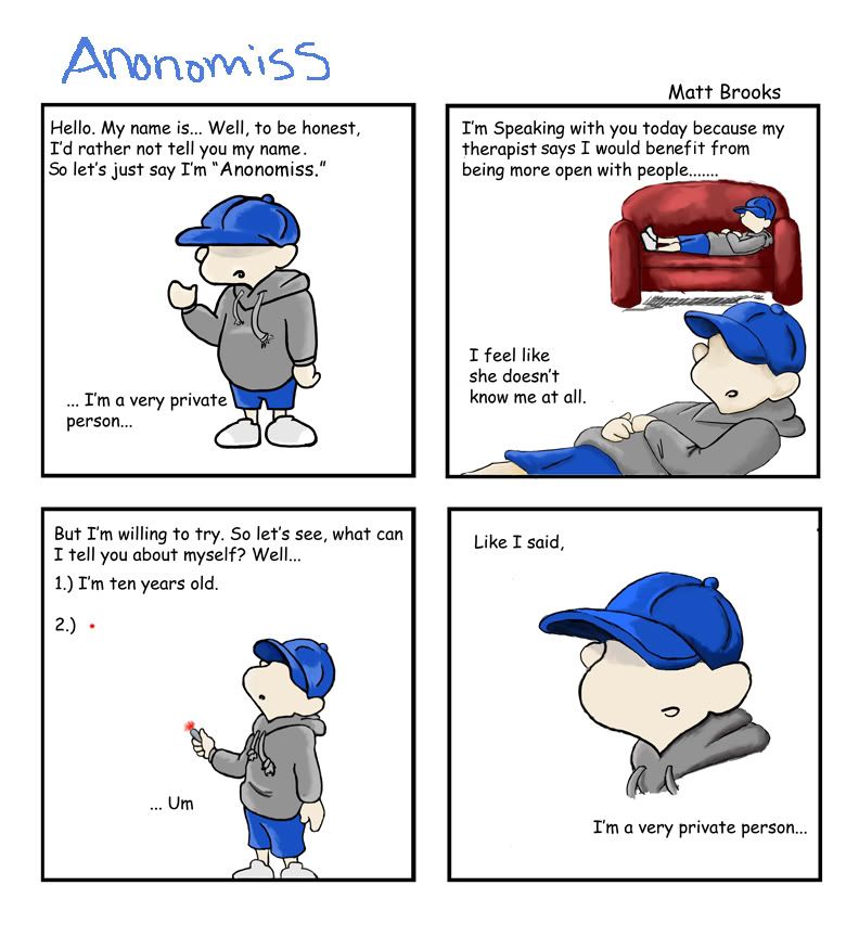
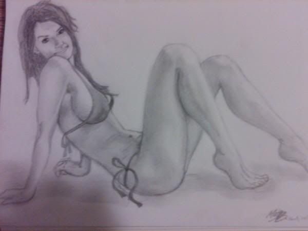
Anonomiss #1 "Private Person"
Anonomissrezised.jpg
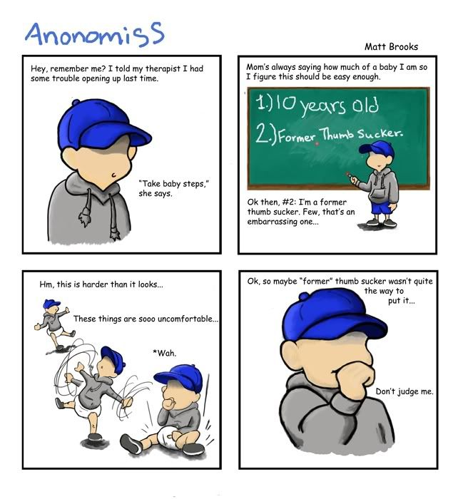
Anonomiss #2 "Baby Steps"
Anonomiss2final.jpg
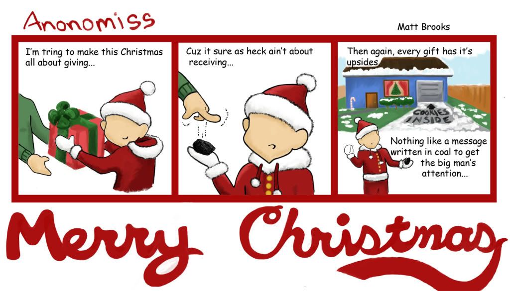
Anonomiss #3 "Christmas"
Anonomiss3_christmas.jpg


NEW ONE USING USING UR SUGGESTIONS:Anonomiss #4 "Heights"


anonomiss4-2.jpg


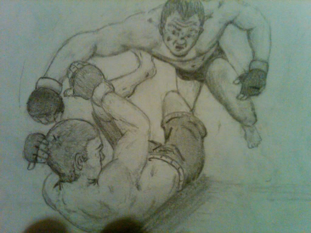
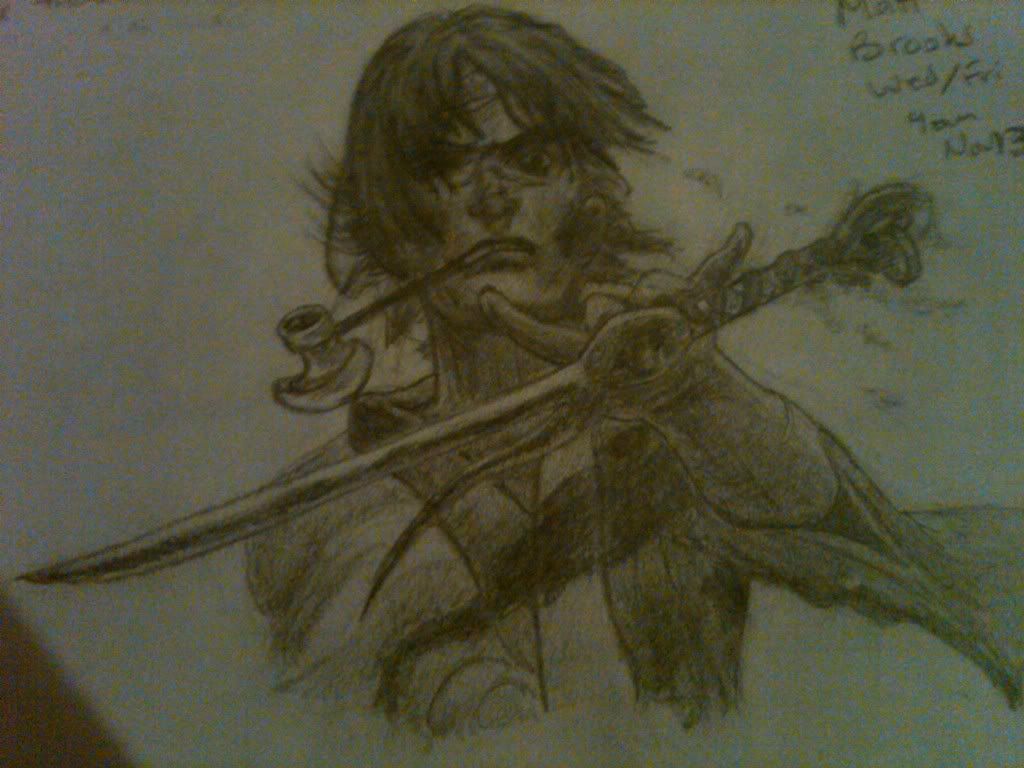
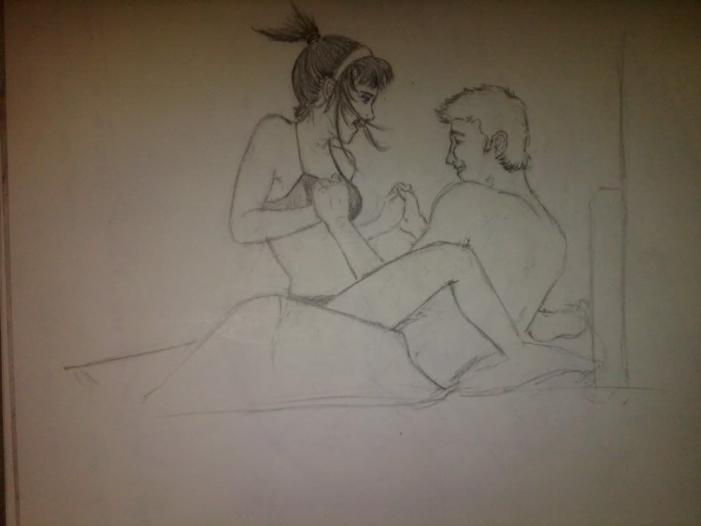
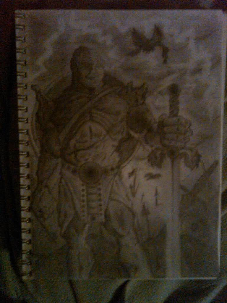
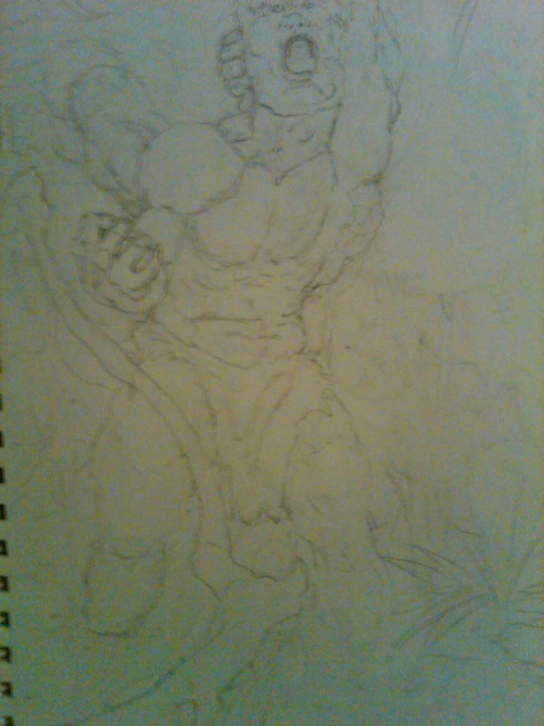
Some random drawings after looking around the whole forum and seeing that you guys critique for real, working artist's I thought I'd get u opinion on a few of my drawings. Please, I am just a college student who learns from Youtube videos like Mark Crilley's and IDrawGirls.com lol... After finishing stupid college i want to try and take art seriously. Please what is something I could work on that would dramatically improve my shiz... maybe a major or more obvious weakness.. encouragement and maybe some of my strengths would be nice too lol :) thanks

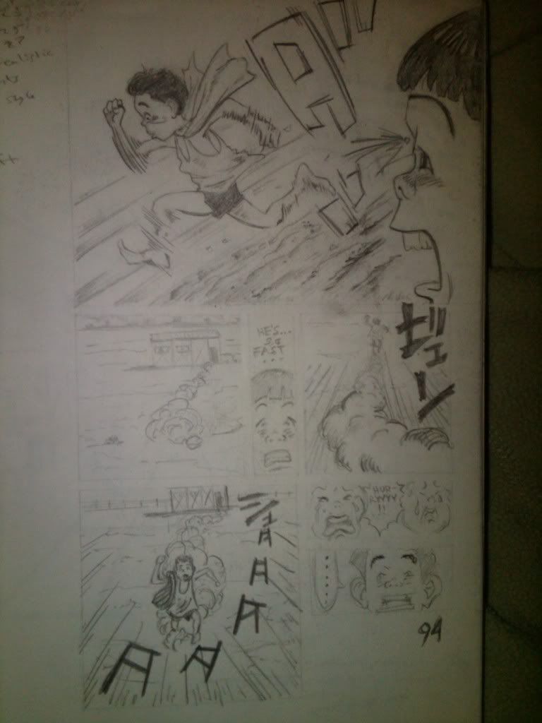
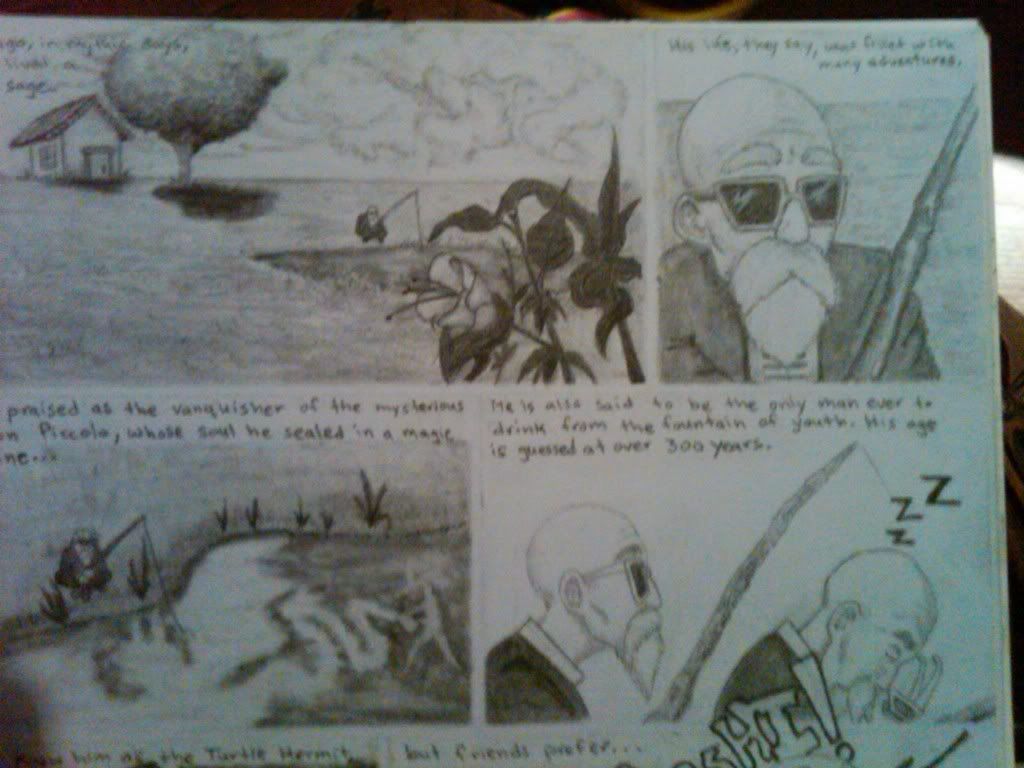
A comic inspired by my old boring job... no, the character is not me

help.jpg

BAOA1st.jpg

BAOA2nd.jpg

akira.jpg

babe.jpg

fedor.jpg

knives.jpg

manga.jpg

play.jpg

rock.jpg

rockguy.jpg

roshi.jpg
roshier.jpg

m.brooks42 on
«1

Posts

  • Options
    FugitiveFugitive Registered User regular
    edited January 2010
    Is Anonomiss actually about you? I have a hard time believing you're 10 years old, considering your grasp of grammar and spelling is more advanced than many people I know aged 25 and up.

    Fugitive on
  • Options
    m.brooks42m.brooks42 Registered User regular
    edited January 2010
    It's me, but a characterized version. Yeah he is a 10 year old, but I wanted him to be "wise beyond his years" but at the same time too naive and inexperienced to fully understand the world.

    So are u saying I should dumb down the spelling to reflect his age?? That is the reason the Anonomiss part is misspelled after all... I just didn't think I needed to do it for the dialogue. And im 20 by the way lol

    m.brooks42 on
  • Options
    MaydayMayday Cutting edge goblin tech Registered User regular
    edited January 2010
    Not much to say about writing, but in terms of art, you show promise. Try variating the hue, not only brightness and saturation, right now the colours look washed out. (read up on colour theory).

    Mayday on
  • Options
    KalTorakKalTorak One way or another, they all end up in the Undercity.Registered User regular
    edited January 2010
    I wouldn't dumb down the writing for his age - it's just that there are a lot of webcomic artists doing autobiographical webcomics that pretty directly reflect their daily life, so that's what I thought this was at first. Dealing with a younger character is an interesting idea, and I don't think the character needs to speak like a child - look at Calvin & Hobbes.

    KalTorak on
  • Options
    NibCromNibCrom Registered User regular
    edited January 2010
    Anonomiss sounds like a woman's name for obvious reasons.

    NibCrom on
  • Options
    melting_dollmelting_doll Registered User regular
    edited January 2010
    You spelled "phew" wrong as "few", hehehe. This is certainly better than some I've seen, but the white backgrounds make all the negative space seem more excessive than it already is..

    melting_doll on
  • Options
    m.brooks42m.brooks42 Registered User regular
    edited January 2010
    Thanks guys these suggestions and comments are great!! Please keep them coming! SO what is the difference between hue and saturation?? I know nothing, I am humble before u... lol

    m.brooks42 on
  • Options
    AldoAldo Hippo Hooray Registered User regular
    edited January 2010
    m.brooks42 wrote: »
    Thanks guys these suggestions and comments are great!! Please keep them coming! SO what is the difference between hue and saturation?? I know nothing, I am humble before u... lol
    Don't.

    Draw an actual background. Instead of a bank in space make it a bank in an actual room. With walls and furniture and a floor and everything.

    Yes that is far more work.

    I like the last one best because you drew a lot more stuff in it and it's the only one that really shows that you can draw.

    Oh and get rid of the comic sans font, it looks incredibly cheap. Doing your own lettering would be awesome, but otherwise there are countless other comicky fonts out there that look better and are not used by everyone's little sister and parents trying to be hip.

    Aldo on
  • Options
    MustangMustang Arbiter of Unpopular Opinions Registered User regular
    edited January 2010
    It reads like a newspaper comic. Is this the kind of target audience you were aiming for?

    Mustang on
  • Options
    m.brooks42m.brooks42 Registered User regular
    edited January 2010
    Umm honestly i don't know... I am new to webcomics period and i've really only read megatokyo... Well I guess an obvious question is what webcomics should i read? Maybe some with a similar style to mine??

    m.brooks42 on
  • Options
    tynictynic PICNIC BADASS Registered User, ClubPA regular
    edited January 2010
    Oy. You do realise there are literally thousands of webcomics, right?

    Maybe you should look at You Damn Kid, because it seems to be similar to what you're trying to do.

    tynic on
  • Options
    m.brooks42m.brooks42 Registered User regular
    edited January 2010
    lol k thanks..

    m.brooks42 on
  • Options
    KalTorakKalTorak One way or another, they all end up in the Undercity.Registered User regular
    edited January 2010
    www.allancomic.com is a good example of an autobiographical comic; he came in here when it was getting started for pointers a couple years or so ago, and I'm still reading it.

    KalTorak on
  • Options
    CuttingRoomCuttingRoom Registered User regular
    edited January 2010
    Here's the little bit of knowledge that I've gleaned from reading webcomics for awhile and starting one a few months ago.
    *There's no ONE right way to do it. Looking at art for example, you've got XKCD that uses stick figures, Dinosaur Comics that uses the same weird panel progression every time, and The Awkward Communicator that uses photographs of those little wooden mannequin things. And they're all brilliant. Subject matter, layout, language, font, etc. There are thousand of webcomics and the best ones in my book are the ones that don't aspire to be like all the others.
    *There are millions of wrong ways to do it. It might seem a contradiction to the last post, but just because there's no one right way doesn't mean that anything goes. Personally, I like the Comic Sans font, but I've learned the hard way that some people respond to it like it's anthrax, so I'd suggest avoiding it.

    I may post more later, but I've got to run.

    CuttingRoom on
    The Cutting Room - A twice a week webcomic about recently released and upcoming movies.
  • Options
    FlayFlay Registered User regular
    edited January 2010
    I can't really say much that hasn't already been said, There also some more good advice in this thread. One thing I'd point out is that you should make sure that every element you include reads clearly - for example I wasn't sure what the red dot was meant to be immediately.

    Best of luck man. :)

    Flay on
  • Options
    m.brooks42m.brooks42 Registered User regular
    edited January 2010
    hold on guys i wanna clear something up... this isn't autobiographical.. the character's appearance and personality are kinda based on me, but i have a face, i don't suck my thumb, i don't see a therapist, im not ten (lol)... I liked charlie brown's eternal bad luck/ lovable loser persona so I thought about how I could give my character a recognizable quality like that. I'm going for an eternal fool who constantly tries to do good in a world that just doesn't make sense to him. And I know this hasn't been shown with the comics ive made so far, but just so u kno

    m.brooks42 on
  • Options
    EshEsh Tending bar. FFXIV. Motorcycles. Portland, ORRegistered User regular
    edited January 2010
    I'm going to say you REALLY need to work on the writing. There's nothing that would make me come back to it. I would rather read something with poor art and good to great writing (early Achewood, early Questionable Content, early Scary Go Round) than great art and poor dialogue. That's what you really need to concentrate on. Badly. Ultimately that is what is going to draw people in, not the art.

    Esh on
  • Options
    DirtyDirtyVagrantDirtyDirtyVagrant Registered User regular
    edited January 2010
    DirtyDirtyVagrant on
  • Options
    m.brooks42m.brooks42 Registered User regular
    edited January 2010
    Hey everybody I checked out Jon's "So You Want to Draw A Web Comic" thread and made me realize how far I have to go... so I'm giving up. Haha jkjk... So I've got to go start my long grueling journey toward being a decent comic creator lol!

    m.brooks42 on
  • Options
    beavotronbeavotron Registered User regular
    edited January 2010
    you definitely have the right attitude
    if you're serious about this, take some time to read through some books, study comics you like etc.
    that's really the best way to improve, to keep at it, practice and work hard.

    beavotron on
  • Options
    Faded_SneakersFaded_Sneakers City of AngelsRegistered User regular
    edited January 2010
    As a good reference I would suggest "How to Make Web Comics."

    Its a thin book, more like the size of a trade paperback comic, written by 4 guys who make their livings by creating web comics. Dave Kellet (Sheldon), Brad Guigar (Evil Inc), Kris Straub (Starslip Crisis), and Scott Kurtz (PvP).

    I dont agree with some of the things in there but they really have put together a fairly thorough look at the necessary steps to being successful. Its far more then just writing and drawing. To be successful you also need to know technology, how to market yourself, what avenues are available to you to make money and how to use all of that to deliver the comics to the public in a manner that is efficient and cost effective.

    The also have done a series of podcasts called Web Comics Weekly that I have found interesting. Sometimes their views are so limited I find myself writting horribly scathing e-mails, then taking a moment to calm down and deleting the e-mail, but regardless it is a pretty good source of information even when it is totally misstaken.

    Good luck.

    Faded_Sneakers on
    Instagram: fadedsneakers
  • Options
    m.brooks42m.brooks42 Registered User regular
    edited January 2010
    Hi again! Ok I took everyone's comments into consideration and made a new one... Is there anyone out there who likes the Muave gutters??lol.. Um but ya please let me know what I'm doing wrong... I'd like to use ur knowledge to sharpen everything up... Is the writing at all better?? thanks

    m.brooks42 on
  • Options
    squidbunnysquidbunny Registered User regular
    edited January 2010
    Thanks for consolidating your threads. I already gave my thoughts on the 4th comic in the other one, but relative to the first three I do think it's a little more organic and less forced-sounding.

    squidbunny on
    header_image_sm.jpg
  • Options
    m.brooks42m.brooks42 Registered User regular
    edited January 2010
    Great thanks!

    m.brooks42 on
  • Options
    kyleorionkyleorion Registered User new member
    edited January 2010
    Dude you misspelled Anonymous wtf is wrong with people.

    kyleorion on
  • Options
    edited January 2010
    I'm pretty sure he did that on purpose.

    Richard M. Nixon on
    chevy.jpgsteve.jpgmartin.jpg
  • Options
    MustangMustang Arbiter of Unpopular Opinions Registered User regular
    edited January 2010
    I'm 100% certain he did that on purpose.

    Mustang on
  • Options
    m.brooks42m.brooks42 Registered User regular
    edited January 2010
    yes i did that on purpose lmfao

    m.brooks42 on
  • Options
    m.brooks42m.brooks42 Registered User regular
    edited February 2010
    yo homies.... you guys don't have any ideas atalll???? please :(

    m.brooks42 on
  • Options
    earthwormadamearthwormadam ancient crust Registered User regular
    edited February 2010
    It's pretty hard to tell you anything cause you've really only posted a few comics. Maybe make a bunch of comics about some different things and post them?

    earthwormadam on
  • Options
    m.brooks42m.brooks42 Registered User regular
    edited February 2010
    Okay thanks for the suggestion!

    m.brooks42 on
  • Options
    The_Glad_HatterThe_Glad_Hatter One Sly Fox Underneath a Groovy HatRegistered User regular
    edited February 2010
    Since you cited Calvin and Hobbes as a bit of an inspiration, i think this comment is suited: it's pretty hard for people to relate something without visible eyes. i know you're going for a non-expressive inconspicuous kid, bit i think i recall watterson putting Calvin's hair up for the exact same reason.

    Not meaning to diss on your character design, but be aware of what this means to the way people percieve your character. Even if you're you don't want his neutral looks to communicate any message, there are tools to help get that message across even better. Instead of omitting eyes, i'd say use them.

    The_Glad_Hatter on
  • Options
    m.brooks42m.brooks42 Registered User regular
    edited February 2010
    ok ill think about it thanks!

    m.brooks42 on
  • Options
    Guy BellGuy Bell Registered User regular
    edited February 2010
    I have to agree with Hatter about the lack of faces. I think it will be very difficult to show emotions without eyes. Also, Bill Watterson of Calvin and Hobbes was a master of brush inking and that's what made his strips so expressive.

    Guy Bell on
  • Options
    m.brooks42m.brooks42 Registered User regular
    edited February 2010
    Man, I have to be honest I really like him without eyes... It's part of his anonymous persona.. I really can't even picture him with eyes or what kind of eyes I would give him... But this is good. I'm going to take your input and now try and make a very expressive comic without eyes and see if there's a way it'll work.. yea ok ill do that and see what u guys think.

    m.brooks42 on
  • Options
    MustangMustang Arbiter of Unpopular Opinions Registered User regular
    edited February 2010
    Just use dots and lines for eyes. I don't think you're gaining all that much persona-wise by not giving him eyes.

    Mustang on
  • Options
    Tubesteak SamuraiTubesteak Samurai Registered User regular
    edited February 2010
    m.brooks42 wrote: »
    Man, I have to be honest I really like him without eyes... It's part of his anonymous persona.. I really can't even picture him with eyes or what kind of eyes I would give him... But this is good. I'm going to take your input and now try and make a very expressive comic without eyes and see if there's a way it'll work.. yea ok ill do that and see what u guys think.

    Are you sure you just don't know how to draw eyes very well?

    They can be hard.

    Do you realize that you're sacrificing a hefty chunk of your character's expressiveness by leaving them out? You've managed to convey a lot without them but I promise you'll hit a wall when it's time for him to... look at something.

    Tubesteak Samurai on
  • Options
    m.brooks42m.brooks42 Registered User regular
    edited February 2010
    ok honestly i take offense to that. I don't mean to be a bitch, but please don't insult me by suggesting i would omit eyes JUST to avoid DRAWING them... I can draw eyes fine enough.. do u see why i would take offense to that compared to other peoples' criticisms that i appreciate? if i didn't know how to draw eyes very well i would say "look guys i get where you're all coming from about the eyes limiting my character's appeal and expressiveness, but I just can't draw them." I wouldn't waste everyone's time giving BS arguments for why I should keep them... damn Tubesteak man u ruined my day! LOL but hey i get where you're coming from I can see why you might think that but I'm just being honest with you that that's how ur comment made me feel.
    Everyone else MERCI
    Ugh tho i wanna prove to u guys i can make the no eyes work..

    m.brooks42 on
  • Options
    ManonvonSuperockManonvonSuperock Registered User regular
    edited February 2010
    then do it. post more comics. actions as opposed to words and all that jazz.

    ManonvonSuperock on
  • Options
    m.brooks42m.brooks42 Registered User regular
    edited February 2010
    YEAH! OK! RAAAAAAAARRR!!

    *clears throat. Just give me a while I have a lot on my plate :/

    m.brooks42 on
Sign In or Register to comment.