As was foretold, we've added advertisements to the forums! If you have questions, or if you encounter any bugs, please visit this thread: https://forums.penny-arcade.com/discussion/240191/forum-advertisement-faq-and-reports-thread/
Options
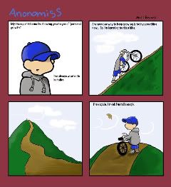
Web Comic advice!! Merci
sccoop Registered User new member
Registered User new member
Yo... opinions, criticisms, comments?? Spanx... Yes I did start a new account thread with devious intentions that I never followed through on lol... here's a link to the original on Penny Arcade: http://forums.penny-arcade.com/showthread.php?t=109192
Check out my comic: myspace.com/mycomics87
sccoop on
0
Posts
I like the last panel, the most dynamic of the 4; 1 and 2 feel really rigid by comparison, 2 in particular because it's just a dead profile of the kid moving up a perfect 45 degree incline.
I think the whimsical feel of this would be better served with lighter, more washed-out colors (the mauve-y gutters aren't working for me) and with better treatment of your lineart. It's really dark and heavy, which can work, but you've muddied it a little where your highlights have been daubed on sort of over the top of it (as in the hat in panel 1).
Also your lettering isn't working for me, either. Hand-lettering would work really nicely with this. Barring that, something a little more readable, yeah.
Show us more!
Why start a new account and a new thread?
To fool the unobservant [me].