As was foretold, we've added advertisements to the forums! If you have questions, or if you encounter any bugs, please visit this thread: https://forums.penny-arcade.com/discussion/240191/forum-advertisement-faq-and-reports-thread/
Critique
WizToast Registered User, ClubPA regular
Registered User, ClubPA regular
Hey guys,
My name's Zach, and I do a comic called SMBC. I used to post here years ago when I was working on my art more. Well, lately I've been feeling a little stagnant, and I thought I'd ask for some expert notes.
Specifically, for this image:
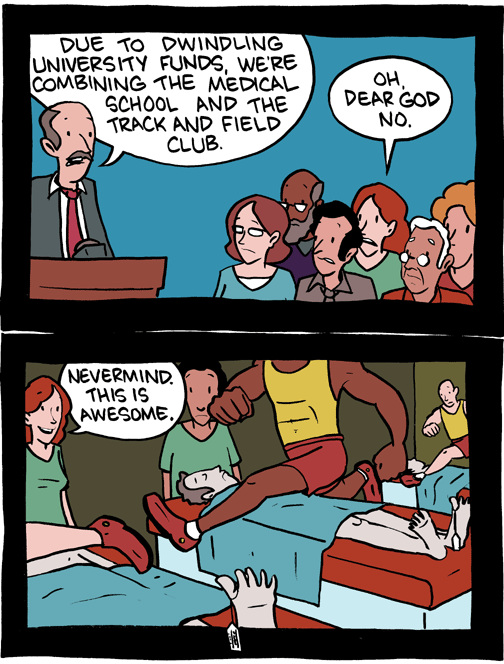
The bottom panel in specific feels really hard on the eyes. The image is supposed to be track and field guys hurdling cadavers. Either because of composition or coloring, I feel like the eye isn't properly lead through the image. So, if you guys could offer some tips, it'd be most welcome.
My name's Zach, and I do a comic called SMBC. I used to post here years ago when I was working on my art more. Well, lately I've been feeling a little stagnant, and I thought I'd ask for some expert notes.
Specifically, for this image:
The bottom panel in specific feels really hard on the eyes. The image is supposed to be track and field guys hurdling cadavers. Either because of composition or coloring, I feel like the eye isn't properly lead through the image. So, if you guys could offer some tips, it'd be most welcome.
WizToast on
0
Posts
i love your comic, I've been a fan for a while now, I think they're all golden
I'm sure someone else will offer up something more useful but to me, it's working just fine
more constructive response to follow later.
Also, I don't know that he could make that jump. It looks to me like his right leg is going to catch the table and trip him.
I really admire your art style, it's very refreshing and clean.
Pretty much what they said. This is what'd I'd do for a quick fix. Lowered the saturation and values of the tables along with changing the hue of the shorts/shoes, and the hue/saturation/value of the two walls. That way each jumper has more contrast against the surroundings, separating the jumpers from the tables and causing them to pop against the walls. I also lowered the saturation of the scrubs so they wouldn't compete with the jumpers.
i don't know the first thing about artistic terms for stuff, but this is how i'd probably frame the scene myself
and bombs, i sort of assumed the guy on the right had just run through a doorway or something :?
Webcomic Twitter Steam Wishlist SATAN
i definitely like the positioning of number 12, the somewhat confused look on his face coupled with the "x"'s on the corpse eyes
also, the deadpan expression of the doctor saying "this is awesome" is pretty awesome
Even though they're athletes, the center guy is herculean in size compared to those immediately surrounding him. His positioning, as well as his relative size, might be what's throwing it off a bit.
Your comic is awesome though, I'm a long-time reader, keep it up!
And yeah, good call on the perspective. I so rarely do wide shots, that I don't quite have the hang of them yet. They usually come out too busy.
If you guys have any general notes on my style (linework, lettering, coloring, etc.) I'd really appreciate it. Thanks!
This is done because with the hero going from left to right, it's more appealing to the eye as it's the same direction that people read. Where as the villain goes the opposite direction, so maybe that's the same problem you're having with this panel, as the actions going right to left.
I hope you don't mind but I flipped the last panel to better illustrate my point.
I just want to say that I think you're comics are great, and probably helped give me the idea to start my own comic.