As was foretold, we've added advertisements to the forums! If you have questions, or if you encounter any bugs, please visit this thread: https://forums.penny-arcade.com/discussion/240191/forum-advertisement-faq-and-reports-thread/

Back to comics on page 3 (daily work log)

edited February 2010 in Artist's Corner
After having posted them in SE a bunch and being told that I needed to get better (which is true), I would like some feedback from you folks on my daily comic. I put one of these up in the doodle thread and the rest are on my site. I actually had somebody order a print which was really, really exciting because this is the first time I have ever had anybody pay me for this kind of creative activity.

For the first little while I was just taking pictures of the completed pages and posting those but they look like crap so I acquired a scanner and have been using it so at least things will be in focus and lit a bit more evenly. I generally draw in pencil first and then do inks with a set of black Pitt artist pens.

My primary goal is to get better at both drawing and writing, but that is kind of ill-defined and hard to measure which, by definition, is not a very good goal. A secondary goal is coming up with a better name for this thing. Right now it's "Bad Comics" but I'd like something a bit less self-deprecating (though I think it is pretty accurate).

Your thoughts, please?

There are three strips per spoiler.
2010-01-12-qualification-inflation.jpg
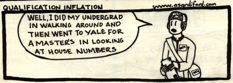
and i minored in losing stuff

2010-01-11-anthropogenic.jpg
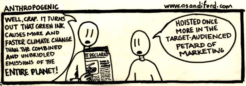
i got a green sharpie for christmas so i am also a contributor. when you point one finger, three more are pointing back and your thumb is blaming the sky

2010-01-08-revisionism.jpg
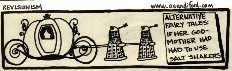
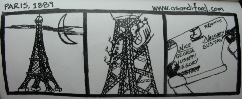
and at the stroke of midnight, EXTERMINATE EXTERMINATE EXTERMINATE
2010-01-07-unveiling.jpg
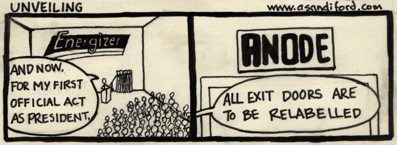
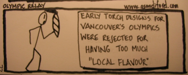
i once again have my wife's science classes to blame/thank for this one.

2010-01-05-waste.jpg
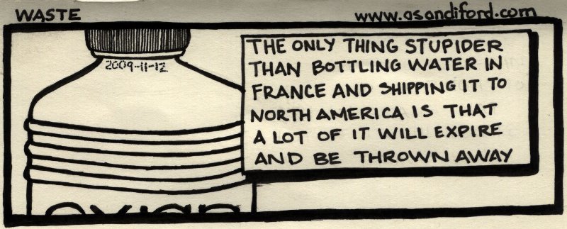
take that, corporate water sellers. seriously you guys, canada has like 70% of the freshwater in the world and this stuff costs like 5x what gas does

2009-12-21-slowdowns.jpg
i draw giant robots almost as well as michael bay directs them which is in turn almost as well as optimus can run
2009-12-18-paris-1889.jpg
people give you such dirty looks when you are sitting in the foodcourt not eating food but taking up space in the mall the week before christmas

2009-12-16-olympic-relay.jpg
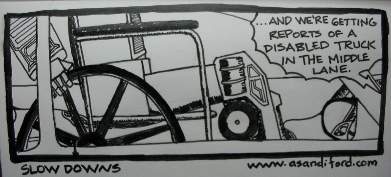
don't screw up the olympian rotation, man

2009-12-11-the-diamond-age.jpg
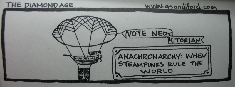
i, for one, welcome our foppish, waistcoat wearing overlords

The text in italics underneath is the alt-text to the picture.

chevy.jpgsteve.jpgmartin.jpg
Richard M. Nixon on
«13

Posts

  • mullymully Registered User regular
    edited January 2010
    i really like the postman one
    the shadows near the edge of your scans bother me
    i think you'd really REALLY have something if you could start inking these digitally
    or at the least
    adding the text/borders in digitally and cleaning up your scans

    mully on
  • KendeathwalkerKendeathwalker Registered User regular
    edited January 2010
    I don't see how him inking digitally is an improvement. His drawings are naive and putting some digital polish will just highlight that in a bad way. I do agree with the clean borders.. might wanna use a ruler.


    I would at least start using facial feature symbols that can express an emotion. Just to give you an extra element to help pull off a joke if you need it.

    Kendeathwalker on
  • GrennGrenn Registered User regular
    edited January 2010
    I actually find the scanning and drawing imperfections quite endearing -- but I am a sucker for things that look hand made and contain natural flaws (most of my own work involves adding imperfections to otherwise quite slick work).

    If the comics were terribad, then the art might be a real issue, but I actually think these are quite good. They're not laugh-out-loud hilarious but they're thoughtful and whimsical enough for me to enjoy them. If you continue to have interesting ideas, I don't think you'll go far wrong. If the direction of the art starts to change/improve then that's a bonus.

    Is the imperfect nature of the strips intentional?

    Also, I really think you should do a strip about 2 gamer guys and their commentary on gaming industry and lifestyle.
    Please don't ever actually do this.

    Grenn on
  • edited January 2010
    Mully: thank you! I am trying (as I mentioned yesterday) to get some fundamentals in regular media before going into digital (though watching you work in oC yesterday gave me some neat ideas to try out digitally). Doing the borders digitally or at least with a ruler would probably be wise.

    ken: How do you mean naive, exactly? I am understanding it to mean 'painfully oversimplified' but I would appreciate further elucidation. Your point about facial features is well taken.

    Grenn: The imperfect nature is due to having only started drawing even slightly seriously within the last several months. I suspect part of my problem to be working on too small of a canvas (I'm doing these in a 4"x5.75" bound notebook) and also lack of confidence in my linework (thus shaky lines). A lot of these look better in pencils than they do once ink is applied which is why digital inking might be a good idea. I'm glad you find my ideas interesting/whimsical.

    Richard M. Nixon on
    chevy.jpgsteve.jpgmartin.jpg
  • beavotronbeavotron Registered User regular
    edited January 2010
    i find them pretty endearing as well, i agree with grenn
    i love that "homemade look" some webcomics have

    but time and time again i have said it's the writing that makes a webcomic... not the art
    the art is secondary
    and sometimes bad art just helps it that much more

    but this is me here... my opinions and they may not coincide with the general public's opinions...

    as a mod of the ac, i feel like i shouldn't say this shit and should be pushing you to become some sort of webcomic darwyn cooke... but naw...

    beavotron on
  • edited January 2010
    Here is what I drew today. I rather liked the idea of a more consistent border because it'll let me use more space on the actual page for actual drawings.
    2010-01-13-the-shambler.jpg
    you gotta know when to walk away and when to RUN SCREAMING FROM THE MONSTER

    I did this one primarily with my brush pen and very consciously worked at having smooth lines (which worked better in some places than in others).

    Thank you, beavo. I felt like it made more sense to put this in here than in WB but I would like opinions on the writing, too. I don't want to get stuck in "Well, I think it's funny"

    Richard M. Nixon on
    chevy.jpgsteve.jpgmartin.jpg
  • edited January 2010
    I took a while this morning and did some wire outline stuff with the 30 second posemaniacs speed sketching thing.

    2010-01-14-gestural-drawing.jpg
    don't count on it, little guy

    Richard M. Nixon on
    chevy.jpgsteve.jpgmartin.jpg
  • beavotronbeavotron Registered User regular
    edited January 2010
    hahhaha nice

    beavotron on
  • edited January 2010
    I decided that, much as with music, I need to learn the rules of actual drawing before I can break them vis a vis cartooning.

    Richard M. Nixon on
    chevy.jpgsteve.jpgmartin.jpg
  • edited January 2010
    I drew yesterday some and today, on the same page. My computer was chewing on something last night so I couldn't bring it down to the scanner.

    2010-01-16-more-gestures.jpg

    Richard M. Nixon on
    chevy.jpgsteve.jpgmartin.jpg
  • bombardierbombardier Moderator mod
    edited January 2010
    I decided that, much as with music, I need to learn the rules of actual drawing before I can break them vis a vis cartooning.

    If you want my copy of Betty Edwards' Drawing on the Right Side of the Brain, you are welcome to it! I'd have to devise some way of getting it to you though as it's on my bookshelf in St. Catharines.

    bombardier on
  • NicNic Registered User regular
    edited January 2010
    I was working without the fundamentals as well. It's a real help learning the basics, so keep it up, Nix!
    bombardier wrote: »
    ...it's on my bookshelf in St. Catharines.

    I'm... from St. Catharines.

    Nic on
  • bombardierbombardier Moderator mod
    edited January 2010
    Ok, just take Nic's copy then.

    bombardier on
  • RubberACRubberAC Sidney BC!Registered User regular
    edited January 2010
    woooo sleeper is posting in the AC
    you have an awesome wit and sense of humour mate
    if you actually really want to improve your art, keep up the studies and listen to the advice you'll get here

    RubberAC on
  • edited January 2010
    thanks, dukes. i actually have a copy of Right Side. I got about 1/3 of the way into it when I had it from the library and then went and bought a newer edition in which things are quite a bit different. I really ought to go back and start from the beginning again on it (make the frame thing out of cardboard as she suggests, that kind of thing).

    t nic: want to have lunch sometime?

    Richard M. Nixon on
    chevy.jpgsteve.jpgmartin.jpg
  • NicNic Registered User regular
    edited January 2010
    I'm in Kitchener right now, at school for Broadcast Radio, but in April/May I'll be back for the summer (I live in NotL, really). I do go home for reading week in February though. We could work something out.

    And before I get ahead of myself, we're talking St. Catharines, Ontario, right?

    Nic on
  • edited January 2010
    The very same. I work on St. Paul Street. My folks live in Waterloo so I'm up there about once a month. How's Conestoga treating you?

    Richard M. Nixon on
    chevy.jpgsteve.jpgmartin.jpg
  • NicNic Registered User regular
    edited January 2010
    Hah, small world.
    It's treating me quite well, actually. Gotta start looking for an internship at a station soon, so I'll probably knock on DAVE fm's door, or 570 news; I have some contacts there.

    You going to Brock?

    Nic on
  • edited January 2010
    Nope, I went to Conestoga 5 years ago for Architectural Tech. and I work for an architect.

    Also, I drew this thing:

    2010-01-17-czarios.jpg
    only 1 gram of horrible genocidal slaughter per bowl!

    Richard M. Nixon on
    chevy.jpgsteve.jpgmartin.jpg
  • Jake!Jake! Registered User regular
    edited January 2010
    I love this, the peter the great bit feels a little forced though.

    Jake! on
  • NicNic Registered User regular
    edited January 2010
    Maybe a little forced, but it's clever still.
    May be draw the back as well, so we can see what kind of puzzles and activities they'd put on the back!

    Nic on
  • edited January 2010
    today is a day for writing a comic that i have no means of drawing or even really writing it particularly well and then making fart jokes instead.
    2010-01-18-communication-breakdown.jpg
    certain personal details have been altered to protect the innocent. and the guilty.

    Richard M. Nixon on
    chevy.jpgsteve.jpgmartin.jpg
  • BroloBrolo Broseidon Lord of the BroceanRegistered User regular
    edited January 2010
    looks like she has a beard in panel 2

    Brolo on
  • edited January 2010
    She does, rather. I think I would have been better served to show a sort of 3/4 view of her looking to our left.

    I am trying to pick up where I left off in Right Side. Whitespace drawing of a chair in my office as well as some stuff that happened to be on my desk. I don't care for curvilinear seating, no sir.

    2010-01-19-white-space.jpg

    Richard M. Nixon on
    chevy.jpgsteve.jpgmartin.jpg
  • edited January 2010
    Going through Right Side some more.
    2010-01-20-sighting.jpg

    Richard M. Nixon on
    chevy.jpgsteve.jpgmartin.jpg
  • edited January 2010
    and some more gestures. i'm off tomorrow so i might actually produce more than a single page worth. also I am going to stop inking altogether for a while and just work with pencils OR just work with a pen/marker rather than going back over things with the art pen after i've pencilled.

    2010-01-21-gestures-2.jpg

    Richard M. Nixon on
    chevy.jpgsteve.jpgmartin.jpg
  • worstcaseworstcase Registered User regular
    edited January 2010
    Its great that you are doing gestures and right side, but it might help if you loosened up your gestures a bit. Only spend about 5 sec on each one, as one of my art teacher's said, "you are trying to capture the essence, or the feeling." Basically you are trying to capture movement. Right now they look more like stiff stick figures. Even if the gesture just looks like an aimless scribble, i think it would help you out some. Something like this:
    gesture_drawing_1.jpg

    worstcase on
  • brokecrackerbrokecracker Registered User regular
    edited January 2010
    I got to agree with worstcase, gestures should look less like stick figures and more like a series of swoops that look roughly like a person.

    Stick figures can start bad habits, because you get used to working with straight lines. Most people don't stand so rigidly, and straight lines rarely happen in nature.

    Your heading in the right direction! Keep it up!

    brokecracker on
  • edited January 2010
    Thanks to you both. I think the mistake I was making was using the posemaniacs stuff to work on proportions rather than actions or forms which is really the point of it. I didn't get back to gestures today and instead played with two point perspective which I haven't really done at all since college (and at that point it was architectural perspectives where I was actually measuring stuff). The shadows are a total afterthought and show it terribly.

    2010-01-22-two-point.jpg

    and then also some sketchier, faster gestures from posemaniacs again. I think these are still kind of rigid.
    2010-01-22-gestures1.jpg
    2010-01-22-gestures2.jpg

    Richard M. Nixon on
    chevy.jpgsteve.jpgmartin.jpg
  • edited January 2010
    Fiddling about with shading whilst watching stand-up comedians.

    2010-01-23-gimme-the-mic.jpg

    Richard M. Nixon on
    chevy.jpgsteve.jpgmartin.jpg
  • worstcaseworstcase Registered User regular
    edited January 2010
    Its good that you are still practicing! Poses look less stiff, but keep practicing those. I know this is a weird tip, but i used to get coffee at like books a million or barnes and nobles and do quick 5 sec gestures of the people wandering about the store. I think it helps when you can see live people out and about.
    Another excercise which may or may not be helpful is duplications. Its where you draw a squiggle and then try to copy it exactly. You use plum lines to help and it really helps you to "see" the object.

    worstcase on
  • edited January 2010
    That's a good idea. I was thinking about doing it whilst watching stand-up but the camera cuts are too fast so I couldn't get a sense of the massing of the people (which is why I ended up doing just that little detail thing since most comics hold the mic in a way similar to that). That duplications thing is a good idea, too. I think one of the early drawspace exercises is similar to that but you draw it mirrored.

    Here's stuff that I'm doing for a graphic for a sermon series at church. They're in the next two weeks so I need to get a move on.

    2010-01-24-refresh-&-vision.jpg

    I fear the tree looks a little too much like a mushroom cloud at this point but that's why I'm working it out on paper prior to working with it in GIMP.

    Richard M. Nixon on
    chevy.jpgsteve.jpgmartin.jpg
  • MustangMustang Arbiter of Unpopular Opinions Registered User regular
    edited January 2010
    Yep, mushroom cloud....some peoples vision may include mass murder with a nuclear weapon.
    Not me though, I'm more of an incurable and rapidly spread super virus kind of guy.

    Mustang on
  • edited January 2010
    That is encouraging :V

    I think I must hate myself. Instead of just doing this in word art or something I did this on my drafting table (expanding on yesterday's ideas). I'm going to do the colours and the rest of whatever I'm doing to it digitally.

    2010-01-25-refresh.jpg

    Actually I'm probably just going to redo it with real fonts and write this off as a misspent evening.

    Richard M. Nixon on
    chevy.jpgsteve.jpgmartin.jpg
  • BroloBrolo Broseidon Lord of the BroceanRegistered User regular
    edited January 2010
    That is encouraging :V

    I think I must hate myself. Instead of just doing this in word art or something I did this on my drafting table (expanding on yesterday's ideas). I'm going to do the colours and the rest of whatever I'm doing to it digitally.

    2010-01-25-refresh.jpg

    Actually I'm probably just going to redo it with real fonts and write this off as a misspent evening.

    That's actually looking pretty good! You're really pushing some new things here, man.

    Brolo on
  • edited January 2010
    Thanks, Rolo. I was getting really frustrated with it. The plan is for it to look like there is water crashing through and around the letters. I'm trying to find a picture of water crashing through the top of a seawall or breakwater to use as a reference (I made a thread in H/A to get some help finding it). I've seen it in movies but I can't think which movie or where it is.

    Richard M. Nixon on
    chevy.jpgsteve.jpgmartin.jpg
  • edited January 2010
    Work in progress for upcoming Sunday service. There is going to be a tree analogy of some kind, thus, a tree.
    2010-01-26-vision.png

    edit: here's today's because I'm frustrated and angry and don't care to bump this thread ever again because hrrrrrrrrrrrrrrrrk

    2010-01-27-my-finest-work.jpg

    Richard M. Nixon on
    chevy.jpgsteve.jpgmartin.jpg
  • edited January 2010
    Hey, it's pierre berton, kind of. Apologies for the low-grade picture. I am reduced to webcam only as I'm at work.

    2010-01-28-pierre-berton.jpg

    I did it partly from a reference picture yesterday and then finished it whilst sitting and waiting for my rental car for two hours this evening.

    Richard M. Nixon on
    chevy.jpgsteve.jpgmartin.jpg
  • edited January 2010
    a little more in the gestural way, though not drawn from any actual source

    2010-01-29-various-doodles.jpg

    Richard M. Nixon on
    chevy.jpgsteve.jpgmartin.jpg
  • GodfatherGodfather Registered User regular
    edited January 2010
    Brother, you need to pick up this book:

    th_176215.jpg

    Right now what you're doing isn't remotely close to a gesture. Read this book and it will help your understanding of it.


    This isn't just a book for animators; it's very sturdy for general life-drawing skills.

    Godfather on
Sign In or Register to comment.