As was foretold, we've added advertisements to the forums! If you have questions, or if you encounter any bugs, please visit this thread: https://forums.penny-arcade.com/discussion/240191/forum-advertisement-faq-and-reports-thread/
Options
[NSFW] Art and comics what I done. - I'm not dead.
Boston House Party Registered User regular
Hey guys, this forum seems full of awesome artists, so I thought I'd share my stuff and maybe get some feedback and cc, I do a lot of comic stuff (and am planning on launching a comic site soon) and I love playing with different styles and materials.
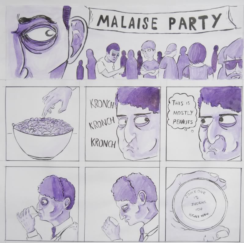
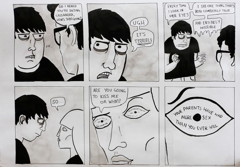
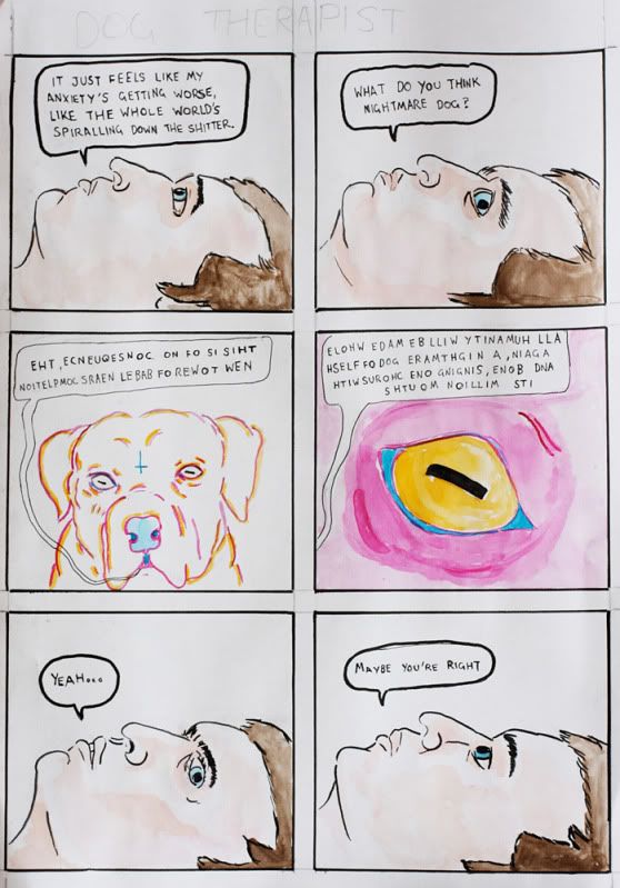
Here's a few comics:
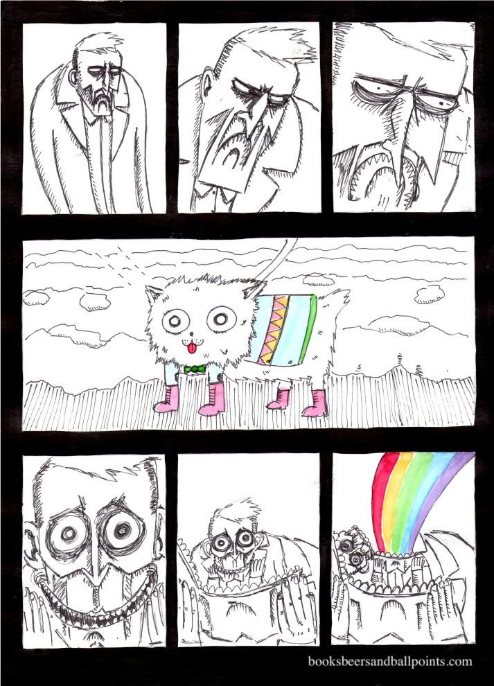
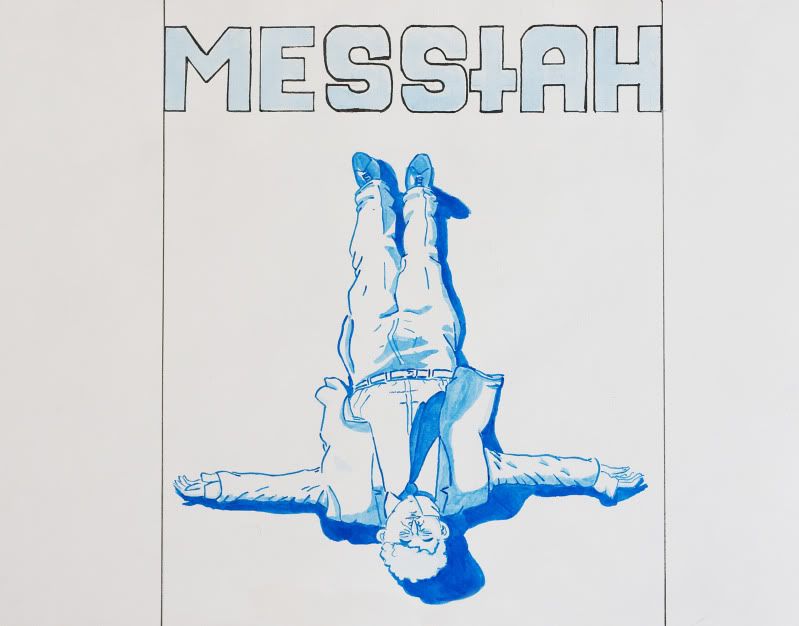
And some illustrations, this one's a cover design for a graphic novel I'm working on:
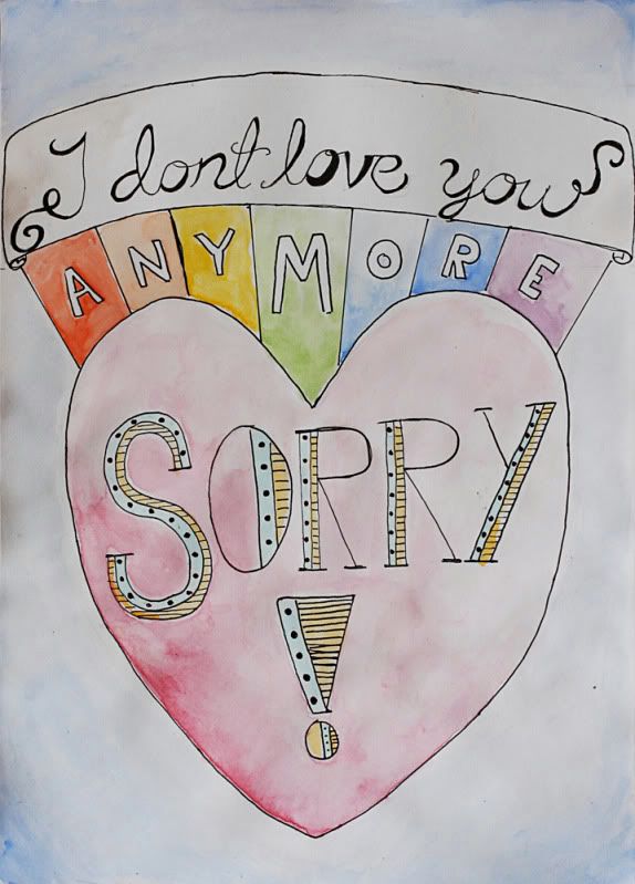
an anti valentines card:
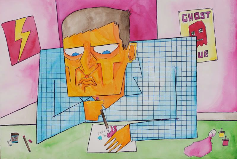
and a self portrait because I love myself so much:
Here's a few comics:
And some illustrations, this one's a cover design for a graphic novel I'm working on:
an anti valentines card:
and a self portrait because I love myself so much:
Boston House Party on
0
Posts
Your work has a melancholy tone and a sense of irony that looks to be a solid foundation for a unique comic. I enjoy the watercolor feel. In general the only piece in here I don't like is the last one (self-portrait). I think organic lines fit better with your tone and style than rigid straights and graphs.
Our first game is now available for free on Google Play: Frontier: Isle of the Seven Gods
However I do notice that the forth comic (the one with felines and rainbows) seems to be of better scan/picture quality than the first two.
Like, you see what I mean? White in the first comic is more of a very light gray-blue?
Other than that, you should be doing a webcomic, you'd probably do quite well.
AMK: The first few I did on much larger paper, slightly bigger than a3 size, then I realised that was way too big to scan so I had to get my friend to lay them flat and photograph them with his SLR, the Bad Day Dog comic is on a4 so I could just scan it straight in, which is why it doesn't have the grey tone of the first two.
Fantastic to see hand-done work as well, it often has so much more personality than digital.
Keep up the good work.
Your comics are wonderful.
Please persist with them. I lol'd immediately. This is a very good sign.
Oh man you're awesome.
Hooray!
Malaise party?
Genius.
not a huuuge fan of the extra-lines-everywhere style in the cute dog strip
but i LOVE the clean lines + wash style of malaise party/terrordog etc.
also it is always nice to meet a fellow doodler of farting butts
Webcomic Twitter Steam Wishlist SATAN
*runs away*
I like these. Do you watch Todd Solondz movies? I get that vibe from this.
For some reason the second comic reminds me of Eugene Mirman. The guys appearance, not comedy. You also pull off that adult swim look well.
Overall, I like the style, shading and color. I'm not interested in most web comics (for instance the Straub comics posted on the main site a few days back) a lot lack depth that I look for and just gun for that third (or last panel joke) I didn't get that vibe from yours.
That's not to say they're all winners, the valentine missed for me, and the Messiah cover looks unfinished (is it?)
I'm more of a writer than an artist and I can see some good plotting in this work. Good stuff.
buy warhams
|look at my bird | listen to these | wishlist | my etsy favourites
Would write more but alas PS3 post...
INSTAGRAM
Thanks everyone else for the awesomely nice feedback, I've got good news too, I'm getting my friend to set me up a website, and hopefully next monday will see the first comic being posted on www.booksbeersandballpoints.com, I'm going to be updating twice a week (mondays and thursdays) with comics about whatever I feel like. My goal is to be constantly experimenting, playing with new and different concepts, mediums, layouts, ideas and styles, if you like my stuff posted here I hope you'll follow along and tell all your friends.
And so this post isn't just shilling myself, here's a little concept piece I did up for a short story idea I had:
"Its million mouths and bone, singing one chorus with again, a nightmare god of flesh all humanity will be made whole”
It all makes so much sense now.
the malaise party and the nightmare dog one had me laughing out loud.
How did you capture that image? Was it with a fixed camera and a swivel light? Did you glue down the elements, or are they just sitting on the page?
It's got a great Little Big Planet feel to it.
In the version I posted here? It's because it's two separate pictures, the version on the website only has it once.
That's really weird, it's working fine on both the computers here.
INSTAGRAM
Also my site now has a facebook page you can follow
INSTAGRAM
INSTAGRAM
Our first game is now available for free on Google Play: Frontier: Isle of the Seven Gods
Noodlesalad: Yeah I wasn't too sure about that last line, I forget why I put it in now, maybe I can photoshop it out or something.