As was foretold, we've added advertisements to the forums! If you have questions, or if you encounter any bugs, please visit this thread: https://forums.penny-arcade.com/discussion/240191/forum-advertisement-faq-and-reports-thread/
Options
Gamer Girl and other odditites
Red Hot Writer Registered User regular
Registered User regular
Hi, I'm Michelle...as my screen handle attests, I am a writer, but I do also have artistic ability to some degree. A friend actually pointed me in this direction some time ago and I finally worked up the nerve to post something.
I've been working on a few projects now for the past couple of months and it looks like they're really starting to take shape. The only real problem is there are so many good ideas I don't want to just cast aside, so I'm working on each a little at a time. One of these is a webcomic I'm calling Gamer Girl and the Dice of Fate. This would be the first page.
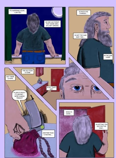
Please let me know what you think....thanks!
I've been working on a few projects now for the past couple of months and it looks like they're really starting to take shape. The only real problem is there are so many good ideas I don't want to just cast aside, so I'm working on each a little at a time. One of these is a webcomic I'm calling Gamer Girl and the Dice of Fate. This would be the first page.
Please let me know what you think....thanks!
my webcomic Spellbound and Senseless
Red Hot Writer on
0
Posts
edit: and just to be a cptn. Obvious for once, draw from life, anatomy, perspective and depth problems blarghblarghblargh. Finding a place to draw naked people is the best advice I can give you.
Naked people don't just teach you how to draw naked people, they teach you proportions, light and shadow, depth and a whole lot more. Naked people is the path every artist has gone, or at least just people.
I really spent a lot of time with those hands too, seeing that everyone says that hands are the hardest part to work on. And they were too...
I'm just glad I was able to do that digitally...the original drawing that came from was utter crap...
also, work on your coloring technique, it's all a bit too splotchy and obviously the airbrush tool right now, work on blending colors.
as for its success as a comic page, I feel that the colors don't work well together at a glance, I'm not really liking that lavender gutter-fill/page background color, and your text blocks feel unnatural on the page. Also, the layout of the panels is a bit erratic, my eye wasn't sure which panels to move to in that middle bit.
From what Belruel said, you need to check some reference material regarding paneling and storytelling. When someone looks at your comic page, youwant them to follow the action from both speech and art, you need to find a suitable structure to a certain page depending on the action taking place.
I'd reccommend looking at some manga pages from several different artists and also some american publishers to see both similarities and approach each person takes to each action and dialogue.
Another tip a friend once gave me is that you musn't clutter the center of the page with too much detail, keep it simple.
Hope I was of any help and looking forward to seeing your progress.
I don't think fixing the word balloons/speech bubbles would be a tremendous problem, so I'll work on that when I get the time. It might just help to make the text a bit bigger and increasing the size of the balloons...maybe a bit of overlap in the second panel? I'm trying to achieve a sort of reflective/meditative opening for this character, establish that he's tired of the thing he's been doing.
The only reason I went with that overall color-wash was to give a cooler night-time feel...I went with some pretty bright colors initially...I'll see if I can post a copy without it. I also used that wash to support the glow of a few things (message light on the phone, moon, pouch). I might go back and just fill the borders/gutters with black if that would help.
I see what you mean about the blotchy look too. Will work on that... I'll also try to figure out a better way to shade...although I've got a sinking feeling it's going to take about three more colors in addition to my base color...
The biggest headache I guess would be that central panel...I will admit it was a learning experience...as in "I will never do that again!!!". Complete and utter nightmare, I don't know what I was thinking! Perhaps I should simplify the panel itself, at least get rid of those darned irregular angles and turn it into a more standard-issue rectangle or a simpler parallelogram? I don't think that will be a problem, the problem is going to be filling the space left over from fixing that...a continuation of the setting of the affected panel? (and yes, I'm known to massively over-think problems)
I'm currently using Gimp2.6.8. I do have Corel Painter Essentials 4 available to me as well as the standard MS Paint, but for comics I've found Gimp to be easier to use. And no...getting another program is out of the question.
I've seen lots of bizarre panel layouts--many of them seem to be simply experiments, which is fine, but I think that for a beginner it may be tempting to copy them, assuming that they work, or because they look very cool to another comic maker. However, I'd urge you to resist that temptation. For many readers it's confusing/frustrating. While it may be aesthetically nice, it may also be a failure at communicating and sharing information.
I think however if you start with a storyboard and rough sketches and keep in mind YOUR goal, you can definitely do a creative panel layout and make things odd in a way that conveys information that you can't convey simply with drawing/writing, or that works better conveyed that way.
Basically I'm saying, don't copy layouts because you like them: instead, try to find what layout really does the job for you.
(Note: I sound extremely pedantic right now. I apologize. I am not trying in any way to convey authority or pretending that I know more than you do--this is just my two bits, and if you ignore/disagree, no problem!)
The original first page just instantaneously dropped the readers into the middle of a gaming session at a particularly tragic moment for the lead (one of her characters dies). I felt this was a rather abrupt and confusing way to bring them into the story, so the current first page evolved as a way to bring the reader in a little more slowly, introduce the situation without giving everything away, let them know that RPGs are involved.
I started to storyboard it and I don't know how it happened that way, but it just did. Honestly I wasn't trying to do anything fancy. At the time I thought it looked interesting and I had no problems with it initially. However, I am going to stick to a four panel page from now on, unless the situation demands differently.
I'm just worried that it's just confusing to the readers...thats all.
Adding to what Bel and others said about panel layout ... the way that middle panel is notched around panel one pulls the eye right past panel two. It's very easy to visually wall off panels when people's eyes are reading left>right/top>down. It's something I frequently run aground of, myself.
I'm gonna haul out the old saw and recommend you give Scott McCloud's Understanding Comics a read, if you haven't already.
The last thing I'm going to worry about is the shape of the center panel...should I just knock the odd corners off and leave the left and rights sides alone or should I go for a normal rectangle?
As far as that central panel ... you could knock the corners off and I do think it would solve the ambiguity with where to go next with your eyes, but I think you'll find it really takes the fun out of that rhombussy shape and you'll decide you're better off with a boring ol' rectangle in the end.
Looking forward to seeing this develop.
I think I may be able to help lead the eye by placing the first balloon in the second panel relatively close to the second balloon of the first...possibly overlapping the gutter...
first I'd like to thank everyone who commented and critiqued thus far, I really do appreciate it! I hope what I'm offering now shows how quick I can learn!
black shading removed; check
lettering resized and balloon placement reorganized; check
appropriate color shading applied; check
adding shape/volume to character; check (see shading)
the only thing I failed to address at this time were a) the night-time color wash and b) that wacky rhomboid center panel which I hoped I alleviated with the placement of the word balloons... so here we go kids...I've got two versions going on...one with the color wash and one without.
without the color wash
with the color wash
let me know what you think and thanks for looking!
Although I can see where the "wash" helps convey nighttiminess, it's sort of a cheap way to do it and it looks really murky. I do prefer it without.
The black gutters are kind of a lateral shift from the lavender, I think, rather than a step up. They might be too dark and heavy for your light linework and too inorganic to match your painterly coloring. I liked your original, thin, hand-inked-looking panel delineations, just not the lavender. How does it look with plain white gutters?
Also, somehow I didn't notice it with the lavender gutters but the heavy black really brings it out: why are the top & left borders so vast and the right/bottom borders so tiny?
it's sort of a long story about the size of the upper and lower borders though...my scanner can barely take the 9x12 Bristol the original work was done on and my husband runs the scanner for me (it's hooked to his computer, as is mine, so it works...it sucks, but it works) and he hasn't quite learned how to practice centering the image on the glass instead of the paper. That particular image got the top and just narrowly missed the bottom of it...either that or he did a shoddy cropping job and didn't tell me. Since then I've taken to cutting down the Bristol to fit the glass so it's not quite a struggle for him...
I'll try and fix that if it's possible.
I also have pages two and three in the works at the moment along with another strip...which leads me to ask, if I have multiple projects, should I open a new thread or may I keep using this one? They're all sort of unrelated at this point.
I'm most familiar with Photoshop, so I can't give specific directions on how to do it with GIMP or what exact terms it uses to describe the process, but changing your overall canvas size after scanning is trivial in Photoshop, and, I would assume, no big thing in GIMP:
Also, if you're working larger you can always scan in halves and recomposite digitally; I work at 10x15", personally, and only have an old letter-sized scanner, myself.
I'm curious what resolution you're scanning these at/working in.
as for resolution...I really don't know...my husband does that and I'll have to ask him when I get the chance
and I'm looking forward to getting some opinions on the strips and other comics I've got going on...really interesting stuff...if you count a 1940's style thriller cast with anthropomorphic sweets interesting...
thought I'd share some of my old stuff..this was actually done with Prismacolor markers long before I went digital:P
did this for another site some time ago..