As was foretold, we've added advertisements to the forums! If you have questions, or if you encounter any bugs, please visit this thread: https://forums.penny-arcade.com/discussion/240191/forum-advertisement-faq-and-reports-thread/
Options
Spectre loves his india ink and watercolours (fuck your Hscroll)
Spectre-x Rating: AWESOMEYESRegistered User regular
Rating: AWESOMEYESRegistered User regular
and if you don't like Spectre's india ink and watercolours he will totally flip the fucking fuck out he is not even kidding because he did not sleep to make these things.
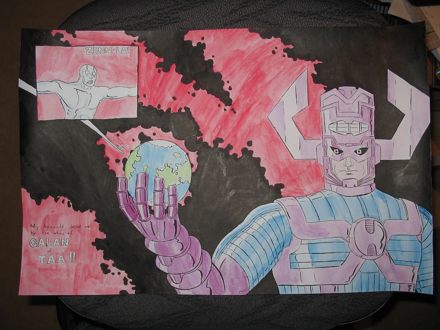
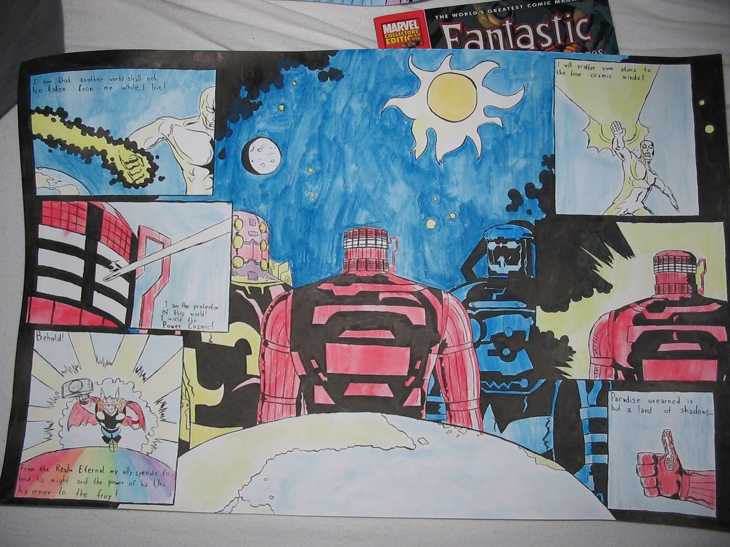
These were done for my final school project in art class. I started a bit late, so I had to stay up all night to finish them.
Talk about these things and give me tips or compliments or whatever I don't really care anymore because I am so tired I could just die.
These were done for my final school project in art class. I started a bit late, so I had to stay up all night to finish them.
Talk about these things and give me tips or compliments or whatever I don't really care anymore because I am so tired I could just die.
Spectre-x on
0
Posts
Those robots looks aces, I like the shading style (solid colours that is)
From what I can see in the bg, these are pretty hueg pieces of work! Hats off to getting them done
I agree, also, about the contrast.
I did this for my final school art project. The text comes from The Scourge of the Fourth Celestial Host by Bal-Sagoth, which is a song about the Silver Surfer. The photos sort of messed up the colours, they contrast more in real life.
And they're not robots, they're Celestials.
without tooting my own horn too much check out my thread, and see how watercolor can work in a comic type sense.
The washes behind him look blotchy and in every which direction. Strokes in the same direction would have been much better.
This whole thing looked rushed, the boxes are uneven, some of the colors are smudged. I think this would have been a whole lot better if more care had been taken with its craftsmanship. The line work on most of it is beautifully done (Galactus in the first picture, the celestials in the second, especially the one to the left Even though these are well done parts, the few poorly done parts (the text in particular) really take away from it as a whole.
Absolutely none of them.
Also fuck you.
On the art: I like the watercolours for the most part. On the second page, it looks like you used a frizzy brush on the sky or something and it makes it look a bit ugly in comparison to the smooth colours on the characters.
Have you used watercolours much before? Cos I'd totally like to see more of them from you.
Also, what size paper did you do these on? I'm guessing A3 size?
Oh it's such a nice day, I think I'll go out the window! Whoa!
Toward the end of the whole thing, I'd completely destroyed the brush I was using.
I haven't really used watercolours a lot, and I'm trying to remedy that.
What the fuck? What is the meaning of this? Why would you come out of left field with such a lame accusation? Uncool.
In other news, I like them Spex. I'm happy to see you ink and color anything, even if your brush was going to hell. :^: And they probably look a lot better in person where the glare from the camera flash isn't washing out your inks and I don't have to scroll 6000 miles to the right to see the whole thing. Agree though that the lettering isn't really on par with the art; it's a little shaky and gets pretty lost in places.