As was foretold, we've added advertisements to the forums! If you have questions, or if you encounter any bugs, please visit this thread: https://forums.penny-arcade.com/discussion/240191/forum-advertisement-faq-and-reports-thread/
Options
dimension help :\
buckarf Registered User regular
Registered User regular
So I made this for my bf a while ago:
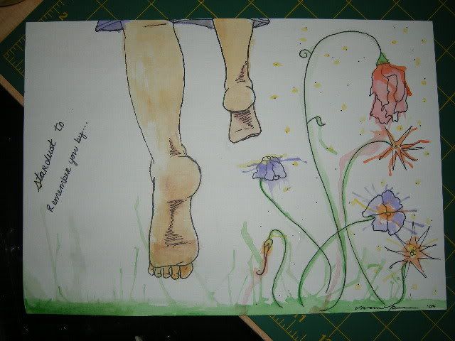
I'm in a bit of a dilemma as far as space goes. As soon as I need to incorporate it into my drawings, my proportions go all out of whack! I have no idea why, and I've been trying my hardest to concentrate. This is actually not that great of an example, b/c I drew from memory instead of a direct/picture source. (But it's the only pic I have available for now). So I'm trying to improve on that. I haven't been drawing for very long, so I just wanted to know if you guys can give me some pointers on what to focus on, what to NOT focus on, etc.
It just seems that when i start drawing a diff part, I start focusing too much on it, and I enlarge it.
Any suggestions?
buckarf on
0
Posts
Your problem in this piece, specifically, is that your composition is off (as you've noticed/mentioned)...the feet are just as "important" in the picture as the flowers, and the writing you've put along the edge fills up the rest of that white space...which leaves you with a few elements, all evenly-spaced out.
Look at different greeting cards, postcards, paintings, whathaveyou...and try to figure out how they've done the compositions - how they've brought your eye to the "main part" of the picture....through contrast? implied line? color? detail? texture? placement? a combination of all the above? To use your piece as an example, both the feet and the flowers are detailed to the same extent, and again, they're evenly placed on the page. They're both colored, and neither element is very eye-catching...if you wanted to emphasize the feet, you may want to try and put the flowers more into the "background"...perhaps by making them a bit more abundant, not outlining them in black pen, and detailing the feet a bit more.