As was foretold, we've added advertisements to the forums! If you have questions, or if you encounter any bugs, please visit this thread: https://forums.penny-arcade.com/discussion/240191/forum-advertisement-faq-and-reports-thread/
Options
'Gold and Blue and Gray,' comic. One whole chapter (NSFW)
Gloria Farmer Registered User regular
I've had a website up and running for about a year and have posted this and other comics around the web and printed up zines, distributing in town. I think I have some readers but never get much actual feedback.
I recently took up the crow quill pen (107 for smaller pictures, 102 for larger), so if the lines seem unsure of themselves that's probably why.
If anyone is interested at all or not I'll post another five pages.
Here's another zine I'll be working on for a while:
Gloria Farmer on
0
Posts
Anyway, the quick "get it on the internet fast" format your using isn't doing much for your narrative, in the sense that I really don't have a clue what is going on.
Also your first page is very sloppy, for the size you of your panels they need to be really neat, you may want to consider drawing them much larger to begin with. That way it'll give you a bit more area to make mistakes in. I'm the sloppiest drawer on this forum, so I feel hypocritical for pulling anyone up on it, but I do think it's where you could make big strides.
Also another thing that a lot of web comic artists don't do, is pursue their drawing outside of the comic, they get stuck in an amateur style and never improve. So try to do life studies outside of this, even if it's sketching quick doodles at work or on the bus, you will find improvement there.
Anyway I hope that helped.
I hope you don't mean panel to panel, because then yes, that is quite a problem. These continue from the last one:
It's hard for me to offer anything valuable, because I'm just not comfortable reading it.
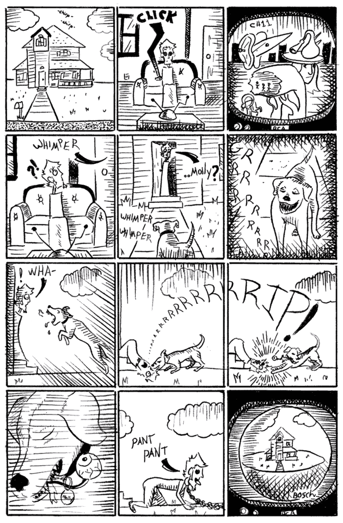
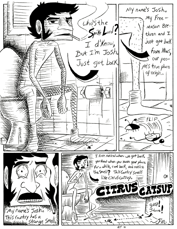
Kyle and Dani wake up in hell and it's sort of a love story about Kyle trying to get to her. This prologue here was how they go to hell to begin with. I'll just post the description I have on the website blog, I'm always looking for an apt description to send to publishers:
Kyle and Dani are killed before we get to know them. When they wake up they’re separated and surrounded by a surreal landscape painted with odd, humorous, and menacing characters. These characters die and resurrect. One is “born again” in the most literal sense. And at the same time these people casually talk about the mortgage rates being too high in Hell.
A surreal black comedy grounded on a firm foundation of irotica (ironic erotica), set in the fireless depths of Hades. Kyle must traverse the perils of the once great city of Dis to find Dani, the woman he loves, who’s trapped in the next town over: the city of Dat. Join him and Dani as their love quest takes them to the highest highs of sex and aestheticization of violence to the lowest lows of sex and aestheticization of violence. And back again.
Here's a non-violent page I finished the other day for another comic. This one is based around a friend's poem about the American occupation of Japan in World War II. It starts out seeming like sci-fi, before it gets into the WWII imagery. So I started the comic that way as well.
This is the first real attempt I've done at a color comic. Though I'm skipping pages and you don't know the plot or anything, any feedback is welcome. Certain things you might critique were intentional, such as some of the messiness (I really like handmade look laden with subtle sloppiness. Not mistakes, just human sloppiness), and the fact that the cockpit is askew.
See, in the next page it will be askew in the opposite diagonal direction, and the next slightly up, the next slightly down. To give it a bobbing look. Outside the window is supposed to be straight, but I wasn't using rulers or anything. The lines are supposed to be ruler-free.
I would love to do words by hand as well (I do in the 'Gold and Blue and Gray' comic, but I feel like the sloppy words there are justified), making sweeping Chris Ware-like designs. But I suck at it. Bad. And I hate the common tactic of making hand-drawn or photoshop-colored comics with digital word balloons slapped on top. In my opinion it looks terrible. So I was iffy about putting photoshopped words in with handmade drawings. But I thought maybe separating the two, picking the right font, obviously not trying to hide the fact that the words aren't handmade but...I don't know, doing it in an interesting way. I think I like the words here, what do you think?
BTW that's totally the font from Super Mario
Does anybody have any comments or criticisms on the other comics posted? Color choices, flow...(I'm kind of paranoid about color, I just read a color blindness test in an old book and I saw a 74 but it said I should see a 29)
Back to black and white. This one's based on a short story I did way back in high school. It's fun to revisit old stuff and make a new interpretation. Yes, I am very aware there are two completely different perspectives in the same picture. The super duper stylization seemed to lend itself well to bending rules.
That said, my skills in perspective are definitely lacking so I work around it. I own probably the greatest book on perspective ever written/drawn (despite the horrible cover):"Perspective! For Comic Book Artists: How to Achieve a Professional Look in Your Artwork by David Chelsea"
and I have read it, but I haven't really applied much of it. I feel bad about it.
It shifts its tone and aesthetics immediately following the dream. This is supposed to be the approach from here on out (the title of the comic is "Fantastic Benefits," about my experiences working for a package delivery company). The funky borders would change themes every page and the words "Fantastic" and "Benefits" would be on alternating pages, on every page. Good idea? Bad idea? Anything?
Here's the next page, unfinished, so you get the gist:
I really would like some feedback on one whole chapter. I haven't gotten that yet. So where as the storyline presented and flow make perfect sense to me, having planned and drawn it out, a reader would probably have a different take. So I'd like to post a whole chapter and see if anyone has any feedback at all. I'm posting these pages as I draw them so this will take some time.
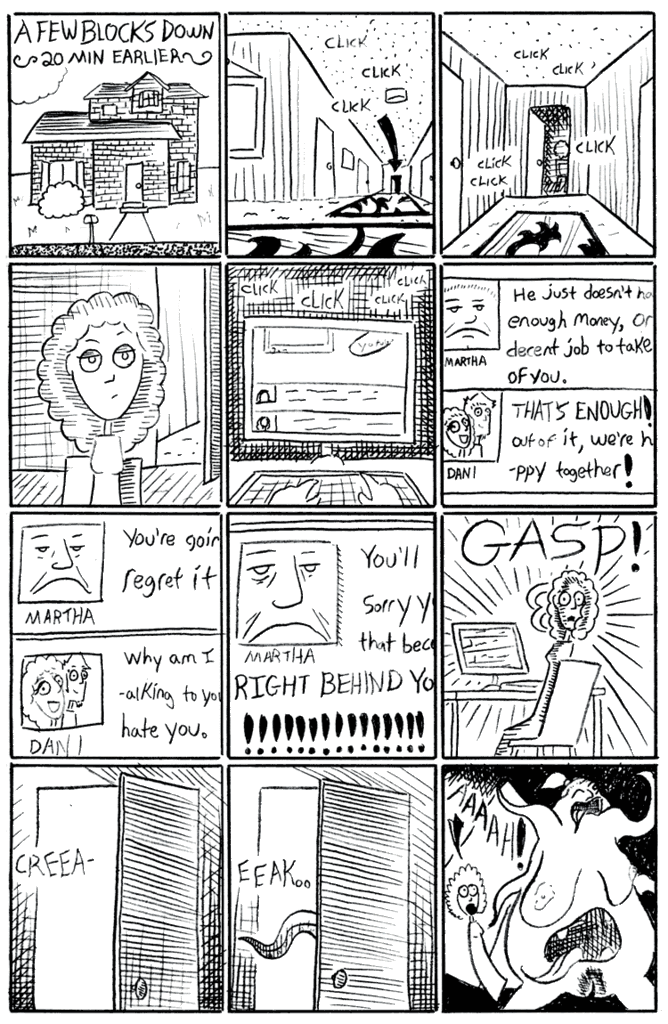
Continuing from the last page of the prologue (of the 'Gold and Blue and Gray comic, where the guy got run over and stuff), here's an in between page and chapter title page.
Hmm. I'm assuming you mean 'goldbluegray.' I do want you to be scratching your head at first, just from the oddness and whatnot. When you say you don't understand, do you mean you can't tell from panel to panel or page to page, like the drawings are confusing? Or do you mean you just don't...get it?
I understand it's supposed to be shocking. That's fine. Shocking can be good. But if you want an audience there should still be a point besides shocking images, which I'm not really seeing.
Okay, good. I was afraid you meant the former. I'm planning on this being a long graphic novel, so there will be more to it.
I like the idea of characters or situations being presented early on as basic archetypes, even stereotypical, then being unexpectedly fleshed out over the course of the story. For example, the whole prologue with the guy fighting the tentacle monster. That part will be revisited later on in a memory or something, only it will be shown realistically as an argument between the girl and her mother, with the girl's fiance (the guy who gets run over) coming over to try and calm them both down. So you could take the prologue as having been symbolic. It was a fight between the mother and daughter because the mother doesn't approve of her daughter marrying the guy.
Same idea with the mom. She's presented first as a mindless monster, then in that part I just talked about, as a stereotypical disapproving mother, and then later on you'll find out more about her past and what might make her the way she is. Know what I mean?
The art itself is inconsistent, Somethings show a pretty okay understanding of cartooning, but then somethings are just sort of sloppy. Sometimes taking the time to figure out how to, say, apply an even layer of paint, makes a huge difference. Or if you are going to hand letter, make it look pro, don't care in some places and not in others. Stuff like that. You can get away with a lot if you just have good craft and art thats cool to look at. If the concepts are going to be out there and aloof, it helps if you at least look like you really, really give a shit about.
All good points. I've said the sloppiness is intentional, but consistency is important. I don't want the art to come across as sometimes lazy, sometimes not. I do want a, what some might consider, sloppy and rough style. I want to draw it like Modest Mouse makes music. Does that make any sense?
I'm not sure I'm getting your point about keeping the reader interested with the art. I think you're saying that if the art's sloppy or the reader doesn't think I give a shit then they won't be interested? Well first of all I don't think it comes across as me not giving a shit. For example, unless intentionally drawn very simply, I try to have anatomy down pretty well (there's some better examples on the next page, below). Which might be part of the reason you said it's inconsistent. I want the style to look intentionally rough and simple, but I don't want drawings on the page that just look like I don't know what I'm doing.
I am trying pretty hard to keep the reader interested past the confusion. Well, I mean I'm thinking that the confusion is part of the interesting part. The idea is that at this point you have no idea what will happen next, then when things begin coming together in the first few chapters there will still be that feeling that pretty much anything can happen. As far as the art style not keeping a reader interested, I...hope you're wrong?
Next page.
I'm not getting the sense of intentional. Particularly here:
I get modest mouse, but even from their dirty albums I get a sense of control and intent, and when they wanted to make a more studio sounding album, they could.
I really like Mikkel Sommer:
Or pug davis, which contrasts between this
The panels are designed, which really lets the more simple drawings shine. the sold blacks are solid, the words are easy to read. It allows for her mushy characters to breathe, it gives them contrast.
Does that make sense?
Gary Panter:
C.F.
Paper Rad
And the whole Heta-Uma Japanese style, some Terry Johnson/King Terry
I'm not necessarily trying to draw like these guys, but they are a source of inspiration.
And I think you're forgetting exactly how wonderfully 'dirty' those early Modest Mouse albums are. I, too, am able to draw with more control. Just not what I'm going for here.
The example of the chapter title page you posted, that is very intentional. To me the odd, flat and slightly off way it's drawn, on top of the garish colors and the fact that you don't know what's going on with her face, lend themselves to a creepy, off-putting sense. At least, again, that's what I was going for. Whether or not it was successful is up to people looking at it. Though I think if people are intentionally looking for 'incorrect' anatomy then they might not get what I was going for in the first place.
BTW, thank you for taking the time to critique and give advice in the first place. I hope I don't come off as not appreciating it or getting defensive. I completely understand where you're coming from. I think you're wrong about some of the intentional stuff on these pages, but am aware that I could be wrong as well. I might eventually change some stuff, but I'm staying the course for now.
Last finished page. I've actually got the entire chapter one drawn out and inked, but I'm redoing most of the pages (the earlier version is much rougher than even this one, done with technical pens instead of dip pens)
Thats really besides the point though. I like all the artists that you posted but I still think there is charm to them. I suppose that what it would boil down to is this, Don't get so married to "what you intend" that you cant occasionally tap into how different people are actually responding to you work. You can spend a lot of time not really improving because one quality or another isn't necessarily what you want. You will be making art until your hands fall off, its okay to take a step to the left and decide to go back to the right. You don't sound overly defensive, but you seem pretty unflexable. I'm not really "looking" for bad anatomy when I look at art, I'm just taking your work in at face value. To me the concepts you're describing aren't hitting me when I look at the images, perhaps thats not an issue for you, perhaps it is, but it wouldn't be a waste of your time to branch out.
Are these comics primarily just for your own personal enjoyment? Because that would shift my perception of them just a bit.
I'd love to see some of your controlled stuff where you intend it to be anatomically correct and well crafted, for comparison.
I do have a couple other things on the front page, though my drawing always tended to be a little rough around the edges. If I seem unmovable, the honest truth is that you've given me one opinion, and I've gotten maybe a couple others on this site. I haven't gotten a whole lot of feedback elsewhere, but I have gotten positive feedback saying the opposite of yours. Basically that the Heta-Uma or whatever style I've got going here works for what I'm doing. As far as the things you're criticizing, I don't see weak anatomy except a stylized part here or there that I intended (there are sure to be some random unintended spots, but those happen sometimes, they'll be taken care of with later edits). And this charming or seemingly controlled chaos that you see in other artists' works but not mine, I can't see a clear reason. I know art like that usually splits opinions down the middle, love it or hate it, so for now I'm taking feedback on the style with a grain of salt.
Having said all that, you're a very good artist from what I can see on your Deviant art site and I'm taking what you say into account, but for now I just want to get a couple chapters down and see how people respond to whole thing. Let some of those concepts I keep talking about actually take shape.
But yes, I can post other stuff. Another comic I've started research for is in no way supposed to have a rough style. I'll post some drawings from it soon, but for now I'll copy/paste a little synopsis from the "Comic Creators" topic in the comics forum:
It's a documentary-style comic about religion in my town. I live in Spartanburg, SC and a friend of mine recently converted to Islam. It turns out we have a mosque, and after going there a couple of times I started looking around and finding some non-Christian places of worship tucked away out of sight. So I started trying to meet people who practice stuff like Buddhism and Wicca while simultaneously somehow living in the Bible Belt.
It's been interesting. So far I've interviewed a Wiccan lesbian couple, a progressive liberal atheist who's family goes way back to the first settlers around here or something (and they're all hardcore Church of Christ people), a Muslim dude my age who's also a doctor and has lived in the U.S. in the South most of his life, etc.
I'm not really trying to have a specific narrative per se, just presenting a side of the South that's not seen much, I guess. It's turning out to be more about me (a lot of documentaries turn out to be about the person making them, I think) in that I also grew up in the Church of Christ and only in the past few years became an atheist. I'm planning on having a part about Christianity as well, but it's pretty much just going to be about myself and my family (my mother, who's a devout Christian and also hardcore conservative Republican, doesn't know I'm an atheist. But I do plan on interviewing her about Christianity and telling her. So that will probably be pretty dramatic).
I'm not doing it just for indie publisher fodder, but it does seem like a good idea to maybe get my foot in the door?
(BTW I'm a male, Gloria Farmer is an in-joke that sort of became my pen name. Sorry if you just read this in a girl's voice in your head.)
I've sat through alot of critiques and know that there is worth in both defending your work and and really trying to step back and separate yourself from it. I'm glad you plan to see the comic through and see what comes of it, I think you'll have something interesting in the end.
This is my first time inking with a brush. The first panel is a tad rougher because I was using Winsor Newton ink, but then I switched to Bombay Black which is much, much better. Any feedback at all on this is very appreciated, because the style and tools I'm using are all very new to me.
Looking at your homages, I can see why you do the things you do in your work, but as a reader of webcomics I can't help but feel that the style you are portraying is less "intentionally rough" and more "first draft." Many of the comments and words in your panels are unreadable without close scrutiny. This may be intentional, but something to consider is that you have about 10 seconds per panel (tops) to convey your message before an online reader moves on. A lot of your more complicated background textures draw more attention that the subject of each panel. You might want to focus on planning out exactly what the purpose and focus of each panel is before adding background clutter and text, carefully adding each of these as needed to convey the message.
As Iruka said, you might want to refine and consider your content a bit. Not that NSFW is necessarily bad, but if you are planning on making money on this you will need a steady stream of clicks (most webcomic visits are during the workday).
How long do you spend on a panel in your first few comics? In the last one with the ink? Can you show your process from start to finish?
Good point about the eyes and mouths. Though, I will say that it's unfortunate that these are now considered "Family Guy" eyes and not "The Simpsons" eyes, as god intended. I claim that Walt Holcombe is my inspiration for this style, yet I can see clearly after looking at the page for a while that my characters are stiff and fairly inexpressive. I will address this.
These are all made with ink, and will all be undoubtedly improved with Bombay black.
I remain unmovable with "Gold and Blue and Gray." I appreciate the input, but just like with Iruka, the difference between "intentionally rough" and "first draft," or having "charm" or not, seems very much according to some indefinable quality of which I am suspicious. Again, I plan to continue on that comic further along until I can clearly see a problem. The religious comic, however, I think you're right on. I'm going to redo what I've drawn (not much) and see about bringing it closer to something Holcombe would be proud of.
I've got a great book on facial expressions that I should crack open. "The Artists' Complete Guide to Facial Expression," by Gary Faigin.
With this last page a few things jump out at me:
-The expressions, which you guys already worked out. Just a note, The second silent woman isn't meeting the eyes of the one who talks in the second panel. The highlights in the eyes in a simple style like this might be unnecessary.
-The feet, It seems like the talking womans feet might be hanging as if she is too short for the chair, but assuming that the others are supposed to be on the ground none of them are planted in perspective
-The hands, They are changing size sorta randomly. In the first panel the womans lower hand seems small, in the last panel its overlapping the table lip, suggesting that its on it, but I assume it hasn't moved. The left hand in the last panel is pretty disproportionate too.
-The lack of word bubbles also seems like an odd choice, which maybe a personal bias because it was always a quality of fledgling web comics to just have a line because it was easier. You lose a lot of functionality not being able to contain your text, as you cant have two peoples words too close before it gets confusing, even with lines. Just something to consider.
I like whats happening in your work generally, so I hope it doesn't seem like I'm coming down hard on you. I just don't think that the quality I'm talking about is an imaginary thing. I think that the rough stuff isn't complementing some small spacial issues you've already got going, where as your cited inspirations seem to have a handle on at least one really important skill (clutter management, color, line energy,) that is making the image hold up under other extreme qualities.
Also, this is the first panel of the second page. I finished it before I decided to redo it, just so you know it's not all people sitting across a table.
I auditioned to do a talk for a TEDx event being held in my town later in the year (here's their website: http://www.ted.com ), to get more volunteers to be interviewed for the comic. The organizers seemed very interested. The idea seems very different and interesting to someone who doesn't know much about comics. Not many people around here do. So I've got that going for me.
So besides some procrastination on my part the project is going well. I'm always open to feedback and criticism.
I find this guy's stuff bizarre and unsettling, even more so when you are trying to read the text to get some anchor into what's going on but even that is nearly illegible. Makes you feel lost and kind of scared. I think that's what he's going for?
To be honest I would never read these if they weren't in here. It reminds me of those old psychedelic comics like Crumb but these are even more innaccessible. I just really feel like if there was a tiny bit more of a narrative structure to these I would like them. I like his idea to have things start very abstract and then become more defined as the story goes on. I just can't picture getting past his unique style to find my way into the later stuff.
I also agree with other posters about the art. Sometimes it seems intentional but sometimes it seems like I have no idea what I'm looking at for too many panels in a row. If the pictures were just 20% clearer and there was a bit more of a story I think I would like them.
On the other hand, the guys you consider to be influences I did not like reading at all so you should probably just keep doing your thing if that's who you want to emulate. I
I'm glad you posted these, I find them interesting I just don't think it suits my taste.
I made a TD for iphone and windows phone!
And that just seems like good, sound logic to me.
delightfully scary in the way Trent mentioned above with a sort of industrial acid feel to them
but uh
when I say reading, I mean more looking
glossing over sorta
no idea what's going in any of the rougher stuff, only getting bits and pieces and the occasional dick shot
but this is coming from a dude that just happened to be browsing this subforum so
conclusion: Keep it Bungle, but gimme something to read
I'm flattered by the Mr. Bungle comparison. I already tend to compare drawing and music. It's so fun to read people's interpretations and descriptions on here. The positive ones, anyway. The more critical ones are useful but less fun.
I actually put plenty of time and energy into the story in this comic, so the last thing I want is for people to never have any clue what's going on. I of course have no problem reading my handwriting. It was intended to be rough, but not unreadable. So I've started experimenting with switching (certain) handwritten portions with font.
I hate hand-drawn pictures with photoshop fonts slapped on top for the most part. There are few combinations I like, so I tried the same typewriter font I'm using with 'Unicorns' on 'Gold and Blue and Gray,' and I think I actually like it. The use of handwritten words and typed words on the same page is odd and goes with the tone well, I think. I suppose I'll go through and switch it all up.