As was foretold, we've added advertisements to the forums! If you have questions, or if you encounter any bugs, please visit this thread: https://forums.penny-arcade.com/discussion/240191/forum-advertisement-faq-and-reports-thread/
Options
Art for a wedding invite. Also: how to create starfields?
plufim DrRegistered User regular
So, I'm making the art for the wedding invites for my wedding. The invites are taking the form of a fake game case, with the details and RSVP card inside the gamecase.
Anyway, I'm going with a super mario galaxy style cover, and as a result have this lineart to start with:
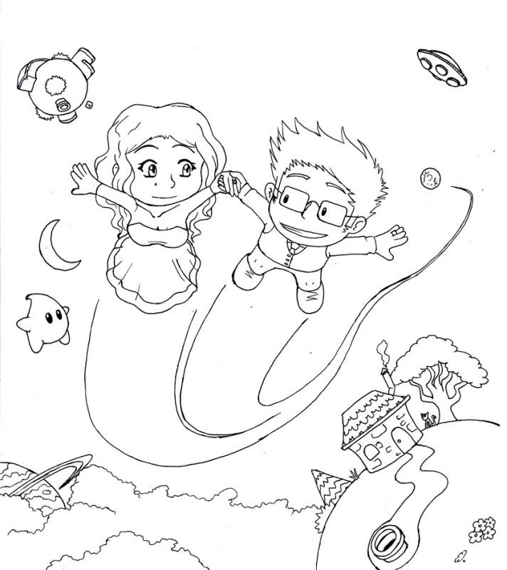
Basically, I was wondering if any of you had any thoughts/suggestions/critiques on this. The final version will be taller, as it needs room for the text "helena and connell's awesome adventure: the wedding" in a mario font.
For colouring this and a few other images, I need to generate a starfield. Does anyone know any tricks to do so without having to draw thousands of little dots?
Anyway, I'm going with a super mario galaxy style cover, and as a result have this lineart to start with:
Basically, I was wondering if any of you had any thoughts/suggestions/critiques on this. The final version will be taller, as it needs room for the text "helena and connell's awesome adventure: the wedding" in a mario font.
For colouring this and a few other images, I need to generate a starfield. Does anyone know any tricks to do so without having to draw thousands of little dots?
3DS 0302-0029-3193 NNID plufim steam plufim PSN plufim

plufim on
0
Posts
Edit: also, you're going to experience some color shift when converting this to CMYK.
How drastic is that colour shift going to be?
A couple tangents make me wonder why you placed elements where they are, when you have all the space you do to work with. The dudes hair barely overlaps the island, the ufo touches the text, the light bling touches the moon ect ect. Give things some room to breathe. The upper left planet also is swimming in some empty space and has too much room. There's nothing but empty space below the UFO.
I would make the characters bigger. They're the point of the card.
Also the text above THE WEDDING is still really squished.
In order to make the eye focus on the characters first, before the background elements without starting over, you may want to try to adjust the colors to be more like the cover for the game. Make the background much darker/desaturated and have the characters be brighter with more vivid color.
Pretty cool idea for a project though, I don't know anyone that is cool enough to use a mario theme for something like this.
Also for true authenticity U R MR GAY must be added somewhere. EDIT: I just realized what you did there, thats probably the more classy way to go. Kudos!
INSTAGRAM