As was foretold, we've added advertisements to the forums! If you have questions, or if you encounter any bugs, please visit this thread: https://forums.penny-arcade.com/discussion/240191/forum-advertisement-faq-and-reports-thread/
Options
Super Nervous! Here is my comic, and i'd love to get input and advice!
thematchingsocks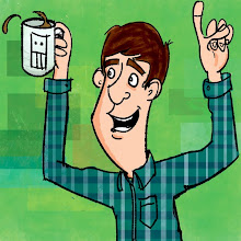 Registered User regular
Registered User regular
So i've been "lurking" in the AC thread for about two years now, never actually posting anything, but having a great time looking at the "daily sketches", or up and coming webcomics, seeing some really great work and viewing some very helpful conversations and tips. So after lurking and seeing all of you post your work for the community to see, I realized it is my turn to share. I am very nervous about posting my work here, but I know I can't get better if i'm never getting "real" feedback. As great as it is for friends to say, "looks great!", I don't get the feedback I want, like "welll...this needs a lot of work", but I can see it, and I change it, but I figured I'd get some input from the community.
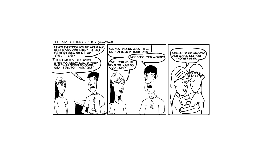
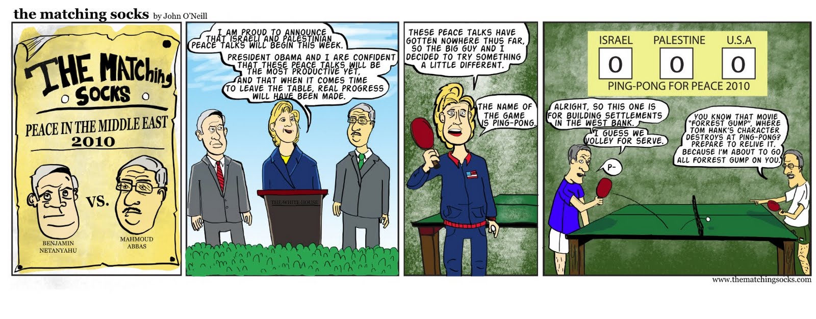
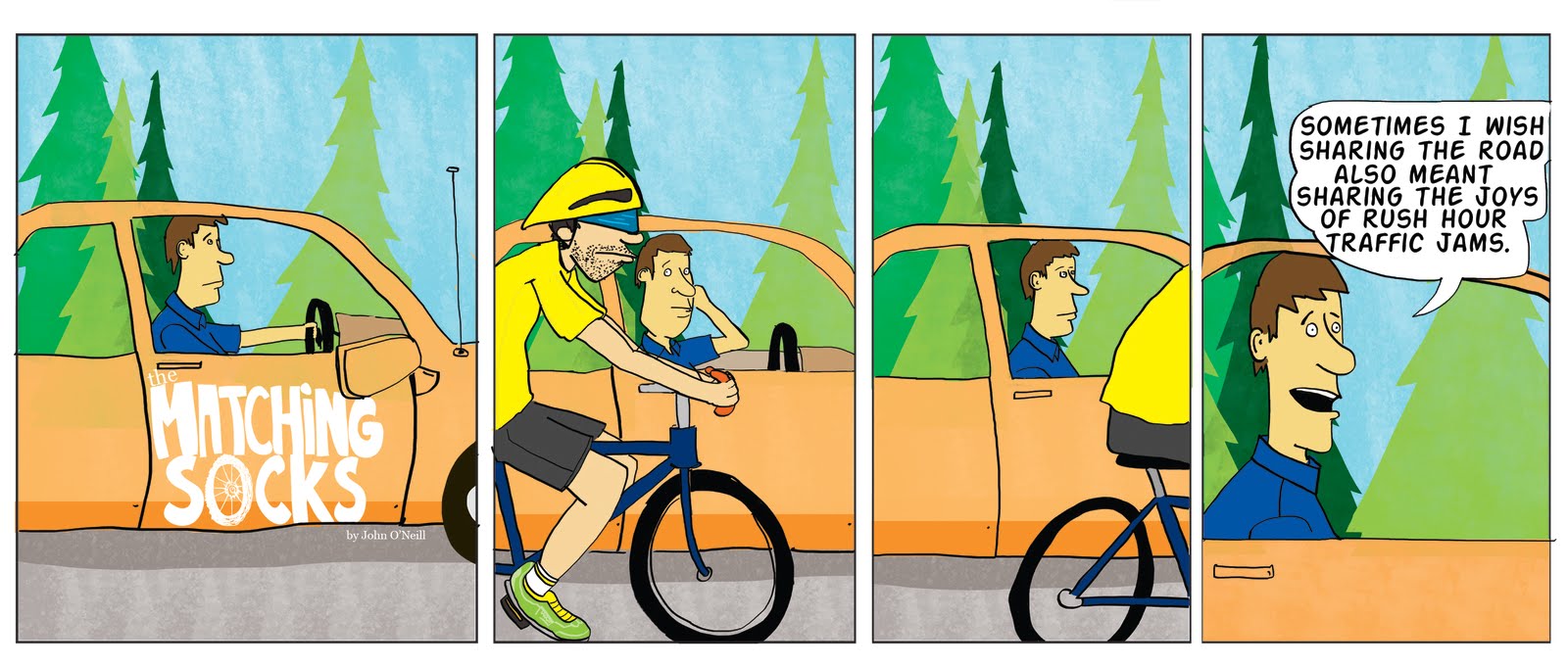
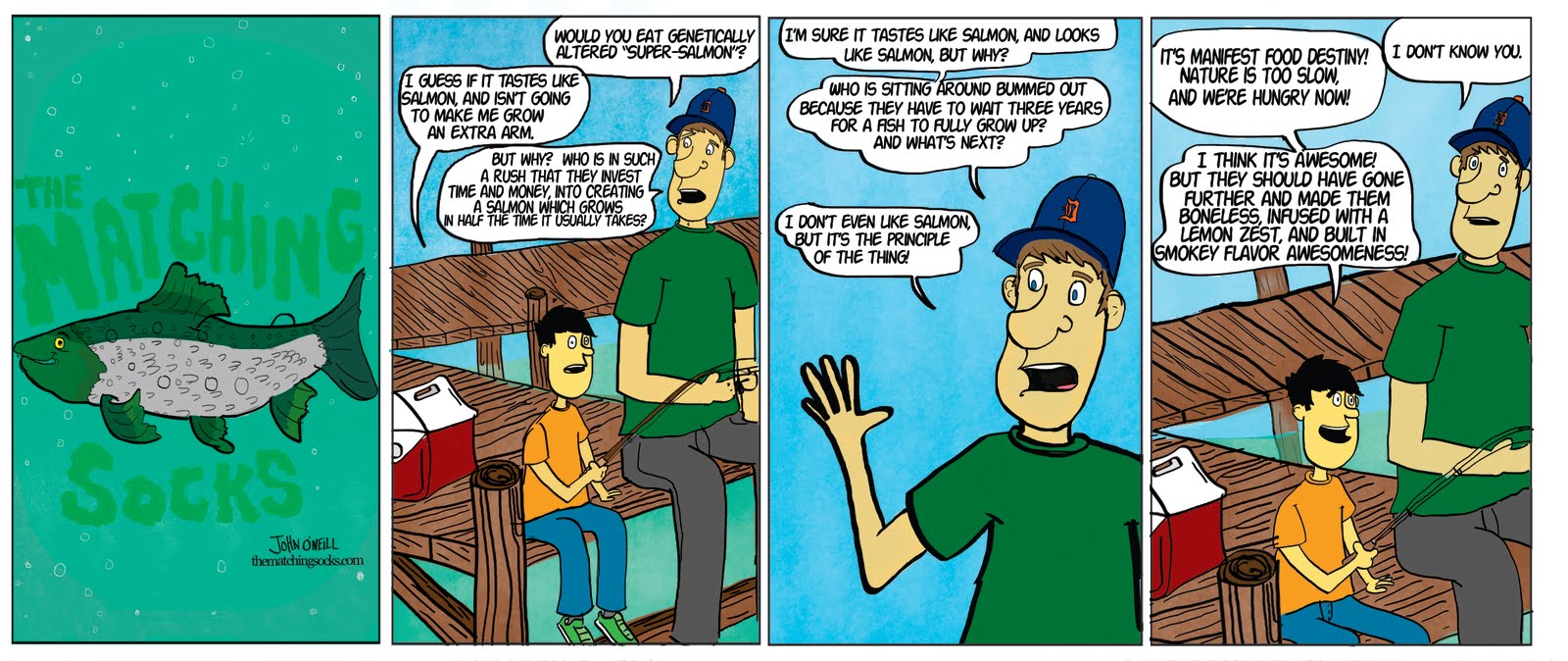
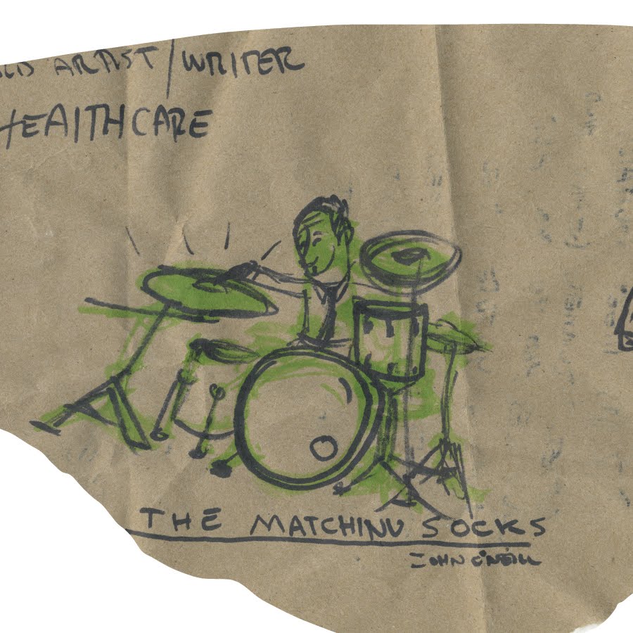
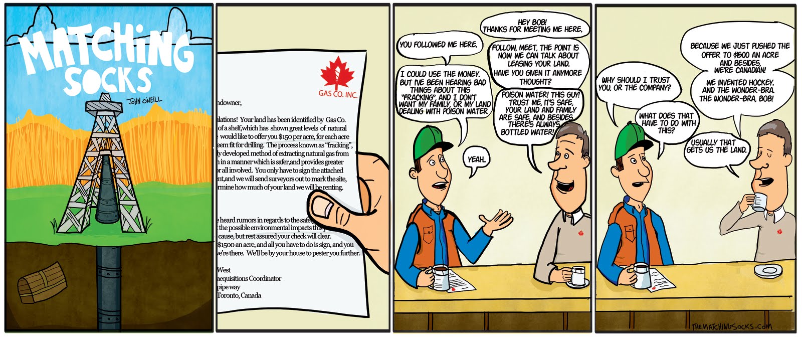
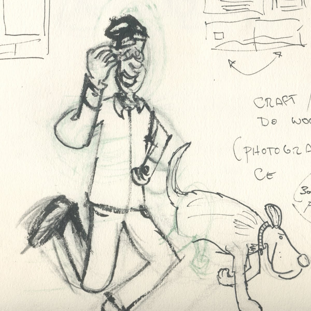
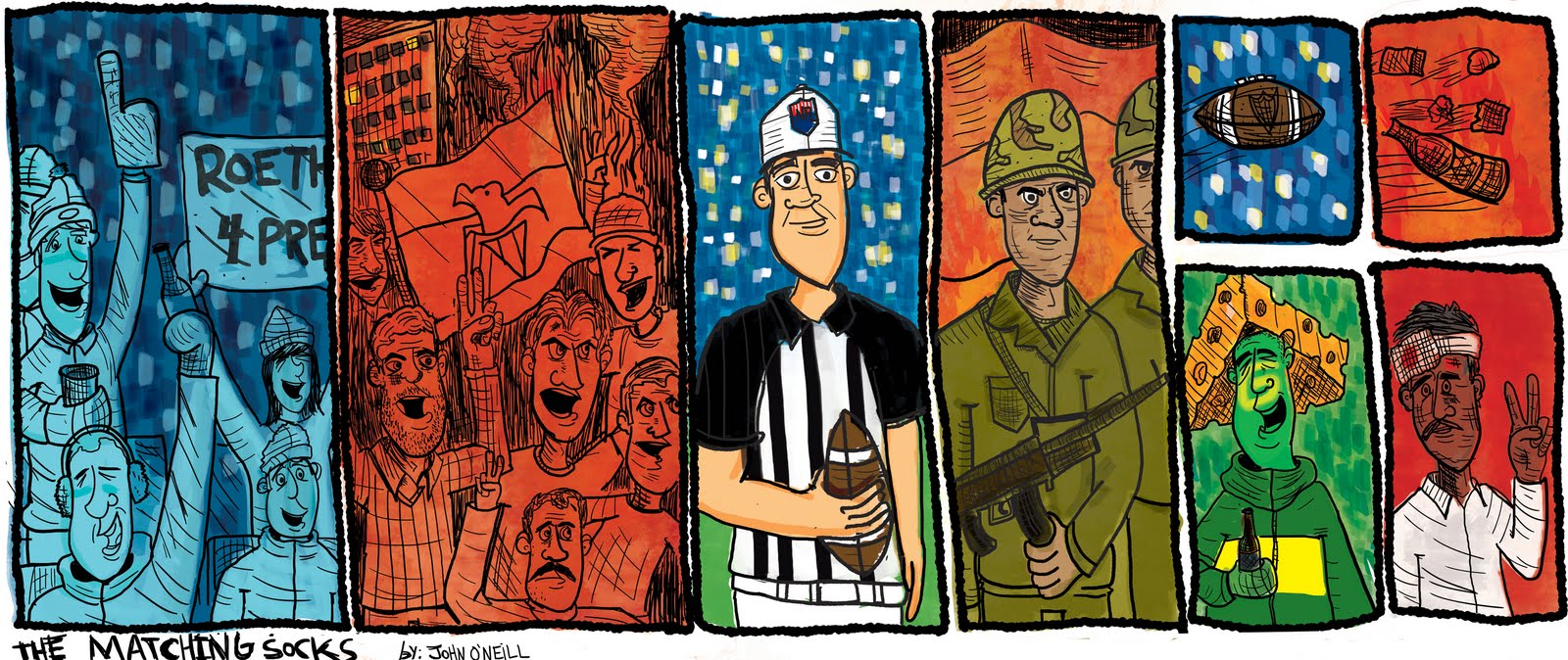
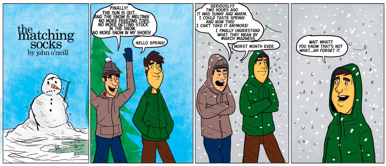
I love art and comics, and am a huge PA fan, and you will see that in my work. I am slowly trying to be less apparent with my influences, and have my work draw from (pun intended) my favorite artists, but be it's own thing, and look like it's own thing, but carry the spirit and fun of the comics I love. Mike has been a huge influence on me, as well as Pixar character design, the work of Kate Beaton, Em Carroll, Bill Watterson, and of course Bill Amend, and way more. So what I would like from the community is: Feedback, advice, and yeah! Though I am not an art student, I do want to become way better, and know what that requires. Figure drawing, life drawing, and sketching constantly. And I have been doing those things, but with Grad school in a totally unrelated field it gets hard to do more than doodles. So I wanted to post here, and see what you all have to say. Thanks a lot for taking a look at this thread! I hope this isn't considered "Site Whoring". I'm not going to link to my blog where all of my work is hosted, but I will start by posting work from the beginning, all the way up until now. I have been doing my comic, "The matching socks" for almost a year now, just once a week, and not every week. I hope you enjoy my work, and i'll also post some sketches and random things. Thank you! I look forward to nervously reading your comments.

.jpg)

.jpg)
.jpg)
.jpg)
%5B1%5D.JPG)
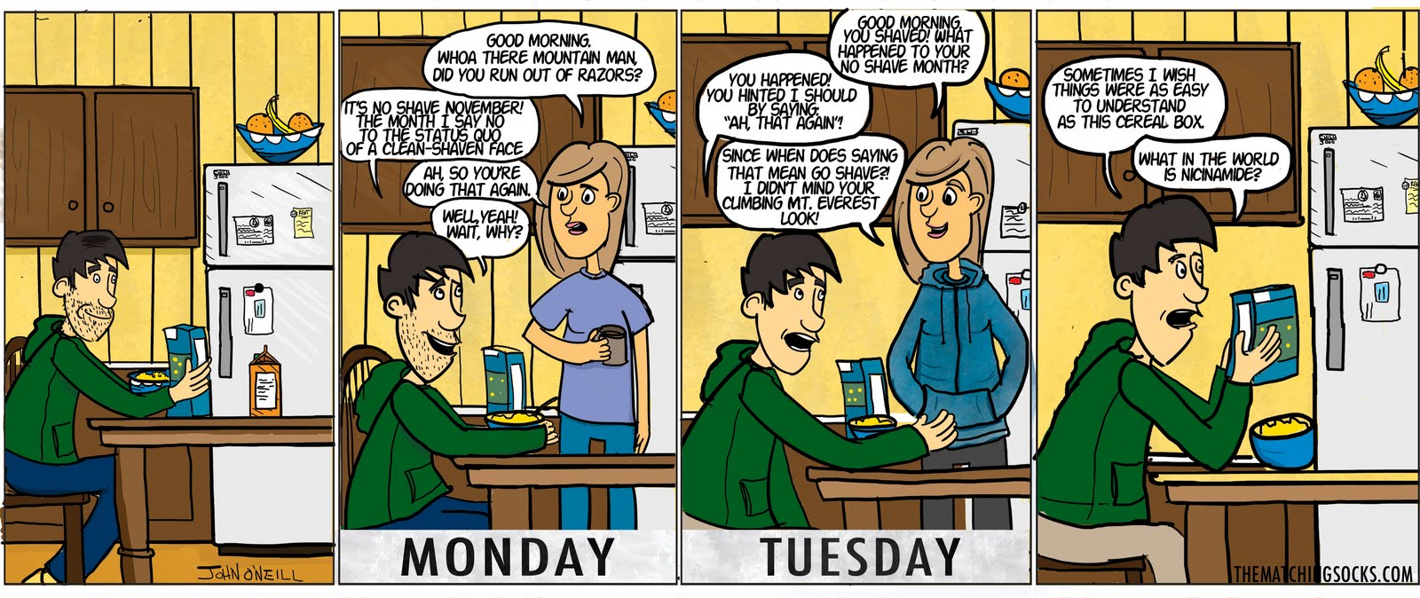
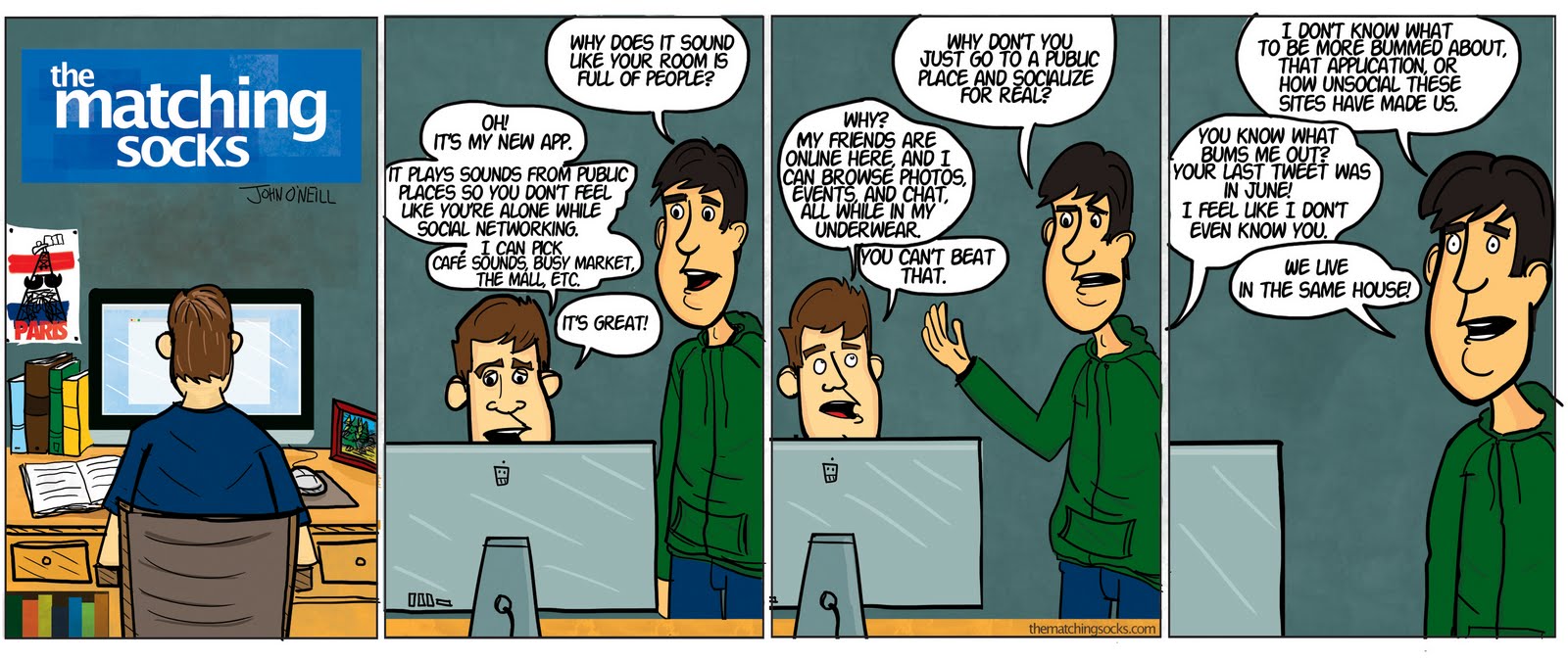
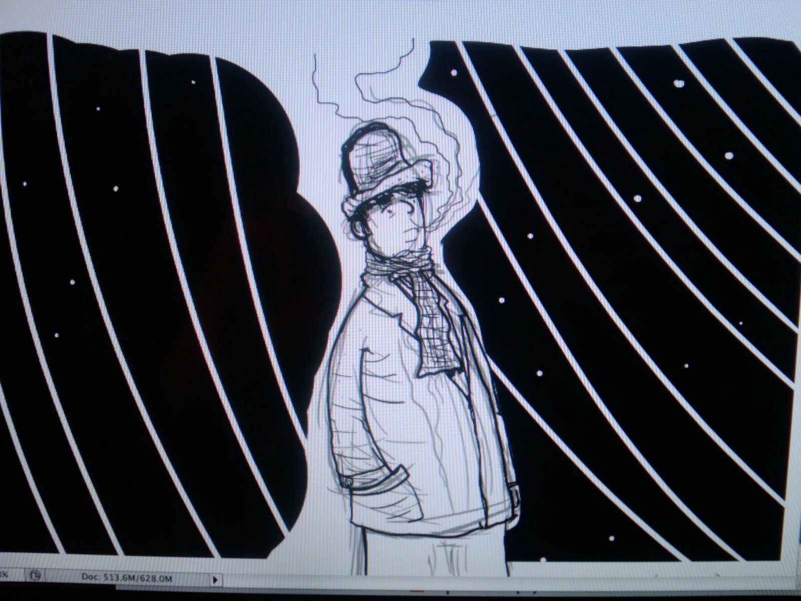
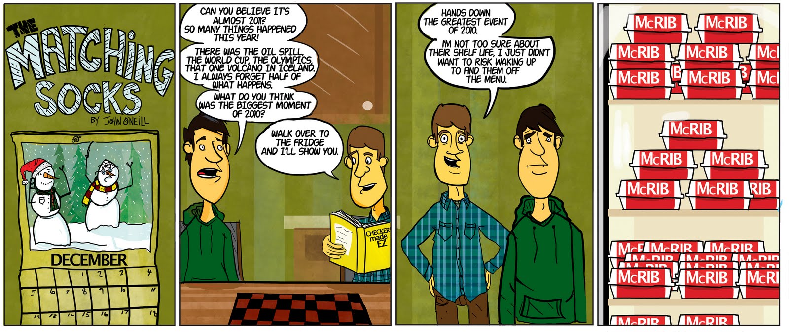
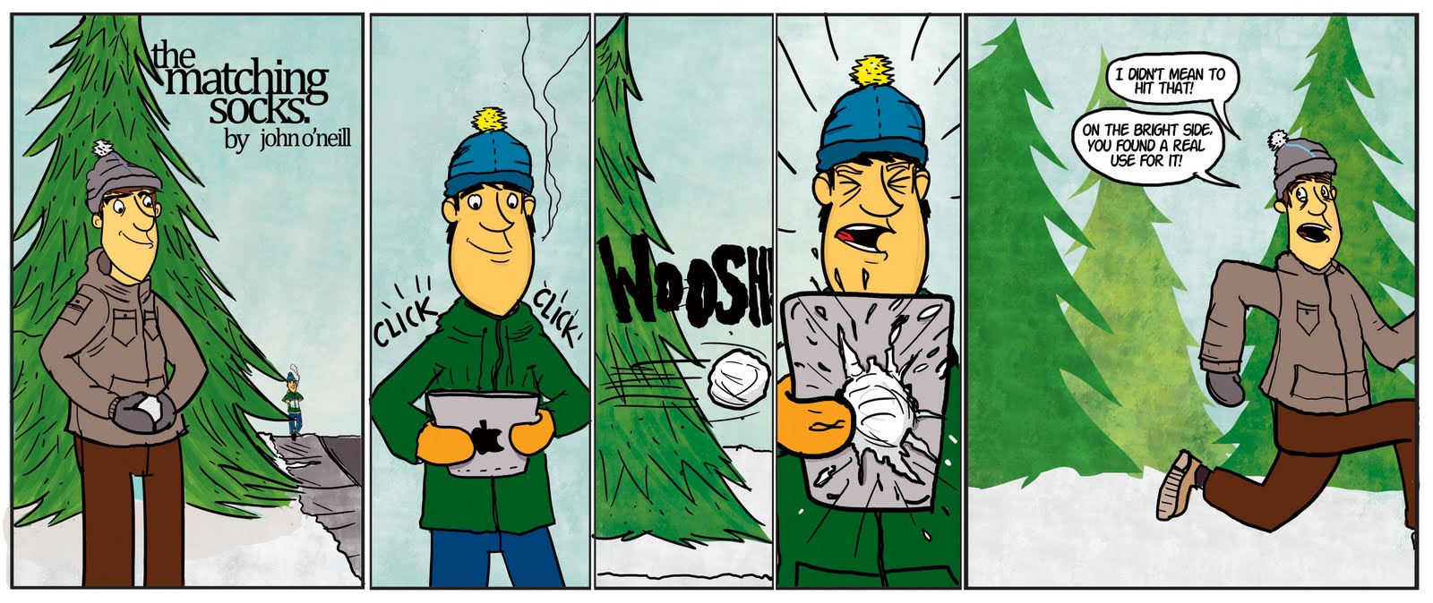
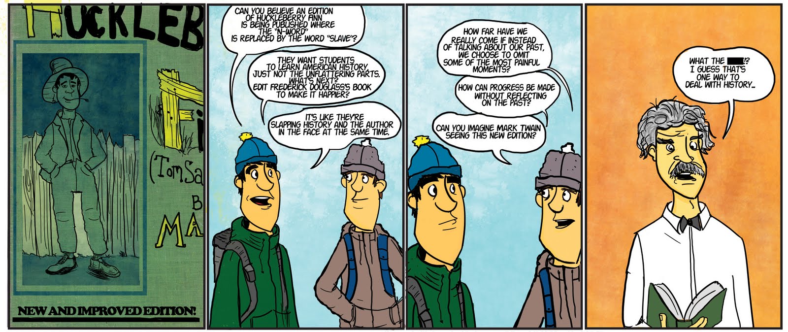

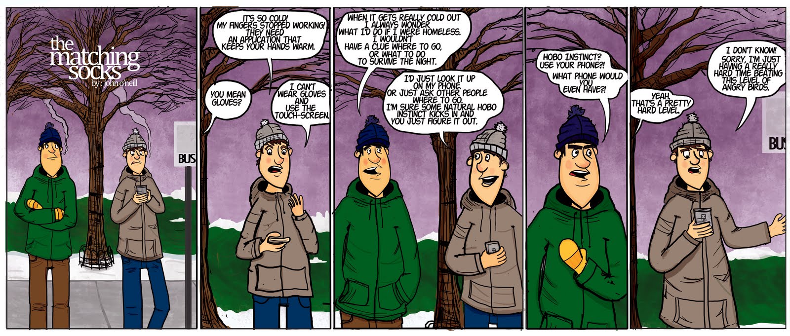
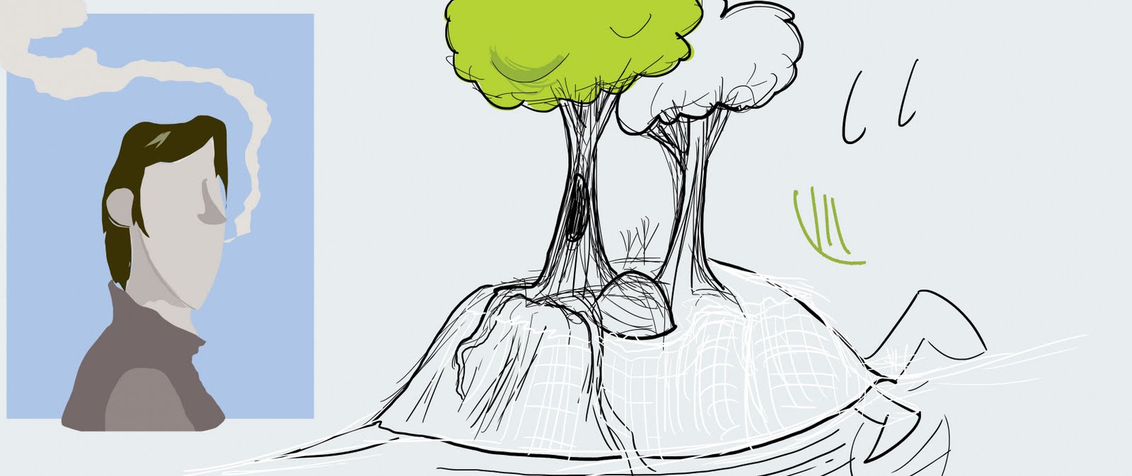
So there they are, just a few doodles, and then my comics that I made throughout this year. They are super rough, and are coming along slowly, I just wanted to get thoughts from all of you. Thank you in advance!
I love art and comics, and am a huge PA fan, and you will see that in my work. I am slowly trying to be less apparent with my influences, and have my work draw from (pun intended) my favorite artists, but be it's own thing, and look like it's own thing, but carry the spirit and fun of the comics I love. Mike has been a huge influence on me, as well as Pixar character design, the work of Kate Beaton, Em Carroll, Bill Watterson, and of course Bill Amend, and way more. So what I would like from the community is: Feedback, advice, and yeah! Though I am not an art student, I do want to become way better, and know what that requires. Figure drawing, life drawing, and sketching constantly. And I have been doing those things, but with Grad school in a totally unrelated field it gets hard to do more than doodles. So I wanted to post here, and see what you all have to say. Thanks a lot for taking a look at this thread! I hope this isn't considered "Site Whoring". I'm not going to link to my blog where all of my work is hosted, but I will start by posting work from the beginning, all the way up until now. I have been doing my comic, "The matching socks" for almost a year now, just once a week, and not every week. I hope you enjoy my work, and i'll also post some sketches and random things. Thank you! I look forward to nervously reading your comments.
IMG]http://3.bp.blogspot.com/_NWkISsmOnPY/TI6WJKlyRUI/AAAAAAAAAGQ/Na21ZEI-7Gc/s1600/eco-comic.jpg[/IMG]
![http://3.bp.blogspot.com/_NWkISsmOnPY/TI6WJKlyRUI/AAAAAAAAAGQ/Na21ZEI-7Gc/s1600/eco-comic.jpg[/IMG]](http://3.bp.blogspot.com/_NWkISsmOnPY/TI6WJKlyRUI/AAAAAAAAAGQ/Na21ZEI-7Gc/s1600/eco-comic.jpg[/IMG])
So there they are, just a few doodles, and then my comics that I made throughout this year. They are super rough, and are coming along slowly, I just wanted to get thoughts from all of you. Thank you in advance!
thematchingsocks on
0
Posts
so that the spoiler text wraps around the image encoding.
Right now your links are broken because they're interrupted by the
I looked up the first few by copy-paste but I will cop to lacking the motivation to check out the rest of them. You have an interesting style of drawing but I lack a frame of reference for what you're trying to accomplish. (I see a list of influences and justifications in the OP, but not a lot of context, like "The Matching Socks is about ___.")
Just my (oh god WHY did I have that French press coffee at 10pm) thoughts. I may have better comments when I am not alternately manic and desperately needing sleep, haha.
Uncanny Magazine!
The Mad Writers Union
INSTAGRAM
haha yeah, you can actually see me trying to figure out what the comic is about as they go, I honestly was just creating content each week, it started off as a comic about a Detroit commentator passing, then it became political, then I started having just normal conversation comics, and now I've moved closer to that, with the Gabe and Tyco, Calvin and Hobees, Foxtrot family, style of interactions and jokes between a cast of characters. It's for sure a work in progress.
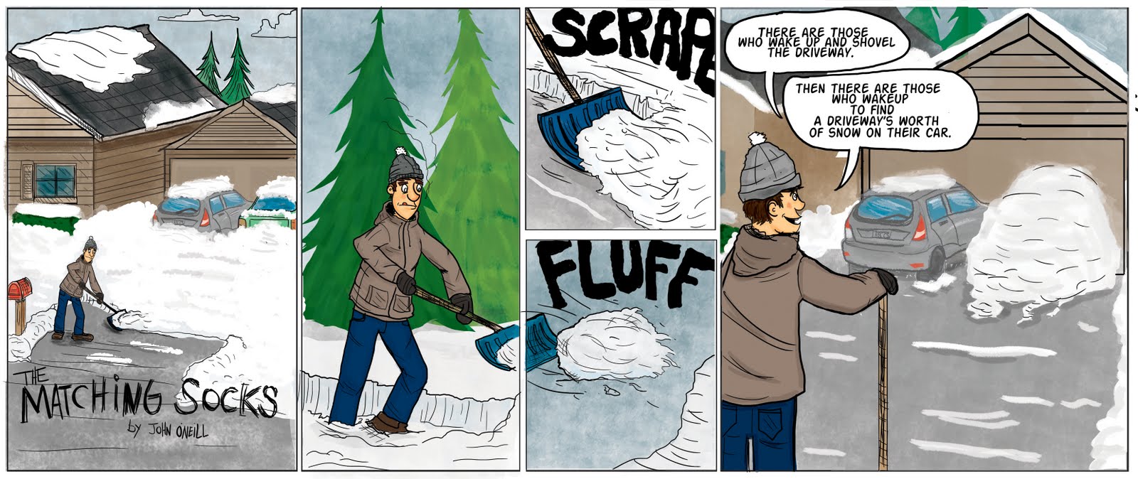
Somethings, you just want into more showing and not telling. Like the snow shoveling comic. You spent all your time showing that he is shoveling a walk, but whats important is that hes the only one shoveling the walk. You then sorta have to explain the whole story in the last panel, because we other wise didn't get any context. Maybe, what you want to show is him walking out with all his gear on and his buddy sleeping on the couch, show the main guy diligently shoveling the walk, maybe brushing the last bit of snow on his car, and then pull out and show the other car completely covered.
As you build up your artistic skills, you'll have more to work with. Expressions will help you tell the story without words.
I think that the comic has potential, it feels like there is content but packaging just needs some help. While you get away from PAs style, dont forget to experiment with your format too.
Sorry about the size, when I get a chance I will shrink them down. Didn't realize how big they were.
INSTAGRAM
I uh, just need a bigger monitor
Thank you for the response. I don't think I had ever really realized that I was doing more showing than telling, but now I see what you mean. For the snow comic, I was debating whether or not to have it show the roommate sleeping, and then the other walking past all bundled up like you had suggested, I think I decided to just show him shoveling the snow covered driveway, with the two cars clearly covered, and then like you said, explain it at the end, but I agree with that being way too much "telling", and it would have been funnier I think if the other character had been involved in some way. But as you pointed out, my art skills are not quite there yet, so I guess I fall back on more simple layouts when i'm not comfortable creating new scenes, which I am working on.
As far as the jokes, haha yeah I tend to over explain, and they aren't the funniest comics, but more reflection, but I do want them to be fun, and will work on utilizing the current format, but also like you said, sort of change it up. Thanks for your advice, and your blog is great by the way.
haha yeah they are a bit wide, it's my ploy to get everyone to go out and buy cinema screens.
I didn't realize just how large the files were, next time when I post I will make sure to submit the right size, haha it is a bit annoying to open up each one and then scroll.
Thanks DeeLock, and I am sorry for being snarky back, doesn't really help.