I've been kicking around the idea of doing a comic because, frankly, I've been bored. Don't think there is a better reason than that
Anyway, I don't have a real clear idea on what I want it to be just yet but I have been working on some character designs. Here's the first one I've got
My apologies for the pencil lines- I need to find a one of my good erasures but... i guess it'll give you some incite to how I'm drawing so you can better tell me what I'm doing wrong.
Anyway, Have at this first character- Hopefully I'll have the others drawn up soonish
NappuccinoSurveyor of Things and StuffRegistered Userregular
edited March 2011
ah, yeah- there'll be some of those as well- I'm slowly re-drawing stuff over break because I don't have a scanner at school and I left all my sketches there on accident
edit: mostly i'm focusing on simple shapes that are really simple the whole way through.
napp, for the first pic in your last post, the guy in the jacket looks like he's about to topple over. Either that or the paper is tilted to look like that...
something that has stuck in my brain since I've been doing figure studies is "the nose knows where the weight is". If you draw a straight line 45 degrees down from the nose, the center of gravity tends to be there.
ninjai on
0
Options
NappuccinoSurveyor of Things and StuffRegistered Userregular
edited March 2011
So I should move the head back further along the body?
its in one of these, sketch trace draw feel book thingy.
He actually looks pretty centered on his feet, but tilted at an angle. so maybe the image is tilted?
edit: If anything I wouldn't move his head back, I'd move his feet forward. If the nose is the center of gravity, just shift his feet to support that. but i think thats moot if the image is cocked at an angle
ninjai on
0
Options
NappuccinoSurveyor of Things and StuffRegistered Userregular
edited March 2011
Oh, yeah, its drawn on a slight tilt and I didn't level it out after i scanned it in.
What kind of comic? Book form with pages and a story? Newspaper-like strips? Posted online? Doing just a single comic? Any vague ideas about what you want it to be? A lot of these considerations could help inform how you want it to look.
I'd say that these things are probably more important to figure out at this stage than character designs.
Toji Suzuhara on
0
Options
NappuccinoSurveyor of Things and StuffRegistered Userregular
edited March 2011
It /might/ be posted online, but mostly its something I'm doing to kill time and boredom. But I'm mostly thinking of it being half character based half just whatever random thing I think might be funny based.
I have absolutely no comic experience so I'm kind of flying by the seat of my pants as far as "what I want it to be" goes.
I have a feeling I won't get a better feel for what I want to do until I start doing some strips and working on Dialog and seeing how that all goes.
I like the last line the way it is, actually. Your second suggestion "wait what band" kinda makes it seem like he's dull and didn't pay attention. The way it is now makes it seem like he's just a bit out-of-touch or un-hip, which is what I think you're going for here.
JLM-AWP on
0
Options
NappuccinoSurveyor of Things and StuffRegistered Userregular
edited March 2011
Actually, he's supposed to be distracted by the girl next to him (it doesn't come out so clearly i guess, but his eyes shift to her), but I do like your interpretation
I can see what you were going for after you explained it, but when I read the comic the first time, I had no idea what was happening. The framing and moment choices are pretty confusing.
I really suggest you get your hands on Scott McCloud's Making Comics. It offers a really in-depth look into the mechanics of comics, and I think it'll be a lot of help to you right now. (Plus, it's written as a comic, so it's very show-not-tell)
(Also, keep doing more comics!)
Toji Suzuhara on
0
Options
NappuccinoSurveyor of Things and StuffRegistered Userregular
edited March 2011
Just so I know for sure, its confusing even with the changed panels (after I drew it I thought it made more sense with panels in a slightly different order so that's why there's the numbers over the panels)- but If its still confusing I'd certainly like to know where you get lost and maybe why.
I'll look into the book but I'm not sure when I'll have the cash to actually get it.
edit: I'm thinking that Panel 3 might be the most confusing since you only see the back of one guy's head but I wasn't sure how else to show them rocking on the stage without the other characters taking up too much space
Dammit I had a big poast here ready to go, and then I stupidly navigated away from the page. Thats what I get for chatting with a girl and having to google something so I don't look like a dumbass. How should I know what a Vizsla is. GARG!
Anyway I'll try to break it down short and simple.
Right now everything is reading pretty flat, which I think could be relieved by building your shapes from 3 dimensional shapes. Since a lot of the characters are already made out of pretty basic shapes, it shouldn't be hard. It seems like you're just drawing the shapes, not building the 3D forms that define the shapes. This will also help draw the characters from other angles, which seems like a problem so far. Everything is either shown from a dead on angle for the most part. Mix things up some.
I like the abstract style you have going, though I think you can develop it further. Having a hovering eyeball looks out of place. It seems like you should either reel it in, or expand that style to the rest of the comic. Like you have a floating eyeball, but only when the angle of the view is showing the head from a certain direction. It seems like facial features should either be where they should be, or be drifting around way more. All the other shapes in the characters and backgrounds are all as they should be in a more realistic representation, so it seems like your abstraction should either tone down, or extend to the overall aesthetics of the entire comic. At least in my opinion.
The two male characters in the last comic look pretty samey if you take away the glasses. You need to differentiate the characters more. Make them feel like different characters with different personalities. Right now they have same noses and same head shapes, so its hard to separate the two of them. Work on making each character more distinct. Alright that was the gist of it. Pump out some more comics, we want to see more.
NappuccinoSurveyor of Things and StuffRegistered Userregular
edited March 2011
Hmm I can kinda see what you're saying about the eyeball being a rather abstracted version of the people- I didn't really give that much thought and, I guess to me, it seems kinda normal comic wise. That said, I'll probably stop that since I'm not really sure how to get the environment abstracted in a way that would match. I may bring it back for some one-off comics since I like the way it looks but If I keep up with these guys I'll tone it back so it's not an issue.-
Also I see what you're saying about the characters being kinda flat though, since they are so simple I'm a little unsure how to show that beyond shading- though I guess a bit of extra perspective (for like the tops of their heads) would help?
The males are going to have completely different noses... its just that for the outline I wanted to get placements and the general pacing out there before drawing everything the way it will be in the final comic. That said, I'll also probably going to shorten his head a bit since that seems like it might be a good idea.
Thanks for the write up, even if girl distractions got the original one deleted
When you're doing your panel borders I'd say yeah, bust out the ruler to pencil some boxes but then ink them freehand to retain the organic look and keep it consistent with your mans.
squidbunny on
0
Options
NappuccinoSurveyor of Things and StuffRegistered Userregular
edited March 2011
Edited the first comic slightly- now its level-ish!
There isn't much I can add that hasn't already been touched upon, but I do want to elaborate a little on the character designs. Tam's said the most critical piece of info so far--mix up those head shapes. If you have one tall, bald guy, give him a complimentary shorty, haired guy as his foil.
As it is right now, those both look like the same guy, only one looks "in disguise" from the other. The other thing I'd express is, be mindful how how well the characters can express emotions. I'm on a real big kick lately regarding that, because most of my character designs have been really stiff in the respect in the past.
Just like in good cinema, a subtle facial gesture can go a long way.
As far as the level of detail for each character, I encourage you to challenge yourself, but they don't have to be over complicated designs. Look at simple designs that still emote greatly to get an idea.
I don't think there's anything wrong with a "modular" approach to making comics, but even so there should be something for every character to helps to convey their purpose and personality.
You could learn a lot from comics like the linked above. Notice that while all the characters are made similarly, you can instantly get some kind of clue as to what kind of personality these characters have. even if there was no text. You should really look at other people's work and analyze what are the best aspects of it.... what are the worst?
What inspires and motivates you? Do you understand what you want to accomplish? Does your work have a sense of direction in it or should every comic page begin and end in the same strip? These are questions every artist should ask themselves.
ConnortheCraftmaster on
delura.tanadrine.com
0
Options
NappuccinoSurveyor of Things and StuffRegistered Userregular
edited April 2011
Thanks Mars!
Working on a re-design for guy number 2... its kind of coming along i guess? I don't have a scanner atm but he's kinda shaped like a guitar pick (more subtle slopes in the cheeks) and i have him more hair so he's not just balding. Will maybe get it scanned in tomorrow sometime?
Also, how subtle are you talking? I don't really imagine myself using any expressions that are too crazy off the bat- just stuff that makes extensive use of eyes and mouth (and body language i suppose.... but we'll see if i can' pull that part off).
Also, would it be worth while posting the scripts to the comics for review?
@Connor: Comics wise the main inspirations are Calvin and Hobbes and... Calvin and Hobbes.
Humor wise I really like dry humor and absurdist/surreal humor but I don't want to go completely off the wall like a certain other absurd comic that's been posted here. I want it to be easy to follow yet still pretty weird at times.
For now, I see it mostly being one off jokes (maybe with 2-3 parts if I'm so inclined)... I probably need to work on getting clear personalities for the characters but at the moment i'm just getting used to the medium and pacing/ drawing comics.
EXCELLENT! EXCELLENT use of dynamics (volume, crescendo/decrescendo) and development of a them! So good!
One thing I would recommend is really really focus on your guitar technique SP?
For one thing, I'm willing to bet you're strumming with your pointer finger. If you're not your strum sounds sloppy at points, and there is quite a bit of buzzing earlier in the song. If its intentional, GOOD ON YOU! If it isn't, really try to focus on eliminating the buzz.
To do this work on your hand strength. You can exercize your hand in various ways, there are grip machines/resistence balls, or you can play chromatic scales using bar chords/alt chords. I prefer the latter because it is a natural way to strengthen your hand, by performing the task you will actually be using that strength for.
The finger strumming isn't an issue the whole time. Some times the soft muted strum using the meat of the finger is beautiul (intro), its the heavier strumming, using your fingernail that sounds a tad sloppy, exclusively during the build ups i.e. 1:09.
But honestly, the organization, the build ups, the development of a theme was beautiful. Execution could use some work, but otherwise great! Can I hear some more?
ninjai on
0
Options
NappuccinoSurveyor of Things and StuffRegistered Userregular
edited April 2011
Thanks for the critiques!
I don't use my pointer to strum and instead use my middle finger and index fingers. The buzz isn't completely intentional- i just have one finger that can't hold a callous for my life but I also don't mind for the most part. I might be weird but i enjoy a little bit of imperfection here and there. It makes the music feel more alive.
When strumming hard in this song, I'm actually using my middle finger and my index finger for the down strokes and my thumb for the upstrokes. I can kind of see why you think it sounds sloppy but that effect is kind of intentional- when strumming with two fingers it (almost) emulates the effect of two ppl struming at the same time. I'll keep working at it and hopefully i can get it a little bit better so it feels more intentional.
I might be weird but i enjoy a little bit of imperfection here and there. It makes the music feel more alive.
I agree with that, its what makes Coheed and Cambria so amazing.
About the strumming, I would try to refine your strumming pattern with your hand so that it sounds more natural, I personally don't like playing without a pick, so I don't have any tips for you there, but search some videos, or some info on strumming with your fingers. It doesn't really vibe the 2 guitar sound so much to me as much as it does a slow awkward strum.
I'm not saying "don't use your fingers" some people are really good at it (matt theissen) and can make it sound really unique, I would just work on refinement of your approach.
ninjai on
0
Options
NappuccinoSurveyor of Things and StuffRegistered Userregular
edited April 2011
The slowness might be more due to not useing a metronome than just using my fingers. I have a tendency to not keep tempo when playing alone. Most of of the time its intentional but... other times its completely accidental
oK so I had a long well written message as a reply, then internet explorer logged timed out as I hit post...
So I'm just gonna shorthand it. Your other song is really good. I love both of your songs and the flowing dynamics really work for you. 2 things to consider:
1: The white noise in your longer track is pretty loud.
2: There are times when buzzing is a good thing and works for you I.E. 3:24 of your longer track, there are times when it doesn't 3:19-20 isn't I think.
Then I said something about Neil Young and how your stuff reminds me of an album of his that I can't find... its an ambient/instrumental album... idk what its called. There is an element of "raw" and "unrehearsed" that is good, adds character and texture to your music, but at some point it needs to be backed by clean, intentional, and rehearsed technique.
I really like what you have, they both sound great, my babblings could all just be a matter of prefference, but I think a little bit of cleaned up playing between the "texture" would add a lot more depth to your songs.
ninjai on
0
Options
NappuccinoSurveyor of Things and StuffRegistered Userregular
edited June 2011
I've got another little improvy demo up on the site here, let me know what you think
1) i probably just have to remember to listen to the songs louder or with headphones. On my speakers I didn't notice any white noise- good catch!
2) yeah... that buzzing is kind of a problem at times but that was due to the string being tuned down to C. No tension let the string do all kinds of crazy things i didn't rally want it to. Like you said it works in some places and not in others.
I like the idea of letting the messy bits show through at times intentionally. I'll have to keep working on it and see what I can do.
The_Glad_HatterOne Sly FoxUnderneath a Groovy HatRegistered Userregular
edited June 2011
i haven't been following the rest of this thread or anything, but Nap, i like it!
The strings action is kinda annoying at 2:25
And overall it has more of a soundtrack-feel than a standalone solo piece. Perhaps that's just a matter of preference, but it just sounds like the music would sound _really_ great in some kind of indy movie, but could use a bit more punch as a standalone piece. But who knows, i can imagine some people listening to this kinda stuff all day.
The_Glad_Hatter on
0
Options
NappuccinoSurveyor of Things and StuffRegistered Userregular
edited June 2011
Thanks! i'm glad to hear you dig it.
I don't disbelieve you about the strings at 2:25 but I personally don't hear it... You didn't happen to mean a different time did you?
I agree that it sounds more like a soundtrack than something that'll hold its own infront of, say, an audience. I'm working on another part to it so they'll be a bit more movement to the thing as a whole...
I think this is the first song i added a bass track to and i'm still figuring out how to record the bass with what i've got, but i'm kinda happy with this so far.
Posts
edit: also, to clarify, that says "Or just nerdy guy," Not "nerdy, gay?"
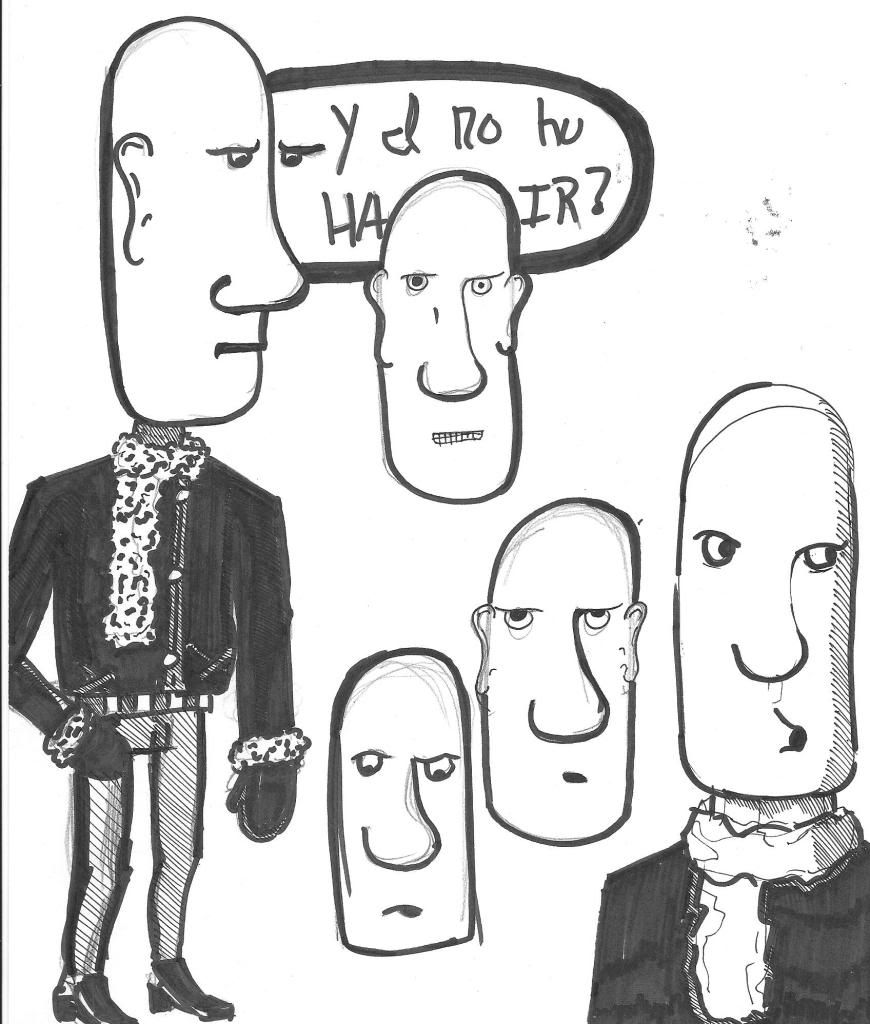
a veritable smörgåsbord of cranial forms
edit: mostly i'm focusing on simple shapes that are really simple the whole way through.
they basically traded on using simple and combinations of simple shapes for head designs
Also trying out bending his skull for more expression- i think it kinda works
And a quick little test of the first comic layout
What say ye?
thinking about it, panel 2 might be a close up of his eyes looking at the already established fire alarm.
something that has stuck in my brain since I've been doing figure studies is "the nose knows where the weight is". If you draw a straight line 45 degrees down from the nose, the center of gravity tends to be there.
Also i'd never heard that saying before.
He actually looks pretty centered on his feet, but tilted at an angle. so maybe the image is tilted?
edit: If anything I wouldn't move his head back, I'd move his feet forward. If the nose is the center of gravity, just shift his feet to support that. but i think thats moot if the image is cocked at an angle
I'd say that these things are probably more important to figure out at this stage than character designs.
I have absolutely no comic experience so I'm kind of flying by the seat of my pants as far as "what I want it to be" goes.
I have a feeling I won't get a better feel for what I want to do until I start doing some strips and working on Dialog and seeing how that all goes.
edit: I probably need to break out a ruler for the boxes...
Thinking of changing the last line to say "wait, what band"
Also... is it just me or is this too long for the pay off?
edit: also I'm thinking of having a semi continuous story- this will probably be the 3rd comic. the glasses guy will be introduced in the 2nd.
I guess I should make that more obvious?
I really suggest you get your hands on Scott McCloud's Making Comics. It offers a really in-depth look into the mechanics of comics, and I think it'll be a lot of help to you right now. (Plus, it's written as a comic, so it's very show-not-tell)
(Also, keep doing more comics!)
I'll look into the book but I'm not sure when I'll have the cash to actually get it.
edit: I'm thinking that Panel 3 might be the most confusing since you only see the back of one guy's head but I wasn't sure how else to show them rocking on the stage without the other characters taking up too much space
Anyway I'll try to break it down short and simple.
Right now everything is reading pretty flat, which I think could be relieved by building your shapes from 3 dimensional shapes. Since a lot of the characters are already made out of pretty basic shapes, it shouldn't be hard. It seems like you're just drawing the shapes, not building the 3D forms that define the shapes. This will also help draw the characters from other angles, which seems like a problem so far. Everything is either shown from a dead on angle for the most part. Mix things up some.
I like the abstract style you have going, though I think you can develop it further. Having a hovering eyeball looks out of place. It seems like you should either reel it in, or expand that style to the rest of the comic. Like you have a floating eyeball, but only when the angle of the view is showing the head from a certain direction. It seems like facial features should either be where they should be, or be drifting around way more. All the other shapes in the characters and backgrounds are all as they should be in a more realistic representation, so it seems like your abstraction should either tone down, or extend to the overall aesthetics of the entire comic. At least in my opinion.
The two male characters in the last comic look pretty samey if you take away the glasses. You need to differentiate the characters more. Make them feel like different characters with different personalities. Right now they have same noses and same head shapes, so its hard to separate the two of them. Work on making each character more distinct. Alright that was the gist of it. Pump out some more comics, we want to see more.
INSTAGRAM
Also I see what you're saying about the characters being kinda flat though, since they are so simple I'm a little unsure how to show that beyond shading- though I guess a bit of extra perspective (for like the tops of their heads) would help?
The males are going to have completely different noses... its just that for the outline I wanted to get placements and the general pacing out there before drawing everything the way it will be in the final comic. That said, I'll also probably going to shorten his head a bit since that seems like it might be a good idea.
Thanks for the write up, even if girl distractions got the original one deleted
As it is right now, those both look like the same guy, only one looks "in disguise" from the other. The other thing I'd express is, be mindful how how well the characters can express emotions. I'm on a real big kick lately regarding that, because most of my character designs have been really stiff in the respect in the past.
Just like in good cinema, a subtle facial gesture can go a long way.
As far as the level of detail for each character, I encourage you to challenge yourself, but they don't have to be over complicated designs. Look at simple designs that still emote greatly to get an idea.
http://www.orneryboy.com/index.php?comicID=103
You could learn a lot from comics like the linked above. Notice that while all the characters are made similarly, you can instantly get some kind of clue as to what kind of personality these characters have. even if there was no text. You should really look at other people's work and analyze what are the best aspects of it.... what are the worst?
What inspires and motivates you? Do you understand what you want to accomplish? Does your work have a sense of direction in it or should every comic page begin and end in the same strip? These are questions every artist should ask themselves.
Working on a re-design for guy number 2... its kind of coming along i guess? I don't have a scanner atm but he's kinda shaped like a guitar pick (more subtle slopes in the cheeks) and i have him more hair so he's not just balding. Will maybe get it scanned in tomorrow sometime?
Also, how subtle are you talking? I don't really imagine myself using any expressions that are too crazy off the bat- just stuff that makes extensive use of eyes and mouth (and body language i suppose.... but we'll see if i can' pull that part off).
Also, would it be worth while posting the scripts to the comics for review?
@Connor: Comics wise the main inspirations are Calvin and Hobbes and... Calvin and Hobbes.
Humor wise I really like dry humor and absurdist/surreal humor but I don't want to go completely off the wall like a certain other absurd comic that's been posted here. I want it to be easy to follow yet still pretty weird at times.
For now, I see it mostly being one off jokes (maybe with 2-3 parts if I'm so inclined)... I probably need to work on getting clear personalities for the characters but at the moment i'm just getting used to the medium and pacing/ drawing comics.
So, http://www.mediafire.com/?29vxu5w2ymhxhh9
Let me know what you think
And there will be some comic stuff updated later in the week I hope-
One thing I would recommend is really really focus on your guitar technique SP?
For one thing, I'm willing to bet you're strumming with your pointer finger. If you're not your strum sounds sloppy at points, and there is quite a bit of buzzing earlier in the song. If its intentional, GOOD ON YOU! If it isn't, really try to focus on eliminating the buzz.
To do this work on your hand strength. You can exercize your hand in various ways, there are grip machines/resistence balls, or you can play chromatic scales using bar chords/alt chords. I prefer the latter because it is a natural way to strengthen your hand, by performing the task you will actually be using that strength for.
The finger strumming isn't an issue the whole time. Some times the soft muted strum using the meat of the finger is beautiul (intro), its the heavier strumming, using your fingernail that sounds a tad sloppy, exclusively during the build ups i.e. 1:09.
But honestly, the organization, the build ups, the development of a theme was beautiful. Execution could use some work, but otherwise great! Can I hear some more?
I don't use my pointer to strum and instead use my middle finger and index fingers. The buzz isn't completely intentional- i just have one finger that can't hold a callous for my life but I also don't mind for the most part. I might be weird but i enjoy a little bit of imperfection here and there. It makes the music feel more alive.
When strumming hard in this song, I'm actually using my middle finger and my index finger for the down strokes and my thumb for the upstrokes. I can kind of see why you think it sounds sloppy but that effect is kind of intentional- when strumming with two fingers it (almost) emulates the effect of two ppl struming at the same time. I'll keep working at it and hopefully i can get it a little bit better so it feels more intentional.
Also I have some random songs here and there on youtube and about 4 songs up on http://thelowlyman.bandcamp.com/releases
About the strumming, I would try to refine your strumming pattern with your hand so that it sounds more natural, I personally don't like playing without a pick, so I don't have any tips for you there, but search some videos, or some info on strumming with your fingers. It doesn't really vibe the 2 guitar sound so much to me as much as it does a slow awkward strum.
I'm not saying "don't use your fingers" some people are really good at it (matt theissen) and can make it sound really unique, I would just work on refinement of your approach.
That said if others hear the same thing and think its a detriment I'll seriously try to work around it.
So I'm just gonna shorthand it. Your other song is really good. I love both of your songs and the flowing dynamics really work for you. 2 things to consider:
1: The white noise in your longer track is pretty loud.
2: There are times when buzzing is a good thing and works for you I.E. 3:24 of your longer track, there are times when it doesn't 3:19-20 isn't I think.
Then I said something about Neil Young and how your stuff reminds me of an album of his that I can't find... its an ambient/instrumental album... idk what its called. There is an element of "raw" and "unrehearsed" that is good, adds character and texture to your music, but at some point it needs to be backed by clean, intentional, and rehearsed technique.
I really like what you have, they both sound great, my babblings could all just be a matter of prefference, but I think a little bit of cleaned up playing between the "texture" would add a lot more depth to your songs.
http://thelowlyman.bandcamp.com/track/alex-hughes-june-4
@ninjai: thanks for the comments!
1) i probably just have to remember to listen to the songs louder or with headphones. On my speakers I didn't notice any white noise- good catch!
2) yeah... that buzzing is kind of a problem at times but that was due to the string being tuned down to C. No tension let the string do all kinds of crazy things i didn't rally want it to. Like you said it works in some places and not in others.
I like the idea of letting the messy bits show through at times intentionally. I'll have to keep working on it and see what I can do.
The strings action is kinda annoying at 2:25
And overall it has more of a soundtrack-feel than a standalone solo piece. Perhaps that's just a matter of preference, but it just sounds like the music would sound _really_ great in some kind of indy movie, but could use a bit more punch as a standalone piece. But who knows, i can imagine some people listening to this kinda stuff all day.
I don't disbelieve you about the strings at 2:25 but I personally don't hear it... You didn't happen to mean a different time did you?
I agree that it sounds more like a soundtrack than something that'll hold its own infront of, say, an audience. I'm working on another part to it so they'll be a bit more movement to the thing as a whole...
now I just gotta figure out what that'll be
http://thelowlyman.bandcamp.com/track/july-21-bass
I think this is the first song i added a bass track to and i'm still figuring out how to record the bass with what i've got, but i'm kinda happy with this so far.
edit: Stapled a test vocal melody line onto it
http://thelowlyman.bandcamp.com/track/july-21-vocalgibbrish
i like it! (with or without gibberish). Nice interplay on the guitar/ bass.
Although for me personally the guitar is a bit too fuzzy at times.