As was foretold, we've added advertisements to the forums! If you have questions, or if you encounter any bugs, please visit this thread: https://forums.penny-arcade.com/discussion/240191/forum-advertisement-faq-and-reports-thread/
Options
New webcomic! Super Brophy Brothers!
Eli Brophy Registered User regular
I don't want to seem like a dingus for this being my first post, but I just started a webcomic with my brother. We're both long-time readers of PA and we're hugely influenced by Mike and Jerry. I do the art and my brother does the majority of the writing. We make a podcast as well, and you could totally email us and we might read it on the cast. Anyway if you like PA (what are you doing here?), or if you like humor, you should read us.
Now is your chance to get in on the motherfucking ground floor of this bitch:
http://superbrophybrothers.blogspot.com/
[strike]If you're too lazy to go to the site[/strike] Or if you don't want to support site whoring by being talked down to, here's the first 2 comics. We update every tuesday, and we'll likely be putting a new podcast up each week as well.
Eli Brophy on
0
Posts
1. People are here to crit your art, not get in on any ground floors of any bitches.
2. If you DO want to be taken seriously as a comic, I would suggest looking into getting some hosting and a legit domain name. Blogspot is, well...Blogspot.
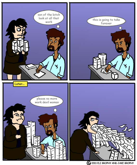
3. Everything in the strips that isn't a person is really, REALLY small. Look at that box of cereal, the spoon, the bowl, and the papers in the first strip. They're so tiny! It really shouldn't matter too much, but it's the very first thing that I noticed.
All that being said, you should post a few more so we can get a better feel, maybe?
1. Noted!
2. Currently, being serious is low on our priority list, and not paying anything is high.
3. A great point. I'll take that into consideration going foward.
And here's more:
As you can no doubt tell, I'm still settling into my art style. It'll take me a little while to iron out the kinks.
Based on the thread title I was expecting this to be two frat boys talking about videogames. I am super relieved.
Welcome to the AC.
And I'm glad the comic defied your expectations. We are brothers, but we are not 'bros.'
http://art-anecdotally.blogspot.com/2010/11/controlling-photoshop-color-picker.html
http://art-anecdotally.blogspot.com/2010/11/controlling-photoshop-color-picker-part.html
... of course, we don't actually know that you're using Photoshop. Are you using Photoshop?
So the art is pretty rough. I would say keep at it, and really expand what you are drawing. Draw from life a lot and your comics will improve.
For me, the writing is a miss. I just dont get it.
Also, think about what needs to be shown in panels. In the first comic you posted here, you don't even need the first panel. In the cat one, i don't even get the last panel.
I would think some of the jokes out more. If they are personal jokes, then no one is going to like/get them.
I'll continue posting comics here every tuesday at the same time they go up on the site. I'd like to continue getting criticism. Also, if you like the comics, check out the podcast!
But if you use CMYK, when you upload it on the web it will display as a giant red x. I don't do web comics, but I always use the CMYK gamut even when I'm doing web work. In the end, I save it as RGB.
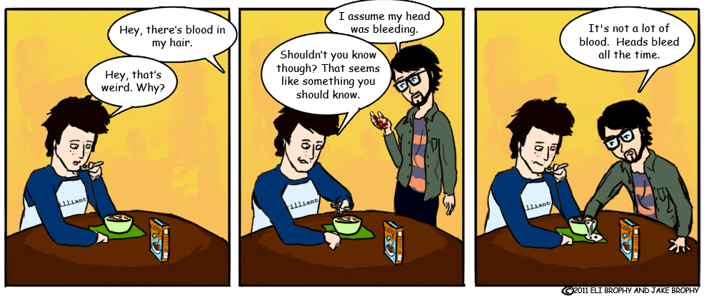
This is what Mike and Jerry call 'animated series'. It's an additional punchline that doesn't carry a comic on its own, makes the joke a little overwrought but still bearable. IMO it's something that should appear in a bonus comic in the same vein as ASP or SMBC's extra hidden panels, but it's not a strip in itself. If I came to your site and that was the first thing I saw, I wouldn't know what was going on.
This, though, I love:
Real understanding of how a joke can be structured with sequential panels, without much speech at all. This strip's great. Take a minute to think about why you do everything, though - why is the 'soon' boxout there? It seems to have happened immediately. Is it funnier if it happens immediately?
@gamefacts - Totally and utterly true gaming facts on the regular!
My comic doppelganger is covering him with a blanket to hide him, because he is shameful. He got moved into an alley with the rest of the trash.
I appreciate the animated series thing, I was worried it wouldn't be great on its own. And I'm glad you like the other comic. The reason the 'soon' is there is because I had to leave the room to get a punishing glass of water for the cat. Anyway, we'll always consider what is and is not necessary for maximum humor.
Well, remember it's your strip, and that humour is a flexible little harlot. He could come into the room with a glass already so he wouldn't have to leave. He could be working in the kitchen with his laptop, and have the jug of water right there. You could just lose the 'soon' box and have him just have a glass in the second panel, trusting in your audience to assume that he'd gone and got it (although I wouldn't recommend this).
@gamefacts - Totally and utterly true gaming facts on the regular!
Right, but the reason he went to get a second glass of water was because the first one had been spilled, I thought that should be as clear as possible.
@gamefacts - Totally and utterly true gaming facts on the regular!
Why would he be moved into an alley, and who would move him? The garbage company? Wouldn't they just throw him in their truck and take him to a dump? Joke might be stronger with panning out and showing it as nighttime and him still lying there, or something a bit more plausible/that invokes less fridge logic issues. Another thing to consider is that we are four comics in, with the bearded character only appearing in three of them. No mention or special consideration has been directed towards his beard, so it's loss is fairly un-alarming to the reader. While we get that the lack of beard is an issue for him, this is not a breakdown-worthy event from what we have seen up to this point.
What I'm saying is that you have to build the joke in order for it to be entertaining. If you wanted to do something like this, leading up to it for a few occasional comics about beard-pride would have been prudent for the final delivery.
This is a notorious problem for author-avatar comics. Generally you know why this is a big deal (presumably the man the bearded fellow is based off loves his beard a lot), you do not have any reason to develop this in the comic itself. Your readers do not know these characters, but you do. This causes you to take for granted key personality traits that are critical to the success of your comedic delivery. It might be a good idea to either 1)scrap the idea of having these characters be your doppelgangers or 2)step back and ask how you would understand this joke if it were someone else before finishing each comic.
Sticking with characters you personally know is generally a very difficult thing to do without a lot of objectivity.
Thanks a lot! I'm going to try to continue to push the strip as far towards being expressive as possible without being too cartoony.
This is fantastic compared to your first one posted here. Keep up the good work!
You may want to add highlights and depth to the hair to add to conveyance. If you have seen any Studio Gibli films, they use hair (especially facial hair) to convey emotions as well via bristling and how it shifts.
Thanks! And the hair thing sounds interesting, I'll give it a shot.
And if you REALLY like a comic, listen to the podcast.
I'm going to give you a small piece of advice here, and feel free to ignore it.
I got started with Trouble Ticket back in 2008 after reading "How To Make Webcomics" and I jumped in full force with everything the book said.
I wrote and drew the comic, had the site, then without thinking I put up a forum and started a podcast because I just thought that's what webcomic duders did. I was following the lead of Kurtz, Mike and Jerry, Joel Watson, etc.
There's a really high fail rate when you're trying to juggle all of that stuff along with the comic and the job so I'll just say this. The comic should come first. It's going to be the thing that 90 percent of your audience is coming to your site for, so make sure it gets top billing and first priority. Don't stress with trying to do too much at first, don't start selling prints when you've only got 30 comics in your archive, etc.
That's just my .02 though, because you've got talent and I'd love to be able to read your comic a year from now... : )
Also, for the love of god man get a dedicated domain name. They're $10 a year and you can plug it right into your google blog.
edit: Just checked the "about the brothers" bio and realized you two are probably late high school or early college based off of those pics, so forget what I said. You've got all the free time in the world. Do a podcast once a week, update your comic at least twice a week.
Thanks for the advice, and yeah the comic comes first. Like Mike and Jerry, we write the comic on the podcast, the only reason we record it is because we have to use skype to discuss the comic anyway. We're both in college, my brother's about to graduate, and unfortunately with the amount of free time I have it only works for me to update once a week, but hopefully that will change.
Also, we're in the process of getting a real domain, so we won't have the .blogspot in our name anymore.
Great joke, and great presentation! You've got some wonkyness with those eye lines on the artist fellow, but the shading and colors are much improved. Keep up the good work!
Also, we changed our domain, to superbrophybrothers.com. I'll probably stop posting the comics here soon, so if you like them be sure to bookmark us.
Also the lack of any kind of movement between panels is a little disconcerting. Is he supposed to have removed his shirt, then set it on fire between panel 1 and 2? If so, why has no part of his body moved even an inch?
You could really stand to put more effort into expressive poses. As it stands, it looks like his shirt has magically teleported off his body, then set itself on fire. Even f his hand were still held up in the air above the trashcan, it would help a whole lot in conveying what has happened
And finally, I would REALLY recommend against stealing artwork from other cartoonists. It wouldn't have taken much effort to redraw one of Buckley's faces in your own style (seriously, they are terrible). The dude has copyright on his work, so it isn't cool to just copy and paste it into your own comic!
I can already see a ton of improvement in your art. The facial expressions have come a mile already, and the writing/timing makes a heck of a lot more sense. Keep it up!
Webcomic Twitter Steam Wishlist SATAN
Also, the lack of movement was on purpose, we thought it would be funnier if the shirt was removed and set on fire instantaneously after the startling realization. I figured that using one of his drawings was fair use in this case, as I wanted to convey his character's face in the best way possible, which is of course to use actual material from his strip. I was a little concerned as well about this, but it should be fine.
Anyway thanks! Future strips will be more gesturally expressive.
Your last few comics proved that.
I did enjoy the joke though.
I was always under the impression that Buckley is a notorious douche when it comes to his material.
Three or so years ago Buckley C&D'd a high school kid for creating a presentation that used CAD strips he'd animated. He was so proud of the presentation he put it up on youtube.
The presentation was about CAD helping him overcome his depression and inspiring him to pursue a career in animation.
twitch.tv/Taramoor
@TaramoorPlays
Taramoor on Youtube
Ruh roh. I hope he doesn't get mad about this one.
Also he is undeniably a douche, I recently read his explanation for writing a miscarriage into the strip and it was the most pretentious thing I'd ever read.