As was foretold, we've added advertisements to the forums! If you have questions, or if you encounter any bugs, please visit this thread: https://forums.penny-arcade.com/discussion/240191/forum-advertisement-faq-and-reports-thread/
Options
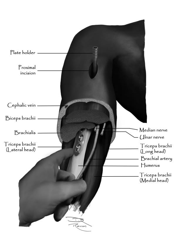
Surgical Illustration
Windburn Registered User regular
Registered User regular
Hey all,
It's been awhile since I last posted some work, but the feedback I get from you all is tremendous. Would you mind giving me some opinions about this piece?
I co-authored a chapter on minimally invasive plating of the humerus and I was asked to include an illustration. The technique requires two incisions, with the plate being advanced through the proximal incision and the surgeon guiding the plate with his finger through the distal incision (so that it doesn't deviate medially or laterally). This maneuver is what I attempted to depict.
Unfortunately, the work has already been submitted, but I would still like some feedback to improve future pieces. There's a strong probability that I will be asked to do similar medical illustrations in the future.
Thank you!
-Windburn
Windburn on
0
Posts
[Edit][Nitpick]
I like consistency. Some of your lines terminate at the extreme edge of the component*, some extend over the piece. I prefer the latter, but making them all the same is the crux of it.
*Tricep, Incision, Cephalic, and Plateholder appear to do this, but it could just be the contrast.
It's funny you should say that, because more contrast is what I was going for. In previous pieces, they were much more mid-tone throughout. I tried with this to keep my darkest shadows black and my lightest areas, well, bone-white. I'll keep working on it. Thanks!
ArbitraryDescriptor
That is a great suggestion about the markup lines. Thank you.
-Windburn
Um. Well, there's definitely a lot of black. I do see some bright white in the highlights on the surgical blade, but that's it. The problem is that your values are compressed down towards the dark end of the contrast scale, which if anything is the opposite of what you want for good visibility. The human eye does not scale intensity in a linear manner.
Here is a diagram which tends towards the lighter end - has almost no darks at all - but is very clear:
This one has what I would consider to be a more natural range of grayscale values - each area is clearly distinguished, there is contrast between adjacent but differing regions, and it goes from white to black BUT most values are much closer to white than they are to black.
You don't even have to get very fancy, with lots of shades or gradiated shading or what-have-you.
To take an example from my own field:
As long as adjacent items are separated from each other very clearly, you can even get away with a two-tone diagram, although in this instance there's no reason not to use several distinct greys. Just remember that for this kind of thing, clarity trumps any kind of artistic impression or physiological accuracy.
I do appreciate the input on selecting more appropriate fonts in the future. I will keep that in mind.
Tynic
I have done several diagrammatic drawings in the past that were probably, as you pointed out, more instructive and easy to follow. I admit to going for more realism here for no other reason than the challenge and variety and at the request of the primary author. As a matter of opinion, I have a greater appreciation for medical illustrations that are more realistic (eg Netter), but that is neither here or there.
Personally, the area I am least happy with is the muscle. Other than contrast, what suggestions do you all have to improve the look and feel?
-Windburn
Yes, that looks much better. If the shapes/important details of an illustration disappear when you squint at it, you should probably increase the contrast between the components of the subject you're illustrating.
I'm a fam med resident from Canada. This second version looks lots better, but I still have a few suggestions/food for thought:
1) In reality are the plate holder and the plate perpendicular to each other? If so you may need to adjust the angle of the holder cause right now they just seem 'off'. It also doesn't appear to be going through the center of the incision, which adds to the lop-sidedness.
2) Also the humerus itself seems to be angled a little to laterally to line up with the shoulder properly.
3) That's an awesome hand but does it actually add anything to the image? Is it just 'extra stuff'?
4) Also, don't neglect your torso /neck. They just kind of disappear/ don't exist.
(PS: this is really just nit-picky stuff. I can't draw half that well.)
If you have time for it a really good book is 'Visual Explanations' by Edward Tufte.
Cheers
PS: what journal are you publishing in?
I always debate about fontss, so Ill do my part.
I dont recommend those free fonts because they often dont have a very robust character map. If you encounter a medical name that has an accent or any type of foreign glyph many of those fonts will lack the proper characters mapping to reproduce it. Go with a professionally designed font, if you cant afford one you will find a wide variety already installed in your computer.
Although I think Papyrus is a horrible font, the reason why I dont endorse it in this case is because its prone to have long ascenders and descenders and its a little wide. In short, it takes up a bunch of space which you might be needing when the illustrations start getting crowded.
Not only that, but Imagine that someone photocopies the book, or it gets digitally distribuited and JPG compression appears. These things will affect the readability of Papyrus.
Although it sounds cliche, I recommend Helvetica. Squid bunny also recommended Calibri or Gill Sans which are both excellent type faces. However, the responsible thing to do is to find out what font the book is being written in and use the same or similar type face so that the illustrations and their captions seem like they belong.
FAKE EDIT.
Actually.... Why are you writting the captions ON the image? To me, this is something that should be done after, the image has been set up in the book.
This is the anal retentive graphic designer in me talking, but if you write these captions now, and then it turns out that the image will be 25% smaller/bigger to fit in a specific area, youre gonna loose a lot of readability, not to mention that there will be a lack of consistancy in the sharpness and size of the type face.
Fake edit 2.
Remember, if this book is going to press, you have to finish up your images in CMYK.
Very insightful information about font selection. Thank you.
As to why I put them ON the image, it's purely as a suggestion to the editor regarding what I think ought to be labeled. The labels are on a separate layer and it's only a matter of deselecting that layer and resaving the file for the labels to be gone.
Regarding the CMYK, I did not know that. I produced this in Grayscale 8-bit, then saved it in EPS (as instructed by the editor) for submission.
One thing I have noticed is that the jpeg as viewed in the forum is MUCH darker than on my home monitor. I thought I might have my monitor miscalibrated, but when I view the source file against the forum on my home monitor, there is a noticeable difference. Is this an issue with jpeg, the forum, or something else?
InaraLock
1) The plate and holder were drawn from references. They might be slightly off. If anything, the plateholder ought to tilt slightly more toward the viewer so that the drill hole is similar to the holes in the plate.
2) What you're seeing in the shape of the humerus giving that illusion from the narrow window it is seen in. As you know, the humerus is not a simple cylinder. It has subtle bumps, curves, and planes. I sketched a skeleton before layering on the muscle and skin. I assure you, the humerus does articulate with the glenoid/scapula correctly.
3) The hand is necessary because it is illustrating the technique of the surgeon using his finger to guide the plate along the humerus as it is advanced. I guess I could have used a disarticulated finger, but I think that might have been more distracting.
4) The torso and neck are only suggested because the focus of the piece is the arm.
This is being published in a textbook on minimally invasive orthopaedic surgery, not a journal (though I do have some work in journals).
Thanks again. Please keep the advice coming. Again, I would love to hear tips on how to make the muscle more muscular.
-Windburn
Regarding your current illustration and the contrast issues, I still have a very hard time reading the image - your value range is drastically shallow, so there isn't a lot of contrast of value between important parts. Everything, with the exception of the plate, is pretty much equally dark. Lighten them up, make the fat layer lighter to help give contrast and framing to the muscles and the cephalic vein. Make the plate holder lighter and the skin around the proximal incision lighter so that they both stand out against their respective backdrops. Give the brachial artery and the two nerves different values, to simulate different colors.
As to how to make the muscle seem more like muscle, I don't see any striation of fat or connective tissue on the muscles you've drawn. They tend to have two distinct purposes in medical illustration - one, to make them look more like muscle, and two, to give them contrast and form.
Regarding content, I don't really understand why the hand is there pointing to the plate. If it isn't necessary for the illustration or the accompanying text, I'd leave it out. And you really shouldn't be putting in the call-outs in your final submitted illustration, let the typesetter do that. It is good to submit a version he can use as reference, but as others mentioned, if it needs to change size or any other formatting, that's a pain in the ass for the typesetter to deal with.
Thanks for the advice on the calibration.
Why does photoshop try to mimic a different color setting than the one selected? Does it always try to mimic CMYK? That's pretty irritating. I prefer to view what it's going to look like in print as I'm drawing it.
Excellent suggestion about making the nerves/artery a different value to make them more visually distinct. I will do that next time.
I realize that it may not be obvious why the hand is there when the illustration is taken out of context. I guess all I can say is, it needs to be there to be there.
I'm not entirely sure what you mean by striations of fat and connective tissue. Muscle has inherant striations by virtue of the bundling of fascicles. These I tried to illustrate (unsuccessfully) with brush strokes. Each muscle has a thin layer of fascia (connective tissue) and muscle compartments have a much thicker envelope of fascia. Neurovascular bundles tend to have fat surrounding them, which can create a stripe of fat along muscle (such as the cephalic vein in the deltoid). Neither of these did I illustrate, because I felt they would confuse the picture somewhat.
Which are you suggesting would be important to improve the rendering of the muscle to make it look more realistic?
I'm also looking for advice on not only what to iclude, but HOW to do so. Most of what I did in this image I created by trial and error. How to draw fat globules? How to draw cut muscle? Bone? etc.
Even though I have seen all of these hundreds of time, if you have ever looked at a Netter anatomy book vs surgical dissection photographs, you understand that one is not a great reference for the other.
-Windburn
Retrograde humeral nail start point
Antegrade humeral nail start point
ORIF humerus posterior approach
ORIF humerus anterior approach
Fracture table effect of excessive traction on the start point for a femoral nail
Location of the piriformis fossa for a piriformis start point for a femoral nail
Effect of inserting a nail causing loss of fracture reduction
Deforming forces on a proximal femur fracture
Type IA intertrochanteric femur fracture
Femoral anteversion correction needed for a true lateral with C-arm fluoroscopy
-Windburn
http://www.pvponline.com/2009/05/11/the-font-snob/
PS: I really like these line drawings. Very clean.