As was foretold, we've added advertisements to the forums! If you have questions, or if you encounter any bugs, please visit this thread: https://forums.penny-arcade.com/discussion/240191/forum-advertisement-faq-and-reports-thread/
Options
Charcoal Dust and Heavy Metal Toxicity (NSFW)
DeeLock Registered User regular
Registered User regular
New Thread!
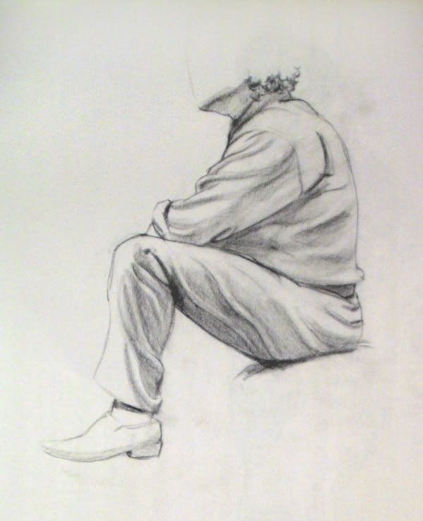
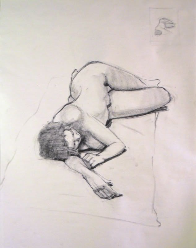
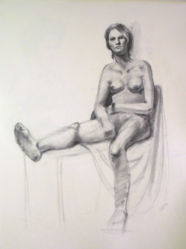
Working hard at school and enjoying every second.
As always, I'd love some feedback and critiques.
5m
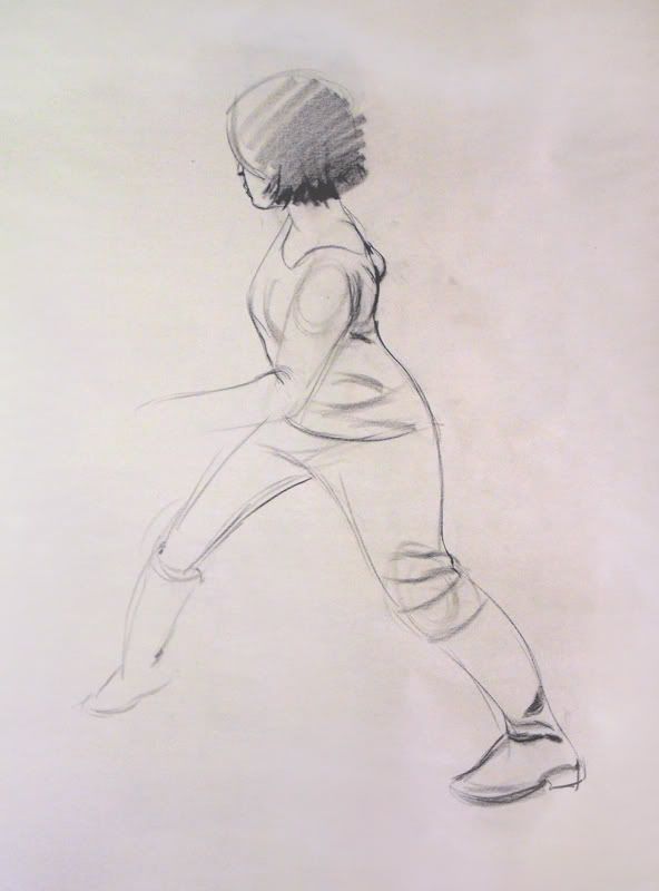
10m
20m
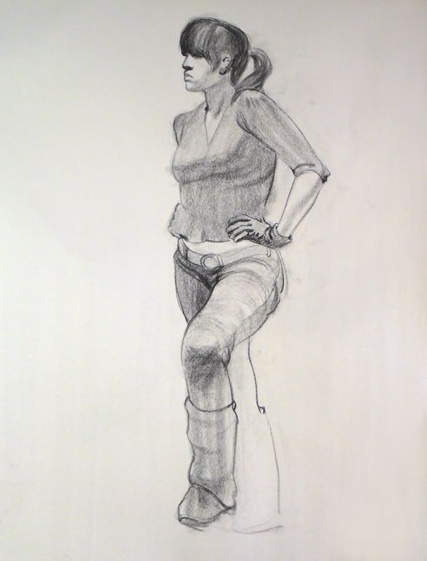
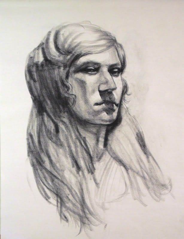
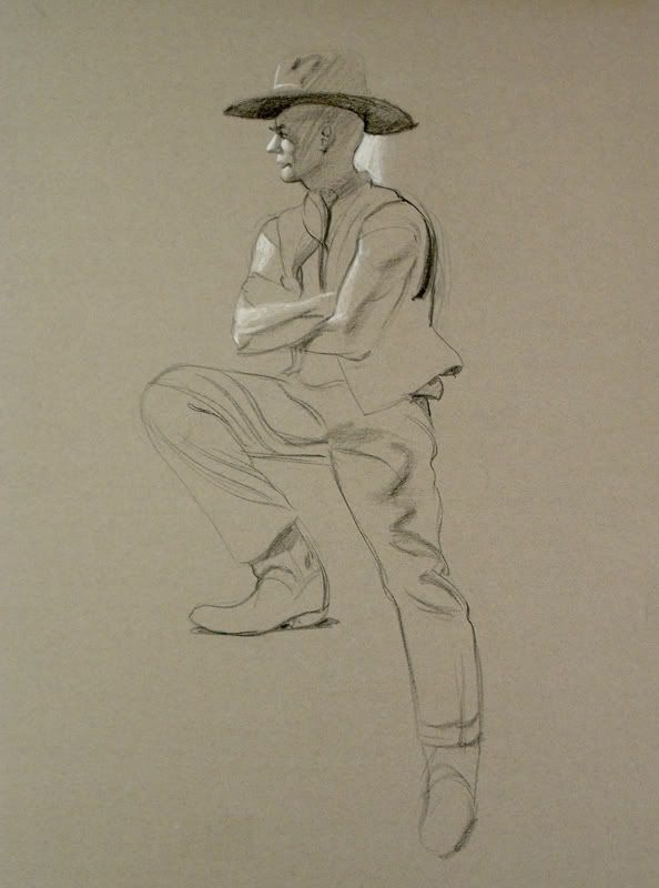
Jacob Collins Copy (24" x 18"):
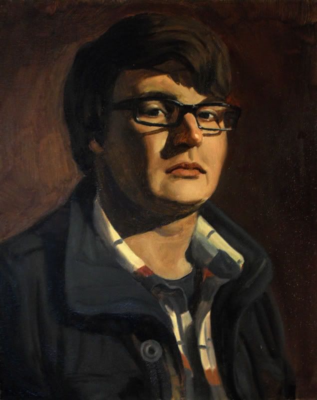
Self Portrait(18" x 24"):
Painting Final (48" x 36"):
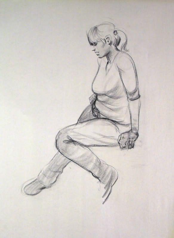
Working hard at school and enjoying every second.
As always, I'd love some feedback and critiques.
5m
10m
20m
Jacob Collins Copy (24" x 18"):
Self Portrait(18" x 24"):
Painting Final (48" x 36"):

DeeLock on
0
Posts
I made a TD for iphone and windows phone!
Guys grab your angry mob gear and meet up with me at... You cocky cock
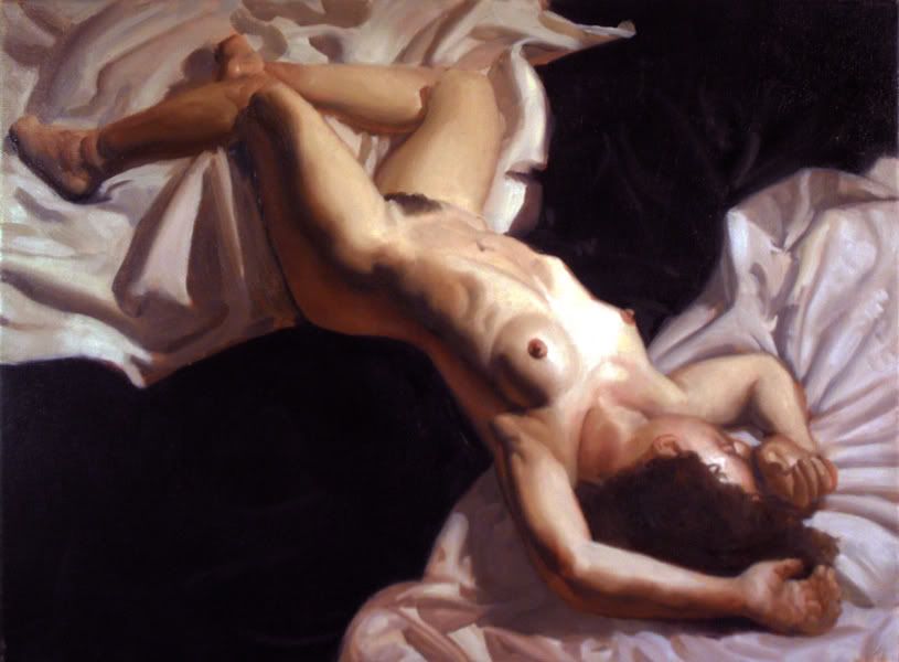
This is particularly strong, stronger than I think I could handle the subject.
m3nace: Uh...please don't organize angry mobs with the sole purpose of murdering me.
Bagginses: Nope.
cakemikz: Thanks man, that means a lot coming from you.
Flay: Thanks! Still a long way to go.
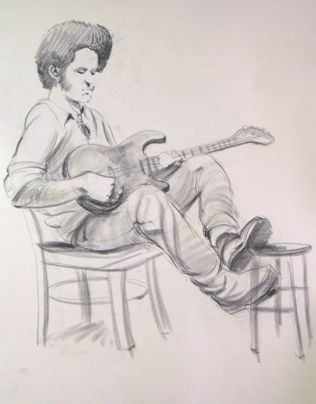
Did a portrait today of a friend of mine from a photo.
Ref
I'm a little unsure about the flesh colors but I'm not so much an expert in that area so I'll let someone better suited comment there. I would say, however, that there is a slight shift around the mouth towards a more greenish tone and it's giving almost the impression of stubble.
There are some observation discrepancies which are hurting the likeness, but I don't know how much of a painstaking study this was meant to be.
I totally agree with your opinion about the blurry look of it, while painting I tried to stay zoomed out and unfortunately used a big fatty airbrush for a lot of it. I downloaded some new brushes and I'm trying to use my oil painting experience for a fairly rough study.
I do need practice with getting a likeness and if you could point out what parts aren't looking right, I'd be grateful.
Thanks!
that little "s" means seconds?! omigawd.
3DS: 0447-9966-6178
3DS: 0447-9966-6178
are you some sort of art timetraveller?
3DS: 0447-9966-6178
However...
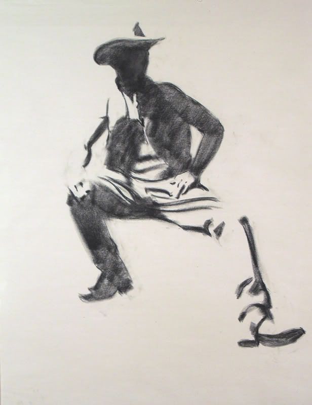
Hands and feet, dude. Hands and feeeeeeet.
Practicing hands and feet is the shittiest thing. Seriously, for me it's like pulling fucking teeth, but even if you finished them on your model drawings, that's better than nothing.
You finished them on your Jacob Collins piece, which is EXCELLENT! They look great (her left hand is looking a bit chunky though, like her fingers don't quite fit on her palm), so you should do that more.
The model study that Cake quoted is beautiful, however the hand on the outstretched arm looks very much like..well.. have you ever seen the movie "American Werewolf in London"? The scene where the main character changes into a werewolf, and there are all these crazy 70s effects going on and you see his hand transform into a werewolf hand, and it's all elongated? It looks like that. Unnatural.
Anyway, besides that nitpicky stuff, you've come leaps and bounds. It's amazing. Keep at it, because you rock.
Edit: THIS! (around 0:33-0:50)
NSFW due to man-ass
http://www.youtube.com/watch?v=Vgh1Wuzubiw
Check out my art! Buy some prints!
Thanks for the feedback and comments guys, I really appreciate it.
Here's my final assignment for my figure painting class at school.
Oil on Canvas
3' x 4'
edit: OH! Also here's the portrait I did for a forumer, if you haven't seen it already.
It's pretty incredible how much you've improved over the last year or so. :^:
Twitter
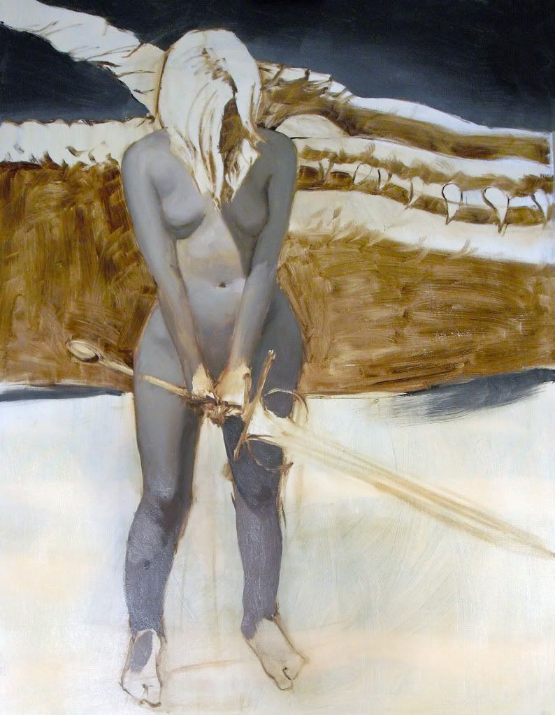
Here's a new painting I finished today.
NZ: Thanks!
I did a study of Velasquez' "Juan De Pareja". Man this guy was good...
But is this done or w.i.p. cos I would say that the face is still lacking the darkest
definition, which makes the original face stick out, or pop.