As was foretold, we've added advertisements to the forums! If you have questions, or if you encounter any bugs, please visit this thread: https://forums.penny-arcade.com/discussion/240191/forum-advertisement-faq-and-reports-thread/
Options
The fantastic comic of awesome wonderment. Temporary Insanity.
InsanelyZanter Registered User regular
Registered User regular
Greetings. those of you with quality taste in webcomics. I ask you to set that taste aside for a moment, and gaze upon my newly started project. The idea, you see, is to combine images with text. This creating a new medium in between the two! And then I stick it on the internet.
I call this unholy spawn of creativity, "Temporary Insanity". Which is no doubt required to develop such a idea.
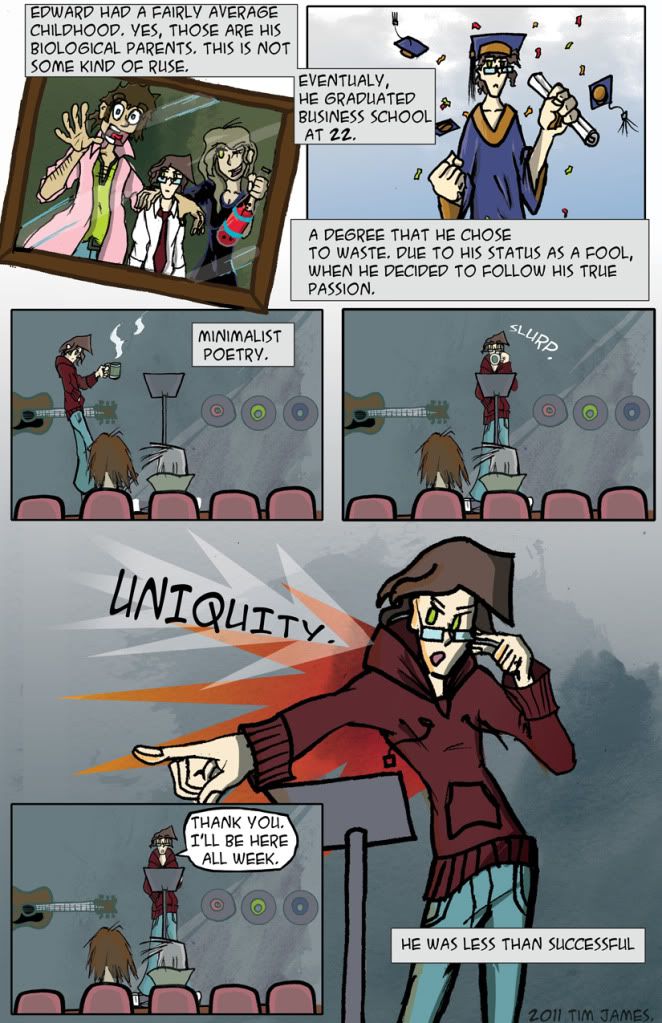
the comic follows Edward Jaye Maddock. A apartment owner in a world filled with ADVENTURE and a slice of MYSTERY. Instead of actively partaking in this adventure, he rents out his apartments. Until his new residents start dragging him into a supernatural turf war spanning the whole tristate area. There is also a kung-fu hobo scientist.
Cover page: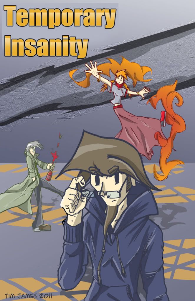 Page one:
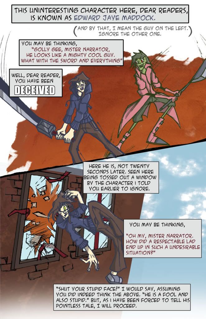 Page two: the sequel to the smash hit, page one:
I'm updating as fast as I can for now, but I'll establish a update schedule soon. Only two pages up so far, but lots of plot in store. Currently hosting on my deviantart, but I'm working on a website.
Follow updates on facebook! http://www.facebook.com/pages/Temporary-Insanity/119248842254
And twitter! https://twitter.com/InsanelyZanter
Alright, now that presenting this semi-professionally is over. What do you guys think? A lot of humor is based on character relationships, so until I get the main cast together it's not at it's best.
I have other comic ideas in store, But I decided this was the most widely appealing. here's some art from my other idea, a fantasy-scifi comic called no Rhyme No Reason.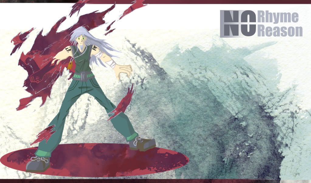
I call this unholy spawn of creativity, "Temporary Insanity". Which is no doubt required to develop such a idea.
the comic follows Edward Jaye Maddock. A apartment owner in a world filled with ADVENTURE and a slice of MYSTERY. Instead of actively partaking in this adventure, he rents out his apartments. Until his new residents start dragging him into a supernatural turf war spanning the whole tristate area. There is also a kung-fu hobo scientist.
Cover page:
I'm updating as fast as I can for now, but I'll establish a update schedule soon. Only two pages up so far, but lots of plot in store. Currently hosting on my deviantart, but I'm working on a website.
Follow updates on facebook! http://www.facebook.com/pages/Temporary-Insanity/119248842254
And twitter! https://twitter.com/InsanelyZanter
Alright, now that presenting this semi-professionally is over. What do you guys think? A lot of humor is based on character relationships, so until I get the main cast together it's not at it's best.
I have other comic ideas in store, But I decided this was the most widely appealing. here's some art from my other idea, a fantasy-scifi comic called no Rhyme No Reason.
InsanelyZanter on
0
Posts
Welcome to the AC!
Understandable. I went ahead and embedded them.
Thanks for the welcome!
Maybe he was successfull AFTER being less.
I really liked looking at the No Rhyme Reason thing
Logos can be a good thing to be good at
And here's some more comic!
But the biggest problem is probably structure. Your figures look like you don't really know much about anatomy and how things are supposed to fit together in a human body, or in objects (like the incredibly crooked sword in the OP). I can see you're not really going for realism, but before you can start to stylize properly you still need a decent understanding of anatomy and proportion and perspective. You should try some life drawing, use photographs, read a couple books (there's a good list of what books can help you in the questions and answers thread, I think). You just need to know the rules before you can start to bend and break the rules, especially in a comic that (judging by the huge swords) will have (maybe even semi-serious) fight scenes. Anatomy is important and it helps, so you should definitely try and acquaint yourself with it.
As for the actual character design, boy, you're not lying when you call the main dude uninteresting in the first page. Because he is. Very uninteresting. It's partially because he has a tremendously dull design, he looks like a schmuck without any unique features whatsoever. He's very plain. Nothing about his design sticks in the mind in any way. Also, it's partially the fact that, again, you don't know anything about anatomy, so he's not drawn consistently enough to actually have any unique, defining features. He's got the shape of a bundle of sticks with some clothes thrown on it, like the laziest scarecrow on earth. A proper scarecrow is recognizable, whereas a bundle of sticks with some clothes is just junk, and the same principles apply here. You need to learn how to construct people in your drawings.
Also, backgrounds. If you're gonna do backgrounds, put some effort into them. You either do that or make them minimalistic. Note, however, that minimalistic doesn't mean empty, nor does it mean looking like a child's drawing, which your backgrounds do. They're blobby and fingerpainty and they're not part of the same whole as your forground, perspective-wise.
And your page layouts are messy, your lettering and word balloons are barely decipherable and everything is really just hard to follow because it's so flawed.
So yeah, if you're at all serious about doing a comic you need to start with the basics and work your way up. You can keep going like this if you want and improve the comic as you go along with practice and so on, but I would personally recommend that you pause the thing for a bit, try and get the hang of basic structure and anatomy and perspective, redesign the characters and reevaluate the story because it really just completely fails to grab the attention at the moment.
Thanks, critique like this is exactly what I'm looking for.
Firstly, the main point of this comic is the "force myself to improve" factor you mentioned. My normal habits show improvement, but very slow. I have some other, much better stories I want to explore, but my art is way to sub-par to do them justice.
It's mainly a Shonen parody. So the comedic fight scenes will be abundant.
Anatomy is undeniably a area I need to work at. Just need to kick myself in the pants and find some good guides I guess.
The main character being astonishingly forgettable was completely intentional. The other important characters are (intended to be) very varied and weird. So he's supposed to contrast greatly.
Thanks, I'll try my best to work on everything you mentioned.