As was foretold, we've added advertisements to the forums! If you have questions, or if you encounter any bugs, please visit this thread: https://forums.penny-arcade.com/discussion/240191/forum-advertisement-faq-and-reports-thread/
Options

thedandmom's work

thedandmomthedandmom Registered User regular
edited July 2011 in Artist's Corner
ranger-7.jpg
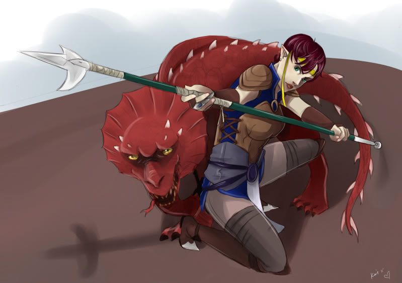
Hey everyone. I'm thedandmom, going to post my artwork here.

You can find more at http://kaitsurinn.deviantart.com/

linkbanner.jpg
thedandmom on

Posts

  • Options
    thedandmomthedandmom Registered User regular
    open.jpg
    suprisefin.jpg
    beholderpony-1.jpg

    linkbanner.jpg
  • Options
    sainsain Registered User regular
    I like the fencer, although I think the whiteness of her belt makes her waist/arm look really thin at first glance (on our left)

    Pony DnD is a pretty awesome idea too, haha.

  • Options
    thedandmomthedandmom Registered User regular
    Yeah I noticed that too and the Pony DnD one was a big hit too, I've found it posted on a few forums

    linkbanner.jpg
  • Options
    FugitiveFugitive Registered User regular
    So, in general, your grasp on anatomy is serviceable, it isn't your biggest weakness.

    The biggest problem with your work is a lack of really solid structure behind the forms. You seem to be trying to strike this weird middleground between cell-shading and formal rendering. By which I mean, you're trying to let the colors and shadows define where the forms end, but at the same time, you're still using these wispy sketchy lines to outline them. The consequence is that neither is being used to its fullest potential, and it's making the pieces look unfinished, like you accidentally left your sketch layer on. The girl in the military regalia is the most appealing thing you posted, and that's due in large part to the fact that you've used very deliberate strokes for the outlines and shading, with virtually none of the sketchiness seen in your other pieces.

    Since you also seem to be trying your hand at more thorough rendering, as seen in the non-Pony DnD image, I'm going to assume you're also interested in using light and shadow beyond simple cell-shading, so I'm going to recommend you read this. It's got a lot of good pointers on how to make your forms much more solid, and the artist is a lot better at explaining and illustrating their points than I am.

  • Options
    thedandmomthedandmom Registered User regular
    Fugitive wrote:
    So, in general, your grasp on anatomy is serviceable, it isn't your biggest weakness.

    The biggest problem with your work is a lack of really solid structure behind the forms. You seem to be trying to strike this weird middleground between cell-shading and formal rendering. By which I mean, you're trying to let the colors and shadows define where the forms end, but at the same time, you're still using these wispy sketchy lines to outline them. The consequence is that neither is being used to its fullest potential, and it's making the pieces look unfinished, like you accidentally left your sketch layer on. The girl in the military regalia is the most appealing thing you posted, and that's due in large part to the fact that you've used very deliberate strokes for the outlines and shading, with virtually none of the sketchiness seen in your other pieces.

    Since you also seem to be trying your hand at more thorough rendering, as seen in the non-Pony DnD image, I'm going to assume you're also interested in using light and shadow beyond simple cell-shading, so I'm going to recommend you read this. It's got a lot of good pointers on how to make your forms much more solid, and the artist is a lot better at explaining and illustrating their points than I am.

    Thanks, I will certainly take a look.

    linkbanner.jpg
  • Options
    BelruelBelruel NARUTO FUCKS Registered User regular
    The girl with the sword looks way too tall to me, as though someone stretched her body like taffy.

    vmn6rftb232b.png
  • Options
    thedandmomthedandmom Registered User regular
    Yeah, I really didn't like that one much either. The person who ordered it wanted me to use a very specific picture for a reference so yeah.

    also new picture!
    korra.jpg

    linkbanner.jpg
  • Options
    NibCromNibCrom Registered User regular
    Your structure looks pretty good. You could give more thoughts to the color scheme. All of the colors are isolated and not affected the surrounding objects. I realize that some of the elements are more graphic elements than environmental details, but I would expect the flame background to reflect onto the character, or at the very least the green crystals would have a glow to them and cast light on the ground and the boots. Maybe that's more work than is warranted for this particular piece, but some of these ideas might strengthen the mood of the piece.

  • Options
    thedandmomthedandmom Registered User regular
    edited July 2011
    it's supposed to have more a 1920's art nouveaux feel to it, to reflect on the feel of the time period that the new avatar series takes place in. The background stuff is supposed to just be decorative.

    thedandmom on
    linkbanner.jpg
Sign In or Register to comment.