As was foretold, we've added advertisements to the forums! If you have questions, or if you encounter any bugs, please visit this thread: https://forums.penny-arcade.com/discussion/240191/forum-advertisement-faq-and-reports-thread/
Options
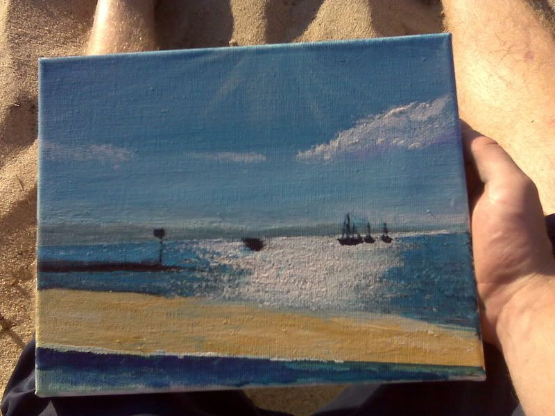
Obilex Goes to the Beach!
Obilex Registered User regular
Registered User regular
So I'm currently living in my cousin's back yard in their RV camper for the next 2 weeks on Martha's Vinyard in hopes of selling some prints and to change things up in the way I work. I brought with me 12 canvases, a pad of watercolor paper, and a whole ton of paint! I'll go more into depth on my trip progress soon, but here's the first painting of the trip!
Also, If any of you fellow AC people are on the island while I'm here, send me a PM and I would love to get together for a painting day on the beach!
Also, If any of you fellow AC people are on the island while I'm here, send me a PM and I would love to get together for a painting day on the beach!
Obilex on
0
Posts
here's some more
Hiking Essentials
Sounds like a lot of fun. Haven't been to the beach in a while.
Hiking Essentials
But the one I really want you to take a look at is this one:
Let's talk about brushstrokes. Robert is notoriously good at creating a feeling of depth without over-using tools like atmospheric perspective. He does this by paying careful attention to how he pulls his brushstrokes. In the far distance he pulls very thin perfectly horizontal (parallel to the horizon) brushstrokes, where in the foreground they get bigger and bigger and bigger. They also get less perfectly horizontal as they get closer to the viewers perspective. This accomplishes a number of things, but the primary is to make the ground feel like it is moving away from us. Imagine a tile floor receding into the distance. He is constantly observing that in reality.
But it also does a little more than that. It assists the viewer in gaining a better perception of where objects lie on the ground plane. Or how far away they are. By using this sort of thin horizontal tiles method, he can easily describe how far away something is by just carefully choosing where it intersects the tiles. We know if it is 2 tiles away, its fairly close, but if it is 50 tiles away...its pretty far. Of course he is just creating the illusion of these tiles so it's not as straight forward. But all of art is about molesting your audience's subconscious.
There is one last thing I want to point out about the ground plane tiling method though, and that is how easily it allows him to make the objects he is putting on the ground plane feel like they have weight. By sort of anchoring them to the ground tiles with strong verticals, he makes them pop and separate themselves from it without over-saturating or blowing things out of their proper value range. This applies to just about everything in the image from bushes to telephone poles. He really is a master and maybe this concept is a little advanced yet for where you are at, but I think it could really help your paintings.
Currently working on 5 different ones right now at the same time so I don't get tired of one, so the next update will be a big one! Till then, here's a photo I took yesterday to tide you folks over.
Hiking Essentials
reffed from a photo. I'll prolly add more to it.
Hiking Essentials