As was foretold, we've added advertisements to the forums! If you have questions, or if you encounter any bugs, please visit this thread: https://forums.penny-arcade.com/discussion/240191/forum-advertisement-faq-and-reports-thread/

Cricketto's Junk - NSFW

CrickettoCricketto Registered User regular
edited October 2011 in Artist's Corner
Sup ya'll. Been lurking for a bit. This place seems like fun. Guess I'll post some stuff here for kicks.

As for my artistic goals. I have no idea. Wouldn't mind making greeting cards though. Maybe I'll start a business for that or something.

Boyhood-Parenting101-ContradictionResize.jpgLupinfortheCamera-950x950.jpgDAWhite-Resize.jpgGorillaDoodle-Resize.jpg

Cricketto on
«1

Posts

  • GrifterGrifter BermudaModerator mod
    Dude with his hands up to the camera has an extra knuckle in his index finger. Otherwise, I quite like these.

  • CrickettoCricketto Registered User regular
    Thanks Grifter. I did not notice that about Lupin's hand. Guess I'll just have to improve.

    Here be a quick experiment I did today.

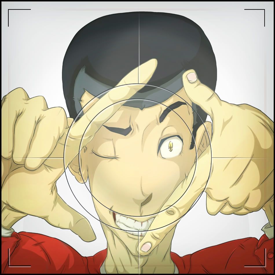
    MAKE THE VOICES STOP!!!

    MeMeMine-Lines-Resize.jpgMeMeMine-Resize.jpg

  • RubberACRubberAC Sidney BC!Registered User regular
    Hey! I really like that!
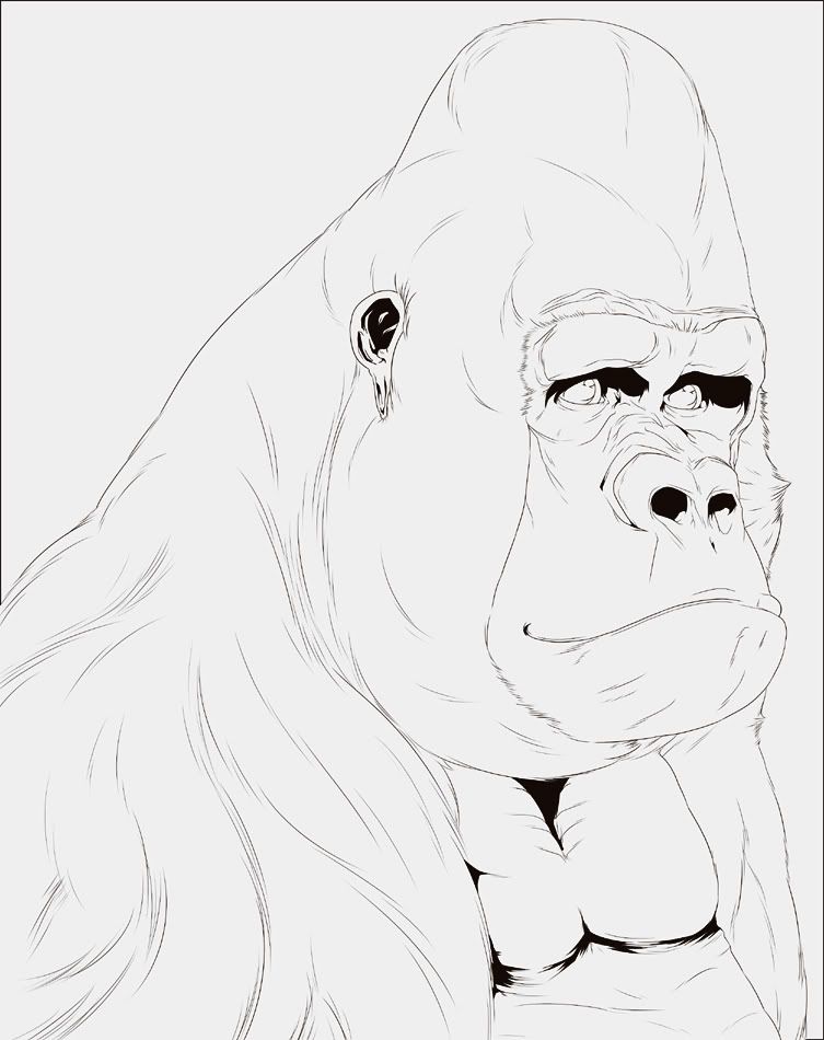
    Great contrast between coloring/simple lines and style
    and that gorilla is gooooorgeous

  • SiegfriedSiegfried Registered User regular
    Man yeah the color makes that 10000x better

    Portfolio // Twitter // Behance // Tumblr
    Kochikens wrote:
    My fav is when I can get my kiss on with other dudes.
  • MustangMustang Arbiter of Unpopular Opinions Registered User regular
    Pretty great. However construction seems to be your weak point at the moment, your stylised pieces all suffer the same problem. It's not terrible, but it's enough to be noticeable.
    Do you flip your work regularly? I tend to find this helps tremendously at pointing out those kind of errors.

  • CrickettoCricketto Registered User regular
    Did this at 1:00 in the morning. Don't know why.

    Instead of downing alcohol, I doodle, I suppose.

    MooningtheSun-LinesResize.jpgMooningtheSun-Resize.jpg

    Hehe, mooning the sun...

  • CrickettoCricketto Registered User regular
    Mustang wrote:
    Pretty great. However construction seems to be your weak point at the moment, your stylised pieces all suffer the same problem. It's not terrible, but it's enough to be noticeable.
    Do you flip your work regularly? I tend to find this helps tremendously at pointing out those kind of errors.

    Hmm. Nope. I never do the flippy thingy. Just haven't made a habit out of it yet. Thanks for that observation though. I'll work on that.

  • CrickettoCricketto Registered User regular
    Just a quickie I did not too long ago. T'was fun.

    ThatOldMan-LinesResize.jpgThatOldMan-Resize.jpg

  • earthwormadamearthwormadam ancient crust Registered User regular
    HEY! I like your stuff!

    I think your work suffers a bit from flatness syndrome. Not doing the thick outline thing, and giving thicker lines to the appropriate areas of the characters will help alleviate this though.

  • CrickettoCricketto Registered User regular
    Thanks for the crits, earthwormadam. I shall try doing that.

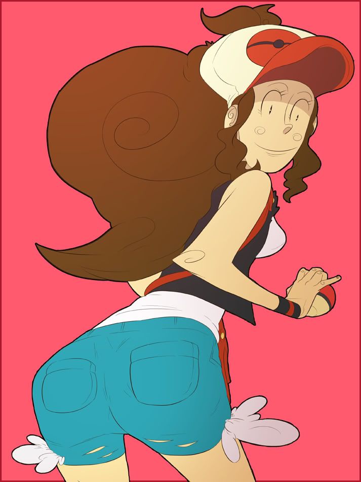
    In the meant time, here be a quick doodle I did of Midna a few days ago. She has a nice rear. T'was fun to draw.

    BackatYaMidna-LinesResize.jpgBackatYaMidna-Resize.jpg

  • CrickettoCricketto Registered User regular
    HOLY HELL this was a lot more work than I thought it would be.

    My pinky hurts... A LOT now...

    Zeldapocalypse-Final-Resize.jpgZeldapocalypse-Flats-Resize.jpgZeldapocalypse-Lines-Resize.jpg

  • CrickettoCricketto Registered User regular
    Here be a doodle I did for some drawing jam at CGHub.

    Hehe, nekid peeps on a hurse.

    SunnyRatorCard-CGHUBResize.jpgSunnyTarotCard-FlatsResize.jpgSunnyTarotCard-LinesResize.jpg

  • IrukaIruka Registered User, Moderator mod
    Cricketto wrote:
    Mustang wrote:
    Pretty great. However construction seems to be your weak point at the moment, your stylised pieces all suffer the same problem. It's not terrible, but it's enough to be noticeable.
    Do you flip your work regularly? I tend to find this helps tremendously at pointing out those kind of errors.

    Hmm. Nope. I never do the flippy thingy. Just haven't made a habit out of it yet. Thanks for that observation though. I'll work on that.

    How do you lay out your construction lines? Flipping the canvas will help, but you have some roaming features in general, I'm noticing that your left eyes are commonly closer to the nose than the right eye, even when the face is strait on (such as the sun in the last one, toon link on your mural, and lupin) Check your layout process and make sure you aren't skimping on getting things lined up, even in simple work its good to not have eyes and noses sliding around, it makes things look funky.

    I think you got some good stuff going, but I agree with EWA on the lines. I would push experimentation, Doing line weight based on volume and emphasis can really give a piece energy, check out Andrews tut for some ideas: http://smokinghippo.com/TSOtutes/inking_tutorial.html

  • CrickettoCricketto Registered User regular
    Iruka wrote:
    Cricketto wrote:
    Mustang wrote:
    Pretty great. However construction seems to be your weak point at the moment, your stylised pieces all suffer the same problem. It's not terrible, but it's enough to be noticeable.
    Do you flip your work regularly? I tend to find this helps tremendously at pointing out those kind of errors.

    Hmm. Nope. I never do the flippy thingy. Just haven't made a habit out of it yet. Thanks for that observation though. I'll work on that.

    How do you lay out your construction lines? Flipping the canvas will help, but you have some roaming features in general, I'm noticing that your left eyes are commonly closer to the nose than the right eye, even when the face is strait on (such as the sun in the last one, toon link on your mural, and lupin) Check your layout process and make sure you aren't skimping on getting things lined up, even in simple work its good to not have eyes and noses sliding around, it makes things look funky.

    I think you got some good stuff going, but I agree with EWA on the lines. I would push experimentation, Doing line weight based on volume and emphasis can really give a piece energy, check out Andrews tut for some ideas: http://smokinghippo.com/TSOtutes/inking_tutorial.html

    Thanks a bunch. Especially for the tutorial. I'm now beginning to notice the left eye thing myself now. It could be that I am SUPER right eye dominant. Wonder if I can fix that...

    I've mostly been posting slightly older stuff here. Here's a somewhat more recent doodle. I think I'm getting the hang of the line weights thing.

    KICKPUNCHSAKURA-LinesResize.jpgKICKPUNCHSAKURA-Resize.jpg

  • CrickettoCricketto Registered User regular
    This here be for a nifty SKRATCHJAMS thing.

    I tried doing Usopp (the newer, manlier version) as the Invisible man!

    Well I thought it was kind of cool...

    TheInvisibleUsopp-Resize.pngTheInvisibleUsopp-Lines-Resize.jpg

  • CrickettoCricketto Registered User regular
    Did a small series of these. Here's the first one!

    The Grass Starter Pokemon and their Queen!

    GrassyPrincess-Resize.jpg
    GrassyPrincess-LinesResize.jpg

  • IrukaIruka Registered User, Moderator mod
    You dont need to post a giant backlog of your work, you'll generally get more pointed help when you are posting stuff you are currently working through. Looking at your DA it seems like this is all pretty recent and you are just in general kinda high output, but getting feedback is a little easier if you aren't overflowing your own thread. If its all out of order, the people giving you crits also cant tell if you are trying to improve but missing some tips, or completely ignoring the input.

  • earthwormadamearthwormadam ancient crust Registered User regular
    Yeah what Ruka said.

    These are wicked rad though. But yeah, push that thickness up a lot, and stop with the bold outlines. Your stuff has great character, with some more dynamic lines, you'll be aces.

  • CrickettoCricketto Registered User regular
    Okey dokey then. And yeah, I'm practicing on the side with that line thickness thing. I think I'm getting better at it though. Will post results later in the week.

    MEANWHILE, my little bro has been bugging me a bunch the past couple days. Can't get anything done! Should be able to get back to full throttle tomorrow though.

    SquareVsCircle-Resize.jpgSquareVsCircle-Lines-Resize.jpg

  • CrickettoCricketto Registered User regular
    Just posting this for kicks. And I also wanted to add the line work. So yeah.

    PkGFinal-RGB-P.jpg
    FieryPrincess-Lines-Resize.jpgWetPrincess-Lines-Resize.jpg

  • rtsrts Registered User regular
    There are a lot of good things happening inside of this thread.

    skype: rtschutter
  • CrickettoCricketto Registered User regular
    edited October 2011
    Up at 3:00 in the morning, proving once again that drawing is my anti-drug.

    Instead of getting drunk and bringing home girls, I just draw them. Both funny and sad at the same time.

    LetBelBlossom-Resize.pngLetBelBlossom-Lines-Resize.jpg

    Cricketto on
  • CrickettoCricketto Registered User regular
    Just so we don't get off track, here's a quick doodle I did in order to practice the line weights thing.

    I think I'm over thinking it. I think...

    Prtce-1.jpg

  • SublimusSublimus Artist. nowhereRegistered User regular
    Boy, you sure do enjoy drawing butts!

    Not that there's anything wrong with that... Just sayin'.

  • CrickettoCricketto Registered User regular
    edited October 2011
    Sublimus wrote:
    Boy, you sure do enjoy drawing butts!

    Not that there's anything wrong with that... Just sayin'.

    Haha! I believe that is true! Maybe it's a fetish, or medical condition of some kind... Then again, I AM partially African, so go figure...

    Just some more practice.

    Prtce-2.jpg

    Cricketto on
  • CrickettoCricketto Registered User regular
    SEE!? I draw things other than buttockses! Like hands...

    HandsOnBottom-MODIFIED2Resize.jpgHandsOnBottom-LinesResize.jpg

    andabutt...

  • farbekriegfarbekrieg Registered User regular
    sirmixalotitis? your poor poor soul
    now bring more buttocks, of the rudest nature

  • FlayFlay Registered User regular
    Well, the first thing I noticed looking through these was how your line weights are improving, so you're doing something right!

  • CrickettoCricketto Registered User regular
    edited October 2011
    Why the hell is this not a movie yet!?

    ABvsGT-Resize.jpgABvsGT-FinalBnW.jpgABvsGT-LinesResize.jpg

    Cricketto on
  • CrickettoCricketto Registered User regular
    Just a quickie done for a contest tribute thing on deviantart.

    MasterHand-Resize.jpgMasterHand-Lines-Resize.jpg

  • CrickettoCricketto Registered User regular
    I've never drawn her before. SO I had to change that.

    More sexy bums. And stars.

    InARosalina-Resize.jpgInARosalina-Lines-Resize.jpg

  • CrickettoCricketto Registered User regular
    Just a quick intermission whilst I "fry some bigger fish", so to speak.

    Only 1 princess left, I s'pose.

    PeekABooDaisy-Resize.jpgPeekABooDaisy-Lines.jpg

  • IrukaIruka Registered User, Moderator mod
    Might want to mark this thread NSFW.

    I feel like the bare video game girl assess are cheapening your work, but thats just personal opinion, I guess. I can see some improvement in the line weight though

  • CrickettoCricketto Registered User regular
    edited October 2011
    Iruka wrote:
    Might want to mark this thread NSFW.

    I feel like the bare video game girl assess are cheapening your work, but thats just personal opinion, I guess. I can see some improvement in the line weight though

    The girls and stuff are mostly just fun little detours from the other stuff. They're also good practice! Glad my line work is improving.

    Here is the last princess. Might as well, considering I drew the other 2.

    ISeeYourPeach-Resize.jpgISeeYourPeach-LinesResize.jpgISeeYourPeach-SketchResize.jpg

    Cricketto on
  • CrickettoCricketto Registered User regular
    edited October 2011
    Me and my big mouth.

    I got all big and proud and was all like "Herp de durrp! Imma challenge myself lots! Push myself over the EDGE!"

    And then I burn myself out over this pic. My head hurts. But oh well. At least I'm challenging myself.

    CvsC-Resize.jpgCvsC-WIPResize.jpgCvsC-Flats.jpgCvsC-LinesResize.jpg

    Cricketto on
  • CrickettoCricketto Registered User regular
    edited October 2011
    Here are some practice doodles I did in order to help make myself feel better.

    Prtce-3.jpgPrtce-4.jpgPrtce-5.jpg

    Cricketto on
  • farbekriegfarbekrieg Registered User regular
    i really like the LR picture, however your endorsement of energy weapons over unarmed/explosives worries me a little bit (glad you pushed through and did it).

    Im really impressed at your prolific activity, and as a suggestion if you enjoy drawing chicks, how about some more diversity in them, meaning stylistically you have your own style already and its well defined, but your even your doodles are rather narrowly defined, i think playing with variety in shape and a greater palette of races might push you in some cool directions (again just a thought)

  • CrickettoCricketto Registered User regular
    edited October 2011
  • CrickettoCricketto Registered User regular
    SOMEONE CALL ELMER FUDD! 'Cuz it's Wabbit Season, baby!

    RabbitSeason-Resize.jpgRabbitSeason-LinesResize.jpg

  • earthwormadamearthwormadam ancient crust Registered User regular
    Try not to use the thick outline on everything so much. You have great style and character, but I don't think the thick outside lines does anything but detract from the overall aesthetics. The naked princess thing seems like its trying a bit too hard, though I did find the Pokemon one with the little mole guy pretty funny. The other ones, with the look at my puss and ass, not so much.

    That being said, you are showing some line variation here and there, so good job there. Keep working on it. Your characters have a lot of life to them, and that's not something easy to inject into toons. You've got some cool action pieces too, like that Astroboy one. I can dig it.

    I'd also recommend working on your color theory, I am def not one to talk, but it seems like sometimes the colors are being thrown around a little willy nilly and your backgrounds sometimes approach near hideous photoshop filter levels. Keep postin' though!

Sign In or Register to comment.