As was foretold, we've added advertisements to the forums! If you have questions, or if you encounter any bugs, please visit this thread: https://forums.penny-arcade.com/discussion/240191/forum-advertisement-faq-and-reports-thread/
Options

Disappointed Panels *Updated with new art*

RobWSalesRobWSales Registered User regular
edited July 2007 in Artist's Corner
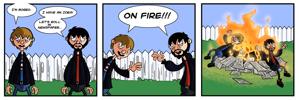
Hello, a friend and I have just started our own webcomic. It's called Disappointed Panels. It doesn't have anything to do with video games, so hopefully I'm not torn to shreds and called a PA ripoff. Let me know what you think.

A_Burning_Sensation_by_RobWSales.jpg

Thanks.

RobWSales on
«1

Posts

  • Options
    EntrYEntrY Registered User regular
    edited June 2007
    I'm sorry, but I must disappoint you..

    You are a PA ripoff. Although the art is clearly inspired by Gabe it does differ a bit, and you have tight linevariation.

    Besides from the joke being unfunny and random (again, I think you've been around the PA humour too long. This seems to be a product of their humour grinded through the minds of someone much less genius.) there is variation in the windows (no talking heads = good) and as you mentioned yourself, it's not about video-games. That is the only thing that makes it different from a complete PA ripoff, though.

    I'm sure much talk about how you can find your own style will ensue - enjoy.

    EntrY on
    beavotron wrote:
    hang on, i need to go put an adult diaper on before you continue explaining.

    Flickr ... Myspace
  • Options
    GrifterGrifter BermudaModerator mod
    edited June 2007
    Ummmm.... are you joking, Entry? It doesn't seem to be a PA rip off to me. Is it just because there's two guys in the comic? You're going to have to do better than just "It's a PA rip off" to convince me of your reasoning.

    Also, it's spelled "genius."

    Grifter on
  • Options
    CampionCampion Registered User regular
    edited June 2007
    The art style is completely different. Well, maybe the ears are similar, but c'mon, they're ears. The guys look identical to each other though. And it's kind of odd that they both have a knee on fire in the last panel.

    Campion on
    4484-7718-8470
  • Options
    srsizzysrsizzy Registered User regular
    edited June 2007
    That kind of humor was in no way invented by Penny Arcade at all...ever...no. Neither does the art look like PA. Clearly he's taken some artistic advice from PA for line weight and hands, but that doesn't make it the same style. The bodies and heads are shaped way differently.

    Advice: Work on conveying emotions. The two people just look like plastic toys in all the panels. The hands are these weird congealed clay figures that don't really move (and are the only thing that are a ripoff of PA style). The faces just don't really cut it, I'd suggest working on facial anatomy from life, and then working that into your style.

    Also, work on making funny jokes. The only reason popular comics like CAD, PA, or VGC can do anything close to this is because they're already famous so they can do anything and people will laugh. You need to have a foundation of actually good humor.

    srsizzy on
    BRO LET ME GET REAL WITH YOU AND SAY THAT MY FINGERS ARE PREPPED AND HOT LIKE THE SURFACE OF THE SUN TO BRING RADICAL BEATS SO SMOOTH THE SHIT WILL BE MEDICINAL-GRADE TRIPNASTY MAKING ALL BRAINWAVES ROLL ON THE SURFACE OF A BALLS-FEISTY NEURAL RAINBOW CRACKA-LACKIN' YOUR PERCEPTION OF THE HERE-NOW SPACE-TIME SITUATION THAT ALL OF LIFE BE JAMMED UP IN THROUGH THE UNIVERSAL FLOW BEATS
  • Options
    EntrYEntrY Registered User regular
    edited June 2007
    Ok, well, I must say it's not as bad a ripoff as other PA ripoffs we've seen, but it has some very distinct features in it, that shows that the creators have drawn imense inspiration from PA.

    That said, I may have been too blunt, since it's not hopeless at all, and I do hope I didn't give the impression that that is my opinion.

    Anyways, it may be tough to explain what makes it stand out to me as heavily inspired by PA, but for instance the hands in the first panel are very Gabe-ish, and as you said, it's two guys, and the "two guys, bla bla, pain/penis joke" is also something typical for a PA-ripoff.

    Actually, the term "PA-ripoff" may be a bit hard. But it is close. At least it's a nicely masked one.

    Kudos on the line-work and also the coloring, though.

    EntrY on
    beavotron wrote:
    hang on, i need to go put an adult diaper on before you continue explaining.

    Flickr ... Myspace
  • Options
    NakedZerglingNakedZergling A more apocalyptic post apocalypse Portland OregonRegistered User regular
    edited June 2007
    i like the art, not so much the joke. keep at it.

    NakedZergling on
  • Options
    MagicToasterMagicToaster JapanRegistered User regular
    edited June 2007
    EntrY wrote: »
    You are a PA ripoff.

    Is this our new thing?

    MagicToaster on
  • Options
    Aaron LeeAaron Lee Registered User regular
    edited June 2007
    EntrY wrote: »
    You are a PA ripoff.

    Is this our new thing?

    Seriously. I don't think there's any precedent for this claim. I could go find artists whom this style is much closer to than Mike's. Maybe merely the fact that he's posting on a PA forum makes you draw some unlikely conclusions, because I doubt if this were posted anywhere else on the internet, PA influence 2would not even be mentioned.

    Anyways, the style works for me. The characters are a bit stiff, and I'm not sure what kind of personality you're trying to depict (I assume they are really stupid?). The humor could use some work, but the style and colors work for me.

    Aaron Lee on
  • Options
    lyriumlyrium Registered User regular
    edited June 2007
    I put my vote in the 'this isn't a PA ripoff' column.

    Campion had a good point that the two fellows look very similar (as far as their face structure and whatnot). Maybe take some time to practice drawing faces that look very different from each other (but still make sense as faces). It will help you practice your style and encourage creativity in character design, which will help if you add more people to the comic.
    One thing that sticks out to me is that fire is very angular. The people are all round and curvy but the fire is mostly defined by straight lines. This is probably just personal opinion about something really trivial, but I figured I'd mention it.
    Overall this is a really nice start to a webcomic, hope you keep practicing and improving.

    lyrium on
  • Options
    IrukaIruka Registered User, Moderator mod
    edited June 2007
    Doesn't remind me of PA either. I would love if in general instead of jumping to be dicks, people would actually crit the quality of the art, Rather than if it falls into "I can shit on this dudes face as long as its about his web comic and I wont get in trouble" category.

    I actually really liked this, timing is good. I would imagine this kind of comic would be better over time, so that the characters develop. Its hard to tell with just this one, it could get good or it could get redundant. Reminds me much more of Men In Hats in terms of humor. I miss that comic so.

    Iruka on
  • Options
    EdcrabEdcrab Actually a hack Registered User regular
    edited June 2007
    Pretty neat art style, but I really don't like how similar the characters look (yay, I'm repeating what eight people have already said). I mean, if they're brothers or something I'll stand down, but generally I just find it irritating when unrelated characters have such major similarities in their facial structure. But hey, as an aspect of a style I could get used to it.

    As for the comic content... well, it's okay. I wouldn't bat an eyelid if I found it in some other comic's archives, but... you know... it doesn't really do anything. For outright randomness and their gleeful expressions at the end, though, you get many Interweb points :lol:

    Edcrab on
    cBY55.gifbmJsl.png
  • Options
    NibCromNibCrom Registered User regular
    edited June 2007
    Well I think the hands are very Gabe-like, but I like the art. Nice and clean, it's got a professional polish. I wish the characters were more...different. They're pretty much just repaints of each other.

    Good job on the backgrounds. I can't stand it when people used blurred photos. The fire looks good. I like the shading.

    I think the name of your comic needs work. Disappointed Panels just sets the viewer up to be disappointed. Calling your comic things like Boring People or Uninteresting Beings just puts a negative spin on the comic, it gives it a bad first impression.

    The joke...sorry, didn't do anything for me.

    Keep on illustrating, I think your art is pretty darn good.

    NibCrom on
  • Options
    D90D90 Registered User regular
    edited June 2007
    I agree with the majority here - I don't really see how this is a Penny Arcade rip off.

    As for the humor, it didn't do much for me, but humor is subjective, so people saying "make jokes that are actually funny" isn't particularly representative or actually constructive/usable advice in the first place.

    D90 on
  • Options
    NovusNovus regular
    edited June 2007
    I... I laughed; god help me I laughed. *sob*

    Novus on
    I'm not smart, but thanks to the internet I can pretend.
    wii Number 0648 2052 0203 3154
  • Options
    Stupid Mr Whoopsie NameStupid Mr Whoopsie Name Registered User, ClubPA regular
    edited June 2007
    What the fuck is this PA rip off?

    Stupid Mr Whoopsie Name on
  • Options
    amateurhouramateurhour One day I'll be professionalhour The woods somewhere in TennesseeRegistered User regular
    edited June 2007
    I wonder if an artist posted his stuff in a PvP forum would people call him a Kurtz rip-off, is this like the standard for any major art webcomic site these days? If this guy is a PA rip-off (which he's not), and Gabe took design ideas from (ripped off) Silver and imo genndy tartakovsky, who ripped off x, and so on, and so on, then shouldn't this guy really be ripping off the first caveman to draw a half naked cave chick or a tiger eating a dinosaur?

    (this wasn't a rant or anything, I think the comic was really good (especially the art) and I love the forums here... it's just early and I felt like throwing in my .02)

    amateurhour on
    are YOU on the beer list?
  • Options
    Lewis RiceLewis Rice Registered User regular
    edited June 2007
    I wonder if an artist posted his stuff in a PvP forum would people call him a Kurtz rip-off

    Nah, we're just pricks. ;-)

    Lewis Rice on
  • Options
    amateurhouramateurhour One day I'll be professionalhour The woods somewhere in TennesseeRegistered User regular
    edited June 2007
    Lewis Rice wrote: »
    I wonder if an artist posted his stuff in a PvP forum would people call him a Kurtz rip-off

    Nah, we're just pricks. ;-)

    Heh, that's why I post my art at the battle tourney and not here 8-)

    amateurhour on
    are YOU on the beer list?
  • Options
    GrifterGrifter BermudaModerator mod
    edited June 2007
    Lewis Rice wrote: »
    I wonder if an artist posted his stuff in a PvP forum would people call him a Kurtz rip-off

    Nah, we're just pricks. ;-)

    Heh, that's why I post my art at the battle tourney and not here 8-)

    Well done. Now, fuck off and stop derailing this thread.

    Grifter on
  • Options
    Stupid Mr Whoopsie NameStupid Mr Whoopsie Name Registered User, ClubPA regular
    edited June 2007
    Grifter wrote: »
    Lewis Rice wrote: »
    I wonder if an artist posted his stuff in a PvP forum would people call him a Kurtz rip-off

    Nah, we're just pricks. ;-)

    Heh, that's why I post my art at the battle tourney and not here 8-)

    Well done. Now, fuck off and stop derailing this thread.

    Fuck both of you. Both of your PA-ripoff asses! Now I gotta go run to the grocery store and ripoff some PA Milk before they ripoff any more PA from the PA PA PA PA. Ripoff.


    milk.

    Stupid Mr Whoopsie Name on
  • Options
    JandissJandiss Registered User regular
    edited June 2007
    Hey I just noticed something..
    What the hell are those lines around their elbows in all the frames?
    Do they have wiggly elbows?

    Jandiss on
  • Options
    lyriumlyrium Registered User regular
    edited June 2007
    Jandiss wrote: »
    Hey I just noticed something..
    What the hell are those lines around their elbows in all the frames?
    Do they have wiggly elbows?

    Maybe it's just a few strands of really long, really thick elbow hair that pokes through their shirts?

    lyrium on
  • Options
    Stupid Mr Whoopsie NameStupid Mr Whoopsie Name Registered User, ClubPA regular
    edited June 2007
    Seriously though, I don't think this falls even in a shade of being considered a "PA Ripoff." In fact, it's one of the better strips I've seen come through here. This single strip is good, got anymore?

    Stupid Mr Whoopsie Name on
  • Options
    Kewop DecamKewop Decam Registered User regular
    edited June 2007
    art is good, the comic itself is a bore though.

    Kewop Decam on
    pasigfa7.jpg
  • Options
    EdcrabEdcrab Actually a hack Registered User regular
    edited June 2007
    Heh, I hadn't noticed the elbow-squiggles. So what are they?
    This is so definitely a PA rip-off. C'mon. There's far too much in common between the setups for it be to coincidence. Two people. And they have eyes, noses, hair, clothes...

    To be fair there's something PAish about the hands, but otherwise there's nothing to stand on beyond them both being comics...

    Edcrab on
    cBY55.gifbmJsl.png
  • Options
    Kewop DecamKewop Decam Registered User regular
    edited June 2007
    Edcrab wrote: »
    Heh, I hadn't noticed the elbow-squiggles. So what are they?
    This is so definitely a PA rip-off. C'mon. There's far too much in common between the setups for it be to coincidence. Two people. And they have eyes, noses, hair, clothes...

    To be fair there's something PAish about the hands, but otherwise there's nothing to stand on beyond them both being comics...


    it's a mix of many styles if you ask me, not just PA.

    That's not his problem if you ask me... the strip just isn't funny

    Kewop Decam on
    pasigfa7.jpg
  • Options
    IncenjucarIncenjucar VChatter Seattle, WARegistered User regular
    edited June 2007
    They have... the bodies of generic adults from The Kids Next Door... and the eyes of a vacant Invader Zim character...

    They look so... artificial and inflexible... like they're those rubber-covered-wire toys...

    And they don't appear to be on the fire so much as floating over it slightly.

    I get the overall feeling that they are half-balloon, half-man, half-bearpig (okay, maybe not bearpig).

    Palms look like they've been bee-stung.

    The burning paper could use some transition. You have either "On fire" or "Pristine." Need some "half-burnt" cinders and the sort, if you care to get that detailed.

    The lines and coloring are great though.

    There is definite talent here. But the style is decidedly... atypical. Whether that's bad or good depends on taste and how the strip goes, obviously.

    Also: Is it twilight? The light seems to be coming -really- strongly from that one side, rather than from the sky at all. If so, you may want to try to add some shade to the background as well. The foreground objects and characters have shading, but the background has no hint of it.

    Incenjucar on
  • Options
    RobWSalesRobWSales Registered User regular
    edited June 2007
    Hey, thanks for all the feedback everyone. I've never really drawn in such a cartoony style before, so it's all pretty new to me so hopefully I get better at it. I appreciate the comments on the humor itself as well, I guess I'll have to try harder with the next ones.

    Oh, the squigglies on their arms was just an attempt on my part to stylize the folds in their shirts. Guess that part didn't come out so well.

    Thanks again for the feedback.

    RobWSales on
  • Options
    hijinksensuehijinksensue Registered User regular
    edited June 2007
    The art is pretty distinctive as far as cartoon-styles go. I see some influences but definitely not a rip-off. I wouldn't say I dont GET the joke. I would say there isnt a joke to be had. Not dogging you, but it looks like 100% of your effort went into the art and none went into the writing. The last panel taken out of context is actually pretty funny by itself. Maybe team up with a writer?

    hijinksensue on
    HijiNKS Ensue
    geek comic
    www.hijinksensue.com

    [SIGPIC][/SIGPIC]
  • Options
    RobWSalesRobWSales Registered User regular
    edited July 2007
    Here's the new webcomic for a week. This one as well as a few other were drawn before I posted up the first one, so I wasn't able to put any of it to use in this strip. The lighting really bugs me now that it's been pointed out that it doesn't look like it's coming from the sky. I do actually work together with a writer named Chris Hebert on these things. Anyways, here is the new comic.

    Pizza_Bodies_by_RobWSales.jpg

    RobWSales on
  • Options
    srsizzysrsizzy Registered User regular
    edited July 2007
    Uhm...do the jokes go anywhere besides "random"?

    srsizzy on
    BRO LET ME GET REAL WITH YOU AND SAY THAT MY FINGERS ARE PREPPED AND HOT LIKE THE SURFACE OF THE SUN TO BRING RADICAL BEATS SO SMOOTH THE SHIT WILL BE MEDICINAL-GRADE TRIPNASTY MAKING ALL BRAINWAVES ROLL ON THE SURFACE OF A BALLS-FEISTY NEURAL RAINBOW CRACKA-LACKIN' YOUR PERCEPTION OF THE HERE-NOW SPACE-TIME SITUATION THAT ALL OF LIFE BE JAMMED UP IN THROUGH THE UNIVERSAL FLOW BEATS
  • Options
    Stupid Mr Whoopsie NameStupid Mr Whoopsie Name Registered User, ClubPA regular
    edited July 2007
    Yeah, "random" will get stale real quick

    Stupid Mr Whoopsie Name on
  • Options
    milknpeachesmilknpeaches Registered User regular
    edited July 2007
    The art on the second one really improved. The shading on the background is pretty nice, but I might change a few things. I would take out the sidewalk on the left, because even though it looks good it draws the reader's eyes down and away from the characters' expressions. To be honest I didn't even see that the pizza slices had faces until the second time I looked at your comic.

    Also, the shading on the grass looks much better than in the first strip, but in real life I think that the shadow would fall under the white fence, not just across the lawn. Also, having some darker green under the fence would give it some weight. With the extremely green grass contrasting with the extremely white fence, and no shadows whatsoever, it looks too flat.

    milknpeaches on
  • Options
    MKRMKR Registered User regular
    edited July 2007
    Needs more dynamic pose and better jokes. Random might work for the 13-18 year old majority at deviantART, but you need to be more clever to amuse people here at PA.

    MKR on
  • Options
    HugmasterGeneralHugmasterGeneral Poopmaster General YobuttRegistered User regular
    edited July 2007
    Hey, I got an idea for your next strip. The style is different, but I used your techniques and humor. I think everyone will be majorly impressed.
    panels.jpg
    Really, you copy paste your art a little too much, and random jokes are only funny if surrounded by realstic situations the majority of the time. We still know nothing about your characters. We don't know their names, their occupations, whether they're on drugs or just insane, whether they have friends.. we gotta know something.

    HugmasterGeneral on
  • Options
    JandissJandiss Registered User regular
    edited July 2007
    Actually did any of you guys check out his Deviant art site? There is not alot there but some of the sketches are pretty cool and funny.
    There are a few of just random superheros eating sandwiches. They made my heart smile.
    Seriously tho, check it out.

    Jandiss on
  • Options
    Stupid Mr Whoopsie NameStupid Mr Whoopsie Name Registered User, ClubPA regular
    edited July 2007
    Oh my gooses, Yaw, that made me laugh considerably.

    Stupid Mr Whoopsie Name on
  • Options
    EntrYEntrY Registered User regular
    edited July 2007
    He actually didn't copy/paste (at least not in the sense where you technically make the computer copy a piece of graphics), he drew every panel again.

    EntrY on
    beavotron wrote:
    hang on, i need to go put an adult diaper on before you continue explaining.

    Flickr ... Myspace
  • Options
    MKRMKR Registered User regular
    edited July 2007
    EntrY wrote: »
    He actually didn't copy/paste (at least not in the sense where you technically make the computer copy a piece of graphics), he drew every panel again.

    If that's true, he spent way too much time mastering symmetry and not enough on improving his style.

    MKR on
  • Options
    jpegjpeg ODIE, YOUR FACE Scenic Illinois FlatlandsRegistered User regular
    edited July 2007
    I watched your videos on your myspace and holy shit those are so funny. The april fool's and scotland interview ones were hilarious, great work on those.

    jpeg on
    so I just type in this box and it goes on the screen?
Sign In or Register to comment.