As was foretold, we've added advertisements to the forums! If you have questions, or if you encounter any bugs, please visit this thread: https://forums.penny-arcade.com/discussion/240191/forum-advertisement-faq-and-reports-thread/
Options
Linespider's Place of Stuff(NSF56K)
Linespider5 ALL HAIL KING KILLMONGERRegistered User regular
ALL HAIL KING KILLMONGERRegistered User regular
I will have things here shortly. I haven't made a thread in a long time...two seconds here please.


Linespider5 on
0
Posts
I kind of have a certain obsession with the original Quake.
Often I like things raw and messy, because there's a lot of vitality and impact in the image when it works. But I'm also very interested in being able to refine and polish what I do. A lot of my character work comes from an effort to achieve something along those lines. Ideally, I'd like to be able to land somewhere that lets me do both, stylistically speaking.
I've seen a great deal of digital art that succeeds at an extremely refined presentation and dynamic coloring in the work. I would like to gain a better understanding of the methods that allow these types of outcomes while maintaining my art style.
This pirate is something I've been afraid to work on for a while. The line art was so perfect on its own, and I really didn't want to riddle the image with details, because it seemed strong enough that it didn't need them, and would only reduce the picture's effectiveness. At the same time I imagined the image to be much more colourful than it turned out-I really imagined a great deal of green and red accents in it, looking at the original sketch, but I haven't come up with an effective way to bring that out without compounding additional details. I'm still pretty happy with the outcome, although I have a strong sense that with some smart surgery it could really pop a lot more, and some of the features of the work, particularly in the face and the bald head, could be more architecturally defined than they read right now. Any suggestions or examples on how to magnify what I'm doing here would be greatly appreciated.
Here's an example of some other work I've got on my plate as of late. A lot of what I do initially begins as a sketch on paper before being transferred to photoshop, where it inevitably becomes the basis for line work that will in turn house the coloring and lighting I'm looking to impress on the design. For a long time I've been looking for elegant methods to allow the linework to lead me to the eventual finished look without having the lines themselves dominate the picture. Sometimes I'm more successful at downplaying the linework than others, but this is a fairly good example of how I'm going about reducing the linework after the image itself has been largely determined. There's quite a lot of work yet to do, but you can see how the image on the right is miles ahead, yet still carries the structural information laid down by the linework, enabling me to move past it.
Granted, right now I have some complex stuff to resolve, particularly the innumerable crevices in the turtle shells roped onto this fellow's head...but overall, it's a massive improvement in moving past what can be considered a drawing-an interesting drawing, yes, but still too clearly defined as such-and now begins to succeed beyond the illustration level into something more painterly but still maintaining the work that brought it to this point.
Crits: you need to work on the structure of your figures. I like the paint style, i think it works, but the structural issues really detract from your figures. I think because of the nature of these characters... being somewhat abstracted.. it'd be most useful for us to see some figure drawings that you do. Not so stylized and it'd help give you a bit more focused critique.
I am really digging your environments, I'd love to see more along those lines but again with a bit more structure. Right now it's very abstract, just sort of angular shapes, which make interesting pieces, but for concept I'd like to see some actual believable spaces done in this style.
Great work, I'd like to see more from you
First I got Number 48 here, who's someone I've been wanting to draw for ages, but dammit if he ain't a tough one (plus there's the fact he's basically dressed in nothing but stark black and white). I'll probably come back to him someday, again.
Aaaand here's a figure I referenced out of a Guardian piece back in May or so. Oftentimes when I've got a reference everything will just come out a LOT looser without structural preoccupations or obsessive sketching. I like the looseness of it, and I'd love to do something in Photoshop with it, I just haven't figured it out yet. Plus the whole 'no legs' thing.
(having a terrible time getting this image to post for who-knows-why)
Here's one of my sketches that I've spent some serious time on, prior to any real digital work on it. Just drafting and mechanical pencils on this one, but I think it should give you some more ideas on my method.
The Big Daddy here represents a lot of challenges for me, in terms of properly shadowing and coloring something. There's all this lovely odd detail in the machinations of the creature, and although there's a certain dress code for what a Big Daddy is, it allows a huge amount of variety at the same time.
But then there's getting it decided in terms of agreeable materials and colors and it gets soooo much trickier.
Here's an image of the original hand drawn BD for comparison:
Some homemade nightmare fuel.
I've started to conceptualize that a realized piece should proceed out a series of steps, with each step involving fewer actions than the previous one. Maybe this is incorrect, but it sounds plausible. The purpose of this would be reinforcing one's art style, enabling effective time management of a project, and allowing pieces to objectively be completed through predetermined planning.
This could be hogwash. Half of this likely is. But in my head I'm imaging an inverted pyramid with each row representing a stage of finishing the work, with the the lowest point of the triangle being the finished piece. Some of this comes from a feeling I have that, unlike the inverted pyramid example, my process would likely be much more jagged and uneven and not really achieving that final point-which leads me to suspect I could do what I do more efficiently, and work against myself a whole lot less.
Much of this stems from an idealized sense of my own work reaching a 'finished' state which generally eludes me. I end up experimenting more than creating. I would like a better sense of getting there.
Is any of this sounding familiar to anybody here? This is not specifically about technique, because I think what I'm talking about would apply to any art style, broadly speaking. I guess what I'm asking for is kind of an open discussion on methodology, in terms of how people approach a piece of their work and complete it.
I'm gonna try to share how I go about it. I'll post as things emerge.
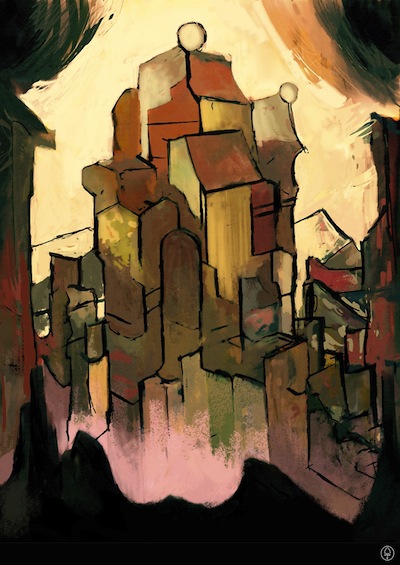
Usually I draw from scratch on something. In this case, a simple example of interplay of black and white brushwork, cooking together a composition. A certain suggestion of space and scale, and, not a heck of a lot more than that. I drummed this up by accident and then shaved some of the borders and filled the black solids, that kind of thing. Little tidying up so it's less scribble and more shape.
I ended up doubling the size of the image, then dropping the opacity to less than half, so I could work on another layer over it to use outlines for emphasis and to suggest new details. Something has emerged, suggesting a figure crouching over a watery expanse with some kind of wreckage or ruins cast around a rocky outcropping across a bay or something. Some less defined objects in the foreground to the right. It seemed to dictate a higher peak overlooking everything and emphasizing a vertical layout.
for fun I've also added my Cintiq Photoshop layout just because:
Examples of work that attracts me:
Paul Pope
Hokusai
Mignola
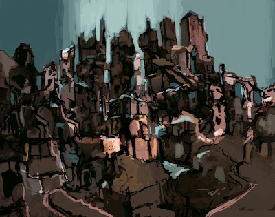
This is more or less an attempt at setting the desired mood of the piece. I feel there's a lot more that can happen here yet, but the working design is giving a better sense of color and shadow to what's happening...
The yellow outlines on the beam structures (light from an offscreen sunset?) just completely happened by accident. I wasn't planning it or anything, but it's working in a really interesting way that seems to dictate where this is all gonna go...
This is embarrassing for me to admit, but I have been up until this week entirely ignorant of masking techniques in Photoshop. I can excuse myself a little because I am almost entirely self taught with the software, but maybe that's a little obvious to some of you already. I would submit in my defense that 99% of online tutorials are one of two things: Either extremely generalized fundamentals, or extremely specialized specific techniques. Either you're looking at some guy spending ten minutes explaining how to remove the background from an image, or someone else spending six minutes explaining how to make a window appear frosty with realistic lighting.
Not a lot of middle ground.
I wish to submit this guy, though, for having some excellent, meaty stuff that lies in the mid-range of actual digital illustration from scratch. Not the most excellent voice quality, but the content more than makes up for it. Best of all, it's stuff you can apply to just about anything you might want to be doing, and also stuff you wouldn't necessary uncover on your own going into Photoshop blind.
Core digital painting technique:
http://www.youtube.com/user/Bugmeyer#p/u/5/Hi_3HymnpXE
Removing the white from a scanned line drawing quickly:
http://www.youtube.com/user/Bugmeyer#p/u/6/qDq426DMC04
Masking and you:
http://www.youtube.com/user/Bugmeyer#p/u/1/Zw30GfWeR1E
Adjustment levels and why they rock:
http://www.youtube.com/user/Bugmeyer#p/u/0/RnDF22yfVCQ
I'm currently working on mentally fitting this all into my methods, which is simultaneously gratifying and aggravating.
I think this sucker may almost be done.
I dig the rocks, though.
I dunno, maybe somebody with better words for things can shine some light on it?