As was foretold, we've added advertisements to the forums! If you have questions, or if you encounter any bugs, please visit this thread: https://forums.penny-arcade.com/discussion/240191/forum-advertisement-faq-and-reports-thread/
Options
Skyward Sword (feedback welcome)
kingworks Registered User regular
Registered User regular
At the risk of getting laughed out of here ...
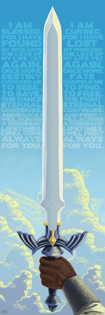 Photoshop CS4, Wacom Graphire4 6x9
~8 hours?
~8 hours?
kingworks on
0
Posts
Welcome to the forums!
I erred on the side of making the text legible ... maybe it'd still be readable at 75%?
Do you think it'd be possible to reposition the arm slightly to make the pose feel less artificial? I can't do much with the sword, since the whole layout is based around it being vertically centered.
kingworkscreative.com
kingworkscreative.blogspot.com
The arm is off. Maybe try flipping it so the fingers are curled toward the viewer?
I do agree that having the fingers towards the viewer would be more interesting (sans-triforce). I'd just have to make sure the sword was still being held in his left hand.
EDIT: Oh, and thanks for the feedback!
kingworkscreative.com
kingworkscreative.blogspot.com
The text starts and ends kind of abruptly. Maybe integrate it into the clouds as it moves further down the image? And the clouds seem kinda oddly placed around the main image. Awkward areas just to the left of the base of the blade where the Triforce is, stick out the most.
INSTAGRAM
When I read about Skyward Sword, there was something about it that made me think of Michael Morcock's Eternal Champion and how living out the life of a hero over and over again - same people, (somewhat) different settings - could be both a positive and negative thing.
EDIT: Can anyone recommend a good tutorial or tips on digitally painting leather texture by hand?
kingworkscreative.com
kingworkscreative.blogspot.com