As was foretold, we've added advertisements to the forums! If you have questions, or if you encounter any bugs, please visit this thread: https://forums.penny-arcade.com/discussion/240191/forum-advertisement-faq-and-reports-thread/
Requesting Logo/Icon Design Critique (Updated: 12-23-2012)
kingworks Registered User regular
Registered User regular
Need to build up my portfolio. Let me have it.
kingworks on
0
Posts
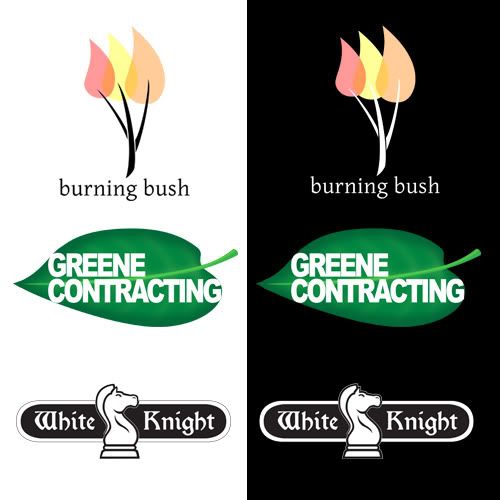
Greene Contracting is good, but I'm assuming the leaf bears significance to the company? (Is it a Green company?) I would shrink the font just a point or two though so it doesn't touch the edges of the leaf. Especially with the white background it's a little distracting.
Burning bush font is great, but I'd change the colors a little. I can barely see the overlap between the flames at the base of the bush twigs, and that's a cool detail that should stand out more.
Greene Contracting: The small slivers of green (where the last "G" is) create distracting focal points. It doesn't look like there was too much thought put into this logo. It feels like you typed up the name and put it on a stock vector leaf image. I would put more thought into how the stem of the leaf could enhance the movement of the piece.
White Knight: This is my favorite of the three. The stroke around the chess piece and the stroke around the curved rectangle seem a bit delicate. I would make them just slightly thicker, although it almost seems like it's more of a rendering problem. On the white background the bottom black line under the rectangle looks blurry. I would consider changing the rectangle shape to make it a little more interesting. Maybe like a castle wall? The key would be to not make it too busy or complicated.
What program did you create these in?
Greene Contracting: I don't really like this at all, the tangents on the type and the leaf is all kinds of distracting. The whole design is pretty weak.
White Knight: Love this as it is.
Excellent font choices on Burning Bush and White Knight.
Bush: My laptop LCD tends to wash out colors, so I often err on the side of making things too light for fear that they are actually too saturated. I really need some way to calibrate it.
@NibCrom: How would you make the bush more 'bushy?'
Leaf: I agree that the leaf is the weakest of the three. I was going for a negative space effect on white, but it totally falls apart over a dark BG.
All three of these were totally made up simply to give myself some experience. The images were done completely from scratch in Illustrator CS4 and the fonts are courtesy of dafont.com
I'll tweak these and work on getting some more designs up in this thread.
kingworkscreative.com
kingworkscreative.blogspot.com
Invest in a good monitor when you have the chance!
Keep at it!
kingworkscreative.com
kingworkscreative.blogspot.com
www.lotd.org
Logos will eventually (hopefully) be printed out on promotional items. Sometimes the number of colors will not matter, sometimes it will. If one wants to say, get a logo printed on a pencil, the first color might be free with a small fee for each additional color. There might be a maximum of four colors allowed. It will be more expensive, and options will be more limited, for a company to work with a logo that involves gradients or multiple colors. That isn't to say a company should discard those options - but there may be a trade off, so its something small start ups should consider, and that logo designers should keep in mind.
White Knight: This is my favorite. I think here I would like to know what the logo goes with, since that would modify my opinion of how well it works. Currently, the logo is very 'curvy' with the rounded edges and the pudgy horse - but it might have more impact with cornered edges and a more fierce looking chess knight. It might help if the horse was moved back to the left a hair, and raised slightly rather than sticking so far below the design, with a larger head that angled downwardsto direct the eye back towards the name of the company. I like the lower case letters of the font, but not the upper. I think this is because the upper draw up in on themselves rather than lead on to the rest of the word.
The examples you can find on that website not only often have excellent composition in their designs, but are very, very creatively executed. They're very inspirational and informative, and I think it could help you to just browse a handful and think about what makes each so effective.