As was foretold, we've added advertisements to the forums! If you have questions, or if you encounter any bugs, please visit this thread: https://forums.penny-arcade.com/discussion/240191/forum-advertisement-faq-and-reports-thread/
Three Dollar Bill Web Comic
ShadowMaginis Registered User regular
Registered User regular
Ok sorry I linked my comic and was "Site Whoring" I'm such a slut sometimes. I was at work and Didn't have access to my comics to post them here, but now I do.
Here are a few of my comics. It's a bit more, low brow, than Penny Arcade but hopefully good for some cheap laughs.
The first is my most recent, so any art critique should mostly be based on it.
Here are a few of my comics. It's a bit more, low brow, than Penny Arcade but hopefully good for some cheap laughs.
The first is my most recent, so any art critique should mostly be based on it.
Here is my webcomic! http://www.3dbdotcom.com/
ShadowMaginis on
0
This discussion has been closed.
Posts
INSTAGRAM
If you're looking for critiques, post a couple of your comics in this thread.
well don't i feel like a boob, sorry i posted this up at work on my crappy computer...wasn't try to break the rules. Thanks for pointing it out. I should have just waited till i got home and could properly submit it.
Fixed it!
Apart from that who knows, it could grow to become the next Penny Arcade, it's not any worse than the first few Penny Arcade strips.
Or it may burn in webcomic Hell for all time. >:^['
All. Time.
Lol. Maybe they will like it down there in web comic hell.
I am not really trying to make a "Pop Culture" comic. It's just a comic about geeky things. It doesn't matter to me how old the subject matter is at all. I make some comics about recent stuff, and others about things long since dead. I believe the older something is, the more likely a larger number of people will be familiar with it.
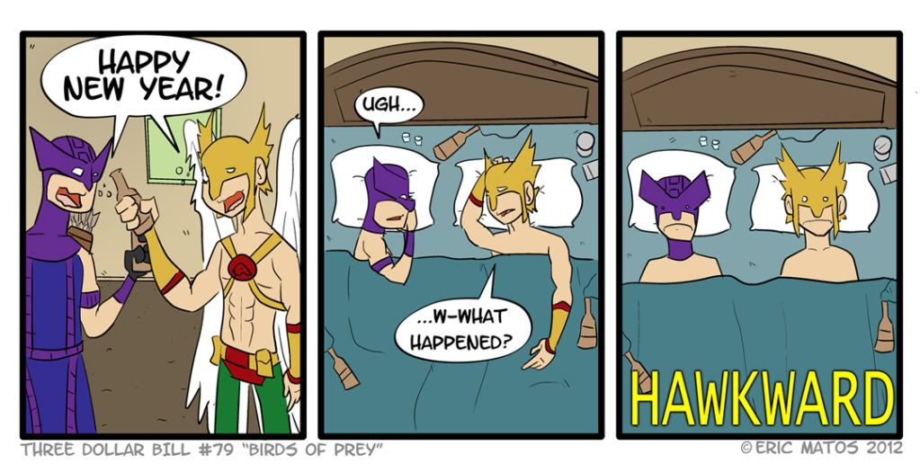
Your characters are well designed, you've got a good grasp of anatomy, the jokes (even the dated ones) are funny (I laughed), it's expressive, there's no comic sans, Hawkward was f'ing hilarious to me, and I've added it to my bookmarks.
Congratulations. I am pleased.
edit: it looks like you took the link down. Now that you've posted art, but a link to the comic back in your sig or something.
double edit: what are you using for your CMS manager? inkblot + webcomic? It doesn't look like comicpress, and your navigation system is a little difficult to use. You have to click "permalink to this comic" to get the proper url and that might hurt your google indexing a little.
I know that when I googled "3 dollar bill webcomic" the closest I got to your site was the about page, and that was like 12 links down... Might want to look into an SEO plugin or comicpress to fix that.
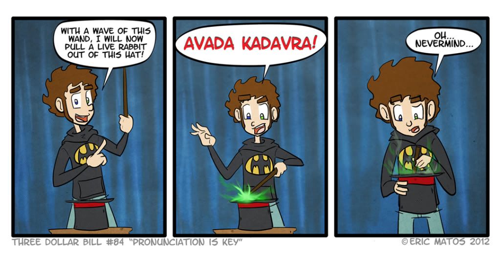
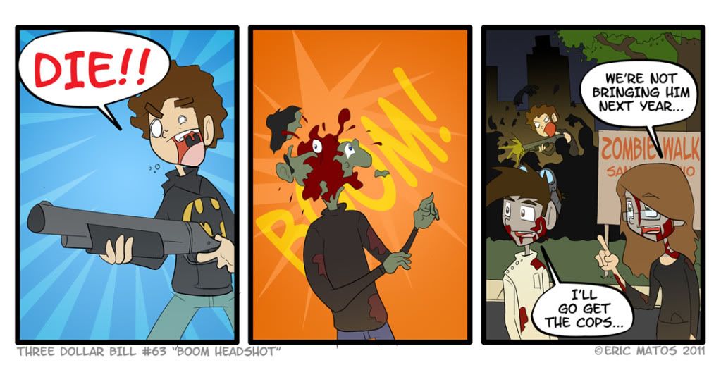
Most of your delivery has a solid, workable joke behind it but either is stretched out too far or lacks sufficient setup. The Hawkward comic could have been two panels with a better setup describing why them drinking and sexing would be awkward (I get the joke, just more contextual clues could be included). The Harry Potter death spell one would probably work better without the text and just a reaction shot.
As a whole, though. None of these are bad at all! If they were a bit more timely they would have been pretty solid jokes (like others said, the humor is substantially diminished due to saturation of similar jokes over time). Finding new things to work with, especially for video game/"geek culture" materials, will be critical if you want to build an audience. There are a lot of comics in that genre out there doing the safe targets of Zelda and other decades old franchises, what you do with what people are talking about right now will make or break you, though.
Overall, though you are in a good place doing good things! Keep em coming and I'll be reading them.
Thanks for all the feedback. The site was actually built from the ground up by my brother. I agree about the problems with the site, but he made it for free so I can't really complain. Hopefully, in the future, we can fix these things and make it a more user friendly experience!
What? Okay I think this is a step too far. Your drawing is sort of adequate, and I really, really appreciate that you're varying up your line width when you're inking, but these look pretty flat and the faces in particular are all kinds of chronic c-mouth and flounderface.
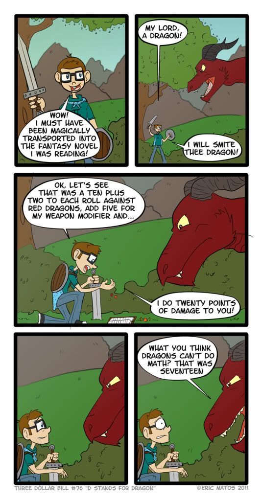
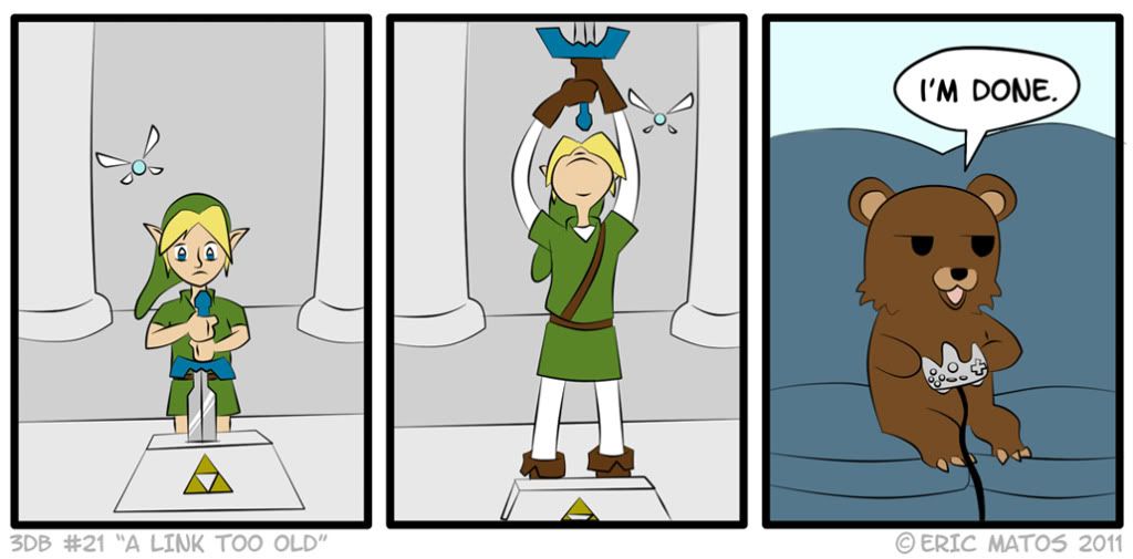
That said, some of these made me smile, which is getting increasingly rare with geek/nerd/gamer 3-panels for all the reasons Enc went on about. The Hawkward one and the dragon are both pretty good, and really so is the Portal one although Portal jokes are sort of weak. Last week. (And speaking of weak/week... pst: it's "weakness" not "weekness.") You do have a basic handle on joke writing for this format though, most of your punchlines have the right amount of buildup (panel 3 of Avada Kedavra [it is "Kedavra", not "Kadavra"; nitpicking I realize but you're supposedly targeting nerds] may be unnecessary, though -- at the very least Enc's right about the text).
You're also to be congratulated for not using Comic Sans, yes.
Overall you're headed in a decent direction. Just work on your drawing and continue practicing your jokecrafting and, yeah, try to jump on current topics because it's always a smaller pond. I hope you'll keep posting!
Thanks for the feed back to you too! I am always happy to listen to these suggestions. I agree that my subject matter would probably be better if it were more current, but I tend to just make comics about jokes I think up on a whim, That is usually how they come to me. I am going to have to keep up with current events in the geek world more though, I hardly have time to play video games anymore
I am always striving to better my self as an artist and as a web comic creator and every bit of feedback helps! I will try my best to make these comics better, because as a web comic reader, I expect it from the creators. Hope ya keep reading
Thanks for the comments
I am personally very happy with were my art is right now. I am not opposed to getting better though. The whole flounder face, c mouth thing I believe is a matter of opinion. I'm sorry if you don't like the style, but it's how I like to draw mouths. I have tried different ways and I am very familiar with Tracy J. Butlers work But just because it's the way she likes to draw, and because she says you shouldn't do it in art, doesn't make her right. I like doing the Generi-Facial Expressions too. I know saying "it's my style" can be a cop-out at times, but I have tried to do alternatives, and I am happy with this.
I will continue to better my art. Always. I just don't think that is bettering it as much as just changing it.
I am glad you think my jokes are good though. I know about those spelling errors actually, I've just bit kinda lazy in changing them...I know, I shouldn't be. I actually acknowledged the "Kedavra" one when I posted it, and said "come one, can you really misspell a made up word?" but, I will be making a book here soon, and I will have them fixed for that.
Thanks again for the feedback
By the way, I looked at some of your art, and you are great! Love the look and style as well as your use of color. Awesome work!
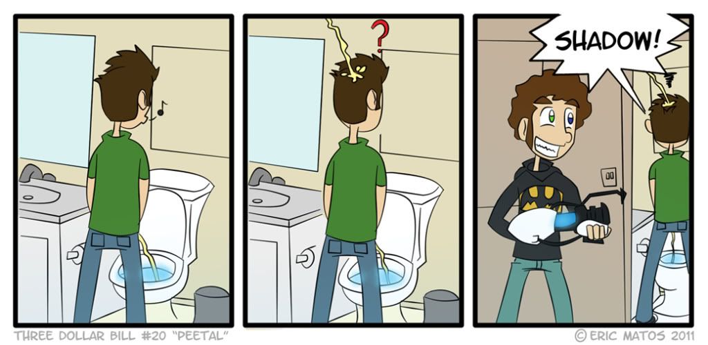
Thanks! Sorry the eyes annoy you. The character is based on myself and I have a condition called Heterochromia....my eyes are two different colors as well...
stop annoying cake! with your mutant existance
on the other hand a young drunk proff x will try to sex you... this may or may not be a good evening for you
edit: since i have nothing useful to say, +1 on hawkward, made me lol as well
The humor isn't bad but I also disagree about the "good grasp" on anatomy. It's not the worst but I do think you should continue practicing!
Thank you for your input. I'm sorry about the spelling mistakes. I will start paying more attention. I will continue to practice as well. I know my anatomy isn't the best, I will try to make it better.
Quoting Robert Watts - "Don't let puppy dogs on the stage or they will steal the show".
Thanks for the input, but I have to disagree. You are actually the first person to ever say that his eyes are a negative. In fact, I usually receive positive feed back on them because people believe it makes the character seem unique and more recognizable. I like them, and I just can't change it.
Thanks again for commenting
I could give that a try, it makes sense. Thanks for the tip!
I also agree that the character designs themselves could use some work, and anatomy practice could make these cartoons a lot better.
INSTAGRAM
I agree that the characters could use some work. But I really don't want to change them a lot. In fact, my web comic is in the process of being turned into a television show, and the producer said he really likes my character designs. So I kind of can't really change them. But like I said, I don't really want to. I just want to get better at drawing them.
Hm. I have negative things to say, but I don't want to seem too negative, because you show a whole buttload of potential.
Oh well, here goes! So I get that you're hesitant to 'change your style' because it's comfortable, and you feel confident while doing it. This is exactly the wrong attitude to have. Wrong wrong wrong. You should ALWAYS be challenging yourself to try new things. Just because you 'like' to draw certain things a certain way does not make it right, or even good. Your style is just a poorly grasped derivative of PA and anime. I want to emphasize that this isn't meant as an insult. The concept you're going for isn't necessarily bad, but the way you're going about it is. There's TONS of competent anime/manga artists out there with a solid grasp on anatomy, facial expression, framing, color, etc. etc. you get the point. Gabe also has a solid grasp on the way an actual human body works, as well as facial expression, framing, color etc. etc. You, however, have a basic grasp on these things. C-Mouth and Flouder-Face isn't a stylistic choice. It's a weakness. An inability to visualize and translate a 3 dimensional object into a 2 dimensional space. In order to best draw in an exaggerated cartoony style, you have to have a good understanding of what, exactly, you're exaggerating. I get the feeling from your art that you've learned how to draw in this way, or you started off in anime, and just sort of slowly molded into this style. You need to get out of your comfort zone and start experimenting with your art, or you'll always get comments on how your art needs to improve. Comfort does not always equal competence.
With that out of the way, I want to talk about your writing. It's pretty good. There's some tightening up to be done, for sure, but your comedic style and timing works well, and I found most of these comics funnier than most new amateur webcomics I come across. You're ahead of the pack, you just need to keep plugging along and you'll start to refine your writing. I'm sure of it. Just keep at it.
Art-wise, you need improvement, and maybe a kick in the ass to get experimenting. Writing-wise, you need improvement, but I'm confident that will just come with time.
Sidenote: Your main character's name is Shadow? Really?
Really?
lol