As was foretold, we've added advertisements to the forums! If you have questions, or if you encounter any bugs, please visit this thread: https://forums.penny-arcade.com/discussion/240191/forum-advertisement-faq-and-reports-thread/
Options

2 of my comics (spacebeard)

spacebeardspacebeard Registered User regular
edited December 2011 in Artist's Corner
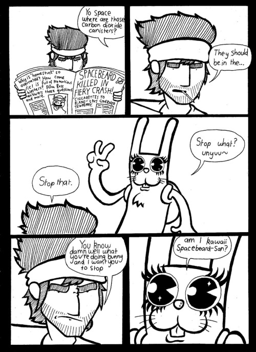
heya, ive been doing a webcomic for a few months, and though id post a couple of em here since im a fan of penny arcade and your humor might be the same as mine.
Heres 2 of them, usually i do pretty giant comics with 20 or more pages but lately ive been trying out simple one page jokes to do on the side, so tell me what you think and ways you think i could improve, cheers

tumblr_lvkbqr7L6T1qkixauo1_500.jpg

tumblr_lvtywjlKwb1r0uzi7o1_500.png

spacebeard on

Posts

  • Options
    MolybdenumMolybdenum Registered User regular
    These are pretty solid! You seem to have a good sense of flow and the jokes work pretty well. I'd work on your lettering; the way things are crammed in makes it difficult to follow the wordier panels. The color also threw me off a bit; since the bacpack/headband weren't red in the first strip it took a second to register they were the same things.

    Steam: Cilantr0
    3DS: 0447-9966-6178
  • Options
    spacebeardspacebeard Registered User regular
    thanks, means a lot man :) yeah im probably gonna start doing my lettering digitally (i do all the comics but hand and scan them in), also the second one ads the red because a different site is going to start hosting the one page comics so thats gonna be the basic layout from now on. you can read past issues at www.spacebeard.tumblr.com
    thanks :)

  • Options
    MolybdenumMolybdenum Registered User regular
    No problem. Good idea with a different hosting format; the current interface to view your comics is pretty clunky. I like the red as a single-color accent, but i think you could branch out to doing more with it than just identifying characters. The strips that use it for blood splatter are very effective. I also prefer the strips where the characters have a bit of environment, like the cactus and spaceship, rather than just floating on a white background. It really helps develop the scenario if the reader can see what's going on rather than reading it all in the speech bubbles.

    Steam: Cilantr0
    3DS: 0447-9966-6178
  • Options
    spacebeardspacebeard Registered User regular
    yeah that used to be a big problem, but if you read the recent issues, namely the halloween one (which is still in progress) ive been doing a lot more with the backgrounds

  • Options
    squidbunnysquidbunny Registered User regular
    I agree that you could manage space a little better with your lettering but maybe reconsider going digital with it. It meshes so well as is and so often digital lettering is janky and inorganic alongside someone's art.

    Anyways, not bad at all. :^: Hope you'll stick around.

    header_image_sm.jpg
  • Options
    spacebeardspacebeard Registered User regular
    yeah i have a BAD habit of just rushing the hell outta my lettering, so its certainly one of my weakest traits at this point haha, also thanks, i hope i stick around too!

  • Options
    earthwormadamearthwormadam ancient crust Registered User regular
    I ALSO LIKE THESE

    (even the newspaper made me giggle)

  • Options
    spacebeardspacebeard Registered User regular
    earthworm i think you may be the first person to actually read the newspaper HAH

  • Options
    bitpixelbitpixel Cartoonist Cumming, GARegistered User regular
    I like the art style a lot, especially in the second one. Using one color on black and white gets me every time. Also, you are a champ at making facial expressions, which is something that I feel like a lot of comics lack(I'm guilty of this as well sometimes...). Keep up the good work, I look forward to seeing more of these.

  • Options
    spacebeardspacebeard Registered User regular
    thanks a lot dude! im glad you like the facial expressions, its something i suffered a lot with in the earlier ones, looking back it seems every character had :l faces, one think i plan on doing is getting a mirror on my desk so i can do some more unique facial expressions from my own face haha

  • Options
    spacebeardspacebeard Registered User regular
    also one more thing, i recent comic i did, this one has a little more background detail im experimenting with/an action panel which im not too skilled in yet tumblr_lwlao76GNQ1qkixauo1_500.png

  • Options
    CrabomancerCrabomancer Registered User regular
    edited December 2011
    I know very little about comics, but I like the humor. Especially on the second one in the OP

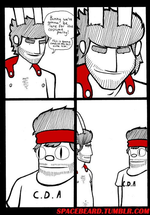
    As for your action shot, I think you have the right idea, but I think it might've worked better had you left more space around the drawing. Between the guy getting hit and the speech bubble there really isn't much of the accent lines visible. At first glance the message isn't as strong as I think you want it to be. I could be completely off base here though.

    e: Thanks EWA, i overlooked the newspaper entirely.

    Crabomancer on
  • Options
    spacebeardspacebeard Registered User regular
    tumblr_lww0117VXi1qkixauo1_500.jpg

    thanks for the advice crab, i think that was actually my first action shot i ever did, since the comic is mostly talking haha. heres another comic i did before i went on holidays, its not spacebeard related and its my first digital comic also

  • Options
    earthwormadamearthwormadam ancient crust Registered User regular
    haha I like it

    Your digital stuff looks nice, though the colors could be more subtle and less saturated!! Still funny though.

  • Options
    spacebeardspacebeard Registered User regular
    edited January 2012
    heres the first part of an issue im doing for busted pixel (its not out yet though so its a secret) haha

    http://www.tumblr.com/photo/1280/dillonwesleyross/16169648756/1/tumblr_ly3njeeqzl1r0uzi7

    http://www.tumblr.com/photo/1280/dillonwesleyross/16169938648/1/tumblr_ly3o3hiJ7d1r0uzi7

    edit: sorry that i cant embed the photos, wouldnt work for some reason

    spacebeard on
  • Options
    spacebeardspacebeard Registered User regular
    alright here we go, should embed now
    spacebeard__12_angry_beards_part_1_by_thebustedpixel-d4n22rz.png

    spacebeard__12_angry_beards_part_1_continued_by_thebustedpixel-d4n25d2.png

  • Options
    NappuccinoNappuccino Surveyor of Things and Stuff Registered User regular
    edited January 2012
    I would stay away from gradient backgrounds. It really does the rest of your art no favors at all.

    They don't have to be complex, but anything that grounds your characters in a world is highly preferred.

    Nappuccino on
    Like to write? Want to get e-published? Give us a look-see at http://wednesdaynightwrites.com/
    Rorus Raz wrote: »
    There's also the possibility you just can't really grow a bear like other guys.

    Not even BEAR vaginas can defeat me!
    cakemikz wrote: »
    And then I rub actual cake on myself.
    Loomdun wrote: »
    thats why you have chest helmets
  • Options
    earthwormadamearthwormadam ancient crust Registered User regular
    Yup gradients could go. Still...awesome comics. Get some more confidence, clearly you can draw hands, so don't shy away from it.

    Your comics would be very well suited in War for Arcadia. You should check that out.

  • Options
    spacebeardspacebeard Registered User regular
    yeah about the hand thing.... it was like 30 something degrees in australia and i get really god damn stressed out so i cracked the shits hahaha, i probably shouldnt do that. also the gradient was an experiment, i tend to experiment a lot. maybe its a learning experience maybe im just too curious who knows.

  • Options
    earthwormadamearthwormadam ancient crust Registered User regular
    Well the gradient in the third panel doesn't look terrible because there's also a background to distract a little bit. The rest of the panels that use them seem like a gradient is used as substitute for the background, and it looks lazy. Keep the comics comin'.

  • Options
    spacebeardspacebeard Registered User regular
    took yo advice dawg and laid off the gradients a whole lot, also tried out some shadows, havent really perfected it but its something

    tumblr_lyn8edujai1r0uzi7o1_500.png

    tumblr_lyn9xqLbTf1r0uzi7o1_500.png

  • Options
    earthwormadamearthwormadam ancient crust Registered User regular
    I like both of these comics! Nice lines!! The first one still suffers from the "no background" problem. The second one, for example, seems like the characters are grounded and are actually interacting within an environment, because we can see the area that they inhabit.

    Try to maximize your punchlines, for example, in the first one, the 3rd panel shows him crying, and then the 4th panel the punchline is pretty much him crying again. Might have had a little more oomph if he had his hands covering his face in the 3rd panel or something. Then the 4th panel could have had a little more powerful reveal.

    I still think that the gradient you used is detracting, and that the comic would be more well suited to just a plain, solid mid-tone shading. Also I think the diagonal line shading for that guys hair is kinda weird if nothing else is going to be shaded that way. Maybe it wouldn't look odd to me if the lines were waving in a way that his hair would actually flow.

    I like the second comic very much overall, though I don't really get it, but I still can't help but like it!! Also I really don't think that logo belongs on the page with such a finely inked black and white comic. It just doesn't match the aesthetics. And the website listings are too prominent, If people are impressed with the comic, they will find the website at the bottom even if it's written small.

    CHEERS

  • Options
    spacebeardspacebeard Registered User regular
    HEY sorry for bumping this thread, but i thought i'd mention that the comic isnt dead yet, in fact its being completely revamped into something stronger, more fleshy, better drawn and better written. it'll be somethin else hopefully. Anyone who wants to contribute to the project is free to message me, even though theres nothing to go on yet, why not take a risk? heres some character concept art, enjoy.

    tumblr_m47g6fClLC1qkixauo1_500.png

  • Options
    spacebeardspacebeard Registered User regular
    edited May 2012
    promo poster tumblr_m4dcmlBFS01qkixauo1_500.jpg

    spacebeard on
Sign In or Register to comment.