As was foretold, we've added advertisements to the forums! If you have questions, or if you encounter any bugs, please visit this thread: https://forums.penny-arcade.com/discussion/240191/forum-advertisement-faq-and-reports-thread/
Options
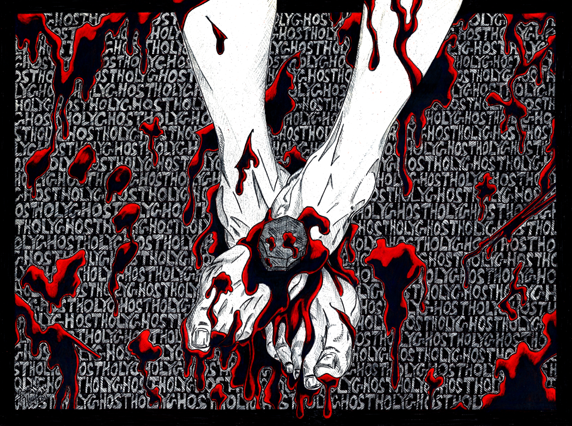
Hand Wave
Faded_Sneakers City of AngelsRegistered User regular
City of AngelsRegistered User regular
Hello PA:AC.
Back once more looking for some crits. Anything that pops out at you I would love to hear about.
A premature thank you.

Back once more looking for some crits. Anything that pops out at you I would love to hear about.
A premature thank you.
Instagram: fadedsneakers
Faded_Sneakers on
0
Posts
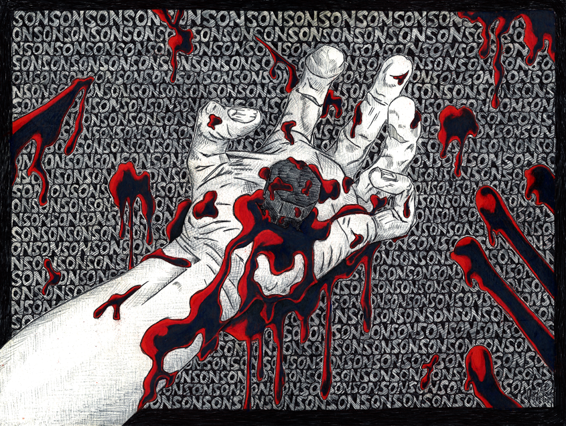
The second I think I once posted before but it was a badly shot image from a camera and not a scan.
I see what you mean about feeling rigid. Here are a couple attempts to loosen up a little that I did last night.
Thanks again for the recomendation on Mattesi Mustang I like what Im seeing so far.
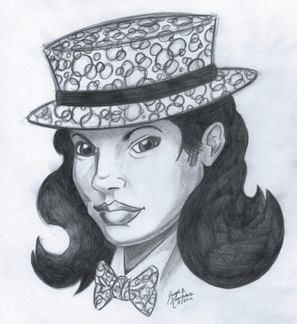
I call her ... Michelinda ... Yes I am retarded.
Colors have always scared me so this is me trying to build some understanding.
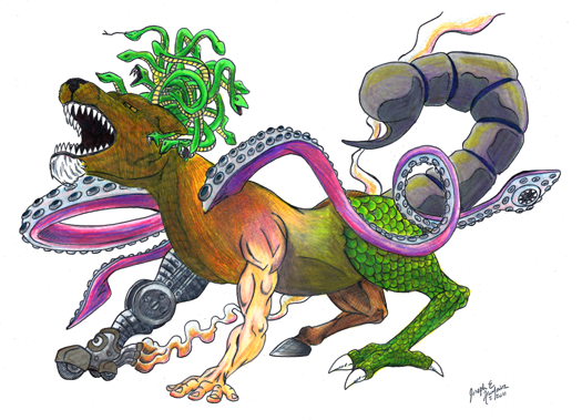
despite any nightmare fuel that pops up (the michelin woman/frankengun? for example)
im getting a bit of a charles addams vibe from a lot of stuff here (and thats a good thing)
^^ is my favorite so far, so keep up the good work
edit: if you are looking for feedback from some of the fantastic artists that shamble around here, you might want to submit something less stylized
Keep at it, I'd like to see more!
Thank you! Googled Charles Addams, thank you for his name. I enjoyed looking through his works. I like his innocent approach to darker themes.
@DarkMecha
Youre absolutely right. I really need a better understanding of perspectives. Especialy the three point perspectives. I downloaded a book on perspective from the Tutorial Thread here in the PA:AC and hope to work on it. Thanks for the feedback.
@SaintElmosWire
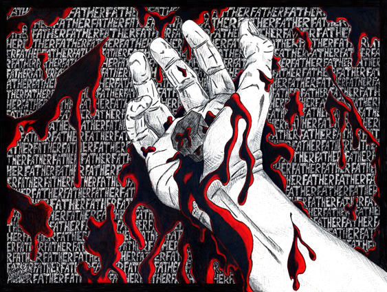
Excellent point. Originally my intention was for a gore feel to emphasize the hurt and pain, but as you put it (and I did not consider this before), the nails are the focal point of that pain and as such should be far more prominent. Im working on a few other pieces in this vein and will keep this in mind. Thanks for the crit.
Some random doodles.
Rather a large WIP. Something Ive started and stoped for some time now. Tyring to get back to it and finish it. Almost started coloring some of it today then began hyperventilating, slapped myself and returned to reality. The top right corner is a huge problem. Nothing Im coming up with it making sense up there. Anyways ... BLAH ...
And then theres this:
Followed rapidly by this:
*vanish*