As was foretold, we've added advertisements to the forums! If you have questions, or if you encounter any bugs, please visit this thread: https://forums.penny-arcade.com/discussion/240191/forum-advertisement-faq-and-reports-thread/
Options
Job test project, hoping for some critique
Doodmann Registered User regular
Registered User regular
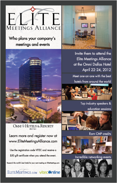
Hi AC, long story short I had an interview last week with a marketing company and last night they sent me a test project for an upcoming event they are hosting. This 3x8" pamphlet will be distributed to hundreds of companies in hope of getting 100 people to register and 20 people to show up. The copy, logos, and photos were in the design brief. I'm not as confident in my ability to do these "corporate" looking designs so I was hoping for some advice or thoughts. I figured it was safe to look here for critiques because you can be relentless bastards.
I like to ARTnope nope nope nope abort abort talk about anime
Doodmann on
0
Posts
The stuff about the gift certificate should be larger. That's what's going to make people sign up, the free prize. That's my only crit. I don't like the bottom photo being black and white for some reason,but that's just me.
"Orkses never lose a battle. If we win we win, if we die we die fightin so it don't count. If we runs for it we don't die neither, cos we can come back for annuver go, see!".
Get the attention first with "Free Money" in big bold letters then tell them where to get info and register.
I'm also a bit iffy on having Elite Meetings Alliance so huge. Granted, I'm not in marketing or hotels, it just seems to take up an eighth of your page with no real information unless I know who EMA is.
One last thing: "Who plans your company's meetings and events", is this a statement (IE: EMA, who plans your company's stuff") or a question to the reader?
Again: not in marketing, not in the hotel business. Just a layman offering my POV.
Style wise, I'm not crazy about the black and white picture at the bottom. I am also not crazy about how close the type is to the borders. I'd separate that a bit. Also, on the right side of the document, where it says "Meet one on one" "top industry speakers" "Earn CMP Credits" "Incredible networking", I'd center the text. To me, it's leaning too much to the bottom.
Personally, I like to keep all my closing logos at the bottom right of the page, because that's the last place people will look.
Also, I would have never chosen that page size because it's awkward to fit in a page and it's gonna give the print guys a lot of wasted paper that they're gonna charge. I made a deal with our print providers that if I can reduce their waste, they would give us better rates, as a designer, you have to watch out for these areas where you can cut costs. These type of flyers I work based on how many I can fit on a letter or tabloid size sheet.
I hope you get the job!
@see317 I had that first thing as a question first and my friend who is going to school for design suggested I change it to a statement to hammer home the call to action. I like big logos because it's the brand and service they are trying to sell. With something that has this much information they aren't going to remember most of it but hopefully the logo sticks in someones mind when they walk away.
"Planning your company's meetings and events." or "We're planning your company's meetings and events." maybe "We will plan your..."
Starting with the "who" there, it just doesn't read clearly to me.
With the pamphlet size, I was assuming this was going to be printed in fat stacks where any interested party could pick one up and take it with them. If this was a poster or something, I'd agree with you that the most important thing is that the prospective client remember your name so they can look it up later. For a pamphlet though, it seems like the most important thing would be to get the customer interested enough to pick one up. Huge logos don't do that for me unless I know the brand already. Instead they speak of wasted space, particularly when the name is repeated three times in a relatively small space (the logo and two URLs) while very little information is provided. If you don't have anything better to tantalize me with then screaming the name repeatedly, it's not going to stick out. On the other hand, wall o' text rarely gets a second glance either unless the text contains buzzwords that my subconscious picks out. It's a tricky thing to strike a balance between the two extremes. (I think I may be reading the logo wrong, is the "Who plans..." bit part of the logo, or is the logo just the "Elite Meeting Alliance". I initially interpreted both as a single logo since they share the same white square, but after a third look I'm thinking I was wrong on that.)
But as I stated, I'm not your target audience for these, just providing what feedback I can.
I'm not crapping on this, and I apologize if it's coming across that way. I do wish you the best of luck in the job search.
Also, experiment a bit with using left aligned text instead of centrally aligned text in the left column. Just see if it feels a bit cleaner.
Overall it's not bad so far.
Our first game is now available for free on Google Play: Frontier: Isle of the Seven Gods
@Heartlash Other than the logos I used 1 font.
EDIT: Also, good luck!
Our first game is now available for free on Google Play: Frontier: Isle of the Seven Gods