As was foretold, we've added advertisements to the forums! If you have questions, or if you encounter any bugs, please visit this thread: https://forums.penny-arcade.com/discussion/240191/forum-advertisement-faq-and-reports-thread/
Options
art works questions
gyf7048 Registered User new member
Registered User new member
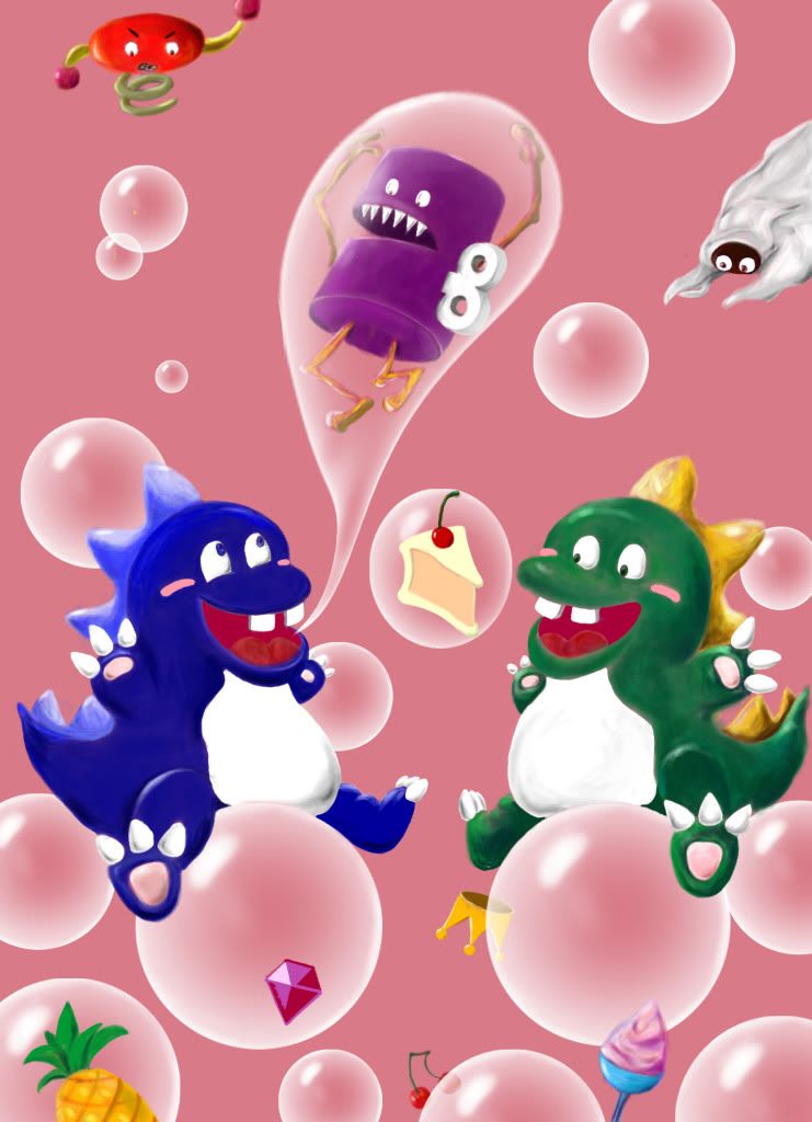
How can I improve my background? I want the composition to feel exciting and fun but simple
Please help") ))
))
Afi
Please help
Afi
gyf7048 on
0
Posts
It's up to you though, but whenever I see the bubble bobble characters I immediately think of those kinds of two-tone backgrounds.
So good, in fact, I'd say the lower half of the image actually looks a little less interesting than the upper portion. Part of the problem might be the bubble composition in the lower half is very symmetrical. Which wouldn't necessarily be bad, but it's just not as visually interesting as what's going on up above. The top half of the image has bubbles that seem suspended in a moment, rising or falling, but the ones in the lower half are kind of clustered, settled-they look like they're not going anywhere. The scattered items in the bubbles in the lower half don't seem to have a lot of presence, which might be solved by making them larger, or by having more of them.
I'd definitely play with the bubble arrangement a little more on the bottom of the screen. Try making one of the major bubbles the guys are sitting on larger than the other. It might help placing the bubbles that are there a little more unevenly, as the four bubbles that define the 'corners' of the lower half kind of also have identical clipping going on, which makes them appear even more similar along with seeming static.
Whatever you might be looking for in the background will probably be good, because as far as I'm concerned, the mauve shading back there already seems pretty effective to me. Good work so far, though.
Here is revision of the cover
I decided not to change the background very much but just a light touch of gradient
here is a drawing I just did. It is about reflection between life and death. Some feedback will be great! :P
For the second one maybe a little color (or gray shading) would help distinguish the characters a bit, separate them from the background. You have a lot of great detail there, but it gets lost in black and white.