As was foretold, we've added advertisements to the forums! If you have questions, or if you encounter any bugs, please visit this thread: https://forums.penny-arcade.com/discussion/240191/forum-advertisement-faq-and-reports-thread/
Options
Aliens, Robots and Microns
patrickhall Registered User regular
Registered User regular
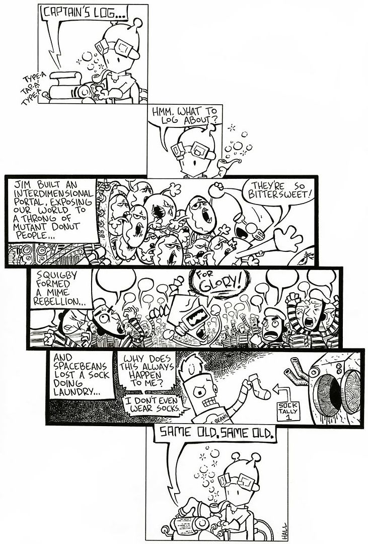
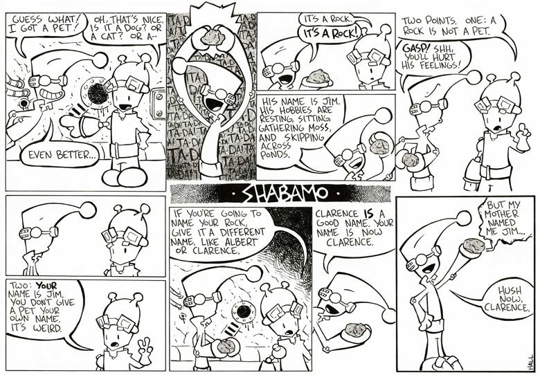
Hello, all! My name is Patrick and I'm an aspiring professional doodler like many of you on this forum. For the past few months I've been chipping away at making my own webcomic. It's entitled, Shabamo. Long story short, it's three aliens and their robot made of space bean cans that crash on earth and, inevitably, hijinks ensue. Here's a sampling of some of the strips I've done:
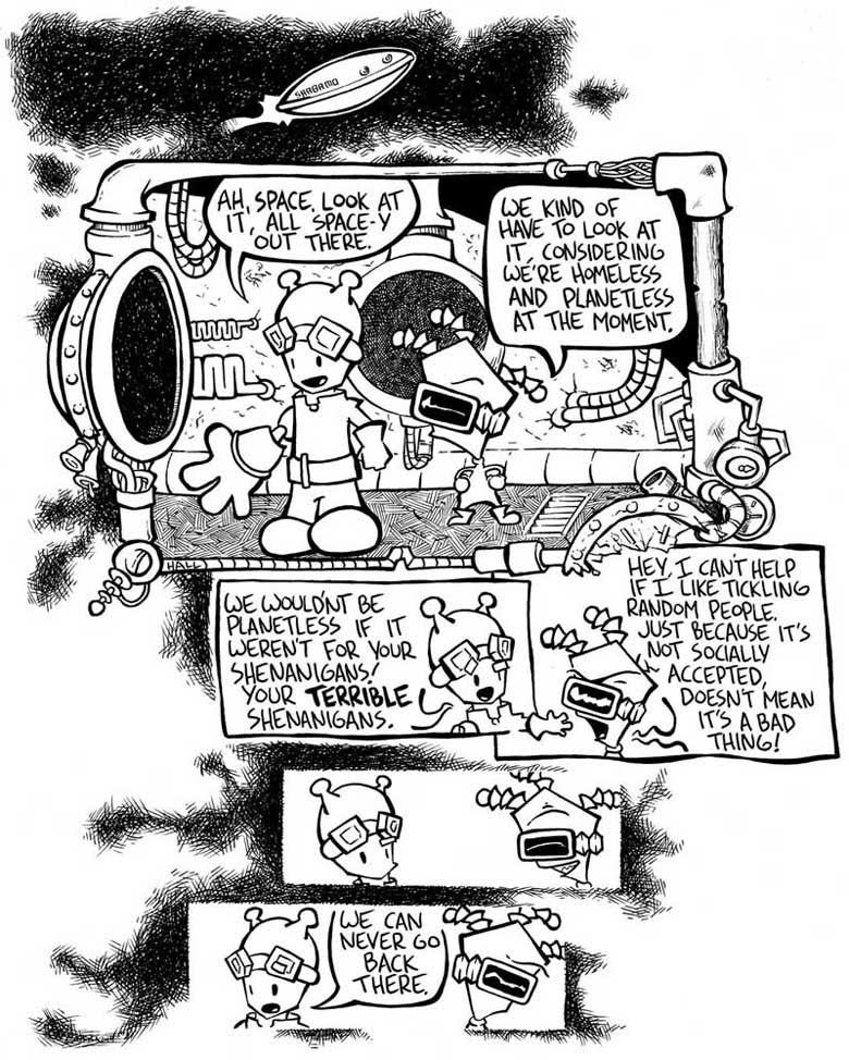
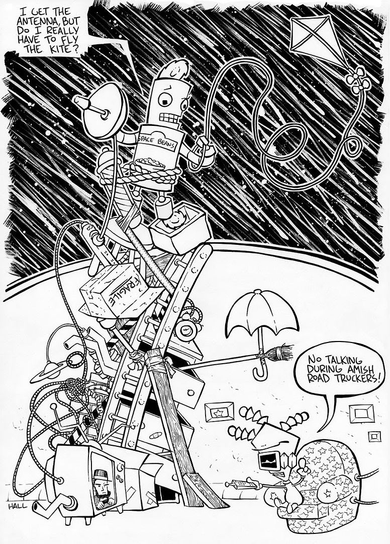
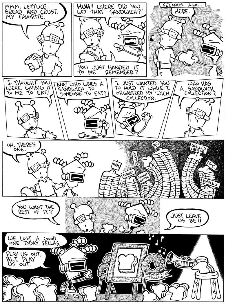
And here's a one off I did, unrelated to characters of the main strip:
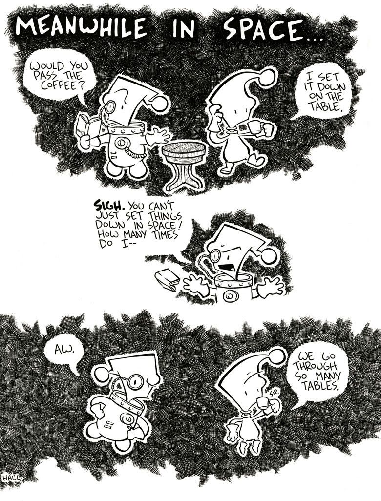
Any comments, feedback or thoughts are welcomed.
Thanks for checking it out!
-Patrick
And here's a one off I did, unrelated to characters of the main strip:
Any comments, feedback or thoughts are welcomed.
Thanks for checking it out!
-Patrick
patrickhall on
0
Posts
But it did take me reading through all of them before I realized Squigby and Spacebeans weren't supposed to be direct references to Invader Zim and Bender.
The art is pretty spot on for the tone, love the details and the hatching. Expressive characters add a lot to the story tellling.
Welcome to the forum! Keep posting! Is there anything specifically you want crits on?
I am aware that Squigby has a resemblance to Zim, though I'm trying to give his character a tough exterior while wimpy/lame on the inside kind of feel, to differentiate the two.
As crits go, one of the things I'm really trying to work on is storytelling. Having the comic be visually interesting while, and most importantly, still be easily read. So any feedback as far as that's concerned would be great.
In the meantime here are a few doodles from my sketchbook:
-Patrick
You were asking for critiques as far as story-telling and I don't know if I'm the one you're looking for in that department, but I do have a few things to say about the comics you posted.
1 thing that is glaringly obvious to me, but I don't know how to address it or how to correct it, but the characters don't often stand out amongst the business of your style. They do in the illustrations, but in the comics not so much. Take the first page, first panel for example. My eyes weren't drawn to or able to clearly define the characters in that panel. I didn't understand that those "dreadlocks" sticking out of squigby's head were attached to squigby, and at a glance I had a hard time deciphering the scene. I think that may be as a result of the clutter in the background. Not to say that the clutter is inherently bad, but it is very distracting the way that it is now.
In the second comic it is the same way. The donuts all glomping onto Jim, I didn't immediately see Jim, and I had to re-look at the image after reading the text to figure out what was going on. Same with the Mime Panel. For the mime one, maybe a fix would have been to elevate him above the croud of mimes. 1) to emphasize that he was the one in charge, and 2) to separate him from the group visually.
As for both the Pet Rock and the Sandwich comics the LACK of a background had a lot of the same "business" effect I'm referring to on me. Specifically in the sandwich comic the center row of panels, in general it is a bad idea to have your characters change position (left/right, right/left) as it is confusing to the reader how to understand where the characters relate in a scene. You could have simple reversed the second two images in that row (because squiby apparently came from off panel right, the captain was on his left, then the sudden and unnecessary position swap) and avoided the added confusion.
edit: Having read through what you have uploaded at that link I notice you do that character swap bit I mentioned above quite a bit. Every other page I'd say. I didn't take notes, but if you would like me to cite specific examples I could go back and have a look.
Thanks for the feedback and critique! I'll definitely try to be more mindful of my clarity as far as characters vs background/environment is concerned. As much as I love cross hatching and miscellaneous doo-dads, I can see how mixing those with my characters is something to carefully consider.
And as far as the conversational panels go, I always try to be mindful of who's where in relation with the other character. Sometimes when it's one character speaking I'll draw them facing another direction in their own panel just to try to break up the monotony the that static "that one's facing right so the other one has to face left" type of scenario. But I can see how in a few cases that can be confusing, and again I'll try to come up with some visual solutions for those problems.
Again, thanks for the input!
I've dabbled a bit in color in the past. A few years ago I sent a version of the comic to some syndicates in hopes of getting in the newspaper funny pages, and in my packet I did a few samples in color.
Here's one that I included:
But since then, for the most part, I've just been doing black and white to get the art out faster. And since I'm keen on the hatching, the b&w usually suits it better. But I've definitely wanted to do a few special strips in color in the future.
And bonus points for posting the Otomo and Darrow examples! I'm a big fan of both.
This first one I did for a small art show put together by a friend. The theme of the show was cinema.
And here's a little something I just finished in my sketchbook:
Iruka, I agree with your comments about use of color. With all the hatching going on, past attempts with color have come out muddy. The handful of drawings I've done that have come out decent evolving color are either, drawings with little or no cross-hatching, or drawings done with, like you suggested, a light acrylic wash of colors.