As was foretold, we've added advertisements to the forums! If you have questions, or if you encounter any bugs, please visit this thread: https://forums.penny-arcade.com/discussion/240191/forum-advertisement-faq-and-reports-thread/
Options
Nic's thread now taking requests [NSFW]
Nic Registered User regular
Registered User regular
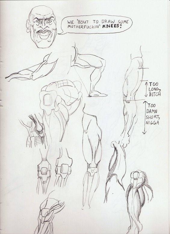
Long wall of text shortened. I draw stuff and I work to improve all the time. Examples below!
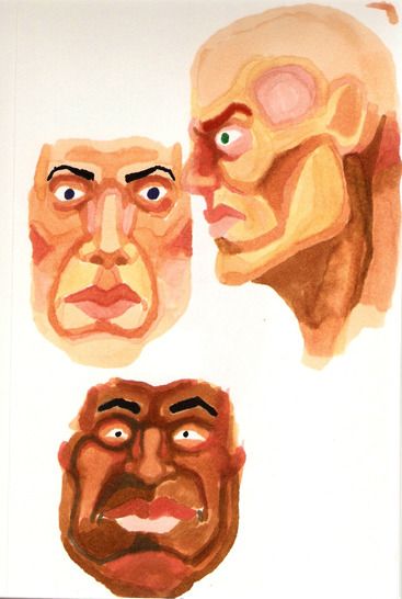
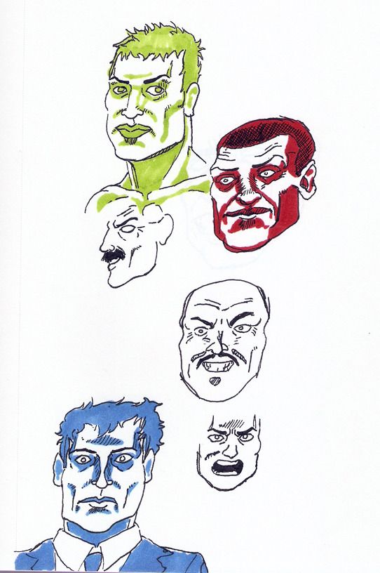
I wanted to play with the idea of tone conveyed with a single colour. Fun fact: the red guy's face has tone to try and distract from the poor structure. It didn't work.
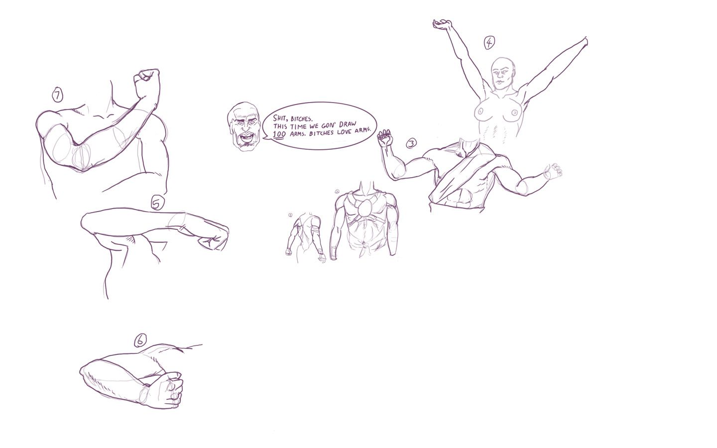
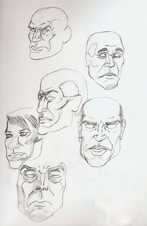
I've started a thing as suggested by ctrl+paint's Draw 100 video. As you can see, my latent racism rears its ugly head once again.
Some things I need to improve on overall:
Forms: using shapes as an underdrawing to properly convey a subject and understand the structure. Symmetry is a big issue in my stuff.
Lines: make sure to draw with clean strokes and properly learn line weight.
Perspective: another thing I've avoided until not too long ago.
Tone and shading: it's not quite as important as form and line weigh, but if those two are correct, but a form is poorly shaded, you'll know instantly.
Everything else: nuff said
Slowing the fuck down: I get pretty eager to put the lines on the page, and often I end up with a form that is way off from what it should be, you can see it in a lot of the above images, and it's something I'm slowly starting to improve. I'm undisciplined as fuuuuuck.
Bonus points if you actually read this far down, I appreciate any advice you may have and will work to improve on things based on your feedback.
I wanted to play with the idea of tone conveyed with a single colour. Fun fact: the red guy's face has tone to try and distract from the poor structure. It didn't work.
I've started a thing as suggested by ctrl+paint's Draw 100 video. As you can see, my latent racism rears its ugly head once again.
Some things I need to improve on overall:
Forms: using shapes as an underdrawing to properly convey a subject and understand the structure. Symmetry is a big issue in my stuff.
Lines: make sure to draw with clean strokes and properly learn line weight.
Perspective: another thing I've avoided until not too long ago.
Tone and shading: it's not quite as important as form and line weigh, but if those two are correct, but a form is poorly shaded, you'll know instantly.
Everything else: nuff said
Slowing the fuck down: I get pretty eager to put the lines on the page, and often I end up with a form that is way off from what it should be, you can see it in a lot of the above images, and it's something I'm slowly starting to improve. I'm undisciplined as fuuuuuck.
Bonus points if you actually read this far down, I appreciate any advice you may have and will work to improve on things based on your feedback.
Nic on
0
Posts
3DS: 0447-9966-6178
No...
Okay, maybe...
Yeah. I did.
Also, this is my first attempt at painting texture spheres. Now I know there's varied opinion on using photoshop brushes that aren't the basic one, but I like to use a balance of different brushes and brush settings. I feel like I did a decent job on the rock sphere, but I might fine tune the 'down' sphere.
EDIT Also: shout out to Eggy Toast because that's totally his photo I ref'd
3DS: 0447-9966-6178
We started with a few gesture poses, but I was still getting warmed up, so I won't share those ones.
We moved into 20 minute poses which I'll post in order.
1) The proportions are off on this one, for sure, I was still a bit nervous, I didn't think 20 minutes was going to be enough time at that point so I kind of rushed:
2) This one was pretty okay:
3) I rushed this one a bit, the eyes are uneven mostly because he was moving on to the next pose so I didn't want to waste any more time with it:
4) this one I felt was the strongest of all of them, I took a bit of extra time to straighten things out and add a little bit of tone:
PS: The one sitting on the chair, facing to the right looks awesome
Hahaha, yeah it's fine though, I don't know how to describe it, but when you're drawing the part of your brain that goes 'aw gross naked middle aged dude' gets tuned out. As much as I hope there's a female model next week (because I want the experience of drawing the live female form, obviously!), I don't really mind either way, it's all for drawing experience.
Also thanks! I think the sitting poses turned out the best.
really like the 25 min study from 10 april.
I'ma watch this thread now.
Also, when drawing hair try to just shade shapes in the hair where it's "generally dark" instead of trying to insinuate hair with an excess of lines. It's much quicker and works a lot better.
I'll keep that advice in mind on Tuesday night, m3nace. I'm really enjoying life drawing, and I feel like it's helping me immensely.
Funny and strange story about the model: she had her seven year old daughter there with her. She was very well behaved and played DS in the other room. Kinda awkward.
http://conceptart.org/forums/showthread.php?261761-RJbonner-2d-3d-Artist
http://www.polycount.com/forum/showthread.php?t=78501
Here's the sketch of Communist Superman that I put in the doodle thread.
I'm going to Life Drawing shortly and then I'll be back to plan out a two page comic. Which I'll try and post progress on tonight for crits.
there are still spots where the drawing gets awkward - odd angles on parts of the body that you may not be used to, proportions on faces (it seems like you might have more trouble drawing women, which i totally sympathize with) but when i see something like the face on that guy who's facing right, i am totally confident that you're going to be producing consistently excellent stuff really soon
like that guy's whole head is just excellent. i keep looking at it with enjoyment.
facebook.com/LauraCatherwoodArt
Note: this next one was 15 minutes and I have no excuse for having drawn it in the top corner of the page. I am a dunce.
I really like these man, keep at it. Do you do any quick gestures? I always found starting a session just doing 1 - 5 minute gestures for a while helped make the longer stuff better.
Is this for a class, or just a studio session? In either case, they should be starting with quicker than 1 minute gestures. That helps you look and think and put lines down quicker, which in turn helps the final product. 30 second to 2 minutes are not going to be finished products, and you shouldn't treat them like that. They're to help you warm up, and to help you see better, to make a finished product.
If you're trying to have your drawings resemble to model and the proportions and all of that, here are some things that can help. Always start with a gesture, but don't forget to check that gesture in a few ways. Look up and notice- what points line up vertically? Horizontally? On a curve? Then seeing the angles of these things will help you see how your drawing is off.
For example:
Vertically, the point of her chin lines up with the edge of her left breast, and also the crease where her left thigh meets her torso is not that far from this line.
Horizontally, the creases inside her left elbow and right leg line up.
You can look at the curve that connects her right ankle to her left knee to her left elbow and left shoulder. Or look at the angle of the line that connects the point of her chin to her left shoulder.
Etc.
Really there are infinite guidelines you can find on the model, but use ones that you find in order to help you capture the big picture and the proportions of the pose.
facebook.com/LauraCatherwoodArt
Also ninjai, the gesture poses the models do are usually about 30 seconds give or take, but last time she did more one minute ones.
There are couple other sites like that that give you timed poses, I'll see if I can find my bookmarks for them if you want.
I will update this post with stuff a little later, I'm about to go out and do some plein air sketches, and the stuff I've drawn lately has been sub par.
REQUESTS
What I want to do now is draw specific things, so if you have any requests, I will see what I can do.
Keep it simple, by which I mean one or two subjects, as opposed to whole completed works, but if you have any characters, objects or structures that you'd like to see me draw, I will do a study for you. Basically it helps me more than it helps you, because looking at most of the stuff around here, you guys could draw it better. I'm hungry for improvement and the hardest thing for me is ideas of things to draw, unless it's photo reference or what's sitting on my desk.
Meanwhile, had my fifth life drawing session last night. I decided to use nonphoto blue pencils for the lay-in on the longer poses and then ink with a Staedtler 0.3 pigment liner. I think it worked well.
20 Minutes:
also 20 minutes:
30 Min, also I think it was the best of the night:
First attempt from yesterday:
Second attempt from about an hour ago:
Now I feel like I did a better job on the proportions in yesterday's sketch, the chest looks almost deflated in the one I just did.
I messed up on the hands of both. I did a nonphoto blue lay in for both of them.
I'll probably take another crack or two at it later on.
Edit: also I feel like his bicep is a too large compared to the deltoid/ shoulder in the second one...
Now I have to do it again, considering the point was more or less to be more anatomically/proportionally correct than Rob freaking Liefeld. It sounds easier on paper.
They have this wonderful invention called an eraser. If you feel that something can be better, especially since you're doing the sketch with non photo blue, just erase it, no more time spent than if you just leave it and redraw the whole thing 5 times. Spend more time on completing a single "attempt" and I think you'll find you won't do more than 1. I think the first one looked fine and could have looked good completed.
Edit: The point being I'm not sweating it as a major project or something, not that I'm so amazing that I can identify and resolve all my drawing problems in one or two variations of a sketch. There's always more stuff to sketch and time to sketch it.
Thats the exact opposite of what my drawing teacher would say, I will remember his kind words forever "DONT use the eraser, everything you draw will be worthless, so scrap it and do it again, but right."
All I'm saying is don't waste your time on 15 drawings. Get it right once. It's far less time consuming/frustrating and far more educational. You're not going to get every subject perfect and I don't understand the mentality of redrawing the same picture a several times in a row, then fix what you messed up on in a third or fourth drawing, especially if your goal is a finished piece. Maybe try doing thumbnails of your drawings before you take a crack at the final?
I've had teachers like that, and I'm ashamed to admit that it scared me off art for awhile when I was younger.
If the end of the drawing is a finished piece, then I guess yes, using eraser, taking your time to render, etc. is the way to go, like Ninjai said, one piece well done instead of doing the exact same thing 10 times.
Now about the drawing itself, if you ARE going to draw it again, I would say, try to loosen up, aside from the anatomy issues, it looks a bit stiff, and as if you struggled with each line... its hard to explain, as if you draw the lines really slow and thinking too much. the exact same drawing could benefit a lot from a more relaxed aproach.
PS: all concepts and ideas posted by me are to be taken as personal opinions wich may NOT reflect the truth about... well, anything.