As was foretold, we've added advertisements to the forums! If you have questions, or if you encounter any bugs, please visit this thread: https://forums.penny-arcade.com/discussion/240191/forum-advertisement-faq-and-reports-thread/
Options

comix of questionable humor

earthwormadamearthwormadam ancient crust Registered User regular
edited April 2009 in Artist's Corner
I have returned, and with a newly aquired DSL connection to boot. I stayed up really late the other night drawing after realizing I need to output more art. Things seem a bit on the slow side around here, so here we go...

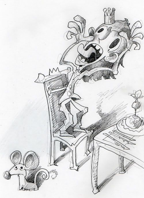
These 2 were me attempting to get a little loose. The prince one is going on file with the rest of the sketches for that comic series, which I will likely never finish.
JARVISthepusspuss.jpg

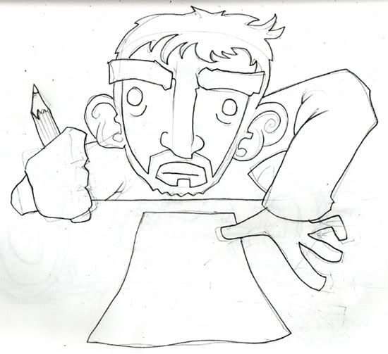
This is supposed to be me.
insomniac.jpg

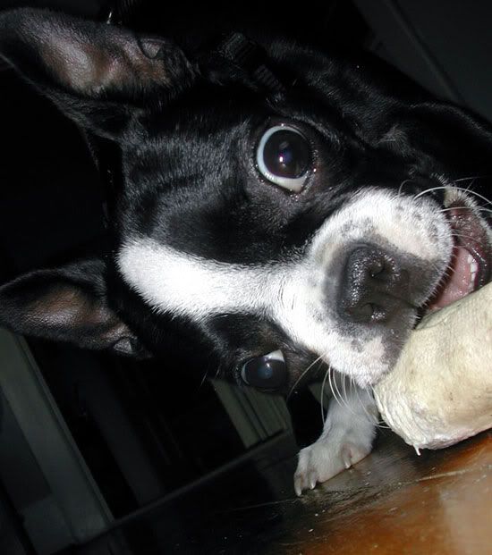
I've also been doing lots of stuff on a more large scale then I usually do. This one is a portrait of my dog, on the backside of a ping-pong table.
mugenart.jpg

Heres a pic of the little monster for comparison sake.
mugen.jpg

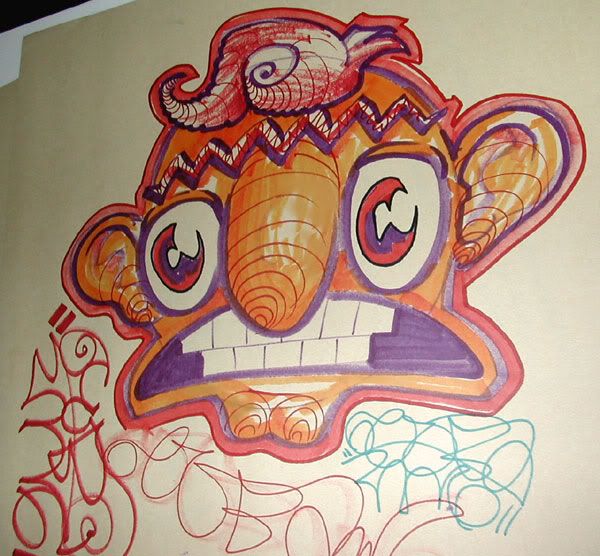
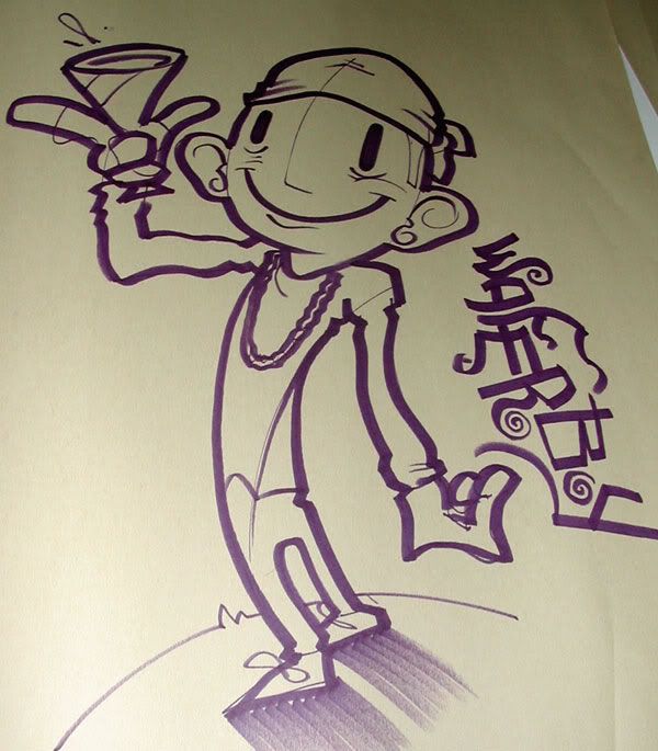
These 2 are marker on pretty big sheets of paper.
unibrow.jpg

waferboy.jpg

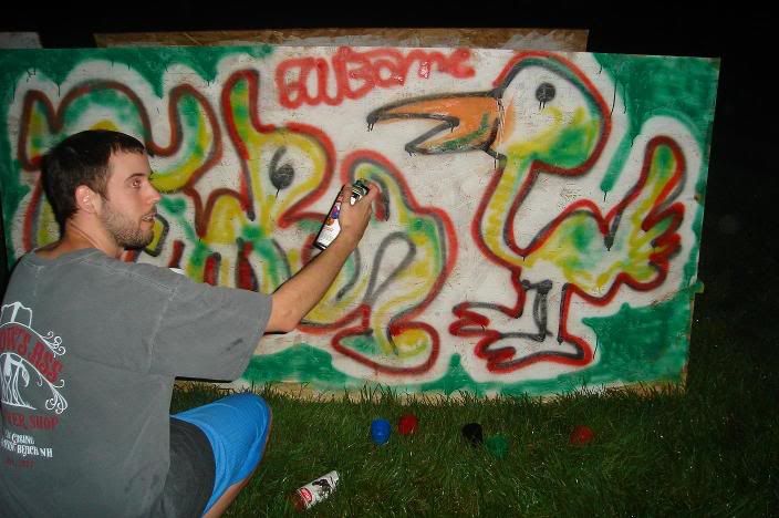
This was a sweet outdoor party I was at, that had plywood and spraypaint on hand for whoever wanted it. Keep in mind it was very dark and Yager was involved...
Picture031.jpg

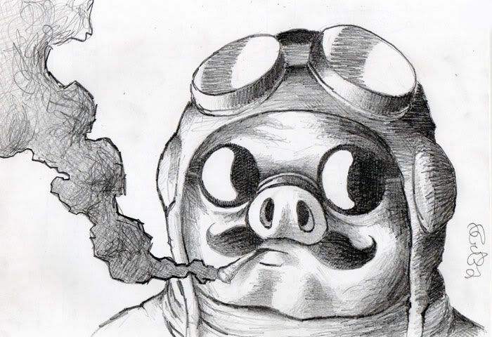
And some fanart to round it out.
porco.jpg

A website is in its very early stages of planning, and I will post my progress on that also, as it comes along. I hope to move T-shirts on the site, but will set my sights on it being strictly my art site for now. I haven't been around for a while, for various reasons, but I should be around more now that I have my own internet connection. Comments and critiques are welcome.

earthwormadam on
«13456711

Posts

  • Options
    DogDog Registered User, Administrator, Vanilla Staff admin
    edited July 2006
    ever read jim mahfood's comics? thats what the second pic reminds me of. looking great too, cant really think of anything to say

    Unknown User on
  • Options
    TamTam Registered User regular
    edited July 2006
    I don't think that even you, the great Worm, realize how cool that mouse is.

    Tam on
  • Options
    Chop LogicChop Logic Registered User regular
    edited July 2006
    Nice, I've always been a fan of your stuffand style. I really like your handstyle/signiture in a lot of your pics too. I know I asked you think last time, but you have any pics of any painted shit on the streets?

    Chop Logic on
  • Options
    SublimusSublimus Artist. nowhereRegistered User regular
    edited July 2006
    The look in your eyes says yager, indeed.

    Sublimus on
  • Options
    Mr. BlooberMr. Bloober Registered User regular
    edited July 2006
    Wooooo Porco Rosso!!! That's a great drawing.

    Mr. Bloober on
  • Options
    earthwormadamearthwormadam ancient crust Registered User regular
    edited July 2006
    Neon- I didn't think that I had heard of him. But I checked out his webpage and myspace and sure enough, he was already in my friends list. His comics are pure snazz, so thanks!

    Tam- I guess that I hadn't, but I'm glad you did.

    CL- Sorry, but my previous vandalizaions have been painted over. Thats the beauty of graffitti in a way. Here today gone tommorow.

    Sub- <Yager = Sweet nectar of life>

    Mr. b- Thanks for the comment. I just rewatched PR the other day, it never gets old to me. Such a great movie.

    EDIT- I've been working on some more stuff. This one I posted a while back and I finally got around to finishing it. Here's the old post and the completed one.

    meanie.jpg
    glooth.jpg

    earthwormadam on
  • Options
    earthwormadamearthwormadam ancient crust Registered User regular
    edited July 2006
    jarvisHEN.jpg

    I like the darks I got out of it, but charcoal is so smudgy!

    earthwormadam on
  • Options
    earthwormadamearthwormadam ancient crust Registered User regular
    edited July 2006
    Another old project with a little more progress...

    buried.jpg

    deep-hole.jpg

    earthwormadam on
  • Options
    wakkawawakkawa Registered User regular
    edited July 2006
    You need to focus more on a definite light source. Almost all of these just seem to have local gradient shading.

    this one though is pretty rad.
    http://img.photobucket.com/albums/v62/earthwormadam/jarvisHEN.jpg

    wakkawa on
  • Options
    earthwormadamearthwormadam ancient crust Registered User regular
    edited July 2006
    Yup. I have been trying to define my lightsource better recently. I'll do my best to avoid lazy shading from now on. It's a tough habit to break when all shading I've ever done was just how I thought would look cool.

    Thanks for driving the point home though, cause I do need to do something about it.

    earthwormadam on
  • Options
    earthwormadamearthwormadam ancient crust Registered User regular
    edited August 2006
    Just figured I'd post this little strip I did, so I could get some thoughts. Not really planning on doing web comics or anything. Just a rough draft too.


    backstabber.jpg

    I'll post my villan entry for the contest here as well as in the official thread, in case anybody would like to drop me a few comments...

    earthwormadam.jpg

    Goodnight!

    earthwormadam on
  • Options
    galengalen Registered User regular
    edited August 2006
    aaaa worm arms

    galen on
  • Options
    misosoupmisosoup Registered User regular
    edited August 2006
    harrr that comic is awesome

    misosoup on
    APTBSsig.jpg
  • Options
    Asamof the HorribleAsamof the Horrible Registered User regular
    edited August 2006
    Your villain is incredibly awesome. I wanna see more of him

    Asamof the Horrible on
  • Options
    Kuro HouKuro Hou Registered User regular
    edited August 2006
    Comic made me LOL.

    Say, by the way, have you by chance seen the HP ad featuring Pharell? At the end there is a character climbing over Pharell's name that bears a striking resemblance to some of your work. Of course you may feel there is no resemblance at all.

    Kuro Hou on
    "For a man who looks like a garden gnome, you sure have a lot of demands."

    I dare you to make less sense.
  • Options
    earthwormadamearthwormadam ancient crust Registered User regular
    edited August 2006
    Galen- Not just any worm arms, but worm arms of complete devestation. Is your website still up, just curious...

    MS- Thanks.

    AtH- Maybe I'll cook something up for him later. I think the potential is there, but I'm not quite sure what to do with him yet.

    KH- Nice. I'm glad to hear it. I tried to make more comics but I wasn't happy with any of my other attempts. And no I haven't seen that particular ad, but I did see his album cover thing, and noticed the simple little character on it. Maybe it is the same, I dunno.

    earthwormadam on
  • Options
    wakkawawakkawa Registered User regular
    edited August 2006
    That worm guy is really creeping me out.

    I also laughed at your little comic. I really like the sketchyness of it.

    wakkawa on
  • Options
    FantasyrogueFantasyrogue Registered User regular
    edited August 2006
    They're not just worms, they're angry worms. Freaky (in a cool sort of way).

    I like that old project thing, it almost seems like the cover of some strange story. :)

    You've got a really unique style, which is a good thing, but it makes me a little unsure of what to say that'd help (sorry).

    Fantasyrogue on
  • Options
    earthwormadamearthwormadam ancient crust Registered User regular
    edited August 2006
    Wak- I would have been dissapointed if he hadn't creeped you out. Glad you like the comic too. I've learned that there is only one thing worse than a extremely unfunny comic, and that would be an unfunny comic with really good art.

    FR- Thanks. I'm a little unsure as well.

    earthwormadam on
  • Options
    sebgouveiasebgouveia Registered User regular
    edited August 2006
    I like that picture of mugen...and the wormhanded villian is really cool. I don't know what he could do with those...but it's still intimidating.

    sebgouveia on
  • Options
    earthwormadamearthwormadam ancient crust Registered User regular
    edited August 2006
    I don't know what he would do with them either, but the possibilities are endless. Endless!

    I finished my next step in my villan project. I would like to hear what everyone thinks. I think the light source is a bit questionable, but thats just me. Should I post this version in the official thread, or should I leave the plain, unshaded one as my entry because this one is crap? Thoughts?

    earthwormadam2.jpg

    In other news...I got a DS lite today. Soooo pretty.

    earthwormadam on
  • Options
    LlyLly Registered User regular
    edited August 2006
    I like the lines without the shading a lot more. I guess i just don't like the gradient style shading you've used if that makes sense. I really REALLY like the character though, I was thinking of trying to colour it myself if you didn't mind (if you don't mind, do you have a hi-res image of the lines?).

    I love colouring other people's linework .... possibly because my inking blows.

    Lly on
  • Options
    KunkohKunkoh Registered User regular
    edited August 2006
    I love the lines; but it still cracks me up because I can't help but think of the old '90s porn, Edward Penishands (spoof of Edward Scissorhands). Well, that or "Hentai, Konichiwa!"

    Kunkoh on
  • Options
    Kuro HouKuro Hou Registered User regular
    edited August 2006
    Un-shaded is the winner in my book. Also I found a "better" picture of the Pharrell guy. I think it was late when I saw the resemblance. And corked out of my damn mind.

    Kuro Hou on
    "For a man who looks like a garden gnome, you sure have a lot of demands."

    I dare you to make less sense.
  • Options
    earthwormadamearthwormadam ancient crust Registered User regular
    edited August 2006
    I'll get a more high-res image up soon just for you Lly. I's love to see what else someone can do with it. I should have it for you tonight or tomorrow.

    C'mon Kunkoh, this guy would kick Edward Penishands stupid ass into next week. EarthwormAdam can turn his penis into a worm. Think about that!

    Kuro Hou- I usually seem to favor my plain lines as well, sometimes I don't even know why I bother...

    earthwormadam on
  • Options
    RobertRobert Registered User regular
    edited August 2006
    I really like The Worm. his design is hilarious! I actually like the shading you used, I think it works for that image. might not work for others, I can't say, but it does work in that case. let's see that guy in action!

    Robert on
    he's never gonna cut his hair.
  • Options
    earthwormadamearthwormadam ancient crust Registered User regular
    edited August 2006
    Thanks Rob. You know, I was thinking of putting him in action, but I am at a loss for what exactly to do.

    Maybe I will wait for a few more contest entrys to trickle in. Then I can have him battle someone else to the death in an epic comic battle...

    earthwormadam on
  • Options
    KunkohKunkoh Registered User regular
    edited August 2006
    I want to see the Worm colored! ;) For some reason I'm not fond of the B/W shading. It feels to... generic. Normally I prefer BW (unless the colors are high quality); but the shading in it doesn't work. It feels like it is just a gradient over the sections; without actually giving it real depth. The lines are really sharp though, and I think it would look great in color though.

    (ps. But Edward has penises. For HANDS. PENISES! they spit.)

    Kunkoh on
  • Options
    earthwormadamearthwormadam ancient crust Registered User regular
    edited August 2006
    Sorry, but I gave up on coloring a while ago. I suck at it, and I think that I eventually just got sick of wasting my time.

    Here is a linky to a bigger version of the lines, if people want to take cracks at it.

    Whoops. I guess I can't post it, photobucket doesn't want me to...

    earthwormadam on
  • Options
    earthwormadamearthwormadam ancient crust Registered User regular
    edited August 2006
    Allright, I attempted coloring one more time. What do you guys think?

    I like it okay, I tried to nail the lightsource, and I attempted to add a second lightsource too. Sometimes I think half the reason I get so frustrated with coloring is becuase I have no choice but to use the mouse...

    insomniac.jpg
    MWHA.jpg

    Also, LINKY for Lly, to that larger line art. Sorry it took so long. Fair game for anybody else as well!

    http://img.photobucket.com/albums/v62/earthwormadam/earthwormadamcopy.jpg

    earthwormadam on
  • Options
    LlyLly Registered User regular
    edited August 2006
    Well thanks to my server on wow being down STILL for maintenance i actually got this finished tonight! Not sure how well it ended up as i was pretty much experimenting with randomly conceived techniques throughout!

    Crits welcome and many thanks to you adam for the opportunity. I had a huge amount of fun doing this! In fact i love colouring other people's artwork far more than making my own for some reason. I hate the fact that the inking/colouring thread died :(

    Hope you like it!

    earthwormadam_lly.jpg

    Oh yeah, crits wise i am specifically pissed off with the cloth. How do you make cloth look more clothlike?!

    Lly on
  • Options
    DversedDversed Registered User regular
    edited August 2006
    That coloring job is awesome. Those worms look like there gonna fuck some shit up.

    Dversed on
  • Options
    earthwormadamearthwormadam ancient crust Registered User regular
    edited August 2006
    Ha, that coloring is a serious kick the ass. Nicely done! I'll post some more links to plain lineart if it is going to result in this much awesome...

    I think the pants and worms are my favorite parts. Wicked cool dood!

    earthwormadam on
  • Options
    earthwormadamearthwormadam ancient crust Registered User regular
    edited August 2006
    So um, I have begun the developing stages for my website. I have some names and logos that I really like. I really only have one problem. Many of the domain names I first thought of were already taken. I will post some of my thumbnail sketches soon.

    If I add "productions" after the name I had in mind, then I could get that domain name. That would make the site name about 20 letters. Is that considered too much?

    I want my site to have lots of art in general, photography, comics, web toons ect. I wanted to use "productions" because of the wide array of stuff I want to have on the site.

    Does anybody have any suggestions? Help!

    earthwormadam on
  • Options
    RyeRye Registered User regular
    edited September 2006
    When registering domains, 15 characters is pushing it. After 15, unless it's really catchy, people won't remember it. If your art/content is unrelated in subject, you should go with a more abstract or interesting domain name. For example, if all you ever draw is dragon porn, a good domain name would be "dragonporn.com"

    It would probably be taken, so you have to think of a more "outside" the box name, like "barelymolting.com". These kinds of names can be extremely catchy and easy to remember. Wierd names like "blindviking.com" and "daysgodarkly.com" are catchy and look good on a business card.... on top of the fact that "dragonporn.com" looks bad on ANY business card.

    Can you give me an example of the domain you want to secure? Or would it be in danger of being squatted on by someone from the forum?

    Also, instead of productions, you might use a smaller word like studios. Even if you don't have a "studio" it's not something people can question you about. If you put "inc" at the end, it implies that you actually have become incorporated (registered as a business). It's not ILLEGAL to put inc at the end. It's just innacurate if you aren't actually an inc.

    Oh and for the record, I would recommend bluehost.com for getting domain names and hosting. It's one of the cheapest/most reliable hosting I've come across. Make sure you're buying hosting too (unless you already have a server). Some newer people don't realize that just because you have the domain name doesn't mean it's necesarrily hosted.

    (bah... another website related post.)

    Rye on
  • Options
    earthwormadamearthwormadam ancient crust Registered User regular
    edited September 2006
    Rye wrote:
    When registering domains, 15 characters is pushing it. After 15, unless it's really catchy, people won't remember it. If your art/content is unrelated in subject, you should go with a more abstract or interesting domain name. For example, if all you ever draw is dragon porn, a good domain name would be "dragonporn.com"

    It would probably be taken, so you have to think of a more "outside" the box name, like "barelymolting.com". These kinds of names can be extremely catchy and easy to remember. Wierd names like "blindviking.com" and "daysgodarkly.com" are catchy and look good on a business card.... on top of the fact that "dragonporn.com" looks bad on ANY business card.

    Can you give me an example of the domain you want to secure? Or would it be in danger of being squatted on by someone from the forum?

    Also, instead of productions, you might use a smaller word like studios. Even if you don't have a "studio" it's not something people can question you about. If you put "inc" at the end, it implies that you actually have become incorporated (registered as a business). It's not ILLEGAL to put inc at the end. It's just innacurate if you aren't actually an inc.

    Oh and for the record, I would recommend bluehost.com for getting domain names and hosting. It's one of the cheapest/most reliable hosting I've come across. Make sure you're buying hosting too (unless you already have a server). Some newer people don't realize that just because you have the domain name doesn't mean it's necesarrily hosted.

    (bah... another website related post.)

    Thanks. Yeah, I was hoping somebody could shed some light on the subject for me.

    I was a little hesistant to post all of the names I was considering, but not because of anybody in the AC. Just fuckwads in general. What the hell, none of my names so far are that great anyway. These are the ones I was considering the most for dot coms...

    PencilNeck
    GazeboFreakshow
    CactusLead
    LeftyLoosey
    RightyTighty

    The one I really wanted was PencilNeck. Mostly cause I had a cool idea for a logo. But alas, as I feared, it was taken. I was thinking about adding productions to the end because I like how PencilNeckProductions sounds, but it is too long. PencilNeckStudios aint bad, but I don't think it has the same ring to it. I guess I just have more brainstorming to do...

    Thats too bad dragonporn is taken already, I guess I can scratch one more off my list of possibilities. And thanks for the recommendation, because I am looking for hosting and all that jazz.

    earthwormadam on
  • Options
    RyeRye Registered User regular
    edited September 2006
    20 letters isn't so bad now that I hear it aurally. I suppose that's because it's only 3 words. People have the tendancy to use lots of little words like "thewarondrugsandyou.com"

    Also be aware that pencilneck.us is available. Having a .us domain isn't bad. Some people might see it as a less "legitamate" (spelling) domain, but it's becoming more common after the .com boom has fallen out.

    Rye on
  • Options
    SleitherSleither Registered User new member
    edited September 2006
    that name is a bit big for a website. hmm I thougth of a great idea, Penisland, you know Pen Island an island for pens. and you could have the slogan as, the other thing you hold when your lonely. or in your hand or something like that. I'm hungry.

    Sleither on
    This area under construction.
  • Options
    misosoupmisosoup Registered User regular
    edited September 2006
    does thinking of penii make you hungry?
    wow I'm useful today

    misosoup on
    APTBSsig.jpg
  • Options
    earthwormadamearthwormadam ancient crust Registered User regular
    edited September 2006
    So I may end up going with this [.us] thing. It sounds like it really doesn't make a difference if is .com or .us to me.

    Also I will likely be posting some new stuff soon. Probably just a quick comic and a t-shirt design. I am too lazy to scan right now though. Plus the comic is apparentally horrifically unfunny, if my girlfriend's humor is any indication.

    earthwormadam on
Sign In or Register to comment.