As was foretold, we've added advertisements to the forums! If you have questions, or if you encounter any bugs, please visit this thread: https://forums.penny-arcade.com/discussion/240191/forum-advertisement-faq-and-reports-thread/
Options

Damascusxie's art dump

DamascusxieDamascusxie Registered User regular
edited July 2007 in Artist's Corner
page01.jpg

page02.jpg

page03.jpg

page04.jpg

page05.jpg

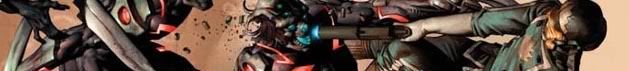
- Some rough comic pages I did in some spare time. What I'm planning on doing when I get the chance is to clean it up in Photoshop and tossing it through Flash in order to get smoother lines.

Any kinds of critique would be appreciated, from glaring anatomy wrongs (Which are hard pressed to notice in pictures like this) to any kinds of techniques which would help me further refine a pure black and white style.

I've been wondering if using a white-out pen would work, especially once scanned and cleaned up.

If this looks familiar, alot of the poses, paneling, and the first panel is referenced from the first Hellboy book. I've never attempted this before, so I needed some references to get everything together right.

starlordsig1-2.jpg
Damascusxie on

Posts

  • Options
    djFindusdjFindus Registered User regular
    edited June 2007
    OK, first off.. sequence of the panels is pretty good. But the lines are way too thick, try using variable lineweights. The more detail you have the thinner the line should be, IMHO. Even though you want to keep it black and white, you can use crosshatching to imply shadow, give value and increase readability because right now they're pretty hard to make out in certain places.

    Hope it helps!

    djFindus on
  • Options
    MufasaJoeMufasaJoe Registered User regular
    edited June 2007
    Fuck man, I kinda like this. Major problems, but likeable. Sure, theres no line width var. The Mignola ref is a little tawdry but understandable. And you might take some heat for no story and a lack of actual figures in drawings, just clothing and suits of armor with faces on top.
    What it's got going for it.
    1) It's dramatic.
    2) It shows that you had fun making it. Everybody likes to draw two dudes duking it out in castles.
    3)It's bold. Perhaps too bold. Maybe even really fucking bold. Mighta been nice to see the pencils.
    What it's got against it.
    1) Manga panels are for manga. (page 3)
    2) Cluttered.
    3) Total misinterpretation of how speed lines are implemented.
    4) Your faces is ugly son. Fug. Find some grizzly dude and ref his face if you want to but no more of panel 1 page 4.
    5) We know you didnt draw your figures or pillars according to a horizon, but so do you.
    All in all, just looks like you were having fun doodling. No need for the PA to set you straight on lack of narrative or story or cliches like armor dude vs. shadow beast.
    I've been wondering if using a white-out pen would work, especially once scanned and cleaned up.
    Go ahead and get some Sharpie paint pens. With poster paint not oil based. Black and white. Do that instead of white out. Lots of fun if you want to stray from pencil.
    The last thing this comic needs is crosshatching to clutter it. Sry, Findus.
    Also, flash line smoothing is not going to help you.
    As to pure black and white style refining, just steal. Jack the moves from Mignola and Miller and whoever, but they apply their tricks with style to basic understanding of figure, form and lighting. Just keep drawing.
    Other than that, draw from life, read up on Andrew Loomis and check some Scott McCloud out from your local library, blah blah blah. Etc.
    Welcome. Cheers on your first attempt.

    MufasaJoe on
  • Options
    djFindusdjFindus Registered User regular
    edited June 2007
    I was merely trying to give advice on one possible way to move forward with his style, I actually like it too. It's expressive but could be developed :) I still think trying to experiment with different ways to give the illusion of shadow and depth while staying b&w would be interesting, and might help develop the readability of the drawings.

    djFindus on
  • Options
    srsizzysrsizzy Registered User regular
    edited June 2007
    I'd say work on thinner lines. These just aren't appealing when the lines are so thick that I can hardly tell what's going on. Also, either work on straighter/smoother lines or work with a ruler more, the castle is definitely crooked. You should also work more on anatomy, form, and lighting, because if you're going straight to markers with shading you need to know what you're doing. Good luck.

    srsizzy on
    BRO LET ME GET REAL WITH YOU AND SAY THAT MY FINGERS ARE PREPPED AND HOT LIKE THE SURFACE OF THE SUN TO BRING RADICAL BEATS SO SMOOTH THE SHIT WILL BE MEDICINAL-GRADE TRIPNASTY MAKING ALL BRAINWAVES ROLL ON THE SURFACE OF A BALLS-FEISTY NEURAL RAINBOW CRACKA-LACKIN' YOUR PERCEPTION OF THE HERE-NOW SPACE-TIME SITUATION THAT ALL OF LIFE BE JAMMED UP IN THROUGH THE UNIVERSAL FLOW BEATS
  • Options
    DamascusxieDamascusxie Registered User regular
    edited July 2007
    Here is a quick second update.

    What I did was draw some more and scan it in, then run it through flash to clean it up. I think it looks decent, but thats just my opinion. Currently, also no white paint pens yet :( Haven't found alot of time to really do some serious drawing. World of Warcraft owns my soul.

    The following is a 7 page comic, detailing the efforts of Lysander to rid a castle of an evil ghost, and the reward he gets for doing so from his Order. Halfway through, I ended up getting the new Dark Angel's codex and felt a urge to draw something DA-ish, so I turned and made it a story about how Lysander kills the ghost of a Fallen and is promoted to Deathwing. The Terminator looks hooky because I didn't have a refence on how the armor looked like at that time, so I over did it with the decorations.

    page1f.jpg

    page2f.jpg

    page3f.jpg

    page4f.jpg

    page5f.jpg

    page6f.jpg

    page7f.jpg

    This is the first page of a comic which I am currently working on. No real idea a plot yet v.v.

    test1f.jpg

    Damascusxie on
    starlordsig1-2.jpg
  • Options
    Creambun 007Creambun 007 Registered User regular
    edited July 2007
    If there wasn't so much black everywhere, you could almost pull off a sweet stain glass effect with these. It's very jarring when you use mostly black and then use dark grey for like... three elements in each picture. I'd just stick with black throughout.

    Creambun 007 on
    Diggity.
  • Options
    ZombiemamboZombiemambo Registered User regular
    edited July 2007
    Wait, there's dark gray?

    Anyways, I find it really hard to see with such thick lines. I can't decipher half of the panels without staring at it for a few moments.

    Zombiemambo on
    JKKaAGp.png
  • Options
    Kewop DecamKewop Decam Registered User regular
    edited July 2007
    Yes there is dark gray. If it isn't black, it's pretty much considered gray.

    Kewop Decam on
    pasigfa7.jpg
  • Options
    earthwormadamearthwormadam ancient crust Registered User regular
    edited July 2007
    It's nice to see some comics where the artist isn't afraid to lay down some thick black. The drawback of this however is it looks muddy and it's hard to comprehend what is going on. You need thin and thick lines for the art to be complete. It's like your microns ran out of ink and you opted to finish the comic with your Magnum 44.

    earthwormadam on
  • Options
    MufasaJoeMufasaJoe Registered User regular
    edited July 2007
    Flash didn't help you none. You just gave up more control over line width.

    MufasaJoe on
Sign In or Register to comment.