As was foretold, we've added advertisements to the forums! If you have questions, or if you encounter any bugs, please visit this thread: https://forums.penny-arcade.com/discussion/240191/forum-advertisement-faq-and-reports-thread/
Options
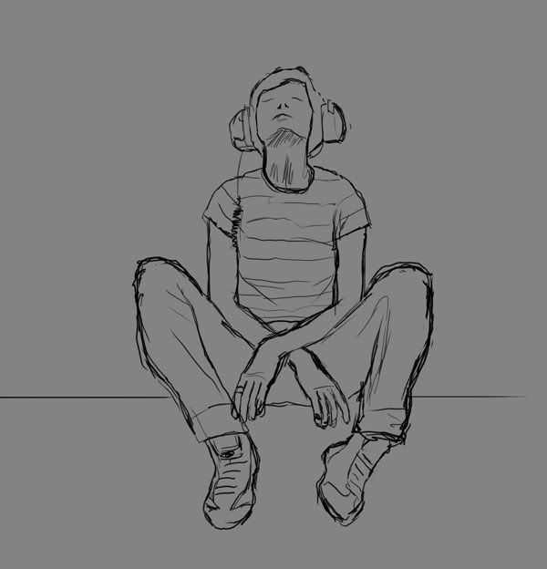
Headphone girl.
Lly Registered User regular
Registered User regular
Ok so I want to take this past a doodle so I figured I'd make a thread. This is done from a photo ref.
Initial sketch was already in the doodle thread so spoilered:
And now the lines:
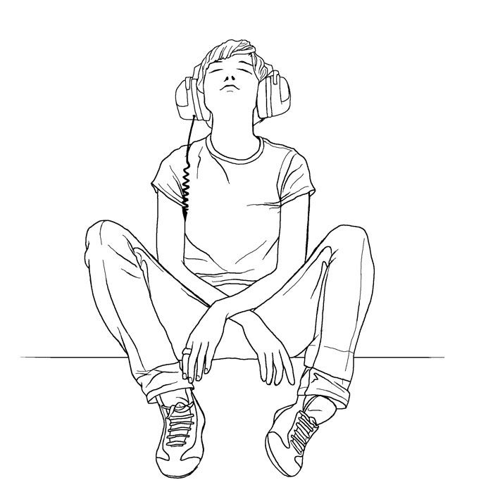
I would appreciate any crits before I take it to colours. Are there any glaring problems with the lines etc etc.
Cheers
Initial sketch was already in the doodle thread so spoilered:
And now the lines:
I would appreciate any crits before I take it to colours. Are there any glaring problems with the lines etc etc.
Cheers
Lly on
0
Posts
No immediate issues I can see. Take it to colour and give it some pizzaz.
JWahke, her right or our right? If anything i'd say that her right arm looks slightly shorter than the left .... Maybe after a nights sleep it will be more obvious!
Thanks guys. Preliminary colours have just this second started ... I am having trouble choosing how to colour it though! How stylized/realistic etc etc ... I like this part of the process
All around though, looks really good.
One small nitpick:
The girl's left hand that is leaning on her leg bothers me a very very little bit. Maybe it's my personal tastes but I think you should ink in the knuckle of the thumb to show that the thumb is squished between the pants and the rest of the hand.
Furious, I am planning on indicating more subtle stuff like you mentioned with the colouring, rather than black lines (if i can pull it off). Good crit though.
Anyways, possible colour scheme ... sorta. Pending fixing the arm.
The BG will be paler.
Thanks for the input folks. It's much appreciated!
edit: Crap, seeing the ref right there next to it it seems quite different proportionally. Damnit.
No one will know but you ;-)
http://thornsbook.com online novel
Yeah I noticed that too. Silly me
geek comic
www.hijinksensue.com
[SIGPIC][/SIGPIC]
what ref did you use?
The ref's spoilered above the semi-coloured version.
The other thing is to the right of her right hand index finger the pant leg has a crease line that touches a line that is on the butt area of her pants, I know there is a name for this type of situation and for the life of me I can't remember it right now.
This is what I'm talking about with the pants:
Colours are nearly done, it's just missing the finishing touch and I am stumped! Will post an update in a bit.
Any opinions would be great. I'm not sure about the BG cloudshapes, and also I am not sure how well the juxtaposition of kinda realistic skin rendering and vector clothing worked. Lemme know what you think.
just an opinion.
Whether or not I like the shading. . . not sure. It's like you have three different art styles going, with the lines, the shading of the skin, and the shading of the clothes. Maybe it should be more unified, maybe it makes it more interesting as an art piece, I can't really say. Seems a little much, though.
The clouds are sexy, don't worry.
I like the clouds too, but the shading of the skin looks weird in comparison to the vectorized looking coloring of the rest of the piece.
INSTAGRAM
If your going to outline it to start, you probably don't want to go back in and try to re-invent the form. What I'm trying to work on lately at least, maybe you can find some use in that idea as well. As is, even if the coloring style was uniform, it would still look flat, and less interesting than it's potential. For the process you went through, I'd say you're probably better off leaving it in that second stage with the flat colors.
Anyways, I'm still pretty novice too, so take it with a grain of salt. (whatever that means)
Here is a hopefully better version with the skin rendered as vectors. Any better?
Skin looks much better now.
INSTAGRAM