As was foretold, we've added advertisements to the forums! If you have questions, or if you encounter any bugs, please visit this thread: https://forums.penny-arcade.com/discussion/240191/forum-advertisement-faq-and-reports-thread/
Options
Making comics - critique and feedback?
Cr33g AustraliaRegistered User regular
AustraliaRegistered User regular
Hey everyone.
I've been lurking these forums for a while now, don't post very often but thought maybe it might be a good time to post up some work and get some feedback and critique. I'd love to hear your thoughts and I'd appreciate any constructive criticism that you can offer. I guess to introduce my background, I'm twenty four years old and I've been working full time for almost two years now in a multimedia position, specialising in film, video editing and graphic design. I have two Bachelor degrees from the local university, a Bachelor's in Visual Arts and a Bachelor's in the Creative Arts and Industries: New Media Design. Multimedia basically. One of my biggest passions and enjoyments, is drawing.
Years ago back in 2008, I wanted to try and get into web comics. However I eventually went on hiatus from that for a long while, tried to get back into it in 2011 and now in 2012, I'm trying again. This time with a little help from my older brother for the writing. It is a dream to try and get into the world of web comics as a full time career, however that isn't the entire point I suppose. I guess what I want to achieve from taking a stab at the world of web comics, is practice and experience. The true dream is to try and get full time work from my drawings. Web comics, cartoons, maybe even publication comics I dunno, but at the end of the day I want to try and draw for a living.
The overall theme and concept of my comic is overdone, I admit. You're probably going to roll your eyes at this, but the comics are about video games and general pop culture. No story lines or anything, just "gag strip" comics.
Anyway, I've probably bored you enough so I'll show you some of the works by my brother and I. I'm looking for feedback and critique on the art and style, as well as the writing and execution of the jokes. Any help would be greatly appreciated.
[Edit/Update] - sorry to do this, but I felt it would be good to show you one my older works, from 2011.
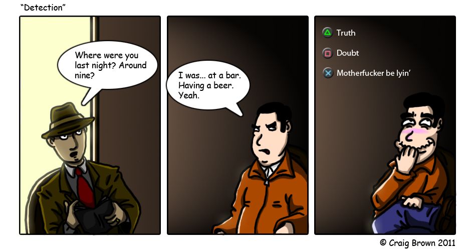
"Detection" - L.A. Noire
Below are my works from 2012.
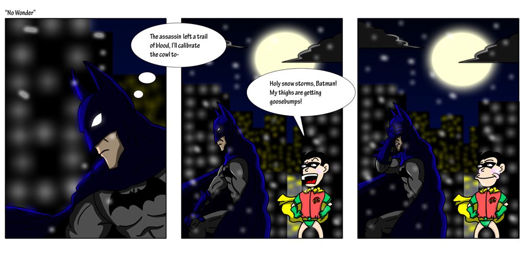
"No Wonder" - Batman: Arkham City
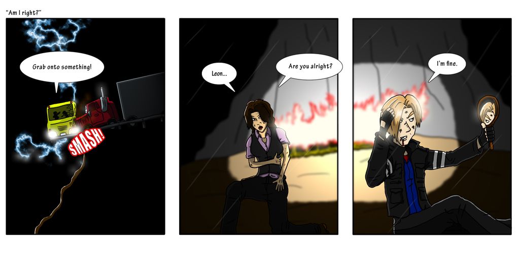
"Am I Right?" - Resident Evil 6
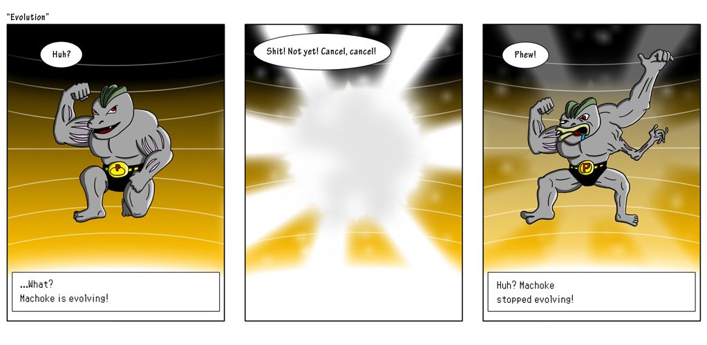
"Evolution" - Pokemon
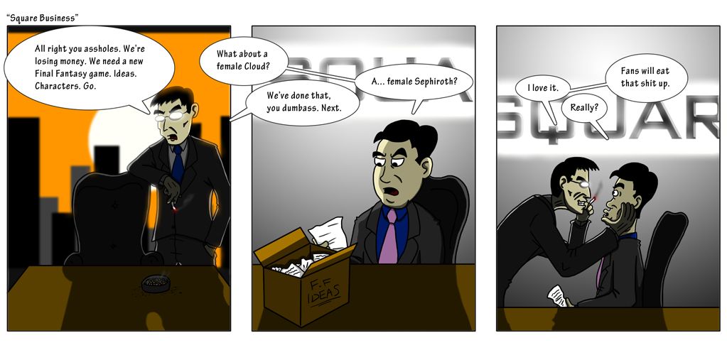
"Square Business" - Square-Enix
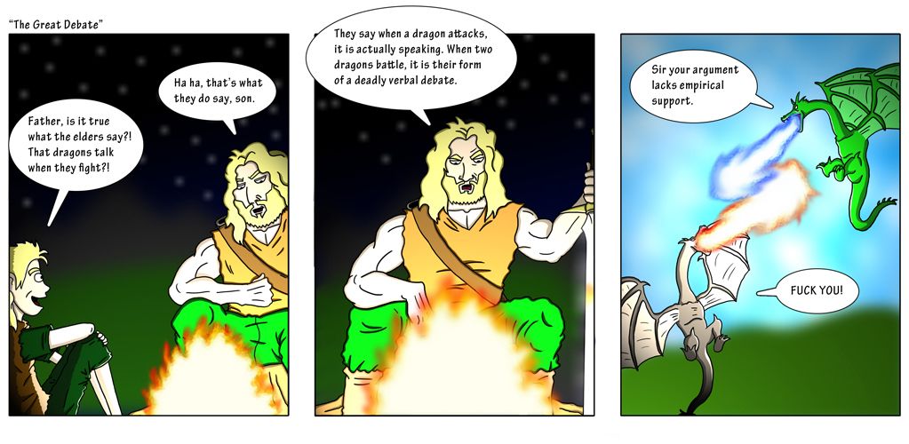
"The Great Debate" - Skyrim
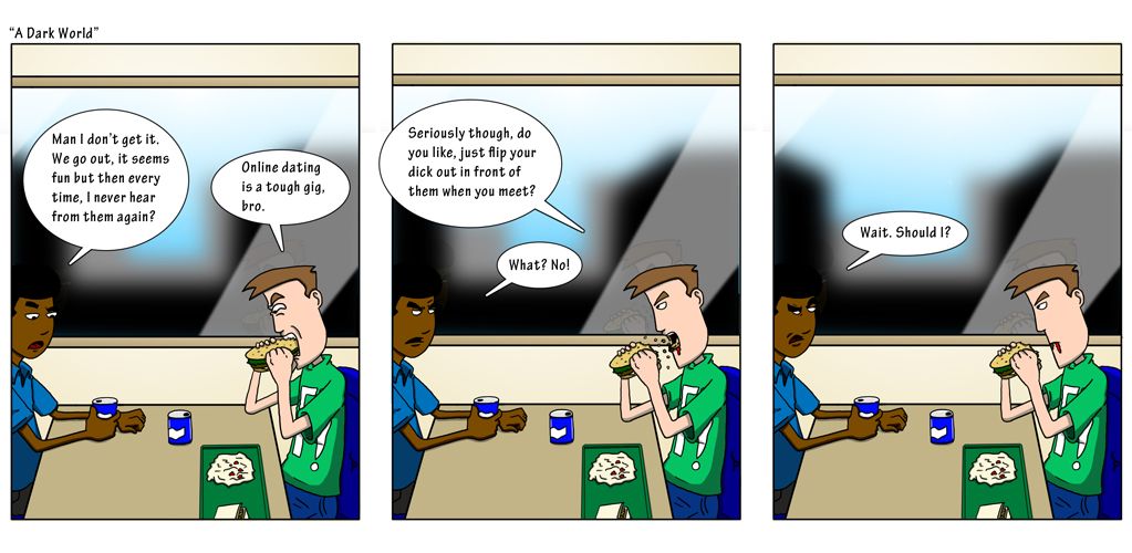
"A Dark World" - online dating
One thing I do not like about my comics is... my speech bubbles. They don't look very much like actual speech bubbles from a comic at all. Would anyone have any advice on how I can make my speech bubbles look better and more like a comic?
If anyone is interested in the process... each comic is sketched by hand with a pencil or pen on a pre-made panel print out, A4 paper. It's then scanned up, before being digitally inked and coloured in Adobe Photoshop CS5. I use a WACOM Intuous3 graphics tablet for the work. I hope you like my work and I look forward to your feedback.
I've been lurking these forums for a while now, don't post very often but thought maybe it might be a good time to post up some work and get some feedback and critique. I'd love to hear your thoughts and I'd appreciate any constructive criticism that you can offer. I guess to introduce my background, I'm twenty four years old and I've been working full time for almost two years now in a multimedia position, specialising in film, video editing and graphic design. I have two Bachelor degrees from the local university, a Bachelor's in Visual Arts and a Bachelor's in the Creative Arts and Industries: New Media Design. Multimedia basically. One of my biggest passions and enjoyments, is drawing.
Years ago back in 2008, I wanted to try and get into web comics. However I eventually went on hiatus from that for a long while, tried to get back into it in 2011 and now in 2012, I'm trying again. This time with a little help from my older brother for the writing. It is a dream to try and get into the world of web comics as a full time career, however that isn't the entire point I suppose. I guess what I want to achieve from taking a stab at the world of web comics, is practice and experience. The true dream is to try and get full time work from my drawings. Web comics, cartoons, maybe even publication comics I dunno, but at the end of the day I want to try and draw for a living.
The overall theme and concept of my comic is overdone, I admit. You're probably going to roll your eyes at this, but the comics are about video games and general pop culture. No story lines or anything, just "gag strip" comics.
Anyway, I've probably bored you enough so I'll show you some of the works by my brother and I. I'm looking for feedback and critique on the art and style, as well as the writing and execution of the jokes. Any help would be greatly appreciated.
[Edit/Update] - sorry to do this, but I felt it would be good to show you one my older works, from 2011.
"Detection" - L.A. Noire
Below are my works from 2012.
"No Wonder" - Batman: Arkham City
"Am I Right?" - Resident Evil 6
"Evolution" - Pokemon
"Square Business" - Square-Enix
"The Great Debate" - Skyrim
"A Dark World" - online dating
One thing I do not like about my comics is... my speech bubbles. They don't look very much like actual speech bubbles from a comic at all. Would anyone have any advice on how I can make my speech bubbles look better and more like a comic?
If anyone is interested in the process... each comic is sketched by hand with a pencil or pen on a pre-made panel print out, A4 paper. It's then scanned up, before being digitally inked and coloured in Adobe Photoshop CS5. I use a WACOM Intuous3 graphics tablet for the work. I hope you like my work and I look forward to your feedback.
Cr33g on
0
Posts
A) that font (after you [wisely] got away from Comic Sans you switched to using a lettering font that is nearly as bad [is that Komika?] but you've also scaled it way too small to be immediately legible, which is exacerbated by it being a typeface with a lower case that you happen to be using. It's tiny. Hit up Blambot and try again.
Short > Medium > Long > Medium > Short.
C) There are a lot of places where you've set up distracting tangents with your balloons and panel borders even though there's zero reason and plenty of space to nudge them away. Panel 1 of Great Debate is a perfect example.
I'm not going to get into the art side too much because most of what I have to say is pretty basic "draw from life, study light and color" type advice. Your cartooning skills would greatly benefit from more acquaintance with anatomy. One thing I can tell you right off though is stay away from super saturated colors. They are unnaturally, distractingly bright. Great Debate is, again, a key offender. Those impossible greens are not easy to look at. Batman's blue rim light in No Wonder is also pretty bad -- that kind of RGB-gamut-only blue is not a thing, particularly in the dark.
There's some improvement in these though from first to last. Keep it up & welcome to the AC!
Regarding speech bubbles, I see exactly what you mean... I've always been a little "Eeeh" about my own speech bubbles and the points you raised are probably why I feel this way. Next time, I'll try to centre my text within the bubble (rather than aligning it left) and I'll attempt to have the dialogue fit within the bubble, so there isn't so much white empty space around it. Thank you as well for your reference (the cowboy fella), that gives me a much better idea as to what you were getting at.
As for the font? The font is Tekton Pro (bold condensed). I originally chose this because I worked on one computer, then another and on the second computer I was thinking "Oh crap, what font did I use again?" and ended up going with that one. You're right though, it's not a very good looking font... I'll check out Blambot as you suggested and see what's available. I'm sure there's something free there that's ten or a hundred times better than Tekton Pro.
For future reference, I will also try to keep the speech bubbles away from the edges to give them some 'space' (as evident in The Great Debate strip, as you pointed out).
As for the colours... I do agree as well. I may revisit the original .PSD files and do some work. With the No Wonder strip, I could probably just elimate the brighter blue on the edges of Batman, replacing it with the secondary 'not so dark' blue that you can see in the first panel. With The Great Debate, that's my own doing for sure... with that comic I wanted to experiment with the lighting effects filter tool (which now that I see your critique and now that I think about it, probably not a good idea for me to do). I obviously went a little too bright... way too bright. I could revisit the .PSD file and look into the history and get rid of those pesky lighting effects or at least, dumb it down a little. I'm thinking the former.
Thank you again squidbunny, your critique and advice is really appreciated!