As was foretold, we've added advertisements to the forums! If you have questions, or if you encounter any bugs, please visit this thread: https://forums.penny-arcade.com/discussion/240191/forum-advertisement-faq-and-reports-thread/
Options
[Assignment] [design] - Brand Yourself!
Iruka Registered User, Moderator mod
 Registered User, Moderator mod
I'm posting this thread a little early, to introduce the new activity threads for the new year, and so people can get a head start on this topic.
Branding, Self Promotion, And Logos


There's no set point in your art career where you need to start to consider yourself as a brand. You may not be a graphic designer, but having business cards, a clean universal web presence, and a logo to stick on stuff are nice things for self promotion. Your overall image will probably change and shift over time, but sitting down every now and then and considering your identity is fun, self-indulgent, and ultimately beneficial to you. Have a show and need business cards? Bam, you already have a stack of 300. New art social media site comes along with a customizable page? Bam, slap your logo into that shit and its already customized and professional looking.
You can choose to work on some, or all of these parts to participate in this thread:
A logo
A Facebook banner and profile picture
Business Cards and Letter Heads
A portfolio site
Promo Mailers/postcards
Demo Reels
References and Advice
various design site inspiration
http://dribbble.com/tags/self_branding
www.behance.net
http://www.aiga.org/logo-warehouses-crowdsourcing-lack-of-understanding/
http://www.tumblr.com/tagged/self+branding
Look at famous artists (not needing to be your favorites, but ones that are high in professionalism and polish) and see if they have an identity and branding that you like. Not all of them will have flashy websites, or have their business cards online, but they may have product design you can draw from:
http://www.ovmlove.com/collections/bound/
Your self branding can be rough and primitive, or prim and proper. It can be plain white text over a Pollock inspired paint field, or intricate ink work on wood. Think about yourself as an artist, and how you want to present that to the world. I recommend posting about what you'd like to highlight about your work, and starting with a logo if you have nothing.
Templates and stuff
Printing Templates for overnight prints
business cards
PS: http://www.overnightprints.com/php/fdownload.php?file=en/specs/templates/businesscard.psd
Ai: http://www.overnightprints.com/php/fdownload.php?file=en/specs/templates/businesscard.ai
letter head
PS: http://www.overnightprints.com/php/fdownload.php?file=en/specs/templates/letterhead.psd
Ai: http://www.overnightprints.com/php/fdownload.php?file=en/specs/templates/letterhead.ai
Post Card
PS: http://www.overnightprints.com/php/fdownload.php?file=en/specs/templates/4x6_postcard.psd
Ai: http://www.overnightprints.com/php/fdownload.php?file=en/specs/templates/4x6_postcard.ai
Facebook Banner template
http://thejiggymonster.deviantart.com/art/Facebook-Timeline-Banner-Template-276014457
Twitter banner template
http://goo.gl/t8Pvq (via this website just saving you the "give us your email" download link")
Portfolio Site templates and managers
http://carbonmade.com/
http://www.weebly.com/
http://wordpress.org/
http://www.squarespace.com/
http://cargocollective.com/
If you have any tips, links, or templates to add, please post them! Otherwise get participating.
Branding, Self Promotion, And Logos


There's no set point in your art career where you need to start to consider yourself as a brand. You may not be a graphic designer, but having business cards, a clean universal web presence, and a logo to stick on stuff are nice things for self promotion. Your overall image will probably change and shift over time, but sitting down every now and then and considering your identity is fun, self-indulgent, and ultimately beneficial to you. Have a show and need business cards? Bam, you already have a stack of 300. New art social media site comes along with a customizable page? Bam, slap your logo into that shit and its already customized and professional looking.
You can choose to work on some, or all of these parts to participate in this thread:
A logo
A Facebook banner and profile picture
Business Cards and Letter Heads
A portfolio site
Promo Mailers/postcards
Demo Reels
References and Advice
various design site inspiration
http://dribbble.com/tags/self_branding
www.behance.net
http://www.aiga.org/logo-warehouses-crowdsourcing-lack-of-understanding/
http://www.tumblr.com/tagged/self+branding
Look at famous artists (not needing to be your favorites, but ones that are high in professionalism and polish) and see if they have an identity and branding that you like. Not all of them will have flashy websites, or have their business cards online, but they may have product design you can draw from:
http://www.ovmlove.com/collections/bound/
Your self branding can be rough and primitive, or prim and proper. It can be plain white text over a Pollock inspired paint field, or intricate ink work on wood. Think about yourself as an artist, and how you want to present that to the world. I recommend posting about what you'd like to highlight about your work, and starting with a logo if you have nothing.
Templates and stuff
Printing Templates for overnight prints
business cards
PS: http://www.overnightprints.com/php/fdownload.php?file=en/specs/templates/businesscard.psd
Ai: http://www.overnightprints.com/php/fdownload.php?file=en/specs/templates/businesscard.ai
letter head
PS: http://www.overnightprints.com/php/fdownload.php?file=en/specs/templates/letterhead.psd
Ai: http://www.overnightprints.com/php/fdownload.php?file=en/specs/templates/letterhead.ai
Post Card
PS: http://www.overnightprints.com/php/fdownload.php?file=en/specs/templates/4x6_postcard.psd
Ai: http://www.overnightprints.com/php/fdownload.php?file=en/specs/templates/4x6_postcard.ai
Facebook Banner template
http://thejiggymonster.deviantart.com/art/Facebook-Timeline-Banner-Template-276014457
Twitter banner template
http://goo.gl/t8Pvq (via this website just saving you the "give us your email" download link")
Portfolio Site templates and managers
http://carbonmade.com/
http://www.weebly.com/
http://wordpress.org/
http://www.squarespace.com/
http://cargocollective.com/
If you have any tips, links, or templates to add, please post them! Otherwise get participating.
Iruka on
0
Posts
Enrichment activities aim to encourage you to tackle a small but useful assignment every month. They are either multifaceted, or loosely defined, giving you the option to mold it to help you reach previously held aspirations. They will mostly be assignments that you can fulfill in whatever media, and commit whatever time you feel benefits you.
What Do I Gain From Participating?
If I'm at all qualified, I will try to provide crits and support to the people who participate. I hope that people in the thread also engage in a little more cross talk when they are working on the same assignment. I will do my best to not let anyone's work go un-commented upon. I will also try and load the OP with resources for everyone to draw from on the topic at hand.
May I post an old work if it fits into the topic?
You may post work that you are currently working on, or plan to revisit during the month. Don't post old work if you have no intention of touching it. If I spend time commenting on year old work and then you never do anything to it within the activity, I will shun you.
May I post inspiration and links even if I'm not going to really participate?
So long as this aspect doesn't get in the way of people posting work for actual crits, this is a great place to just throw up some art that is related to the topic and you think its helpful. Link the source, and spoiler images so they don't detract from people working on assignments.
May I suggest a topic?
Sure! If a bunch of people have something they want to work on, I'm happy to make that the next assignment. Just try and keep it something that all artists can do (like color studies) and not something that requires materials that are inaccessible to a large percentage of members (like ceramics, or metalwork) If there is something that members would like to do and it has a fairly low material buy in, like sculpey maquettes, I'm cool with that too.
Deadlines
I will pretty much rotate these out monthly without exception. Perhaps if there is a popular one I will let it run for two months.
Previous Threads:
2013
JAN-BrandYourself
FEB-Simple Shapes
MAR-Show Your Work
APR-Color Studies
May-Hands and Feet
JUN-Still Life
JUL-Character Construction
AUG- (off month)
SEP- Perspective and Environments
OCT- Thumbnails and Silhouettes
NOV - NatCoWriMo
DEC - Secret Santa.
2014
JAN- Resolution
I did some personal branding a little while ago, so I don't think I'll be producing a logo or any stationery, so instead I'll try to produce a motion reel.
http://www.tumblr.com/tagged/brand+design
I need to update my portfolio and overall image because I've been using the same thing for 5 years now. I'll be doing this.
There is one bit of advice that I feel is important to point out: When dealing with print, the actual design is half of the work. The other half is in choosing the right paper. Most paper companies, such as Mohawk, will give away paper sample booklets. These are fantastic resources that will make your print product that much better!
When you get your sample booklet, don't store it for a couple of years. Paper styles, much like the latest fashion trends, come and go very quickly. You might find that the 100lb Velum paper you had your heart set on was discontinued 2 years ago.
Also, I love this page:
http://designerstoolbox.com
3DS: 0447-9966-6178
If you all are looking for a crap load of logos to get ideas from check out http://www.logopond.com
My Portfolio Site
Uncanny Magazine!
The Mad Writers Union
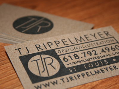
Vectorized my business card.
Now to make a back for it.
I made a logo a little while ago:
Which I will probably put on the back in some way.
Also Helvetica is a very stable typeface without much personality, which is kind of at odds with the energy that your branding has. Try experimenting with some other options from blambot or dafont, perhaps something blockier maybe with the edges roughened up, or a font that with more flow and dynamism (not necessarily a script font, but along those lines). If you keep the coloured bars, find a way to work them in that emphasises the image. It can be used to emphasise the type too, but preferably the type should be easy enough to read on its own.
Here's a quick mockup I made (the details would be on the other side):
I also much prefer my card match my website
http://lauramakesart.com/ (for reference)
Which while I need to do some changes over there, I'm rather happy with the simplicity of it. I'll play with the spacing, though.
I actually already have a card
And my essential goal was to just vetorize it, because the printing came out all shitty since it was before I knew how to use illustrator. The text in the new version is already much bigger, and my old card has been working fine for me, but the phone number was too small.
I do see where your coming from, though. My layered sense of myself as an artist goes down to the bone, and it doesn't always come out coherently. I hate splatters and grunge text though, so I'd have to find some other solution. I'm not sure I'm going to go for a complete re-branding, here though. I'd rather play with the constraints I've already set and see if I can make it work.
This sprang to mind for fun:
So if any of you GD people want to treat me like one of those terrible clients that doesn't know any better and find the perfect font to fit my stupid, arbitrary criteria, go for it.
I'll play with everything else, despite my strong, strong inclination to be lazy and okay with my card as is.
But, You bitches best be working on shit to post in here too, though. I'm not making these monthly enrichment threads just for me.
My initials (JH)
A blocky, graphical representation of how I sign my initials (JRH, seen in lower left for comparison)
What? How is there too much info in the card that Iruka posted? She has her points of contact and her website listed. She didn't include her blog, deviant art, facebook, linkedin or anything else. It's the basic information that a business card generally should have. I would say that Flay's design would probably work better as a masthead for a website than a business card.
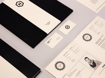
Settled on a geometric logo I like (thanks @Iruka for the feedback!). Here is a business card I put together with it. Nice and simple, I think. Thoughts?
My brand is called Mynt Condition Comics. I will be producing multiple short stories that will be mainly viewed online with an eventual push to print. So my logo and branding will have to work for things like a website header, banners, possibly avatars for social media, spines and covers of books and business cards.
I'd like to convey a message of quality and professionalism. I know that is VERY broad, but in essence, I'm not looking for something "cartoony" for a logo. The stories I have planned might have a touch of whimsy and comedy here and there, but since the thought of having to write funny stories week in and week out is paralyzing for me, I'll be staying away from that.
One thing that does worry me is the name "Mynt"... I've used it as a handle forever, so it's tough for me to stray away from. But I wonder if I should just change it to "Mint"... The worry I have is having to explain to someone that it's "Mint" but with a "y" can be cumbersome. Then again, in today's world of links and copy pasting, does that even matter?
Ok... Enough words... Here's some super preliminary brainstorming I did during Christmas:
Trying to figure out a logo typeface I wouldn't abhor using:
Here's another page with a couple of drawings trying to figure out the logo imagery. As well as my old business card. I like the idea of using a mint leaf as a logo and the image in the middle is something I could see on the spine of a book. I'll probably expand on that in the near future.
Would love some design advice or if you can see anything that is broken, I'm a massive dunce when it comes to jazz like this.
clicky clicky