As was foretold, we've added advertisements to the forums! If you have questions, or if you encounter any bugs, please visit this thread: https://forums.penny-arcade.com/discussion/240191/forum-advertisement-faq-and-reports-thread/

Seeking Critique

b_albsb_albs Registered User regular
Hello AC!

I have been drawing for nearly two years now, in order to facilitate my comic. It's something I'd like to pursue professionally if I ever got the chance.

A friend of mine whose opinion I highly value told me I may be ready to be critiqued here.

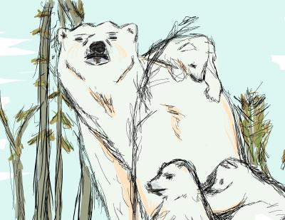
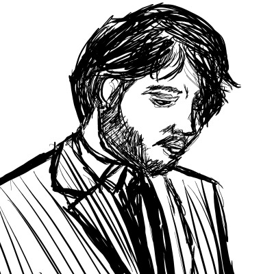
I've attached some pieces I've been working on recently. If there is anything else anyone would like to see, please let me know.

I have not included any examples of my comic, but could if anyone desired to see them.
tumblr_mg7uu2URTm1ro7g6oo1_1280.jpg

tumblr_mg63pxOOuc1ro7g6oo1_400.jpg

tumblr_mg5uzs9JJb1ro7g6oo1_400.jpg

tumblr_mg8mchdO0N1ro7g6oo1_400.jpg

tumblr_mg9tepaQuQ1ro7g6oo1_400.jpg

tumblr_mg4bxqhAeB1ro7g6oo1_400.jpg

Thank you so much for taking the time to look at these, and thank you for any guidance you can offer me.

Posts

  • HalenHalen Registered User regular
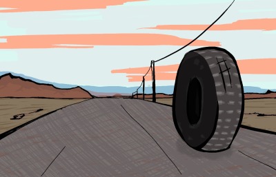
    I'm not one to be offering critique. I find the sketchiness of your lines appealing, although others may not. Oddly, my favourite of these is the tyre on the road - you've managed to imbue it with tons of movement, which is super-great for such a tiny sketch.

    Draw an egg.
  • ChippsChipps Registered User regular
    Halen wrote: »
    I'm not one to be offering critique. I find the sketchiness of your lines appealing, although others may not. Oddly, my favourite of these is the tyre on the road - you've managed to imbue it with tons of movement, which is super-great for such a tiny sketch.

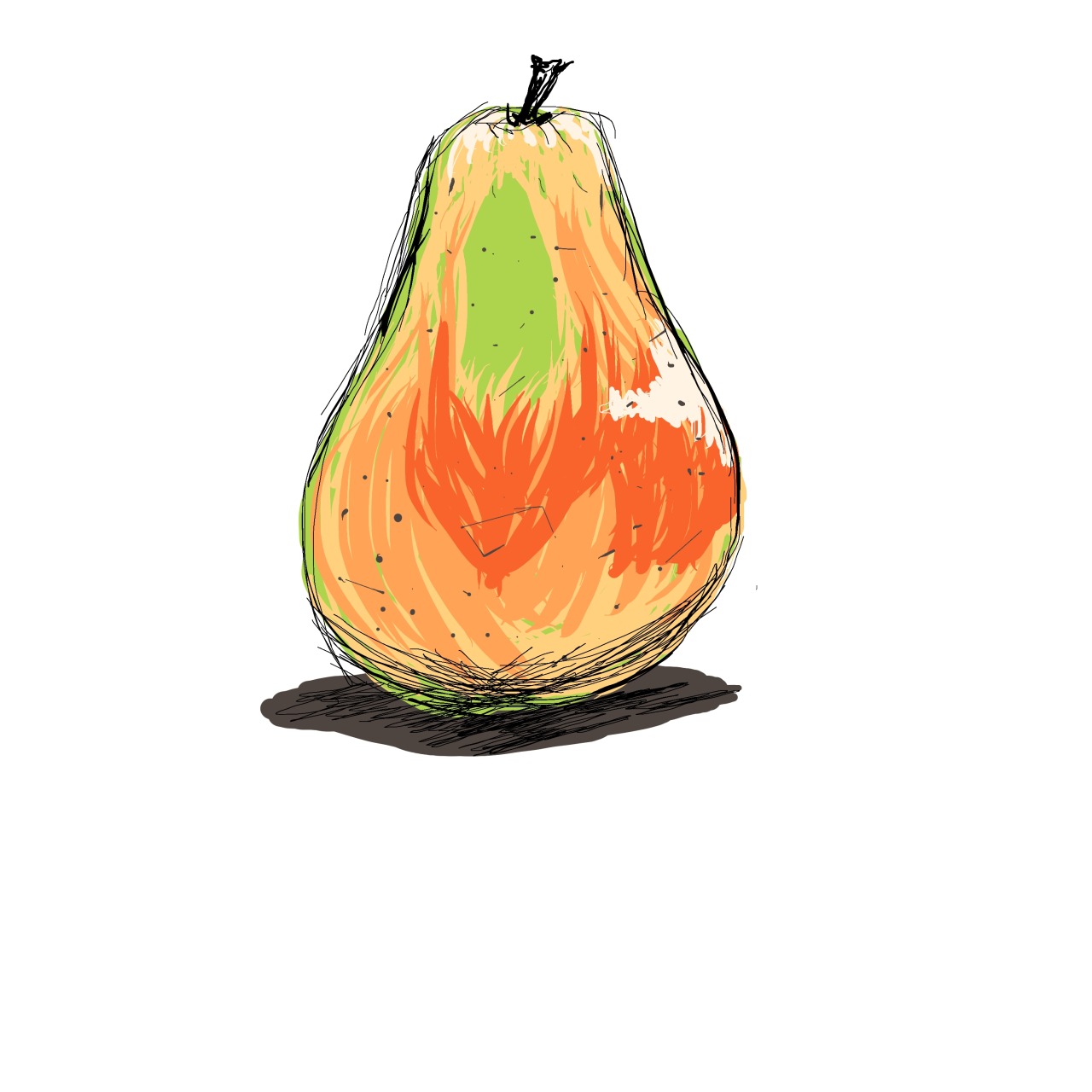
    Funny, the tire doesn't do much for me. I do however think that he has crafted himself a fine pear.

  • b_albsb_albs Registered User regular
    Thanks for kind words. I'm going to throw a few more things up here tonight. Would it be beneficial to post a work in progress, or should i focus on finished pieces?

  • PukioPukio Registered User regular
    That is a damn fine pear, but I think the reason it stands out more compared to the other stuff you've posted is that the color and mark making work to accentuate the shape of the object whereas the scratchy lines in your other work is sort of coming off more as haphazard than focusing on form and volume (for example, why the cross hatching on the pavement in the tire picture? What does that mark making do to convey the texture of the road?). I'm all for scratchy, sketchy lines but they definitely need to be applied with purpose. I'd be interested to see what you can do with a more controlled, clean look - as having both those tools in your arsenal (the ability to go for clean lines or more textured ones) can be a huge benefit.

  • b_albsb_albs Registered User regular
    I definitely see what you're talking about. I often get confused about textures simply because there are a great many that I have no idea how to convey. On top of that, control is something that I feel I don't have a whole lot of right now. Are there any pointers you could give me to help sharpen that? I have kind of a shaky hand and it can be difficult for me to get a good line going.

  • b_albsb_albs Registered User regular
    2lIwb.jpg?1

    Still working on this one, but I'm trying to focus on cleaning the lines up a bit.

  • MustangMustang Arbiter of Unpopular Opinions Registered User regular
    Personally everything you've posted here feels rushed as if you're on some sort of art stopwatch.

    I would try some more slower paced pencil studies. Hands would be a good start.

  • b_albsb_albs Registered User regular
    Kinda defeats the purpose of what you're saying to say I'll get started right away, but I will anyways. You make a very good point though, I do tend to rush through things. I'm gonna take a bit of time to go look at some hands.

  • b_albsb_albs Registered User regular
    tumblr_mgajirjO8U1ro7g6oo1_500.jpg

    I tried to take some time with this one. I hope that I'm starting to strike upon some of the things you all have been saying.

  • MustangMustang Arbiter of Unpopular Opinions Registered User regular
    Remember that everything has perspective. Props for trying but what you've drawn looks very 2 dimensional.

    Try picking up Burne Hogarths Dynamic Figure Drawing, it will do wonders towards helping you see your drawings 3 dimensionally on the page.

    Example
    tumblr_m44bkkGmqL1rskno7o1_1280.png

    Some people find his drawings overtly stylised, but the book certainly helped me a lot when I first started drawing.

  • PukioPukio Registered User regular
    Something that actually helped me a lot with steadying my hand was a) drawing from life and b) doing it in pen. Or marker. Or something that you can't erase. It forces you to be more decisive with your mark making while remembering that the big thing about drawing lines isn't necessarily accuracy, but confidence. Better to make a line that's slightly off than one that's wobbly and uncertain. Definitely seconding Mustang re: taking your time thing. Speed comes later.

  • HalenHalen Registered User regular
    I think I must be on a different planet. I like the wobbly uncertain lines, and I think the cross hatching on the road adds to the movement..

    I'll just be quiet in my corner :-)

    Draw an egg.
  • brokecrackerbrokecracker Registered User regular
    Yea, I will agree with those saying the sketchy style feels like it is distracting from the overall work. I agree with Pukio here, try examining your workflow. I had this problem when I went from pencils to inks, I was using a pen just like I used my pencil. You might not be going for a clean inked look and that is fine, but you won't get confident lines without a little ground work first.

    What I would recommend is sketch the hell out of something in pencil. Do it up, don't change much about the way you draw just detail the fuck out of it. Then ink over the top, try make longer, shape defining smooth lines. As you do this you have to decide what details stay and which ones go, don't be afraid to loose a lot of detail. Remember when inking you kind of want to draw from the shoulder to get those big smooth lines, drawing from the wrist really limits you there. Erase the pencils and check it out.

    An artist to look into who still have a very sketch feel but a lot of line variation and confidence is Skottie Young (http://www.skottieyoung.com/)

    Hope that helps and keep them coming! Welcome to the AC!


  • b_albsb_albs Registered User regular
    edited January 2013
    Wow, I've got a lot to work on today! Thanks so much guys, this is all real helpful stuff. I gotta start keeping notes! Very excited.

    Gonna do my best to take my time, use confident lines and hopefully produce something little more alive. Gonna seek after that book Mustang mentioned too.

    Thanks again!

    UPDATE: Sorry I'm kinda of a forum etiquette neophyte. I double posted this but it got blocked by a filter.

    Here's what spent my morning doing.

    tumblr_mgbm6nFGyA1ro7g6oo1_250.jpg
    tumblr_mgbm6nFGyA1ro7g6oo2_250.jpg
    tumblr_mgbm6nFGyA1ro7g6oo3_400.jpg

    Really appreciate your thoughts on this one.

    b_albs on
  • ChippsChipps Registered User regular
    I like seeing the process and it's nice that you're actually doing your best to feed of the C&C in the topic, here comes the "but"...

    This is very visually confusing, I can't tell if this shark is leaping out of water, swimming through it, jumping into it, what have you. Is what's entering it's mouth more water? It looks like there is some kind of differentation in your sketches but I can't tell what it's supposed to *be* sorry to say.

  • b_albsb_albs Registered User regular
    Wanted to pick a reference with a lot of detail so I could weed some of it out. May have bit off more than I can chew. I think that I'll try the same exercise with a simpler image.

    That being said I'd still like to hear more about sharky!

  • brokecrackerbrokecracker Registered User regular
    Yea, it is visually confusing but the line confidence and variation is much stronger! Yes, keep it up and post more!

  • b_albsb_albs Registered User regular
    edited January 2013
    this was a double post, please ignore with my apologies

    b_albs on
  • b_albsb_albs Registered User regular
    edited January 2013
    this was also a double post. very sorry again.

    b_albs on
  • b_albsb_albs Registered User regular
    edited January 2013
    Hey guys, one more before I go to bed. I decided to repeat the exercise that brokecracker suggested, but with a simpler image. Not really sure I managed to make much headway on the three dimensionality front. Think I'm going to spend some more time looking at hands tomorrow, perhaps go out and seek after that book Mustang mentioned.

    tumblr_mgcj7gp30s1ro7g6oo1_250.jpg
    tumblr_mgcj7gp30s1ro7g6oo2_250.jpg
    tumblr_mgcj7gp30s1ro7g6oo3_500.jpg

    Thanks for your time and attention as always! I really appreciate it.

    Update: Here's a hand. Think I'll be going to get that book this afternoon.

    tumblr_mgdhgqARkU1ro7g6oo1_500.jpg

    Update: @Mustang : Hogarth is great! Thanks so much for the recommendation. I know I'm supposed to be taking my time, but I couldn't keep myself from banging out a quick sketch.

    tumblr_mgdrzq9r5N1ro7g6oo1_250.jpgtumblr_mgdrzq9r5N1ro7g6oo3_500.jpg

    b_albs on
  • lyriumlyrium Registered User regular
    It's good that you planned ahead for your figure with some thought about the basic forms- but if you can take the moment to do this, then you should also be giving yourself a chance to remember basic anatomy. In your shape guy you forgot the abdomen altogether, so it goes right from ribs to hips. Also, doing sketches like those from references would be good practice, so that you don't form bad habits due to not knowing what something looks like.

  • FuzzyFuzzkinFuzzyFuzzkin VirginiaRegistered User regular
    I second @lyrium's "use a reference" suggestion. Until you can draw it perfectly from memory, have a reference handy. It helps tons.

    Designer, Developer, Codemonkey, Artist at Achronic Games Mobile (Link: www.achronicgames.com)
  • AtomicKittenAtomicKitten Registered User regular
    One thing that strikes me with a lot of your images is the inconsistent shading. Using the girl image as an example, you have a shadow under the berasts and a highlight on her right leg (and it looks like some minor highlights elsewhere), but her left leg has no shading, nor do her arms, neck, or face. The face, especially, lacks depth.

    The highlight on her right leg would also mean that the light is coming from scene left, however that is inconsistent with the shadow under the breasts. If there was more shading, I probably wouldn't have noticed this, but as I looked more, it stood out.

    I think the Jan 07 image probably has the best shading, but it is only around the face and edges; the middle is comparatively shapeless and relies more on line weight and shading than it does color / value for definition, which is inconsistent with the face and edges. I can like either as a style, and wouldn't mind seeing more of either, just pick one.

Sign In or Register to comment.