As was foretold, we've added advertisements to the forums! If you have questions, or if you encounter any bugs, please visit this thread: https://forums.penny-arcade.com/discussion/240191/forum-advertisement-faq-and-reports-thread/
Options
Art thread with a clever title!
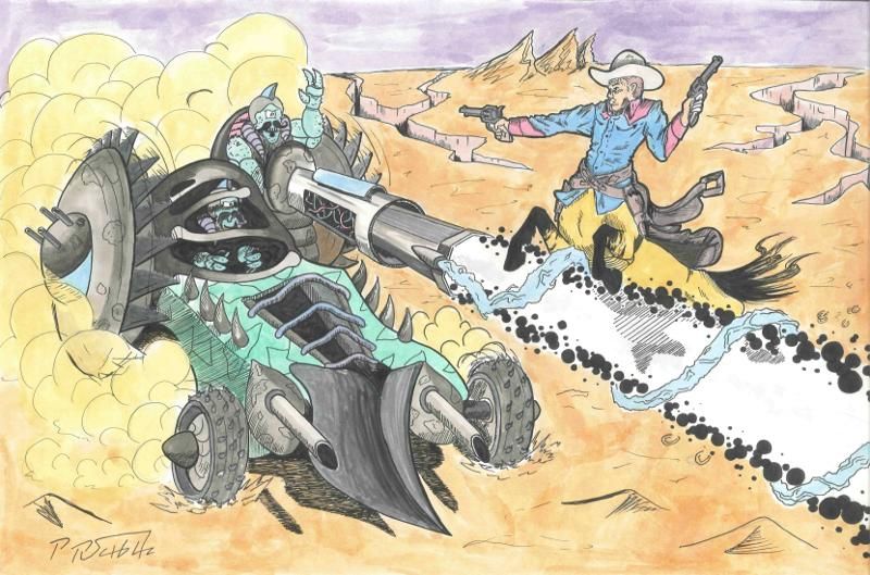
Cowboy Centaur Bullet SpongeWeston, MoRegistered User new member
Bullet SpongeWeston, MoRegistered User new member
hey guys, I would sure appreciate any crits you could give,
trying to get better at vehicles, designing thems not my strong suit
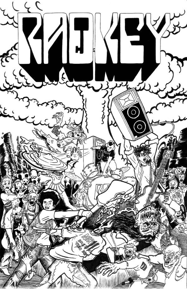
poster for a cousin's band
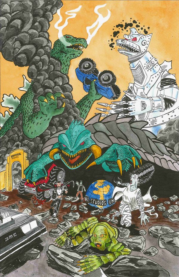
Monster Mash-up
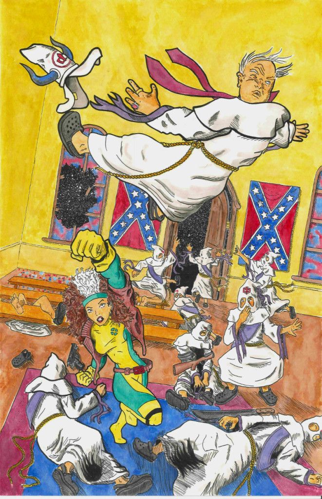
Rogue expressing her opinion of a certain "secret society"
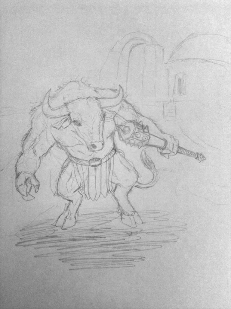
Minotaur design
Fantasy map i came up with for a christmas art swap
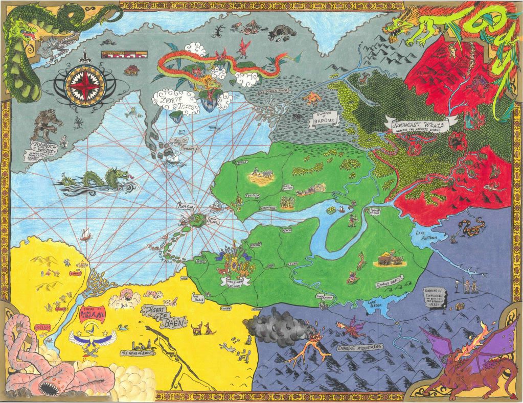
higher res version can be seen HERE
thanks for checking them out!
trying to get better at vehicles, designing thems not my strong suit
poster for a cousin's band
Monster Mash-up
Rogue expressing her opinion of a certain "secret society"
Minotaur design
Fantasy map i came up with for a christmas art swap
higher res version can be seen HERE
thanks for checking them out!
0
Posts
any critiques or comments would be appreicated,
I see what you mean about the treeline, it really does jump out doesn't it? I suppose I ought to have gone with something much lighter, like some 30% zipatone or something. I may redo it in GIMP. im not quite happy with the leaves on the tree either, I really struggle with that kind of thing.
thank you for checking it out man, and thank you as well MuddyParasol for your kind words.
I hope you don't mind, but I did a quick 5 minute paintover to show what I mean:
Anyway, I like the ambition and time you obviously put into your work. Good luck and keep at it.