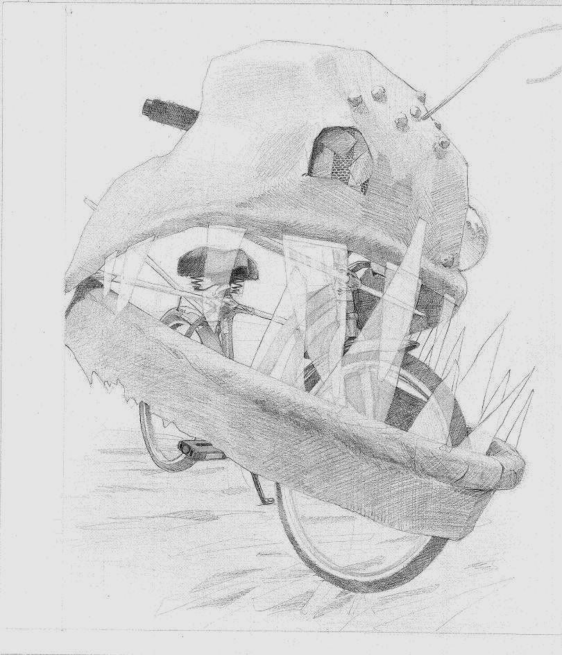
hey guys, i drew this for the RISD application. before i send it to them, could i get some oppinion on if i should add some abstract background to help contrast the lighter parts of the drawing?
thanks again AC.
Isnt the RISD app like 25 bikes? I dont remember what the app was like now. I didn't do it, I had a friend in AP that did, though.
Anyways, I recommend adding contrast without adding a background. There's enough going on for the viewer to suss out, depending on what you mean by "abstract" it may just distract from it. If you feel like the shading would help, go for it, just make sure you don't muddy/smudge your values.
Looked it up, it's one bike and a choice of subjects for the second piece:
Two drawing samples are required of all candidates. Your first drawing must reference a bicycle. Your second drawing should be chosen from this list of options:
In the course of a single calendar day, draw 25 related images in a single visualization
A drawing that uses both sides of the sheet of paper
A drawing that interprets the phrase “Inside/Outside”
I don't think I'd add a background. With the support armature on the bike and the other details (transparency on the teeth, the angler line on the fish head), there's a lot of detail that could get easily lost in a background.
If you want to experiment with a background maybe you could take the piece to a copy shop. Mess around with adding a background on the copy to see how it looks.
Thanks for the replies. As for what I mean by abstract background; using a simple value (a paper towel with some graphite on it).
I feel pretty good about the outline I put on the image already, and initially questioned the use of a value background.
I still do.
@iruka how would you handle punching the contrast?
For "inside/outside" I was going to do my lizards aquarium. Looking into his living room from my living room... OooOOOOooo... But he got a couch, so it's funny.
Any votes for that?
As for 25 related images in a single visualization... You have to define both "related" and "visualization".
I'm still thinking how I would answer that.
Vote?
And two sides of the paper is out. I think of echer or those Tshirts that have superhero's fly through the wearers back and chest.
Hmmm... I just thought of doing a portrait of my front door from both sides. I'm kinda digging that.
Any votes?
I think your bike idea is fine. Conceptually it’s much more interesting than what most people would do. And while the fish head obscures much of the bike, thus circumventing the challenge of drawing one, your strong use of perspective demonstrates advanced draughtsmanship.
As for 25 related images in a single visualization... You have to define both "related" and "visualization".
I'm still thinking how I would answer that.
Vote?
I would go to a public place and draw twenty-five people. Or maybe draw twenty-five animals. But put them all in different places so that they engage in unexpected ways.
25 self-portraits of you throughout a [typical or imaginary] day. What you're wearing, what you're holding, your energy level, your emotion...
25 ingredients you might use to cook something...perhaps with drawings occasionally thrown in of the meal coming together, then being eaten. I'm thinking grid-style...which may not be the most interesting of visualizations, but I think it can be pretty striking to use with a cool concept.
I like supabeast's idea too, of 25 different people all in the same environment, interacting with different areas.
I like the ingredients idea! I'm a HUGE fan of food porn!! I've always wanted to draw my own! Can I take that please? Would you mind? I'll make you proud I promise.
First up! I still have red kale, spinach, olives, two kinds of mushrooms, and some cheese and stuff for my raw items. I chose to randomize their locations.
Media: copic markers.
Do these need touch ups via colored pencil? Or do they look good as is?
ALRIGHTY...
shit, that started not to be fun when i ran out of ingredients to draw. but its done, its in the mail. i dont "hate" it. so it must be succeeding in some way. and the icing in the cake; the actual lasagna tastes AMAZING! who knew that making ones own sauce could taste so good?
this is how i feel about it: Some of the panels i am not proud of. but there are not many bad ones. and the bad ones are arranged in such a way as to help move the eye through the whole piece. so i dont feel bad about the bad panels. i kinda like them.
CC appreciated, and thanks for all the support guys. wish me luck.
ps. even with 90 markers, the pallet limitation was mildly distracting.
Posts
Anyways, I recommend adding contrast without adding a background. There's enough going on for the viewer to suss out, depending on what you mean by "abstract" it may just distract from it. If you feel like the shading would help, go for it, just make sure you don't muddy/smudge your values.
Looked it up, it's one bike and a choice of subjects for the second piece:
I don't think I'd add a background. With the support armature on the bike and the other details (transparency on the teeth, the angler line on the fish head), there's a lot of detail that could get easily lost in a background.
If you want to experiment with a background maybe you could take the piece to a copy shop. Mess around with adding a background on the copy to see how it looks.
I feel pretty good about the outline I put on the image already, and initially questioned the use of a value background.
I still do.
@iruka how would you handle punching the contrast?
For "inside/outside" I was going to do my lizards aquarium. Looking into his living room from my living room... OooOOOOooo... But he got a couch, so it's funny.
Any votes for that?
As for 25 related images in a single visualization... You have to define both "related" and "visualization".
I'm still thinking how I would answer that.
Vote?
And two sides of the paper is out. I think of echer or those Tshirts that have superhero's fly through the wearers back and chest.
Hmmm... I just thought of doing a portrait of my front door from both sides. I'm kinda digging that.
Any votes?
ideas welcome.
Thanks again for the support.
I would go to a public place and draw twenty-five people. Or maybe draw twenty-five animals. But put them all in different places so that they engage in unexpected ways.
I might run with your idea a little. But I get entirely to nervous when drawing in public.
25 ingredients you might use to cook something...perhaps with drawings occasionally thrown in of the meal coming together, then being eaten. I'm thinking grid-style...which may not be the most interesting of visualizations, but I think it can be pretty striking to use with a cool concept.
I like supabeast's idea too, of 25 different people all in the same environment, interacting with different areas.
Well let me stew on it at least...
BA-DUM pshhhhh
:P And yeah - feel free to use that idea. I hope you'll post some progress shots!
First up! I still have red kale, spinach, olives, two kinds of mushrooms, and some cheese and stuff for my raw items. I chose to randomize their locations.
Media: copic markers.
Do these need touch ups via colored pencil? Or do they look good as is?
Kale
Brown Beech mushrooms
Olives
White beech shrooms
Looking like an all-nighter. I haven't started the sauce yet...
facebook.com/LauraCatherwoodArt
ALRIGHTY...
shit, that started not to be fun when i ran out of ingredients to draw. but its done, its in the mail. i dont "hate" it. so it must be succeeding in some way. and the icing in the cake; the actual lasagna tastes AMAZING! who knew that making ones own sauce could taste so good?
this is how i feel about it: Some of the panels i am not proud of. but there are not many bad ones. and the bad ones are arranged in such a way as to help move the eye through the whole piece. so i dont feel bad about the bad panels. i kinda like them.
CC appreciated, and thanks for all the support guys. wish me luck.
ps. even with 90 markers, the pallet limitation was mildly distracting.
Are you applying anywhere else?