As was foretold, we've added advertisements to the forums! If you have questions, or if you encounter any bugs, please visit this thread: https://forums.penny-arcade.com/discussion/240191/forum-advertisement-faq-and-reports-thread/
Options
[Enrichment] - Color Studies
Angel_of_Bacon Moderator mod
Moderator mod
Color Studies
>>Enrichment Directory<<
One of the best ways to make a picture come to life is by having a strong color composition, but often times color is made an afterthought when it comes to study- a touch of local color under a line drawing and calling it a day is often the case.
This month's exercise puts color front and center: by stripping down our compositions to the barest, basic elements, we can concentrate exclusively on the tricky subject of figuring out just what does make for "good color", without getting bogged down in other issues. By engaging color as a crucial compositional element, we can invoke a strong sense of realism or mood with very little in the way of actual rendering. Think of it as a color thumbnail.
You may choose to work on some, or all of the following:
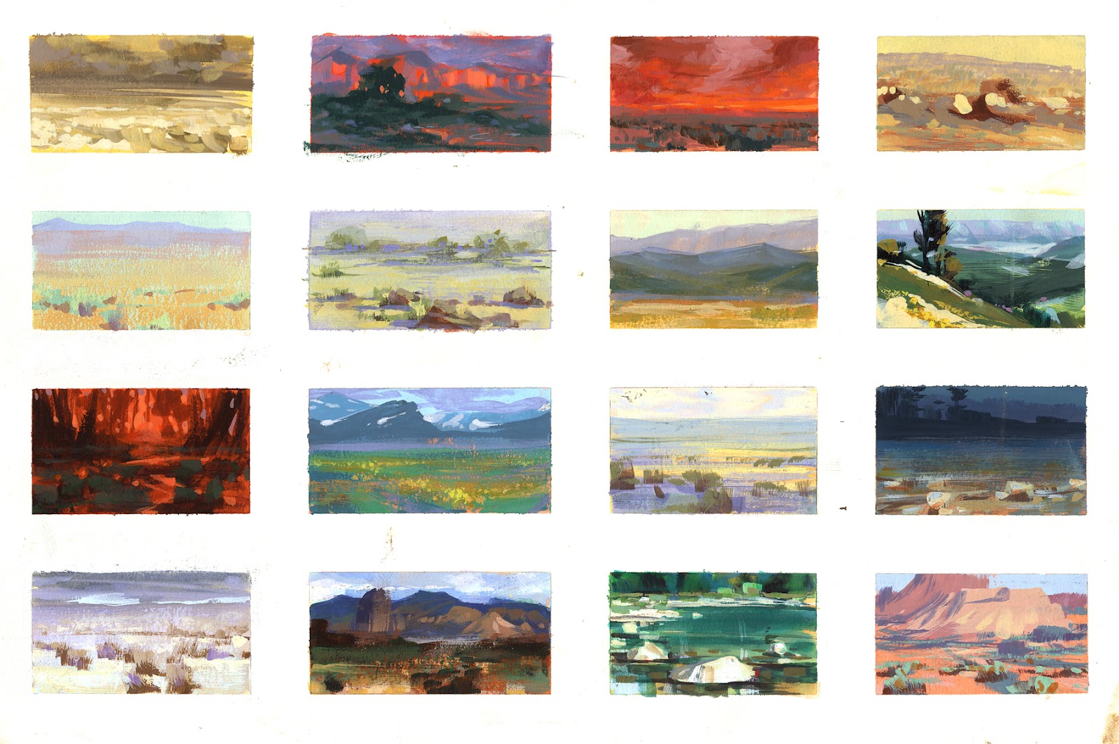
Do quick color studies exploring a color concept (analogous/complimentary colors, saturated vs desaturated colors, etc, using color contrasts to guide the viewer's eye, etc.)
Make a series showing the same objects/setup under various different lighting conditions or moods
Analyze a painting, reference or scene from life by breaking it down into simple color shapes, showing how color concepts function in a real world scenario
For these exercises, try to keep your rendering simple and broad, without going into much detail. Try not to spend more than a few minutes on your rough sketch, and instead try to work exclusively with color. I would suggest working more with opaque blocks of color to encourage you to be bold and decisive with your color decisions, rather than trying to "sneak up" on a color by using transparency, airbrushes, excessive blending, or Photoshop blend modes.
Remember- use color to capture the mood and the light, not the details!
Inspiration and Resources

http://imaginateur.tumblr.com/
http://nathanfowkes-sketch.blogspot.com/
This site gives a decent idea of how to determine color schemes based on the color wheel:
http://colorschemedesigner.com/
James Gurney's blog has tons of posts about colors, color wheels, color schemes, lighting, etc.
http://gurneyjourney.blogspot.com/search?q=color
>>Enrichment Directory<<
One of the best ways to make a picture come to life is by having a strong color composition, but often times color is made an afterthought when it comes to study- a touch of local color under a line drawing and calling it a day is often the case.
This month's exercise puts color front and center: by stripping down our compositions to the barest, basic elements, we can concentrate exclusively on the tricky subject of figuring out just what does make for "good color", without getting bogged down in other issues. By engaging color as a crucial compositional element, we can invoke a strong sense of realism or mood with very little in the way of actual rendering. Think of it as a color thumbnail.
You may choose to work on some, or all of the following:
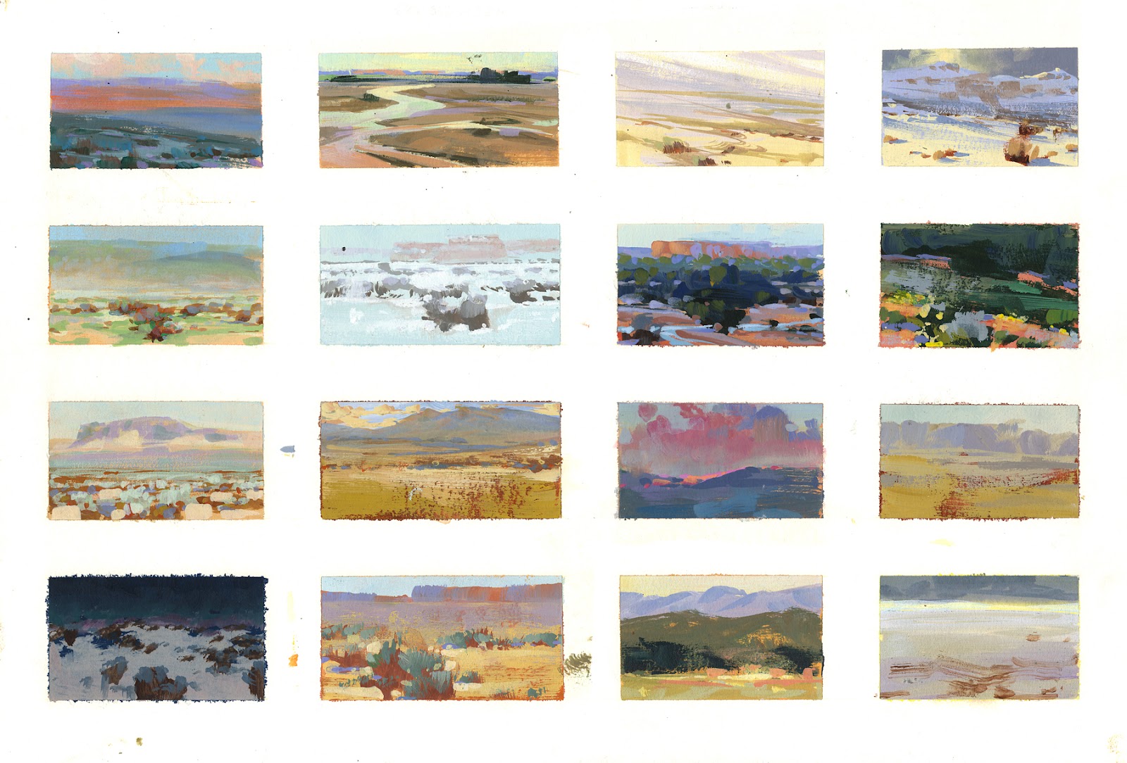
Do quick color studies exploring a color concept (analogous/complimentary colors, saturated vs desaturated colors, etc, using color contrasts to guide the viewer's eye, etc.)
Make a series showing the same objects/setup under various different lighting conditions or moods
Analyze a painting, reference or scene from life by breaking it down into simple color shapes, showing how color concepts function in a real world scenario
For these exercises, try to keep your rendering simple and broad, without going into much detail. Try not to spend more than a few minutes on your rough sketch, and instead try to work exclusively with color. I would suggest working more with opaque blocks of color to encourage you to be bold and decisive with your color decisions, rather than trying to "sneak up" on a color by using transparency, airbrushes, excessive blending, or Photoshop blend modes.
Remember- use color to capture the mood and the light, not the details!
Inspiration and Resources
http://imaginateur.tumblr.com/
http://nathanfowkes-sketch.blogspot.com/
This site gives a decent idea of how to determine color schemes based on the color wheel:
http://colorschemedesigner.com/
James Gurney's blog has tons of posts about colors, color wheels, color schemes, lighting, etc.
http://gurneyjourney.blogspot.com/search?q=color
Iruka on
+5
Posts
I'm so busy I barely have time to eat anymore, but I took a few minutes to do a scribble in this general vein this morning after reading this topic (I've got some illegal transparency going on though):
Time permitting I want to take a more structured stab at this.
My Portfolio Site
All the more reason to participate!
Twitter
My first attempt, ugliness:
I figured I am just doing blocks of color so initially I used Paint.Net at work. I tried to pick about 6 colors in advance and do it with that, thinking restricting my palette would help. I think it's just awful, once I started painting the colors didn't look right:
So I tried again at home with CS2 eyeballing a mid color for each thing (wall, shirt, skin) and then adjusting up and down from it.
I think the background is too busy and there are issues with the forms (I only spent about a minute roughing in their outlines), but I'm not happy with the colors, either. I look at these and feel like the guy posting his mis-proportioned anime fan drawings. I'm more proud of this 6-color MSPaint art I did two years ago:
I think I'm going to go find a tutorial or something, I'm trying not to bite off more than I can chew but I feel like a little mouse trying to find purchase on a large sphere (all the bites are too big).
If you're painting something with depth like a landscape, try painting whatever is furthest away first, using large block colours, and gradually work in to the foreground.
About 3 hours in on this so far. Gonna pick back up this afternoon after some chores. Thanks to Flay and Tynic for the advice on how to get started.
http://nathanfowkes-sketch.blogspot.com/2009/06/blog-post.html
http://nathanfowkes-sketch.blogspot.com/2009/09/demo-for-you-this-week.html
http://nathanfowkes-sketch.blogspot.com/2011/11/i-promise-to-get-back-to-good-ol.html
One thing I would definitely suggest for anyone working in Photoshop, is to make a second window for their document by going to Window>Arrange>New Window for _________. Zoom way out on it so it's really small, around an inch and a half to 2 inches wide/tall. Keep that on your screen while you're working on your primary window, so you can keep referring back to it when working. If you've put in a bunch of work and you can't see much of a change on that tiny window, you are working too tight and not working towards the overall, broader picture.
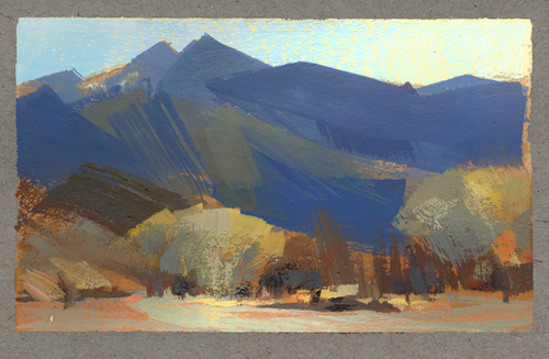
Couple of these- took roughly 25 min-40 min per. Process for these was I closed my eyes and just scribbled with a pencil brush just to get something down, spent a minute trying to sort the randomness into something slightly tangible, and once I had a vague notion of what it could be, started into color.
I like doing this just so I can go at a picture without any preconceived ideas of what it should be- it's easy if you're going for something specific to shy away from making decisions that go against that idea, even if it would make the overall image more interesting than that initial idea. By starting out completely randomly I feel less attached to any one thing, and feel free to explore more. (Though for the same reason, this is a terrible process for anything involving real anatomy.)
Process .gifs
Twitter
Zoomed out comparison (I could have done better on your midground cliffs; whoops:
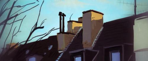
This is from yesterday:
Edit:
Today's
I used Sam Nielson brushes on them. Mostly the conte brush at 100% opacity.
Thanks! I'll try and push the OCD part of my brain away on my next ones.
@chicoblue Goddamn. Great work and great choice of scenes.
That is super nifty!!
facebook.com/LauraCatherwoodArt
@squidbunny thanks for the feedback! I actually had "Moonside" on there at one point but wanted it to look more "series-esque" so I ditched it
I say this without knowing what Earthbound is, though, so I might be missing something.
I think I'll do it again tomorrow, and try to use simpler shapes and communicate with strokes instead of literal shapes.