As was foretold, we've added advertisements to the forums! If you have questions, or if you encounter any bugs, please visit this thread: https://forums.penny-arcade.com/discussion/240191/forum-advertisement-faq-and-reports-thread/
Options
Burying a Hooker in the Desert (Webcomic WIP)
SugarBanshee Registered User new member
Registered User new member
Please let me know if I need to resize/relink any images!
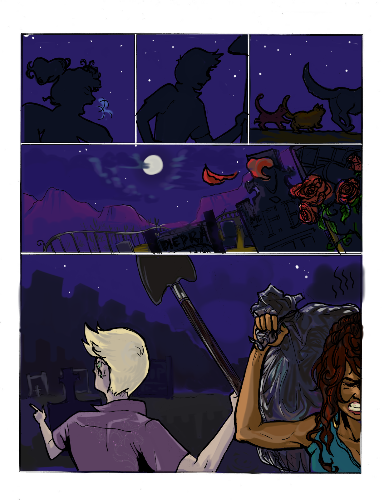
First post in a while, this is a comic I have been planning out for the past few years that I just recently started to buckle down and get started on.
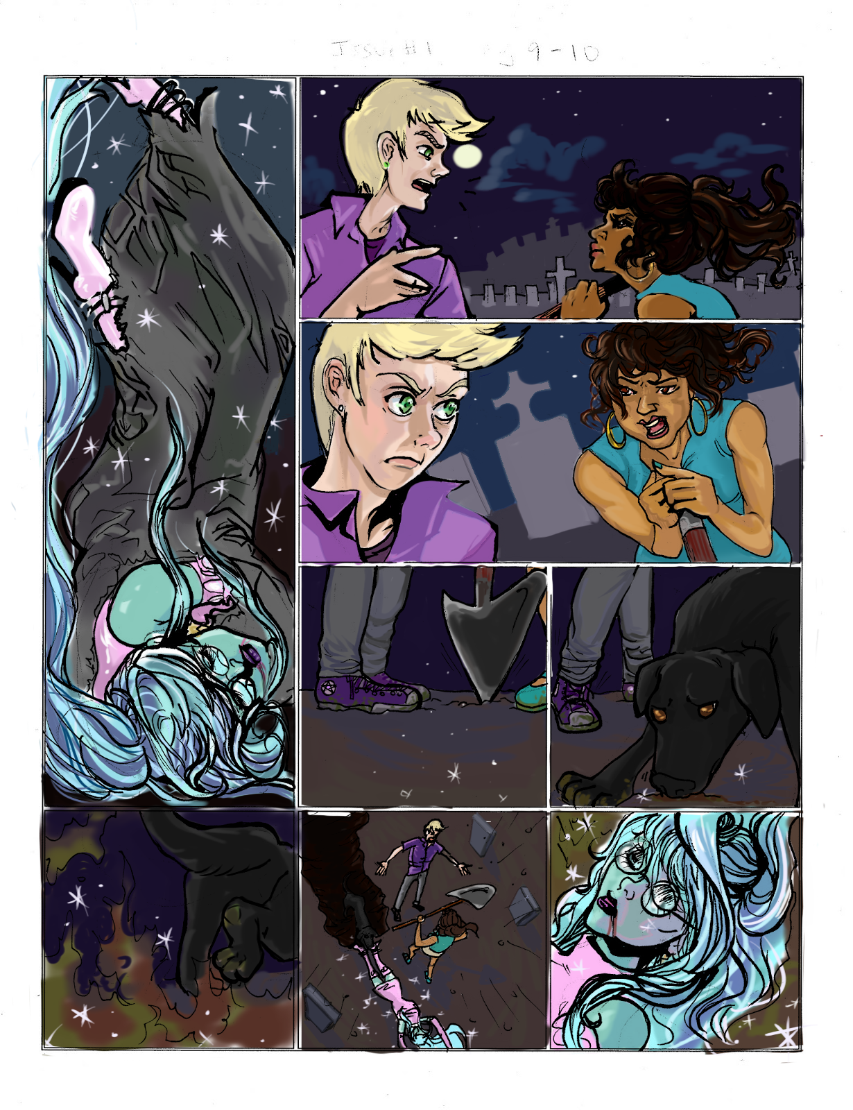
All I am trying to cover here is [Enter Cemetery] > [Drop Bag with Hooker Corpse] > [Argument while Dog Digs Grave/Hole] > [Magical Hooker Corpse Reanimates] > [Corpse Smacks Guy with Shovel] > [Guy drops Flask]. In 5 pages or less, if possible.
*
**

***

I dread critiques like the dentist--the critics here seriously drill deep-- but I need it. So I ask the great people of PA:AC for any advice you may have, on what little I have to offer so far!
Extra Info:
*There's no word bubbling yet; I already feel the need to add extra explanation panels before I make space for dialogue. The script is done in a separate file and I've got about 30 issues of 24-page comics outlined. The story already has an ending.
**These are intended to be pages 10-14. Pages 1-10 have not been fully inked yet; I will add them later.
*** I am doing thumbnails in SketchBook Pro, then penciling/inking on paper. After that, images have been scanned and colored in SBPro again. I don't have a better program; I'm using a tablet PC with very low power... It overheats frequently even just running a 2-layer image. Any suggestions for a better setup are welcome.
Thanks for stopping by!
First post in a while, this is a comic I have been planning out for the past few years that I just recently started to buckle down and get started on.
All I am trying to cover here is [Enter Cemetery] > [Drop Bag with Hooker Corpse] > [Argument while Dog Digs Grave/Hole] > [Magical Hooker Corpse Reanimates] > [Corpse Smacks Guy with Shovel] > [Guy drops Flask]. In 5 pages or less, if possible.
*
**
***
I dread critiques like the dentist--the critics here seriously drill deep-- but I need it. So I ask the great people of PA:AC for any advice you may have, on what little I have to offer so far!
Extra Info:
*There's no word bubbling yet; I already feel the need to add extra explanation panels before I make space for dialogue. The script is done in a separate file and I've got about 30 issues of 24-page comics outlined. The story already has an ending.
**These are intended to be pages 10-14. Pages 1-10 have not been fully inked yet; I will add them later.
*** I am doing thumbnails in SketchBook Pro, then penciling/inking on paper. After that, images have been scanned and colored in SBPro again. I don't have a better program; I'm using a tablet PC with very low power... It overheats frequently even just running a 2-layer image. Any suggestions for a better setup are welcome.
Thanks for stopping by!
0
This discussion has been closed.
Posts
Having said that, without dialogue I'm not sure it makes any sense. In some cases I'm not sure it would help. I think you could do with using more dynamic poses - the dog digging and the zombie spading the guy I wouldn't be able to tell what they're doing if you hadn't said.
@MagicToaster: You're right. I want this to be able to stand on it's own visually, which is why I am happy to get others' opinions on it!
Those dog/cat figures are awful, find some pictures of real cats/dogs and use them as a basis for your figures.
The fourth panel is confusing, it just looks like a whole bunch of lines and shapes. The tombstones don't look like tombstones and the fence looks like a rollercoaster rail.
Draw out the perspective lines, create fanishing points, it might be frustrating at first, but you eventually just treat it like any other part of the process of comic making, and it becomes fun. read this: http://sirspamdalot.livejournal.com/87692.html?nojs=1
The figures are bad in the fifth panel, instead of just shrinking the arms when something is further away, google foreshortening, there are plenty of tutorials with simple illustrations to help you understand. On top of this I would suggest more practice at drawing anatomy! You can never be too good.
I don't know why the girl isn't facing the same way as the guy. I would recommend that change, as it would show the bag over her shoulder, you don't need to show her face to get a feeling for her character, her hair and body shape tell us she is a girl, and from the fact she's carrying the bag tells us she is an accomplice, facial details can be withheld. Also the pose is very stiff, exaggeration is key, show her bending over under the weight of the body bag.
I don't know what you're trying to do with those big rectangular shapes. Are they the mesas' in the fourth panel? Are they buildings around the graveyard? Or tombs on a hill? Whatever they are, they show a completely different environment to the previous panel. Once again, terrible tombstones, use reference.
Second page first pane: As a reveal panel I'm not sure how I feel about this. She's in a bag, I guess. But I think there needs to be a stronger connection between this panel and the previous panel, maybe show the hands of the female accomplice dropping her? If her shoes are gonna be coming out of a hole in the bag, show this in the previous panel. The reveal isn't lost, the reveal itself is that this corpse is some sort of daft punk one more time hooker.
I think the best way to show that the second panel comes after the first, would be to have a word balloon coming from blond guy's head and being above the corpse, stretching over the boarder between the panels.
Rest of the page: Same rules apply, fix perspective, where have the mountains/buildings gone?
Panel 4 page 2: What the fuck has happened to that shovel? Consistency in all things is important to a comic when the main focus is narrative. Shovels and spades are not goddamn triangles. Google some goddamn shovels.
The dog is okay in panel 5, though I don't know why he is digging the hole? A super pet? And the puppies/cats don't show up again after the first page, show i suggest getting rid of them and just making it a single silhouette of the dog. I assume it will be explained in the dialogue, but still, not good enough by itself. I think to better show that this dog is some sort of intelligent being, you should show him in panel 5 of page 1. Give him an intelligent face, thoughtful face, like the frown in this panel, it makes us read him as a being whose trying to solve a problem, or maybe he is exasperated with his masters? I don't know.
Panel 6 page 2. Use reference for this.
Page 7 page 2. Don't bother with the human figures, I think you could have a close up of the dog pulling the hooker's leg/shoe and it would work, their argument in speech bubbles above the dog's head. Right now, its too much detail to put in such a small space.
Panel 8 page 2. This is okay. But i think you need to make her head a little smaller so we see that she is now in the ditch the dog has dug. Also we can't see that her eyes are open behind those glasses. Would she even have glasses on after getting a concussion which from the bleeding mouth I assume is from the face? What is her wound? Why doesn't she have a swollen lip/cheek/broken nose. If she was passed out wouldn't it better to have a wound on the forehead? Blood dripping down/dried and crusted on the side of her face? They way she sparkles, what she wears, the image and identity of her is not going to be tarnished by showing that she has been assaulted more than just a bleeding lip. Remember! Foggy eyes! She's waking up!
page 3: I know whats happening here, but its shallow, meaning when I study the page, its confusing and falls flat.
Panel 1: Space hooker is looking good here, nice arm. I don't know why the female accomplices' leg is there. Does it really need to be there? Why is she walking away? They don't start running until the 4th panel! And is the guy holding the shovel again? Because from that angle the girl couldn't be holding it. maybe the guy is dropping it, but we can't see that so its just a shovel suspended in the air, waiting to be grabbed by the magical hooker. Have the shovel stuck in the ground on the very right of the page. Maybe have the female accomplice do this on page 2.
Panel 2 & 3: You've attempted some foreshortening on that shovel, but it still doesn't look like a shovel. Once again, the glasses, don't know if she should have them after being in a bag/being knocked out. The eyes look okay. Though the shadows on the rest of her face are sort of confusing. I would switch this second panel and make it the third. You can keep it pretty much the same, but I'd have the flames just starting to creep up around her/from her hair.
Then you can scrap panel 3 and put a replacement in panel 2's place. Make it a low angle shot looking up at the two kidnappers/killers. They look fearful/shocked. And make it so that the orange light from the creeping fire is on their face.
Did a quick doodle of this page:
page 4: I thought the flask was a sparkly iphone. Improve his anatomy in page 1, its terrible right now. You seem to be better at drawing women than men.
The action from panels 1 to 2 is terrible. It reads as, he's about to take a drink, then he turns and squats to take a crap. What is going on here? Does she teleport behind him? Does she pull an acrobatic stunt over his head? Those are things that need to be on the page other wise it just looks lazy and doesn't read well. Why is his hand lifted up behind his head? Has she JUST hit him and as he falls he's reaching for his head? It just doesn't work, the page needs to be restructured.
The ghosts too. Why the ghosts in the background? When did they become part of the story or plot? Were they brought to haunt when our space hooker rose from the grave? Then they need their own establishing shot or even an establishing page.
People unconscious on the floor are a hard task and I'll admit that I have trouble with them too. I would say do not make it a top down shot, but slightly on an angle. Once again, that fucking shovel. You have got to reference this thing! EVERYTHING.
So brush up on the anatomy of your characters, use perspective lines and grids, keep in mind your setting and what SURROUNDS your setting. Reference all things that you are not absolutely sure how to draw. This does not mean tracing, simply that if you google gravestones, you'll see that they have certain design and shapes, and this is helpful in creating your own gravestones. You can copy from photographs, but you can't replicate their composition as I'm pretty sure that is plagiarism.
Anatomy is basically like referencing. Use photographs if you want, old paintings and statues are also a great resource as there has been a lot of time and effort put into their composition. Comics are the same and to make truly excellent comics they require your attention and exuberance.
Good work on joining the forum. Taking criticism can be hard, but to be able to take it, and use it effectively will make you and your work better!
tumblrrr
deviantart
(And holy nut buckets that made me wanna crawl into a hole and die. In fact, I think I will. See you in another 6 years PA! It's back to the literal drawing board for me!)
(That is to say, I'll close this thread as soon as I figure out how to report that to a Mod.)
Crits aren't meant to scare you off. We WANT you to stay, we WANT to watch you improve. Not only that, we can help. These are all technical issues that with a little sprucing up, can take your comic to a polish and shine.
Having a new member leave with such potential is super disappointing, and I hope you reconsider. I would recommend looking for some resources that will better help you deal with critiques mentally, and come to enjoy them, even.
Good luck. I hope you come back. Feel Free to PM me if you would like your thread reopened.