As was foretold, we've added advertisements to the forums! If you have questions, or if you encounter any bugs, please visit this thread: https://forums.penny-arcade.com/discussion/240191/forum-advertisement-faq-and-reports-thread/
Options
Been a while since I posted, wanted to get opinions on some new stuff:
DRaelrich AspirantRegistered User regular
AspirantRegistered User regular
A piece I finished a while ago; I'd welcome commentary.
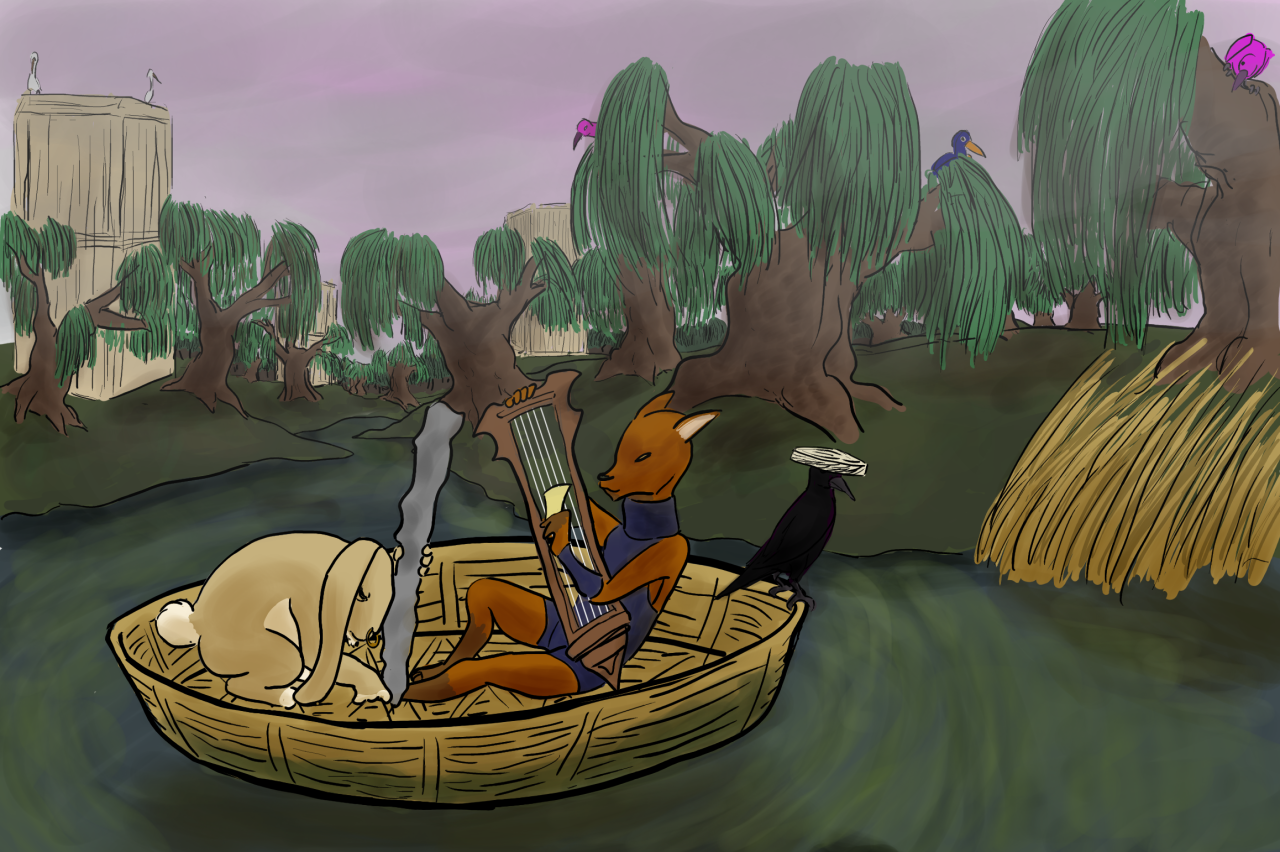
Centered weight, gentle hand.
0
This discussion has been closed.
Posts
First thing is that the light source seems really low compared to the brightness of the piece. Lighting is almost coming from immediately right of the work, which would make some very dramatic shadows elsewhere. We would be talking mostly silhouetted shadows on the left hand side of most every construction on the page, with some indirect lighting tinted by whatever is around it.
There are some inconstant areas for light and shadow (the pond in the back, parts of the boat, parts of the water).
It looks like you are painting a lot with transparency (which is what I used to do 100% before this month). I would suggest trying painting only with hard, round brushes with 100% opacity for a while to figure out how to get the colors you are seeing here without the transparency tricks. You will be able to get much more control over your colors and lose the muddiness that sort of bleeds through with painting only with transparency.
I think the piece has a lot of character. It reminds me of one of the Aesop-like stories about Yokai from Japan, which is pretty awesome. You might want to go look at this month's artists challenge thing for Color Studies. They would help you define this a lot.
Edit: removed the paintover because it wasn't worth the loading space.
Thanks for the feedback, though! I'm a little confused as to how to paint with hard brushes only using no opacities... I'm going to try it out and see if I understand. I'll also have a look at the color studies you mentioned, and see if I can clear up the lighting direction.
(quick attempt)
I like the feel of the pipes and magnets one. It's also a bit hard to parse in places due to the positioning, but some slight changes would probably fix that. A good exercise would be to make the entire image of the letters and pipes black on a white background. If you can still read it without seeing certain letters as different ones (such as not really noticing the cross on the T or associating the RO with a P) you'll need to change your profiles a little bit.
The Horizon one looks badass, but I had to hunt to find the actual word in it. If that's the intent, very nice. If you are branding something, you might want to push the letters out a bit farther.
Separated the latter letters a bit for the first Electromance
And fixed up the spacing for this one.
Old
New
Improvements on Electromance: