As was foretold, we've added advertisements to the forums! If you have questions, or if you encounter any bugs, please visit this thread: https://forums.penny-arcade.com/discussion/240191/forum-advertisement-faq-and-reports-thread/
Options
Hard Parkers
Drtybrd atlantaRegistered User new member
atlantaRegistered User new member
Howdy all, this is my first post so I thought I'd put up some pages from my comic. This is my first time making a comic. I usually just do illustrations and design. I work on it in my free time as hobby. It's loosely based on my experiences in the import car / street racing scene. Any feed back would be appreciated. Thanks for reading.
[img][/img]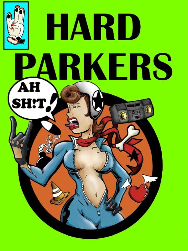 [img][/img]
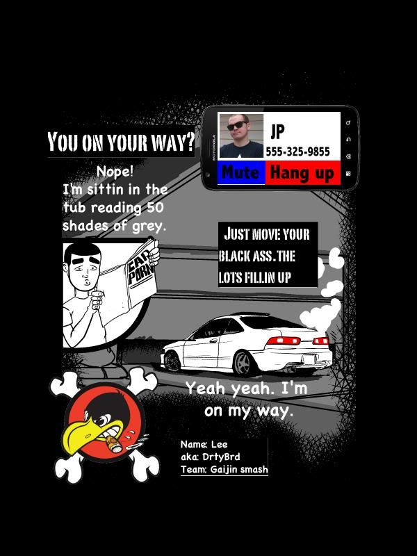 [img][/img]
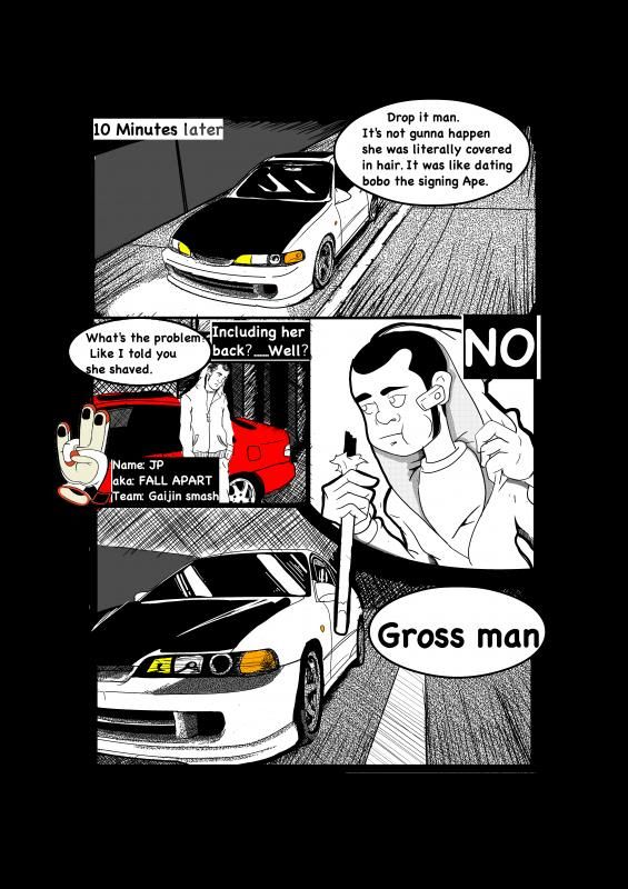 [img][/img]
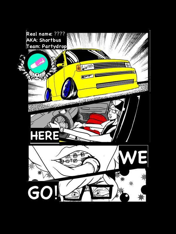 [img][/img]
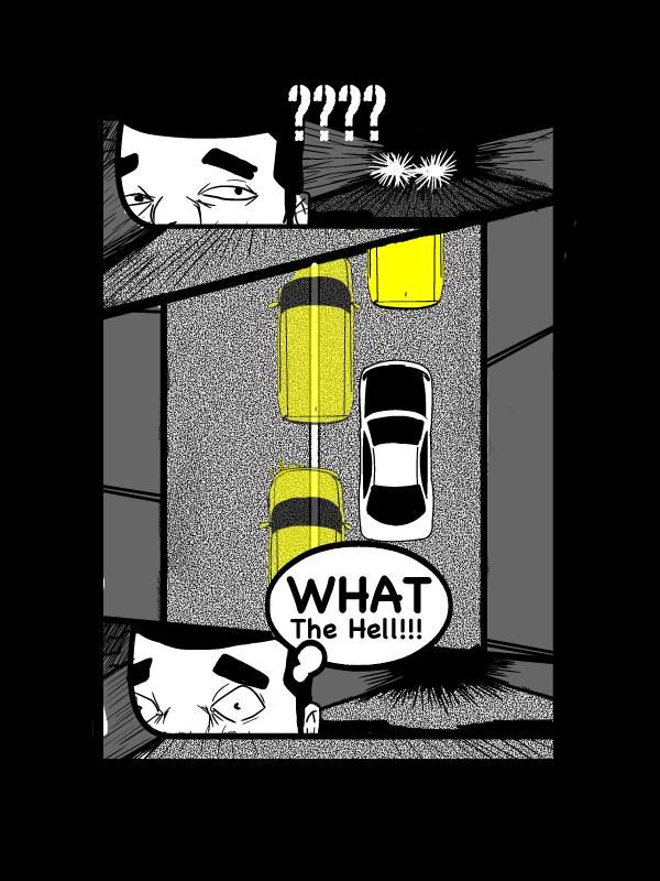 [img][/img]
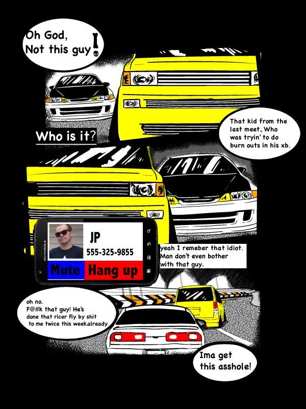 [img][/img]
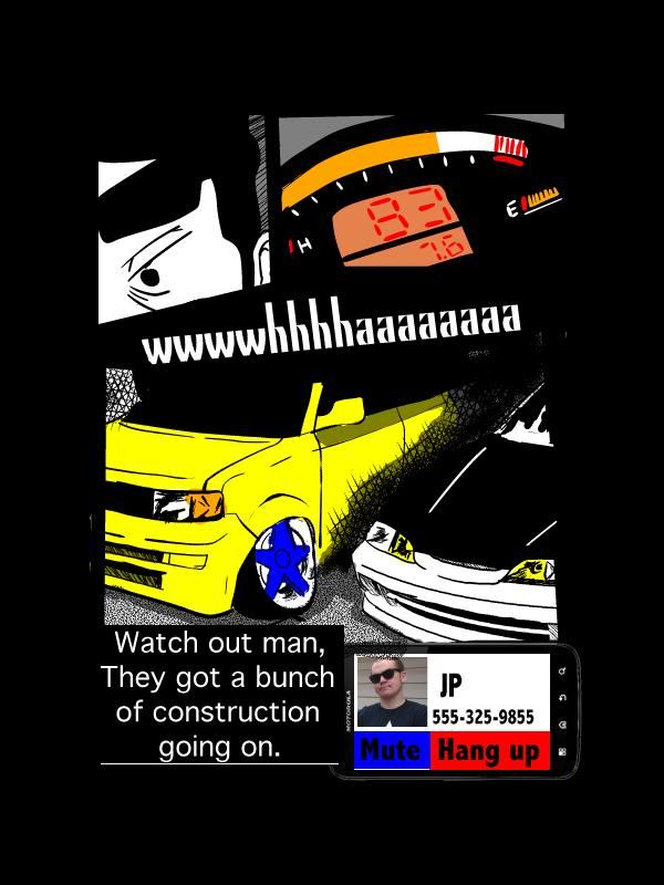 [img][/img]
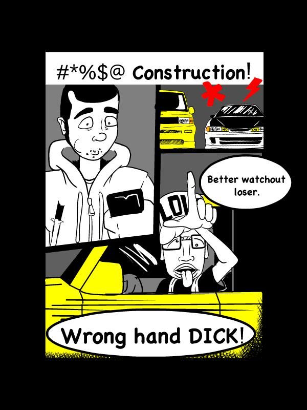 [img][/img]
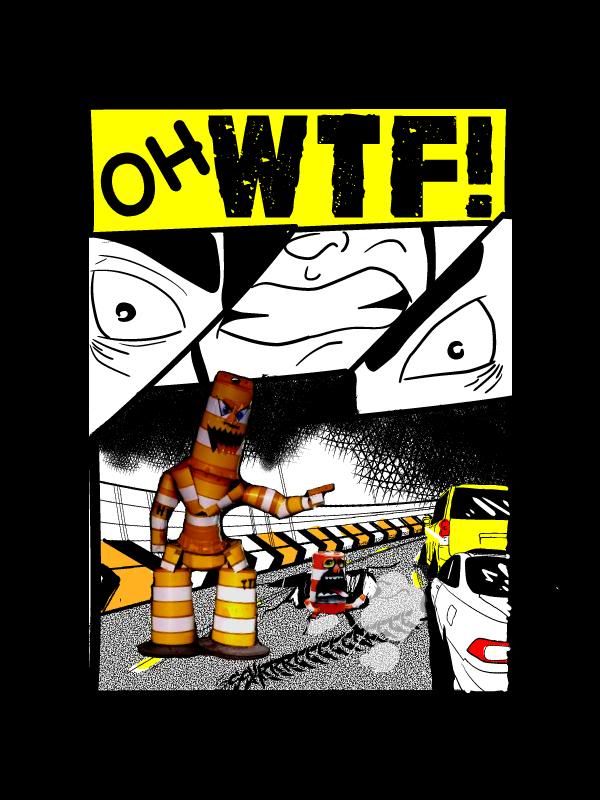 [img][/img]
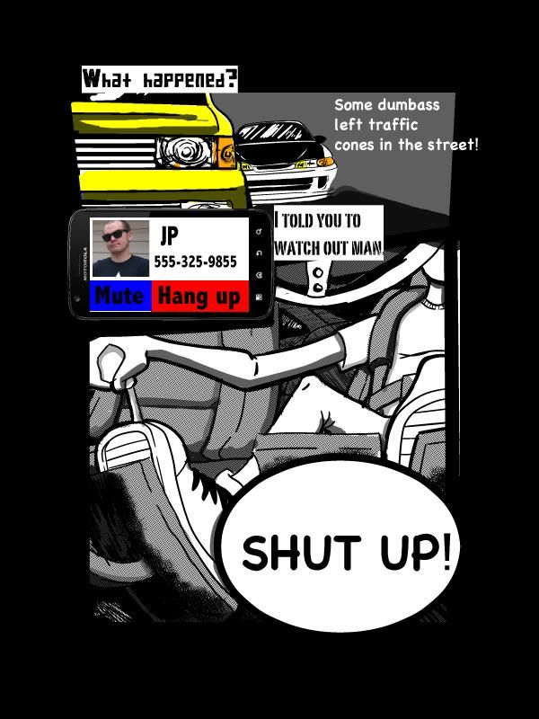 [img][/img]
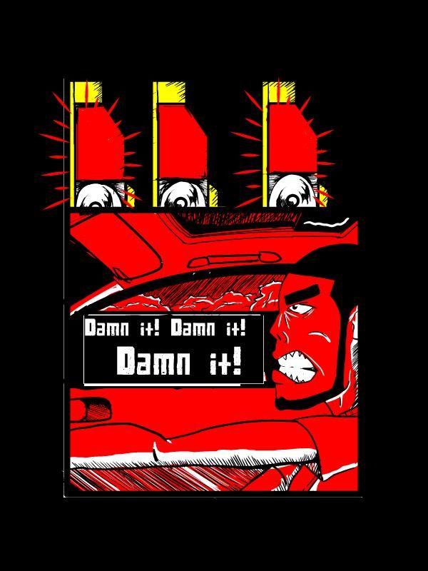 [img][/img]
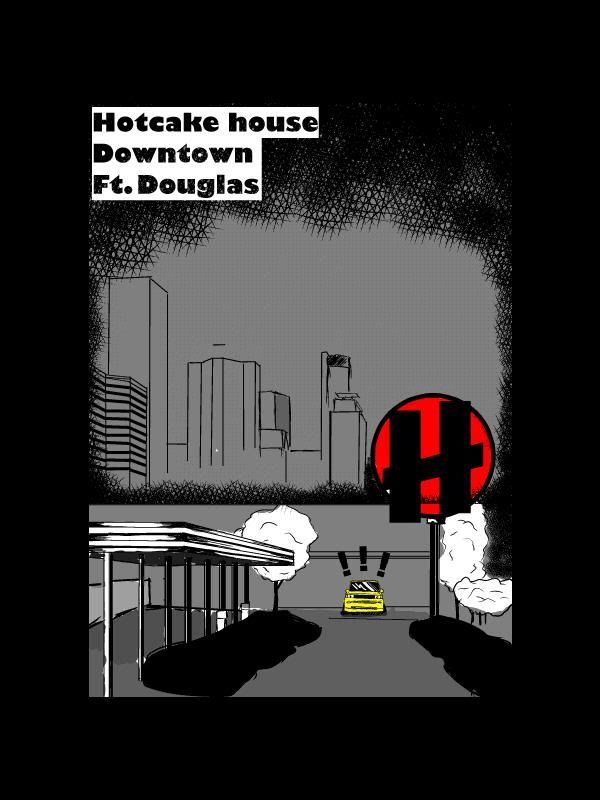 [img][/img]
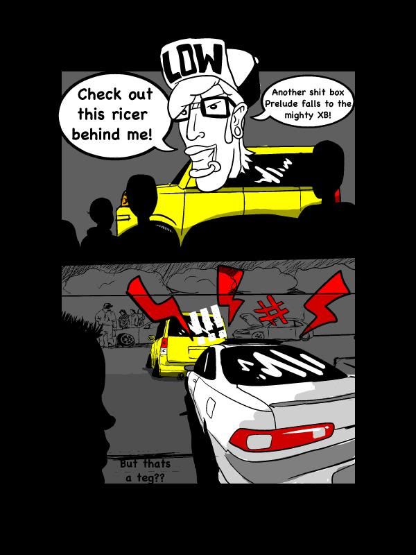 [img][/img]
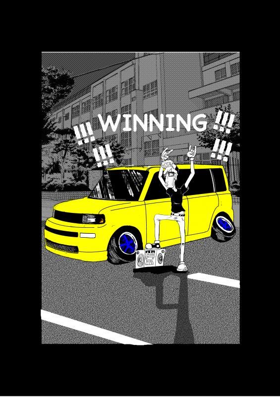 [img][/img]
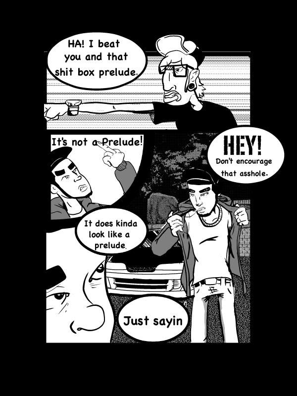 [img][/img]
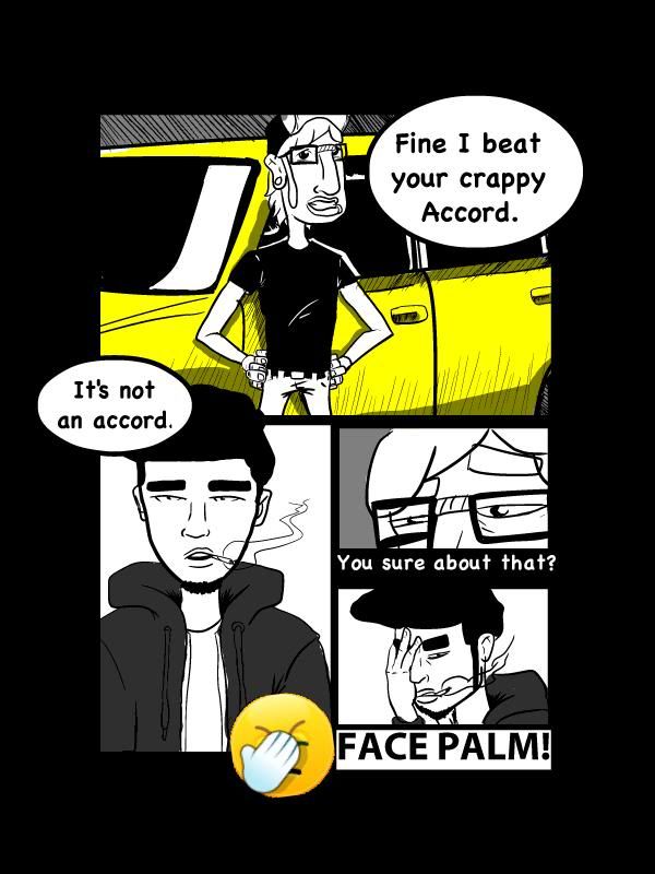 [img][/img]
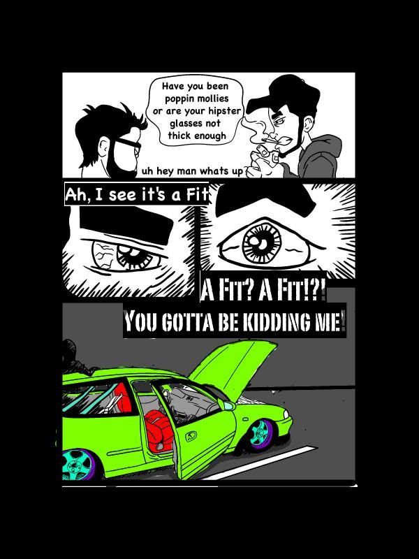 [img][/img]
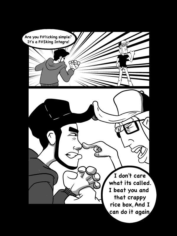 [img][/img]
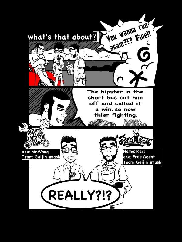 [img][/img]
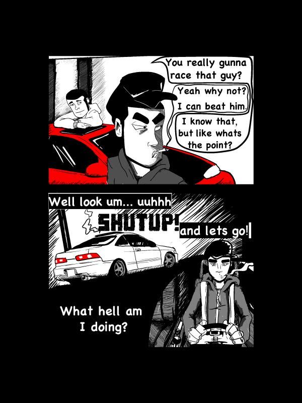
[img][/img]
 [img][/img]
 [img][/img]
 [img][/img]
 [img][/img]
 [img][/img]
 [img][/img]
 [img][/img]
 [img][/img]
 [img][/img]
 [img][/img]
 [img][/img]
 [img][/img]
 [img][/img]
 [img][/img]
 [img][/img]
 [img][/img]
 [img][/img]
 [img][/img]
 [img][/img]
0
Posts
whats working for me is the apparent tracing of actual cars in order to maintain the integrity of the... ahem... integra, and the other cars that appear in the comic.
also the sequence of events is easy to understand and reads pretty well. i appreciate every time you took a shot at difficult/dynamic angles like the camera view from the foot pedals or looking down at a character through a window, those panels are very nice!
what isnt working at all for me is the use of photography on top of the drawing. the road cones are so simple to draw, and the phone image doesnt even look like a real phone. i think you should draw a phone with a call or text screen and replace the one you are using currently. also, rather than having a cone monster which was frightfully confusing, maybe you could draw some cones and a steam-roller and maybe even some alarmed construction crew waving frantically at the speeding cars?
over all i think its pretty awesome what you are doing. id like to know more about who is driving but you’ve set up well for a "rematch" between the two drivers you introduced. the boys at the beginning talking about a hairy chick just make me want to see the girl. i hope she comes into play. if you dont plan on having her as a character though, id suggest you take that part out as its the only thing that doesnt add to the characters or the story.
keep posting
Your overall content is very engaging. I'd like to see more.
Art-wise, the biggest problem I see are the fonts. They are changing all over the place, the word bubbles are shapeshifters, and even whether it's white on black or black on white is a mess. Stick with one maybe two fonts, and be consistent when it's someone talking, or incoming audio from a cell phone. Onomatopoeia should never look the same as dialog. Pick ovals or rectangles or rounded rectangles or something for the word boxes, and stick with it and use it consistently. That will help a lot with the readability; it feels really scatterbrained right now.
I can see how having the pics of the cones could be distracting. I was looking for a way to make things pop a little more without going full color. The cellphone is another aspect I'm still playing with. I wanted a way for the different characters to interact while driving with out it seeming as though voices were coming out of thin air. But I guess that's something I'll have to keep working on. As for character development, The way I'm planning it you will find out more about each character as the story progresses. I didn't want to do a straight up origin story as I find them kinda boring.
Once again thanks for the feed back.
I think in the context, that this is a little reactionary. The comic has a zine/underground/xeroxed comic to it that makes me sort of expect a touch of crude. It doesn't feel out of place in that realm. There are some anatomical issues going on there, though.
That being said, the comic here is lacking polish on multiple fronts.
Font- Is that comic sans? Its terrible. Get some blambot fonts, or better yet, learn to hand letter. You want to have that experimental/authentic feel to work, Comic sans isn't your friend. You can do more interesting things when you don't let the digital medium make everything hard edged. You can do five different lettering types, but doing them with your hand will give them a consistency that is natural.
Inking- You need stronger lines, better line weight, more coherent hatching. Your characters should separate from the background, There shouldn't be little flecks of white between the coloring and lines. Take your time, don't be lazy.
http://smokinghippo.com/TSOtutes/inking_tutorial.html
Color- Using selective color and mixed media is fine but you have to consider the hierarchy of what you want views to look at on the page, and how much attention one thing is drawing to itself over another. Some tips on that, in general:
http://artanecdotally.tumblr.com/post/36677946356/just-to-expand-on-what-every-bodys-been-saying
If you've never read Scott McClouds books on comic making, I recommend them, too.
I choose that cover Image cause the it plays into the car culture theme. the car model, pinup chick, race queen is a theme that is deeply rooted in the car scene. I'm a big fan Ed Roth, Robert Crumb and Rockin jelly bean and draw a lot of inspiration from their work. I would say that it is suggestive and provocative but not sexist. As for the Shocker, that's kind of a wink and nod to the import crowd. Its kind of an inside joke amongst Honda enthusiast and lets them know hey this is something for you.
The word bubbles and text are something I'm working on. Trying to find what looks best and flows with the art work.
Thanks for the feed back
Here are a couple of the pages I'm redoing.
original
[img][/img]
new
[img][/img]
old
[img][/img]
new
[img][/img]
also here are some new pages I'm working on
[img][/img]
[img][/img]
[img][/img]
Here are some pages that I'm redoing
old
[img][/img]
new
[img][/img]
old
[img][/img]
new
[img][/img]
Also here are some new pages I'm working on
[img][/img]
[img][/img]
[img][/img]
[img][/img]
[img][/img]
and here are some new pages I'm working on
[img][/img]
[img][/img]
[img][/img]
Here are a couple pages I'm redoing
old
[img][/img]
new
[img][/img]
old
[img][/img]
new
[img][/img]
here are some new pages I'm also working on
[img][/img]
[img][/img]
[img][/img]
old
[img][/img]
new
[img][/img]
old
[img][/img]
new
[img][/img]
and here are some new pages I'm working on
[img][/img]
[img][/img]
[img][/img]
as always feedback is welcome and appreciated
old
[img][/img]
new
[img][/img]
old
[img][/img]
new
[img][/img]
and here are some new pages I'm working on
[img][/img]
[img][/img]
[img][/img]
as always feedback is welcome and appreciated
old
[img][/img]
new
[img][/img]
old
[img][/img]
new
[img][/img]
and here are some new pages I'm working on
[img][/img]
[img][/img]
[img][/img]
as always feedback is welcome and appreciated
old
[img][/img]
new
[img][/img]
old
[img][/img]
new
[img][/img]
and here are some new pages I'm working on
[img][/img]
[img][/img]
[img][/img]
as always feedback is welcome and appreciated
old
[img][/img]
new
[img][/img]
old
[img][/img]
new
[img][/img]
and here are some new pages I'm working on
[img][/img]
[img][/img]
[img][/img]
as always feedback is welcome and appreciated