As was foretold, we've added advertisements to the forums! If you have questions, or if you encounter any bugs, please visit this thread: https://forums.penny-arcade.com/discussion/240191/forum-advertisement-faq-and-reports-thread/
Options
OBComics
sharky t LondonRegistered User regular
LondonRegistered User regular
I really want to get better at comics! I made a 16 page comic over the last year and it turned out pretty awful. It doesn't mean I won't go back to that project but in the mean time, I really want to get better by making short comics and then try my hand at something a bit longer.
So I thought I'd make a blog (http://obcomics.tumblr.com) and an individual thread to post my attempts and get some feedback from you guys, if you'd be so kind.
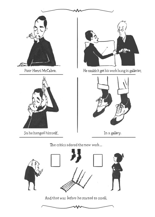
To start off here's a quite dark one-page comic I made recently (you might have seen it in the doodle thread, so sorry for re-posting.)
And here's one that was inspired by the 'Strip Search' elimination challenges. I set myself the 90 minute time limit and picked two ideas from separate elimination challenges-'Dinosaurs' and 'Ukuleles'. You can read it full-size in the spoiler.

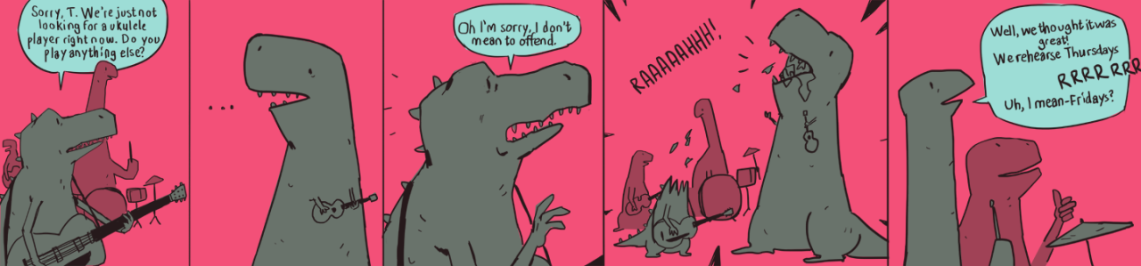
I like the characters and the experiment with the colour palette, but I'm not sure if it reads too well, mabye I should've stuck more to my initial joke idea of 'T-Rexes only being able to play the ukulele because of their short arms' and made that more clear.
This comic also has a stupid dinosaur song to go along with it, which upon listening again kinda just sounds like noise but it was fun to do.
Sorry for the rambling post!
So I thought I'd make a blog (http://obcomics.tumblr.com) and an individual thread to post my attempts and get some feedback from you guys, if you'd be so kind.
To start off here's a quite dark one-page comic I made recently (you might have seen it in the doodle thread, so sorry for re-posting.)
And here's one that was inspired by the 'Strip Search' elimination challenges. I set myself the 90 minute time limit and picked two ideas from separate elimination challenges-'Dinosaurs' and 'Ukuleles'. You can read it full-size in the spoiler.
I like the characters and the experiment with the colour palette, but I'm not sure if it reads too well, mabye I should've stuck more to my initial joke idea of 'T-Rexes only being able to play the ukulele because of their short arms' and made that more clear.
This comic also has a stupid dinosaur song to go along with it, which upon listening again kinda just sounds like noise but it was fun to do.
Sorry for the rambling post!
+5
Posts
I coloured that 'Henri McCabre' comic so I could submit it to an anthology comics magazine here in London.
Better quality in the spoiler!
The Scoundrel & The Bastard
My Comics Thread
Planes are clearly not my strong point.
I was hoping for some more character-heavy pages but I think it did me good to go out of my comfort zone a bit and I feel like I learned some useful things from copying one of the masters of comics.
The Scoundrel & The Bastard
My Comics Thread
The Scoundrel & The Bastard
My Comics Thread
Some little previews of a comic I'm looking to do.
Might try the webcomic format while I've got some time over summer
The Scoundrel & The Bastard
My Comics Thread
Lady Knight
Started out totally not Brienne of Tarth, ended up pretty Brienne of Tarth.
Want to get back to more actual comics soon but this was just a bit of relaxation after some hard days.
The Scoundrel & The Bastard
My Comics Thread
Comics
It's been ages since I've posted anything in here! But I'm back with yet another comic idea!
I've started a new webcomic type thing called The Scoundrel & The Bastard over at http://scoundrelbastard.tumblr.com which I plan on updating every Monday.
Here's the first page:
And a little intro image of the main character:
It'd be great to get some feedback from you guys. Pretty scary starting something like this, I hope I can keep it updated.
The Scoundrel & The Bastard
My Comics Thread
I'm really digging everything in this thread! I'll definitely be keeping an eye on the new comic too
Her hand is also pretty awkward, I assume she's a bird or something? It just looks sort of lumpy sticking out of her sleeve so far.
Looks promising though. What's the font you're using? Did you make it yourself? It really fits the style.
Thanks for the feedback @menace I hadn't even thought about it being like that song! Oh no! Haha
Yeah, that hand is looking a little wonky, I'll have to revisit that. Thanks for pointing it out.
The font is called Amatic SC, I didn't make it myself and I'm struggling to remember where I got it from. I'll try to find it for you, could be a Google font.
It's upper and lower cases are actually just different versions of the upper case letters which gives it a nice bounciness if you alternate between the two.
The Scoundrel & The Bastard
My Comics Thread
Excuse the language!
http://scoundrelbastard.tumblr.com/
The Scoundrel & The Bastard
My Comics Thread
Thanks for the feedback about the text too, still testing the water a little bit so I'll try to spend a bit more time working it out.
The Scoundrel & The Bastard
My Comics Thread
Hi-Res:
The Scoundrel & The Bastard
My Comics Thread
Do the speech balloons look ok?
The Scoundrel & The Bastard
My Comics Thread
And a new page I really enjoyed making for the Scoundrel & the Bastard which will be going up tomorrow. I'm not sure about the colour of the cocktail that the barman gives him, might change that before tomorrow and I've just noticed I forgot to put rain in the last panel.
Hi-Res:
The Scoundrel & The Bastard
My Comics Thread
The Scoundrel & The Bastard
My Comics Thread
You may not have time with the full on webcomic. haha.
I really like the style so far. It may be hard to gain much readership when you have a long format story that only offers up for panels a week, but maybe later you can increase the update schedule.
Aw man Natcowrimo sounds awesome! I have a few of those projects that I've been 'meaning to start on forever' I'll have a proper think about it and see if it's feasible as I go back for my last year of uni in October.
Thanks for the feedback on the webcomic. Yeah I should really update more if I can, I haven't really thought too much about the promotion side of the webcomic to be honest, I think starting out I just wanted to do something that forced me to update every week.
Thanks dude. I'm really enjoying using colour right now, I used to think it was such a tedious process but I've changed my mind since I started actually using the brush tool to manually colour areas rather than letting the paint bucket fill them.
Guess those planes were better than I thought. Thanks!
The Scoundrel & The Bastard
My Comics Thread
Bartkira is worth it alone. I forgot that project existed and now I'm delighted.
I've been neglecting this thread and the webcomic for most of August, what a lame-o!
Here's an update to the comic that went up a few weeks ago. Funnily enough, I've planned out more of what happens next than when I started, but haven't been able to put the time in for final pages.
Hi-Res:
And here's a preview of a comic that is so nearly done I can taste it! Just needs some text and gotta make sure the juices run clear so I don't get salmonella
The Scoundrel & The Bastard
My Comics Thread
Here's the first page of the comic I just posted some panels from. I think I'm happy with it.
It's a story about a case of PTSD in the first world war. The Grey Lady is a famous ghost in the town where the man is from.
For some reason this 4 page comic is taking SO long!
The Scoundrel & The Bastard
My Comics Thread
Comics
Here's the full comic, spoilered for size:
For a bit of backstory, see the post on my blog: http://mikeob.tumblr.com/post/60208954639
The Scoundrel & The Bastard
My Comics Thread
The Scoundrel & The Bastard
My Comics Thread
Hey, embarrassing but handy!
The Scoundrel & The Bastard
My Comics Thread
Hi-Res in the spoiler:
I hope it reads ok. It's designed with print in mind so I'm hoping when it's stapled and folded it'll be easier to tell that it's 2 pages rather than one wide page.
The Scoundrel & The Bastard
My Comics Thread