As was foretold, we've added advertisements to the forums! If you have questions, or if you encounter any bugs, please visit this thread: https://forums.penny-arcade.com/discussion/240191/forum-advertisement-faq-and-reports-thread/
Options
Thedandmom 2013 (new pieces as of 12/30/2013 on page 2)
thedandmom Registered User regular
Registered User regular
Posting some of my works so far from this year. Will also put more posts of artwork from this year in this thread.
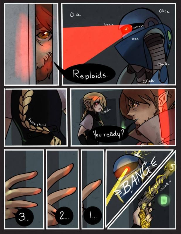 Latest page of my webcomic (which you can check out by clicking the picture)
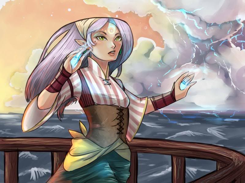
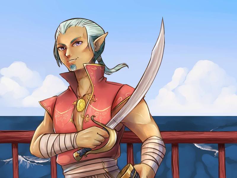
All the piraty looking images are for a game that I'm doing the artwork for called Conquering Corsairs.
Latest page of my webcomic (which you can check out by clicking the picture)All the piraty looking images are for a game that I'm doing the artwork for called Conquering Corsairs.
thedandmom on
0
Posts
A couple more images from the game i'm working on. Also as a note. All this pirate stuff will be under CC come this summer for reuse.
Panel 1: Guy is looking through a crack in a door.
Panel 2: POV of what guy is looking at.
Panel 3: Girl spins around?
Then it looks like they shoot the robot in the head. But whose hand is that? And who is holding that gun? Did they kick the door open and surprise the robot? Some establishing shots would help.
Your sound effects could use some work. They look handwritten, which is fine, but they offer no contrast against your dialogue. They also don't enhance the sound they are imitating. I would expect "Click" and "Bzz" to look very different against each other. Right now, the sound effects look like an afterthought.
Not sure why your word balloons are black with white text. Usually that's reserved for a character that might have a dark or spooky voice.
Watch the order of your word balloons. It's not too bad on this page, although "nod" comes before "Your ready?". Remember that people read left to right and top to bottom. The order of your panels and your balloons should reflect this.
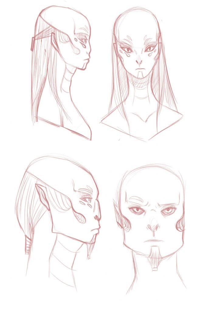
Do you have NON anime stuff we could see? Im sure you've heard it before, but learning real anatomy will make your anime stuff even stronger.
The top of the head lines up, but the rest of the features do not. The eyes mouth nose are all lower on the right model, where on the left everything is elevated. A simple way to avoid this when doing different angles is to establish guidelines on the paper where certain features are supposed to line up. @iruka has a good example of this, I just can't seem to find it.
PS Also, the baby giraffe up above is the cutest thing I've seen all week!
@ muddy parisol-Her body is twisted in a kind of weird way...so yeah it looks a bit off.
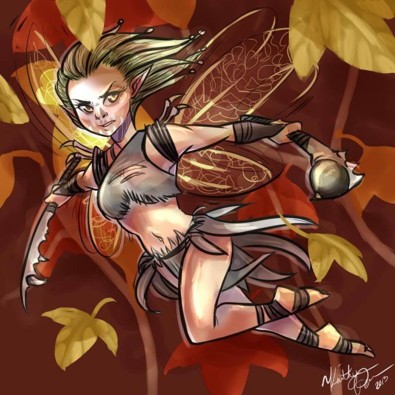
For Rudo Family Circus, I feel like there are too many colors in the wings. I thought there might be some symmetry, but despite the left wing's middle feather color being the right wing's main, the right wing's middle feather isn't the left wing's main color - it's just a new tone. Then the arrowhead beneath being the yellow of the profile backlighting seems random. I think it would be stronger if the wings colors were simpler:
Depending on what color the shirt is, you may need a color behind "The", it kind of got lost when I put it on near black.
Also I just got my site back up. I had taken it down to redo the layout. It's one hot looking site now. experiment073.com
Gamer Dater - My Video Game Dating Website full of Faygo
Strip Search Wastebasket of Broken Dreams App I made
@miaAusa-Thanks, I'm glad you like my stuff.
Things are looking good, but then I see the sorta smushy coloring on the belt pockets where they aren't quite rendered to the lighting scheme, and some blips of color spilling out over there lines here or there. They are tiny nit picky details, but I think that its worse to be just a hair from very clean than it is to be painterly. The flats on the same page, for instance, look great. It just seems like when it comes to rendering you may not be taking your time.
I agree with you, it's something that I need to work on.
Also here is a shaded version I had done of that one (not the greatest) I just didn't include the shading layer in the character sheet.
Actually, this is a fanart I did for work that I think is especially well done.
The girl in the vest running from bugs looks very unbalanced as far as running goes. Her weight is so far forward it looks like a yoga/wushu move, or the Charleston. I get that she might be ducking a little, but the extremely pointed toe of her left foot is making it look less like running. You could probably sell me on that, but on her right foot there is so much sole showing she'd have to have had her ankle broken to twist it like that.
Case in point: a greyscale of the flame magician/gypsy girl reveals that the fire looks more like smoke...
Here you have some clear light sources which you can work with though, but in others the light is all over the place. Try greyscaling your stuff as you go along and see if the lighting looks right, sometimes that's all it takes. You could also try drawing entirely in grey scale to get a feel for lighting.
The Rune Crafter is one of said cards I was talking about. I can see where you're saying things need to be lighter in some areas though (like said fire)
Here is a doodle i finished last night. Zelda's leg is a bit off but it was giving me some serious troubles.
Looooove it, though. the concept is great.
I think 2d is your comfort zone, and your lighting might not have received as much attention, it shows. I'd actually advise you to just paint some objects in a normally lit environment, and focus on getting the lighting right. Don't even draw any lines, just block that shit in. I really do think that'll get you forward in the best way, cause if you could apply sound lighting principles to your lineart, you'd be sitting pretty.
Gamer Dater - My Video Game Dating Website full of Faygo
Strip Search Wastebasket of Broken Dreams App I made