As was foretold, we've added advertisements to the forums! If you have questions, or if you encounter any bugs, please visit this thread: https://forums.penny-arcade.com/discussion/240191/forum-advertisement-faq-and-reports-thread/
Options
Give it to me hot and sweet! gimme critique!
Lewis Rice Registered User regular
Registered User regular
Howdy, friends!
Here I am making a thread, well hows about that!
Been working on a uni project recently. A narrative driven illustration.
This is the given premise:
"SUSPENSE
THE SCENE
A teenage girl is alone on a subway train, deep in thought. Through the windows we see a futuristic
landscape. She looks up, startled by a man approaching her.
YOU GET TO DECIDE: Who is she? Where is she going? What is her relationship with the man? What
sort of planet is this? How will the audience know this is a moving subway train? Is there advertising on
the walls? Do we get a sense of culture? Are there others on the train?"
Its not very strict. Anyway, I was more interested in building the environment and trying to tell a story with that and using it to contribute to the suspense.
This was my original idea. But I found that I just couldn't get it right and it felt just a bit to chaotic. Though I've been wondering if that is not a larger problem!
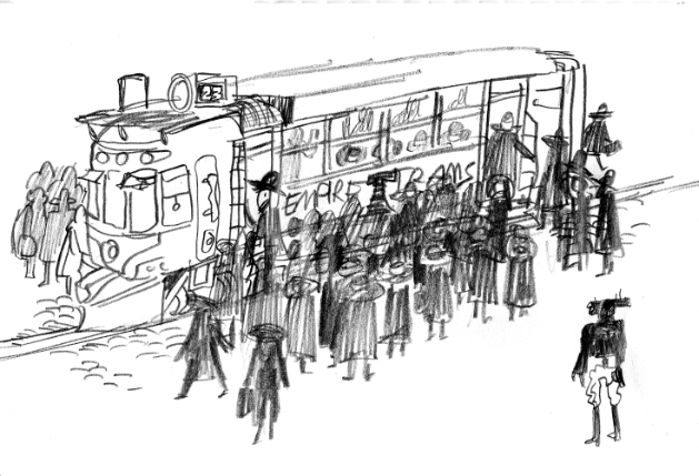
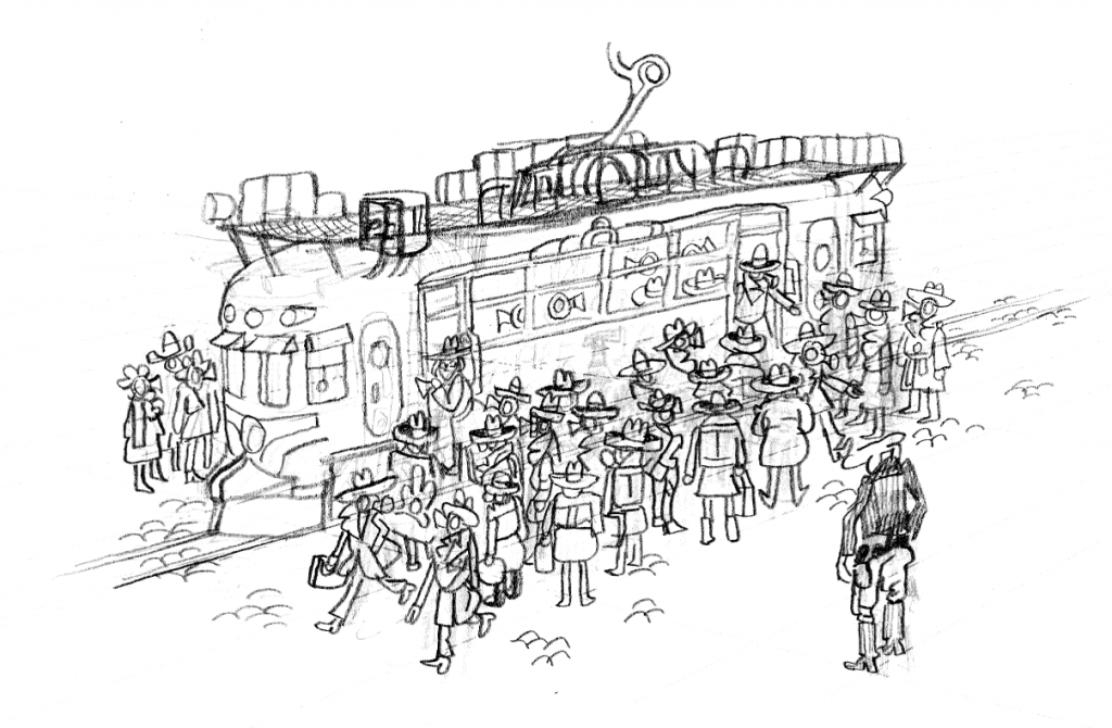
Here was the first image of the next idea. Murkier, and not so actiony. The idea is that the girl is getting on the tram, disguised as the passengers and pedestrians she is surrounded by, while a police robot/monster scans the crowd looking for her.
Next I started brainstorming the passengers/pedestrians. Strange creatures/robots who communicate very differently to how humans do.
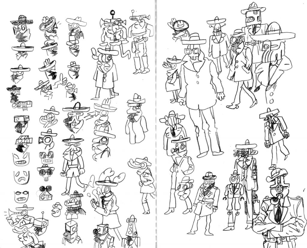
There are some cops in those doodles, but here are some more that I drew much earlier when I was first making ideas in class.
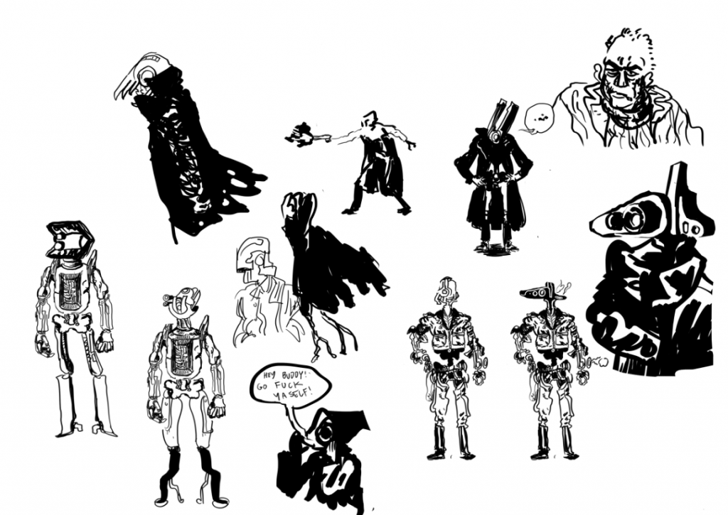
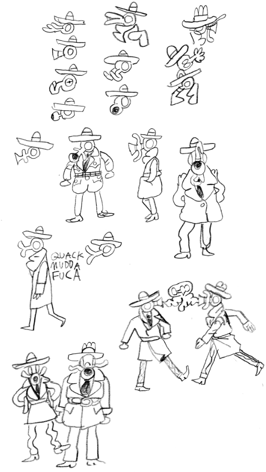
I've really liked drawing the horn faced dudes. There is something simple and silly about them, they remind me of worker bees, going about their regular day pattern, pretty simple minded and quite weak. So printed a scan of the original doodle and drew over it.
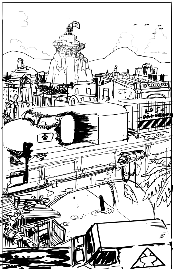
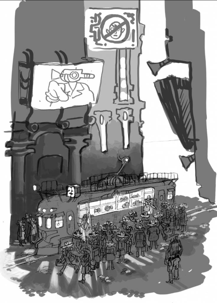
And here is a larger layout that I was just working up. I thought that making the environment taller would make it more menacing and overbearing. The screens would no humans signs or maybe a news report with arrested humans in similar garb to the one getting on the tram, a simple identifying colour that could be seen underneath her disguise?
So thats it so far. I have a few concerns.
1. That the tension or the story will be lost in the detail. I'm thinking that a simple colour palette could draw the eye to the right places though I'm not confident about that yet and really need to just jump in and give it a try.
2. That the horn faced dudes are just a subconscious theft on my part of someone else's work. Though this is bound to happen with a hell of a lot of things.
Here I am making a thread, well hows about that!
Been working on a uni project recently. A narrative driven illustration.
This is the given premise:
"SUSPENSE
THE SCENE
A teenage girl is alone on a subway train, deep in thought. Through the windows we see a futuristic
landscape. She looks up, startled by a man approaching her.
YOU GET TO DECIDE: Who is she? Where is she going? What is her relationship with the man? What
sort of planet is this? How will the audience know this is a moving subway train? Is there advertising on
the walls? Do we get a sense of culture? Are there others on the train?"
Its not very strict. Anyway, I was more interested in building the environment and trying to tell a story with that and using it to contribute to the suspense.
This was my original idea. But I found that I just couldn't get it right and it felt just a bit to chaotic. Though I've been wondering if that is not a larger problem!

Here was the first image of the next idea. Murkier, and not so actiony. The idea is that the girl is getting on the tram, disguised as the passengers and pedestrians she is surrounded by, while a police robot/monster scans the crowd looking for her.

Next I started brainstorming the passengers/pedestrians. Strange creatures/robots who communicate very differently to how humans do.


There are some cops in those doodles, but here are some more that I drew much earlier when I was first making ideas in class.

I've really liked drawing the horn faced dudes. There is something simple and silly about them, they remind me of worker bees, going about their regular day pattern, pretty simple minded and quite weak. So printed a scan of the original doodle and drew over it.

And here is a larger layout that I was just working up. I thought that making the environment taller would make it more menacing and overbearing. The screens would no humans signs or maybe a news report with arrested humans in similar garb to the one getting on the tram, a simple identifying colour that could be seen underneath her disguise?

So thats it so far. I have a few concerns.
1. That the tension or the story will be lost in the detail. I'm thinking that a simple colour palette could draw the eye to the right places though I'm not confident about that yet and really need to just jump in and give it a try.
2. That the horn faced dudes are just a subconscious theft on my part of someone else's work. Though this is bound to happen with a hell of a lot of things.

0
Posts
They took a midnight train
GOING ANYWHEEEEERE
Is this the sketching phase? Will you be doing a final inking of these images?
becausehuman: It is very sketchy early stages. But at the same time, I'm deliberating over my line work, seesawing between pencil and tablet work and liking both results.
Markedward: Thanks, normally I work in very small notepads and like to fill up the pages, I associate this with the success of a page, but I understand what you mean and I'll try to give them air to breath in the future.
Didn't want to post anything til I had actually done some more work, and I've sort of been caught up with a gig drawing a comic. But I've kept working on the tram picture
Also here is something that I posted over in the colour study thread.
I'm very aware that there are some cracks between the colours, it was quickly done, even the line work, was more of a branch off aimless doodle, but I ended up going further with it than I expected. Do you think it would be better to work on some of the shapes though? Being just a doodle, I feel that it would be improved if I rounded the shapes of the trees. Maybe the curves of the trees are too tight?
i think Im concerned with perfected line. I wonder what it takes, is it the first thing you put down after training your mind and arm to be able to link up effectively? Is it the layering of multiple sketchy lines and then bringing out a perfect one from the lot of them? Probably best to stop asking questions and just see what works best.
tumblrrr
deviantart
An illustration for a Carlos Casteneda book about dreaming...
And a Banjo Kazooie illustration...
And playing around with colour filters...
tumblrrr
deviantart
The image with the cowboy I feel needs some atmospheric perspective, so fading out the color a bit in the distance and becoming more cooler in tone. Right now everything is very close in saturation and value making it feel a little flat.
I generally do a sketch and stick with it, erasing what I don't want, adding what I do, some people like to do multiple passes of refinement but I find it kills the sketch for me so I usually stick to one layer, or a few more if I'm adding something to the sketch and I want freedom to take it out if I don't like it. It's usually a little messy but solid, once I get it to a state where I'm happy with it then I start on a new layer, lowering the opacity on the sketch, and doing a final ink. The trick is to not suck the life out of the sketch as you're doing the inking and to not make the initial sketch too tight as you'll be tightening up in the final line work which gives you a little room for spontaneity. But when you are inking yes, it is a training of mind and arm to create that single swoopy line that works.
As far as the perfected line thing goes, I think you're right about just working your way to what you're comfortable with... I know when I started drawing digitally I fussed around with multiple layers and whatnot, but that was coming more from uncertainty than anything else. It's definitely more important to try and keep that spontaneity, like Kallisti says.
Comics
Thanks for the feedback, Kallisti on the cowboy picture. Though I never got around to it, I submitted it before I saw your comment
I really think I WAS sucking the life out of that drawing of the tram with my line work, trying to get this realistic structure to all the buildings. I wasn't even considering the composition. So I went back over it and redrew the whole thing and am much happier with it now. I just started on the buildings and realised I didn't want to follow a specific sort of guideline when it came to architecture. So I just let my hand and mind flow freely to make some silly fun architecture.
Though I worried that at this size, the drama is lost of the girl jumping the tram, so I cropped it a few times to see what it looked like...
A little closer...
And closer still!
Not sure which to go for in the final drawing I will submit, nevertheless they'll all be in my process folio. Any thoughts?
tumblrrr
deviantart
tumblrrr
deviantart
I like your color sensibilities-- really straightforward but well-implemented. You have a good eye for light.
Uncanny Magazine!
The Mad Writers Union
I think correcting the lighting of the streetcar will help with the atmosphere which is already very strong.
tumblrrr
deviantart