As was foretold, we've added advertisements to the forums! If you have questions, or if you encounter any bugs, please visit this thread: https://forums.penny-arcade.com/discussion/240191/forum-advertisement-faq-and-reports-thread/

T-shirt crit

tmccooltmccool Registered User regular
edited September 2007 in Artist's Corner
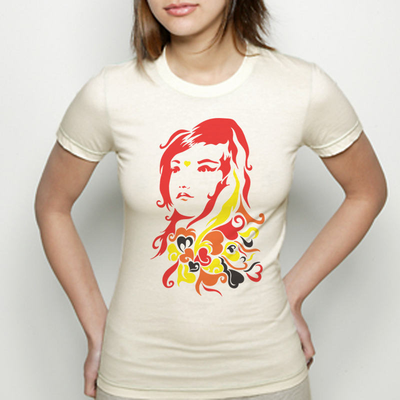
I wanted to post this here before I went to Threadless, etc. etc. It's been posted before in the sketch thread, but now I've really worked to prepare it for submission, so I wanted feedback before I sent it in.

Here is the image:

QoH-Shirt.png

And on a model:

QoHModel.png

Thoughts? Advice on the color scheme?

tmccool on

Posts

  • ZeeBeeKayZeeBeeKay Registered User regular
    edited September 2007
    I quite like it

    Probably wouldn't buy it as a t-shirt, but I don't like having faces on my chest unless they're part of a larger/more complex design, however I love looking at the shirt.

    The one iffy spot for me is the heart in between her eyebrows. It seems a bit...jarring? I'm not sure what the right word is, but it feels a bit off

    Great work, though!

    ZeeBeeKay on
  • super...super... __BANNED USERS regular
    edited September 2007
    i would lower the overall curve on top most section of hair, or add nother section to the top left to balance it out a bit.

    i would also like to see the design on a vary pale lime green shirt or a pale navy blue

    but other then that i really like this design

    zeebeekay

    perhaps it's just the angle of the hart?

    super... on
  • CrazyfoolCrazyfool Registered User regular
    edited September 2007
    I agree about the topmost curve in the hair, it looks odd.

    Also, the eyes seem a bit too far apart. Or rather, her left eye seems to close to the hairline.

    Otherwise I really like it! I wouldn't buy it (being a guy) but I like the design a lot and could definitely see it selling well.

    Crazyfool on
    Floyd86.png
  • TimTheSlothTimTheSloth Registered User regular
    edited September 2007
    This is a good clean illustration and it works well as a t-shirt design. Good balance and weight to it. I must echo the sentiments above that I think it is very well done but the design is not enough by itself to sell the shirt. I don't mean to imply that it's not well illustrated, just that absent of any explanation it comes across as fairly generic. This design would work very well as a branded shirt (if it said roxy in there or something for example). The way most shirts on threadless usually seem to set themselves out from the pack is by having some goofy play on words or something, with a few sneaking through on pure artistic merit. I love the colors, I wouldn't change them though I've found that many people don't really like cream colored shirts.

    TimTheSloth on
    redtidesig1.jpg
  • tmccooltmccool Registered User regular
    edited September 2007
    I'm looking for a bit more explanation about the top most part of the hair. By this, are you guys referring to the curly part on the upper left of the design? Or the upper right area of hair?

    If I changed the heart in the middle of the head to a different color than yellow, perhaps it would seem less jarring?

    tmccool on
  • TonkkaTonkka Some one in the club tonight Has stolen my ideas.Registered User regular
    edited September 2007
    I think the design is great.

    But I like everything, and as such, am a bit of a black sheep 'round these parts... (not really)

    Is this going to be a girls only shirt? If not, make a black one Fatty McFattypants size and I'll purchase one.

    Edit: Didn't notice the black swirls... crap.

    Tonkka on
    Steam: evilumpire Battle.net: T0NKKA#1588 PS4: T_0_N_N_K_A Twitter Art blog/Portfolio! Twitch?! HEY SATAN Shirts and such
  • ZeeBeeKayZeeBeeKay Registered User regular
    edited September 2007
    Hmm...a change of color might help the heart. The other thing is that it doesn't seem like it follows the curve of her forehead well, somehow.

    I'm sorry I'm not being much more help, I've got absolutely no artistic talent and very little idea what I'm talking about.

    ZeeBeeKay on
  • tmccooltmccool Registered User regular
    edited September 2007
    I shuffled the eyes around a bit and did a comparison side by side and this looked better to me. Also, changed the color of the heart. Is this an improvement?

    QoHShirt.png

    tmccool on
  • earthwormadamearthwormadam ancient crust Registered User regular
    edited September 2007
    I liked the heart color better before. Also I think the above comments were talking about the lopsidedness of the top of the head. It makes her look like she has a deformed head.

    Looking at it agian, I really like the look of the face. The hair does not seem to have the same level of effort put into it though. It seems a bit sloppy and it doesn't quite transition into the trippy stuff very smoothly. I hope that made sense!

    Also the black seems like it should not be there imo.

    earthwormadam on
  • tmccooltmccool Registered User regular
    edited September 2007
    Mock up for a music themed design that I have always wanted to do:

    rockoutkj7.png

    tmccool on
  • InzignaInzigna Registered User regular
    edited September 2007
    I'd wear that, I mean, on a shirt for a guy.

    Think that's what's most important in a T-Shirt critique, if consumers would buy and wear them.

    Inzigna on
    camo_sig2.png
  • QorzmQorzm Registered User regular
    edited September 2007
    Make sure you post links in here once you submit em so we can 5 star and "I'd buy it" it

    Qorzm on
  • PhilthePillPhilthePill Registered User regular
    edited September 2007
    I like the shirt.

    I agree with the black sentiment - seems like an odd colour to put against all that brightness.

    Also agree with the heart - it's like her face is angled, but the heart isn't? Like it's just a bit of clipart thrown on the end, and it looks like it's facing straight towards you while the girl is not.

    Nitpicking because you asked us to. Besides that, I really like.

    PhilthePill on
    I'm gonna sing the DOOM SONG now. DOOMY doom domm doom doom doom doom doom doom doomy doom-doom...
  • WastingPenguinsWastingPenguins Registered User regular
    edited September 2007
    Quick sloppy example of putting the heart into perspective:

    heartfacevt2.png

    Makes a world of difference, I think.

    WastingPenguins on
  • tmccooltmccool Registered User regular
    edited September 2007
    Ok, sounds good people. I do appreciate the nitpicking, it's important to me that I have the design down solidly.

    I've sort of put the finishing touches off for the past couple of days because I get distracted easily and my classes are starting to pick up. Hopefully I have time to complete this and submit it this weekend. I expect it to be done by Sunday or Monday.

    Thanks for all the crits.

    tmccool on
  • vrempirevrempire Registered User regular
    edited September 2007
    Hi tmccool,
    The concept is cool and Ilike the pattern below its head. Like others, the 'Love' at the eyes
    looks like something 'weird'. maybe you can try remove it and post it here for us to see the differences.
    Sometimes, a small things bring quite a lot of impact.

    vrempire on
    vrembanner.gif
Sign In or Register to comment.